Green has long been a familiar and dependable fixture in the annual color forecasting cycle, frequently cycling through vibrant jewel tones, earthy sages, and pale botanicals. Yet, as paint manufacturers look ahead to the future of interior design, Benjamin Moore is deliberately choosing to look beyond the transient nature of fleeting trends for its 2027 selection. The iconic paint brand has officially named Webster Green (HC-130) as its Color of the Year, anchoring its choice in the enduring, timeless appeal of a classic mid-tone green. By selecting a shade that feels equally at home in historic preservation projects and contemporary urban spaces alike, Benjamin Moore is making a definitive statement about the evolving desires of homeowners and designers who are increasingly prioritizing longevity and emotional resonance in their living environments.
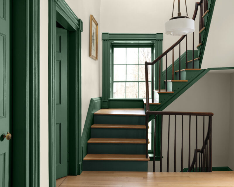
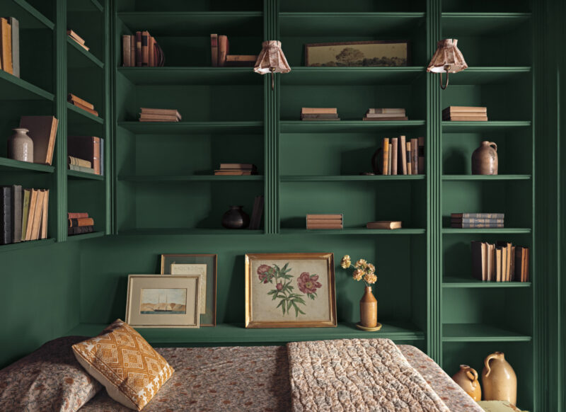
The selection of Webster Green reflects a broader, more deliberate shift within the design industry toward colors with genuine staying power. Unlike hyper-saturated greens that can occasionally overwhelm a room or quickly feel tied to a specific micro-trend, Webster Green possesses a muted, subtly grayed quality. This nuanced undertone softens the natural richness of the pigment without ever diminishing its physical presence or architectural weight. It is a shade substantial enough to envelop an entire room in a cocoon of color—transforming a library or a bedroom into an immersive sanctuary—yet sufficiently restrained to work harmoniously alongside complex architectural details, organic natural materials, and a wide array of complementary accent colors.
According to Andrea Magno, Vice President of Brand, Color, and Integrated Marketing at Benjamin Moore, the decision-making process for the 2027 palette began with a deep dive into a specific color family. For 2027, the brand’s extensive research and creative focus centered squarely on the green color family. When the color team looked across the past, present, and future trajectories of design trends, variations of green consistently demonstrated a remarkable, unwavering staying power that other hues struggled to match. Green bridges the gap between the natural world and human habitation, offering a sense of stability that feels particularly relevant in an increasingly fast-paced and unpredictable world.
Magno describes Webster Green as a sophisticated color that carefully balances a sense of comfortable familiarity with a forward-looking sense of possibility. Its composed and measured nature feels simultaneously deeply rooted in historical design traditions and refreshingly modern, enhancing residential and commercial spaces in a way that feels distinctive, collected, and continually new over time. This dual nature allows the paint to transcend simple categorization, moving fluidly between different eras of architecture and diverse interior design styles without missing a beat.
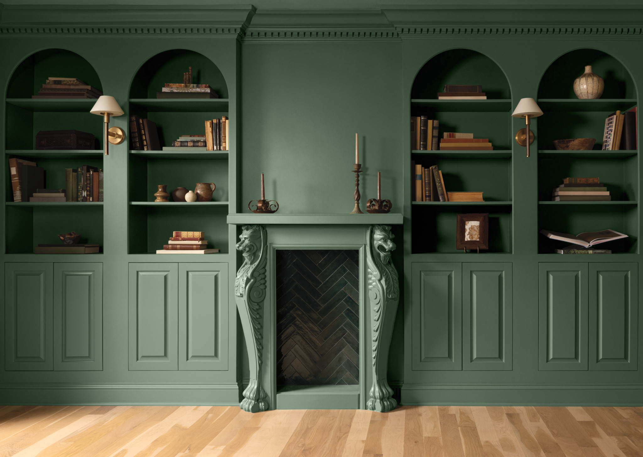
To demonstrate this incredible versatility, Benjamin Moore’s design campaign showcases Webster Green in radically different spatial contexts. In one traditional setting, the color completely envelops a classic library, seamlessly unifying floor-to-ceiling built-in shelving, rich wood-paneled walls, and a grand fireplace surround to create an intimate, scholarly atmosphere. In an entirely different application, it brings a much more contemporary sensibility to a modern bedroom, where the deep green walls are grounded by crisp white trim and set off against a pale blue ceiling, proving that the shade can adapt to lighter, airier color schemes with ease.
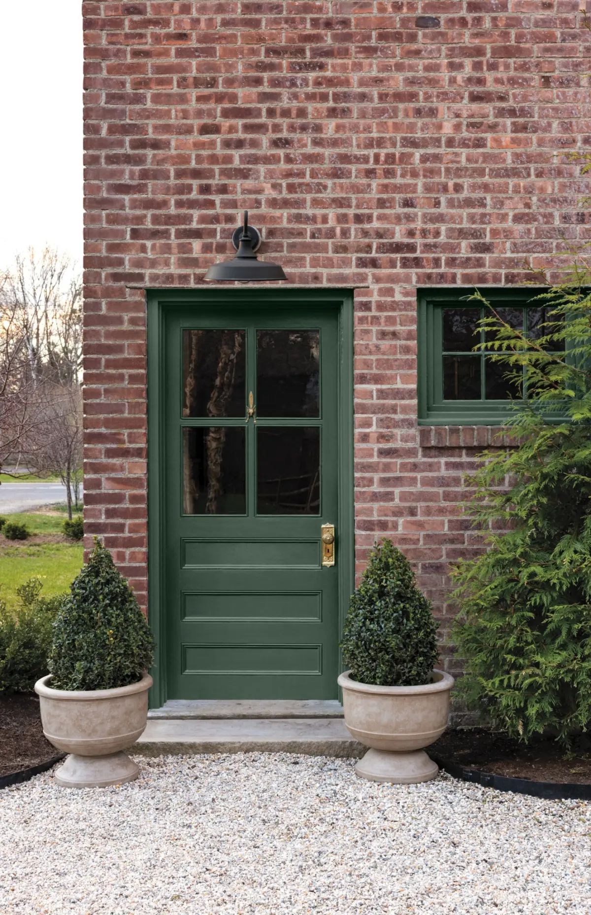
Furthermore, the shade’s robust character extends beyond interior walls. Exterior applications, such as a classic front door set against a traditional red brick facade, demonstrate how Webster Green can establish a welcoming, timeless threshold that connects the interior of a home with the surrounding landscape. Whether used on millwork, trim, cabinetry, or full-room transformations, the color holds its own against varying qualities of natural and artificial light.
Webster Green serves as the anchor for Benjamin Moore’s broader Color Trends 2027 palette, a carefully curated collection of eight distinct hues drawn directly from the company’s extensive library of more than 3,500 colors. This accompanying group of shades is designed to offer interior designers and DIY enthusiasts alike a harmonious toolkit for creating layered, deeply personalized spaces. The seven complementary colors in the palette span a diverse spectrum of temperatures and tones, providing options for both subtle, monochromatic layering and bold, expressive color blocking.
Among the lighter selections in the 2027 palette is White Down, a soft and comforting off-white that provides a gentle contrast to deeper shades. It is joined by Nelson Blue, a pale and watery blue that introduces a tranquil, atmospheric quality reminiscent of misty mornings or open skies, and Shakespeare Tan, a rich golden neutral that brings warmth and earthy complexity to the mix. Moving further into expressive territory, Wild Aster introduces a sophisticated, muted pink enriched by subtle gray undertones, while Antique Copper offers a warmer, distinctly reddish-brown note that nods to industrial and vintage materials.
The deeper end of the palette rounds out the collection with Durango, a moody dark neutral featuring pronounced olive undertones, and Townsend Harbor Brown, a complex burgundy that leans heavily toward a rich, grounding brown. Together, these eight colors provide endless opportunities for spatial storytelling, allowing designers to create environments that range from quiet and monochromatic to richly contrasting and dynamic.
To further reinforce the cultural inspiration and historical depth behind the 2027 palette, Benjamin Moore commissioned illustrator Tanu Vasu to create a series of evocative, hand-drawn illustrations. These artistic works explore the underlying concepts of the collection, reinforcing its profound connection to historical architectural design, personal expression, and the enduring relationship between human spaces and the natural world.
With Webster Green crowned as its 2027 Color of the Year, Benjamin Moore continues to shape the conversation around how we inhabit our homes, making a compelling case that a color doesn’t have to be entirely novel to feel entirely relevant for the future.