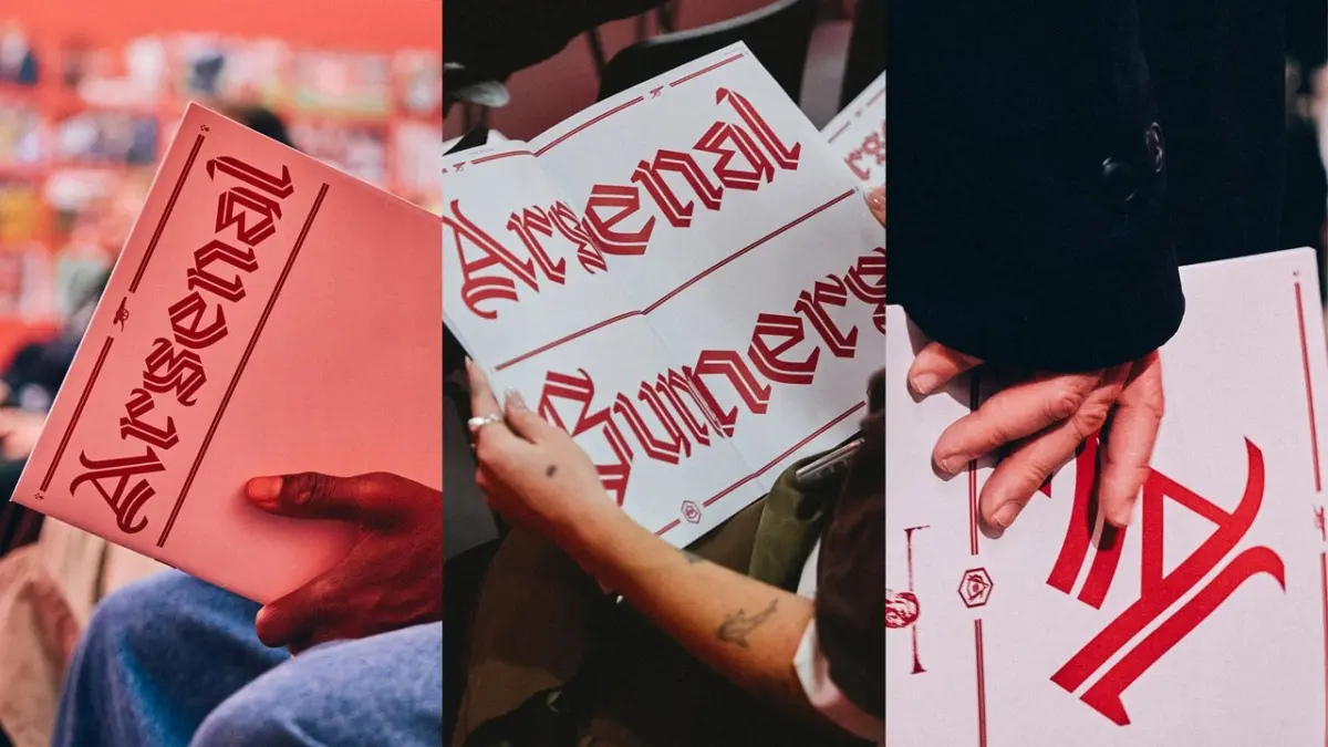
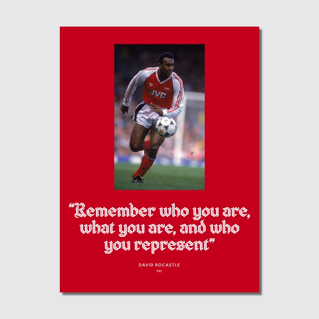
Created by designer David Rudnick—founder of the research and design studio terrain—alongside collaborator Léa Bruneau, the typeface pays homage to the beloved late Arsenal midfielder David Rocastle. Known affectionately by fans and teammates as "Rocky," Rocastle was a legendary figure at the club from 1985 until his departure in 1992, remembered just as much for his exceptional skill and flair on the pitch as for his enduring connection to the Arsenal community before his untimely passing in 2001 at the age of 34.
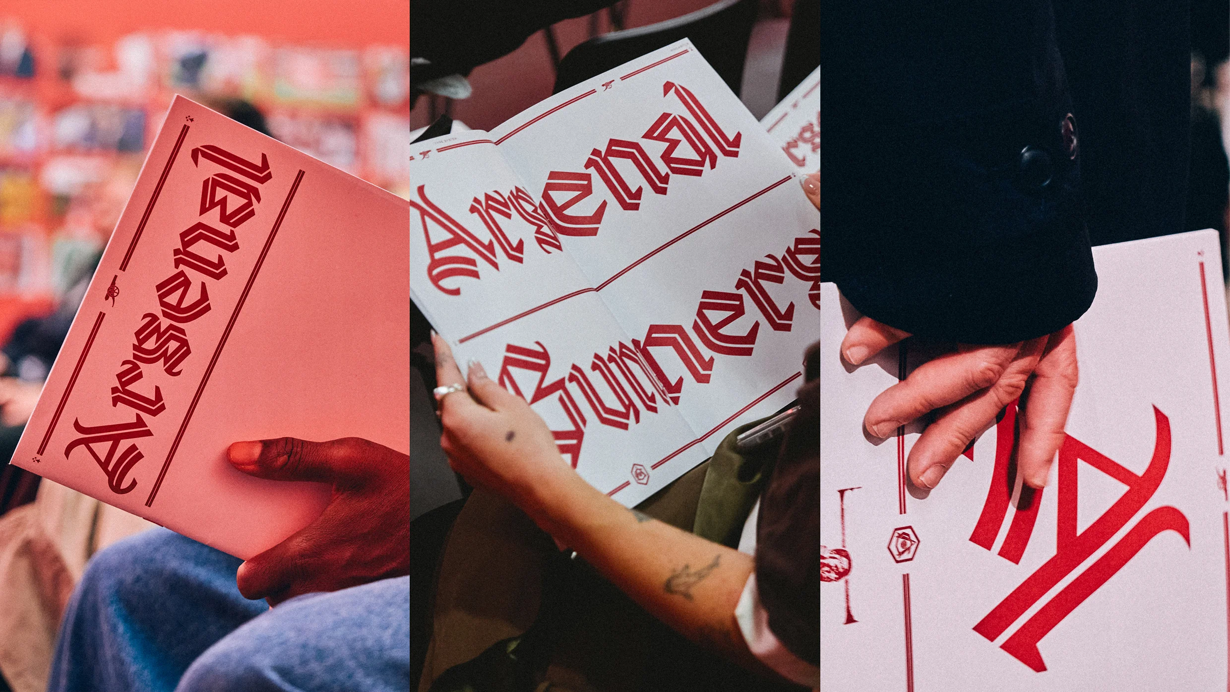
The unveiling at the Design Museum is the culmination of an intensive four-year design project spearheaded by Rudnick. As a lifelong Arsenal supporter, the designer approached the commission with profound personal reverence. Describing his deep attachment to the club, Rudnick noted that he would only ever have agreed to undertake such a branding project for one single football club. Over the course of four years, he immersed himself in the rich visual history of the institution, reviewing hundreds of pieces of historical club memorabilia and vintage type specimens to ensure the new typography authentically captured the spirit and heritage of North London.
At the heart of the project was the challenge of balancing historic gravitas with modern versatility. In an interview with Fast Company, Rudnick explained that the new typeface had to achieve several demanding and contradictory objectives simultaneously. The design needed to be sufficiently distinctive, bold, and proud as a set of letterforms so that it could function as a glorious pinnacle of the club’s visual identity. At the same time, it had to remain simple, legible, modern, and adaptable enough to function seamlessly across the vast array of applications required by a modern global sports brand.
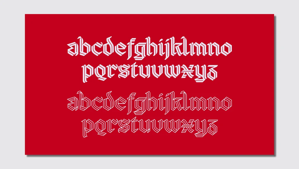
The resulting letterforms are unmistakably rooted in the blackletter tradition, yet they incorporate innovative design elements that separate them from medieval manuscripts. By introducing features such as an inline weight and fluid swashes that evoke the shape and movement of pennants fluttering in the wind, Rudnick and Bruneau managed to infuse the historical script with a distinctly English, contemporary energy. According to Rudnick, these deliberate choices help create the sense of something that feels remarkably chivalric or knightly, echoing the traditional imagery associated with pride, honor, and heraldry in English culture.
This typography is part of a broader, structured overhaul of Arsenal’s visual identity that began back in 2022. Across the multi-year branding campaign, Rudnick designed three distinct proprietary fonts licensed exclusively to the football club. These typefaces were built around three core pillars representing the identity of the organization: team, community, and culture.
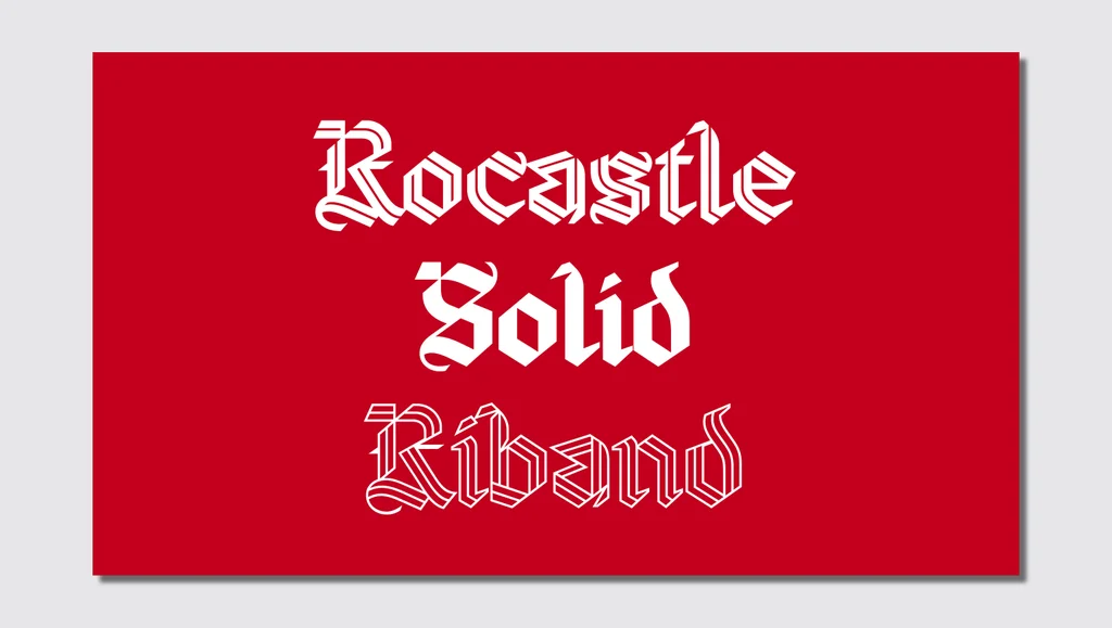
Within this strategic framework, the Rocastle font has been designated to represent "culture"—specifically capturing the space where football intersects dynamically with fashion, art, music, and broader youth culture. Museum curators noted that the typeface possesses a rare duality, making it equally at home featured on a high-fashion streetwear collaboration or printed across the walls of a cutting-edge design exhibition. It bridges the gap between contemporary lifestyle aesthetics and deeply rooted club heritage.
The inspiration for Rocastle, as well as a newly introduced blackletter "A" mark, traces directly back to the lettering found on the club’s retro VCC crest. The acronym stands for Victoria Concordia Crescit, the Latin motto meaning "victory grows through harmony" that has long been associated with Arsenal’s identity. The new blackletter "A" mark now officially stands alongside the club’s traditional crest and historic cannon as one of the three primary visual logos utilized by the organization.
By marrying historical iconography with avant-garde graphic design, Arsenal and its creative partners have established a visual language that honors the legends of the past while positioning the historic club firmly at the forefront of modern design and global football culture.