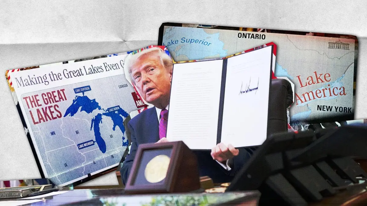
President Donald Trump recently took to the Oval Office to announce an executive order renaming Lake Ontario to "Lake America," a symbolic move unfolding amid an escalating trade war between the United States and Canada. While the geopolitical friction and the sudden rebrand of a major Great Lakes body naturally drew considerable attention, the visual execution of the announcement also put a surprising spotlight on the Trump administration’s graphic design choices. To roll out the executive action, the White House utilized a specific, highly contemporary typeface that has quickly become a signature of the president’s second term—turning what was meant to be a display of authoritative statecraft into an accidental aesthetic talking point.
During the Thursday signing ceremony, the president directed the Interior Department’s Board on Geographic Names to officially change the historic name of Lake Ontario. To visually anchor the announcement, the White House deployed two custom posters on easels flanking the desk. The text on these physical props was rendered in Instrument Serif, a condensed serif typeface originally released in 2023 by designer Rodrigo Fuenzalida with direction from Jordan Egstad.
The typography immediately caught the eye of design critics and digital observers. Rather than looking like traditional, solemn government stationery, the font choice gave the second Trump administration the uncanny visual aesthetic of an artificial intelligence tech startup.
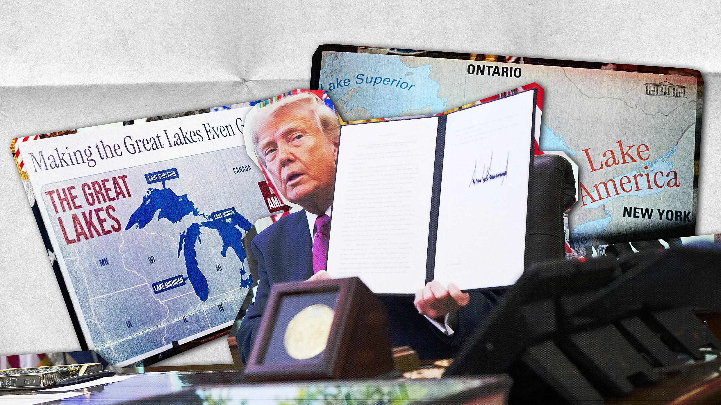
One of the display posters featured a regional map of the Great Lakes overlaid with the slogan “Making the Great Lakes Even Greater” set in Instrument Serif, alongside the bold new designation “Lake America” enclosed within a heavy red box, reminiscent of sensationalist tabloid layouts. A second poster featured a close-up map of the lake system, which the administration subsequently disseminated across its official social media channels. On this map, the adjacent bodies of water—Lake Superior, Lake Michigan, Lake Huron, and Lake Erie—were rendered in a standard, unassuming blue sans-serif typeface typical of conventional cartography. In stark contrast, “Lake America” was plotted in a vibrant red hue and curved neatly across the map using the distinctive Instrument Serif.
The pairing of the typography with the grandiose slogan struck many observers as idiosyncratic. The stunt marks the administration’s second major geographic renaming initiative in two years, utilizing a design language that feels increasingly detached from traditional bureaucratic norms.
The choice of typeface is far from accidental, yet it diverges sharply from historical presidential branding. In the world of government communications, typography has long served as a quiet instrument of authority, credibility, and trust. Governments carefully select fonts to convey formality and carry the profound weight of the state. Documents like jury summonses and voter registration materials lean on formal, reliable, and invisible typography, intentionally avoiding playful or unconventional fonts like Comic Sans or Impact.
Academic research has long explored the psychological weight of typefaces. A prominent 2012 experiment, for instance, famously demonstrated that the serif font Baskerville inspired a higher degree of perceived truthfulness and believability than other typefaces. Modern U.S. presidential administrations have historically leaned into this tradition by selecting serious, established serif fonts to anchor their visual identities. During his first term, Trump’s White House utilized Merriweather, while the subsequent administration under President Joe Biden adopted Mercury for its official digital communications.
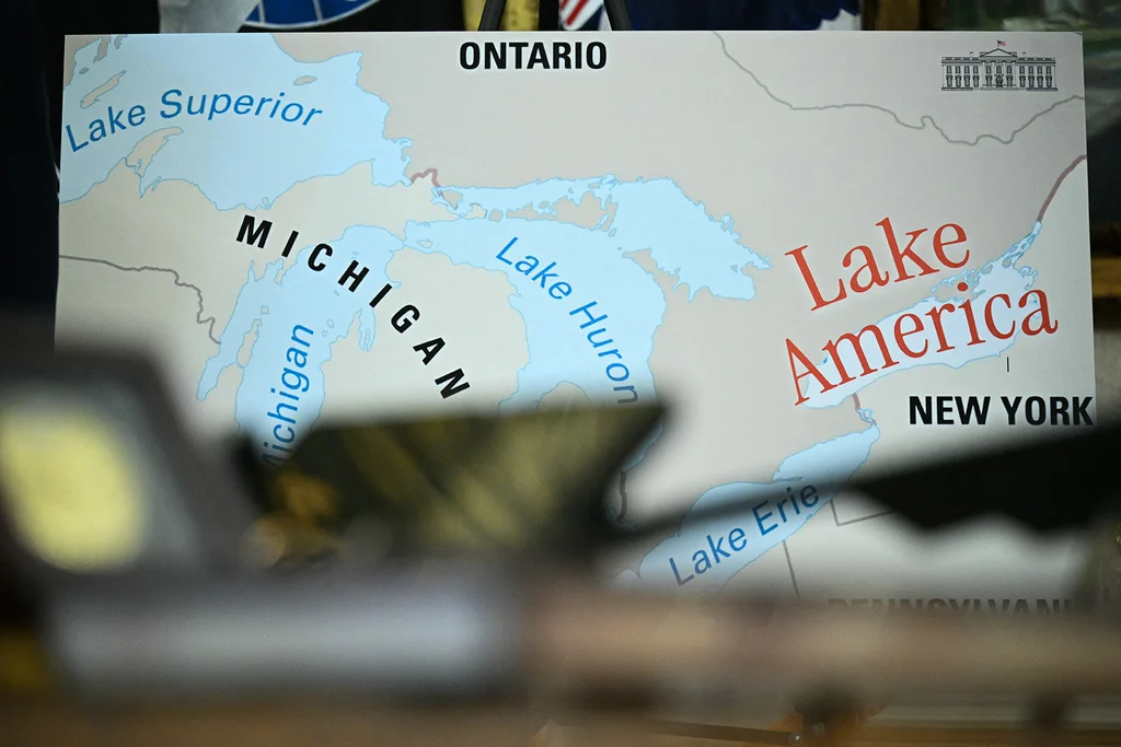
For his second term, however, Trump’s team pivoted toward a typeface that captures a very different cultural and economic moment: the aesthetic boom of Silicon Valley artificial intelligence startups.
Young tech companies looking to project a blend of human warmth and cutting-edge innovation have increasingly turned to condensed serif typography. This trend mimics the vintage aesthetic of classic tech design, such as Apple Garamond, the signature serif font utilized by Apple throughout the 1970s and 1980s. By adopting Instrument Serif for official White House communications, the administration has integrated the font into everything from its primary website and social media graphics to event signage and formal executive orders.
Within the visual ecosystem of the second Trump term, the typeface has become as defining a motif as the administration’s other stylistic departures—sitting alongside the ornate gold redesigns of the executive mansion and the proliferation of AI-generated digital content shared across the president’s official social media presence.