Across high streets, neighborhood coffee shops, local dining establishments, and suburban community venues, a subtle yet pervasive visual shift is taking place. Where physical bulletin boards and storefront windows once displayed handcrafted posters or simple word-processor notices, a new wave of synthetic imagery has quietly taken over. From announcements for local acoustic gigs to community center notices for annual Fireworks Night celebrations, artificial intelligence-generated promotional graphics are appearing in physical spaces at an unprecedented rate. Yet, despite the expansive creative capabilities often attributed to generative algorithms, these physical posters share a remarkably consistent visual fingerprint. Among the various telltale signs of synthetic provenance, there is one recurring element that instantly exposes the machine behind the visual layout: a distinctive, highly specific typographic style that has rapidly saturated modern design.
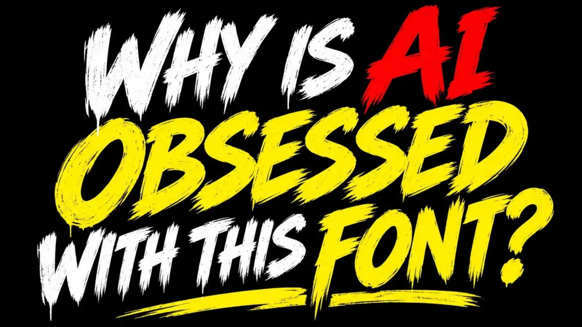
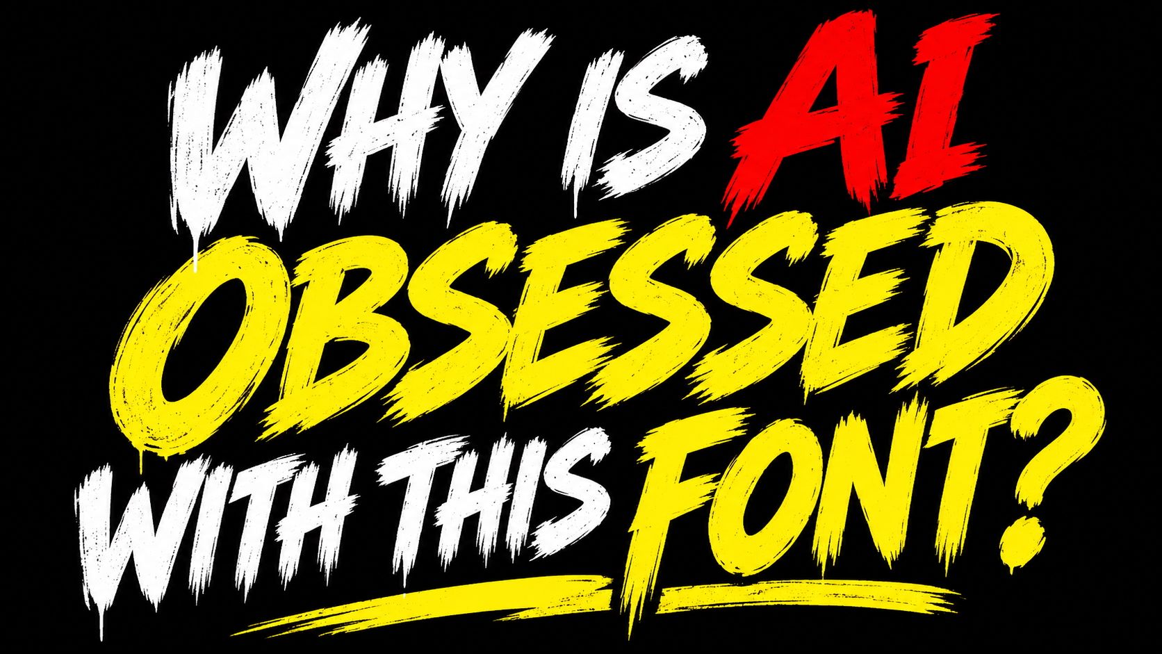
This ubiquitous lettering style is unmistakable once observed. Defined by aggressive brushstrokes, a noticeable upward slant, distressed textures, bright high-contrast colors, and loud all-caps formatting, the typography projects an assertive visual loudness designed to command immediate attention. Whether advertising a local cafe special or a neighborhood festival, generative image platforms seem relentlessly drawn to this precise visual aesthetic. However, as the style proliferates across both digital feeds and printed community boards, a growing chorus of graphic designers, design observers, and casual viewers are voicing frustration over its endless repetition. The sudden visual dominance of this single aesthetic has triggered widespread debate across online design communities, where critics have increasingly begun comparing the omnipresent AI brush script to infamous typographic missteps of the past—most notably, the widely derided Comic Sans.
Yet, comparing this algorithmic default to Comic Sans arguably misinterprets the history of graphic design and typography. While Comic Sans has long served as a convenient punchline within mainstream culture, its creation was grounded in intentional human ergonomics and functional visual communication. Unlike the automated outputs of generative image software, Comic Sans was designed by Microsoft’s Vincent Connare to address a clear digital interface challenge. As Mandy Roscoe, a signage and print expert at Carrick Signs, explains, Comic Sans was originally created to solve a very specific communication problem, built to mimic informal, handwritten speech in cartoons rather than decorate official notices or formal public signage. Roscoe emphasizes that the core issue surrounding Comic Sans is not the font itself, but rather its deployment in inappropriate contexts for the message being delivered.
When evaluated within its intended environment—such as comic books, informal educational materials, or casual speech bubbles—Comic Sans performs its core communication function with distinct clarity and approachability. In fact, despite decades of persistent internet mockery, the typeface’s accessibility and visual legibility earned it notable recognition in 2020, when it was identified as the world’s second most trusted font. This historical perspective highlights the stark contrast between human-designed typography, which carries clear intent even when misused, and synthetic letterforms generated by artificial intelligence. Where Comic Sans was crafted by human hands to serve a specific visual purpose, the recurring AI brush script is the product of statistical probability, reflecting an algorithmic system reaching for dramatic flair without understanding context, tone, or message delivery.
Understanding why this aggressive brush font has become so prevalent requires examining the economic and practical realities facing small businesses, community organizations, and local event hosts. For an independent cafe, a neighborhood restaurant, or a volunteer-run village hall operating on limited funds, producing promotional material historically required a difficult compromise. Hiring a professional graphic designer or purchasing commercial typeface licenses represents a substantial financial investment that is often impossible to justify for minor community events or short-term local notices. The rapid adoption of free and low-cost generative AI tools provided an appealing alternative, offering non-designers the ability to produce visual flyers in seconds using simple text inputs.
When individuals without professional design backgrounds utilize AI image generators to create promotional flyers, they naturally seek out visual results that appear striking and polished. In most instances, casual creators accept the initial image options generated by the software without requesting stylistic revisions or altering typographic parameters. For small business owners who are not chronically online or immersed in contemporary design culture, the sheer ubiquity of this specific typographic output goes largely unnoticed. To a casual user, the energetic brushstrokes and vibrant colors appear modern and professionally produced. However, to observers who are regularly exposed to online visual media, the repeating aesthetic quickly becomes a monotonous visual cliché that signals cheap, automated production.
To understand why generative algorithms continuously default to this specific typographic aesthetic, one must look at the mechanics of how these models process and synthesize visual data. When queried directly about its reliance on this bold, distressed lettering style, ChatGPT offered a clear breakdown of the underlying algorithmic behavior. The AI platform explained that image generators frequently utilize bold, brushstroke-style lettering because they have learned to associate it with exciting, attention-grabbing design through their underlying training datasets.
Throughout their development, generative models digest massive datasets containing millions of public images scraped from across the web, including commercial advertisements, event flyers, promotional banners, and high-performing YouTube thumbnails. Within these promotional contexts, oversized capitals, distressed textures, and bright high-impact colors represent a dominant visual pattern used to capture viewer engagement. Consequently, when an AI generator is prompted to create a dramatic, exciting, or attention-grabbing poster, it routinely reproduces these familiar visual tropes.
Crucially, generative AI models do not actually select or render traditional vector font files in the manner of layout applications like Adobe InDesign or Canva. Instead, the artificial intelligence synthesizes visual approximations of lettering derived from similar styles stored within its training weights. This mechanism illustrates a defining characteristic of generative models: rather than inventing original typographic concepts, the technology leans heavily on repeating established visual clichés that featured prominently in its training materials. Ironically, typography originally intended to look handmade, rebellious, and expressive has become so common in AI-generated artwork that it now looks unmistakably artificial.
This shift underscores a fundamental conflict between automated design tools and human craftsmanship. authentic visual design relies heavily on nuance, hierarchy, and contextual appropriateness—principles that generative algorithms do not naturally possess. While a professional designer chooses typography based on the specific brand narrative, emotional tone, and medium of a project, generative AI relies entirely on statistical association. As a result, it applies loud, shouty brush typography indiscriminately across vastly different subjects, treating a simple community gathering with the same high-decibel visual intensity as a major commercial ad campaign.
As generative technology continues to permeate everyday life, the distinction between thoughtful human layout and automated visual output will remain a focal point for the design industry. Small businesses and local organizers will undoubtedly continue utilizing accessible AI tools to streamline flyer creation and save on operational costs. However, as public awareness of AI design tropes increases, the visual effectiveness of these automated outputs may rapidly decline. Just as audience fatigue eventually reshaped the public perception of early desktop publishing fonts and generic stock photography, the omnipresent AI brush script may soon serve as a cautionary lesson in the limits of uncurated algorithmic design, sparking a renewed appreciation for intentional typography and genuine creative direction.