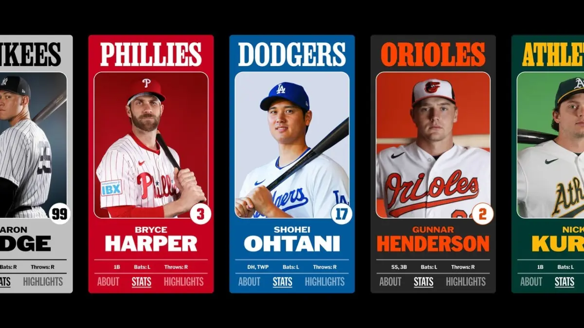
The transformation began in 2020 when Major League Baseball relocated its headquarters to New York City. Following the move, the league reached out to Mother Design, the renowned branding and design agency behind high-profile creative work for major global brands such as Cadillac, Tripadvisor, and the innovative scented water bottle brand Air Up. At the time, league leadership was looking for ways to expand professional baseball’s audience and talent base, and they recognized that their visual identity needed to feel more unified across all touchpoints.
Beginning in late 2022, Mother Design set to work building out a comprehensive new brand architecture for MLB. This ambitious visual overhaul was introduced to the public starting in 2024 on a rolling basis, culminating in the complete rollout of a unified system. While the league’s famous silhouetted batter logo—originally designed in 1968 by Jerry Dior—was left completely untouched out of respect for its historic equity, MLB’s wordmark and surrounding typography were thoughtfully updated to fit seamlessly into a larger, more versatile visual system.
As part of this multiyear brand refresh, the agency tapped five distinct type designers and foundries, each chosen for their specific individual specialties. Together, they built out a one-of-a-kind font book that now makes its presence known across every corner of the league. From the MLB Ballpark app and physical ballparks to broadcast graphics, social media channels, and special marquee events, the new typography creates a consistent thread connecting every fan’s experience.
Each custom font integrated into the brand architecture—specifically MLB Franklin, MLB Clarendon, MLB Flare, MLB Block, and MLB Script—was deliberately chosen because it draws inspiration from typography styles that were historically present in baseball during the early 20th century in some form or another. By rooting the modern identity in historical aesthetics, the design team ensured that the league’s new look respects its storied past while preparing it for the digital future.
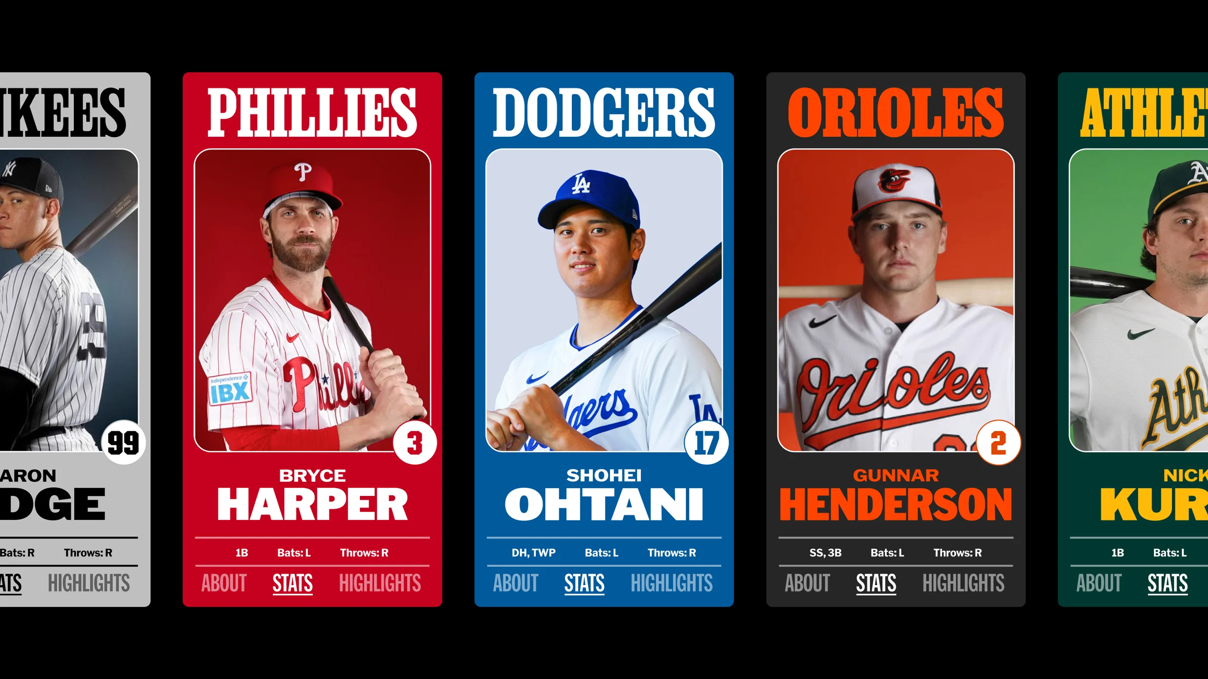
"It’s ensuring that we’ve got these visual cues and these letterforms that have been part of our visual vernacular for longer than any of us have been alive," Mark Sloan, Mother Design’s New York City head of design, tells Fast Company. "How do we make sure that we carry that forward and we honor that tradition, but that we build them in a way that is prepared for retina screens on smartphones and extremely small spaces as well as emphatic, large moments? That’s really the crux of it."
Balancing this deep respect for tradition with the rigorous technical demands of modern media required the expertise of specialized typographers. The contributors for the project were purposefully enlisted to tackle specific typographic challenges within the baseball ecosystem. For instance, MLB Script was designed by the acclaimed Bay Area foundry OH no Type Co., which was explicitly selected for its keen attention to unexpected, quirky details that give the lettering character and warmth.
The resulting variable typeface for MLB Script includes playful and authentic details, such as integrated flags and the classic horizontal stripe extending from a word’s final letter to underline the word itself—a design flourish that looks quintessentially baseball and immediately evokes the handwritten jerseys and vintage memorabilia of the sport’s history.
Through this meticulous blending of historic vernacular and contemporary design principles, Mother Design and its collective of typographers have provided Major League Baseball with a flexible, enduring visual toolkit. The comprehensive refresh ensures that whether a fan is interacting with the league on a tiny smartphone display or experiencing the grandeur of a packed stadium on a summer afternoon, the visual language of baseball remains unmistakably connected to its rich heritage while looking forward to the future of the sport.