Digital interface designers face a persistent challenge on modern websites and mobile applications: organizing dense hierarchies of content without overwhelming screen space or confusing user interactions. To solve this, developers frequently rely on accordions—collapsible UI components that conceal secondary content until a user chooses to reveal it. However, usability evaluations and research compiled by user experience experts, including empirical studies conducted by the Nielsen Norman Group (NN/g) and featured by web design publication Smashing Magazine, demonstrate that small variations in icon selection and menu construction have a massive effect on interface clarity.
The research highlights a recurring point of friction in contemporary web design: screen indicators often fail to communicate their intended behavior clearly. Designers regularly attempt to combine multiple actions into single navigation blocks or rely on visual symbols that carry ambiguous meanings across operating systems. By examining how test participants interact with directional arrows, carets, plus and minus signs, and split-action menus, user experience researchers have established definitive guidance aimed at reducing navigation errors. Central to these findings is a firm warning against split menus—where text labels and adjoining icons perform separate tasks—alongside evidence identifying the classic downward caret as the safest icon choice for expandable content.
No Icon Signifies Direct Page Navigation
A primary finding of user behavioral research centers on how people interpret text labels that lack accompanying icons. When navigation bars or sidebar lists feature plain text without any visual glyphs, users overwhelmingly operate under the mental model that tapping or clicking the item will take them directly to a new webpage.
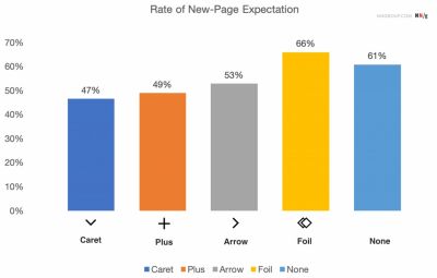
Usability testing indicates that without an explicit icon signaling expandable content, users assume the element is a standard hyperlinked page title. Furthermore, when designers introduce custom or non-standard icons to indicate disclosure, user comprehension drops significantly. Custom graphics often fail to convey accordion behavior because they lack established conventions. Instead of signaling that a section will drop down, decorative or bespoke icons frequently create uncertainty, leaving users guessing whether a click will load a new URL, launch a pop-up modal, or expand a hidden panel.
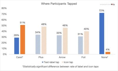
Hit-target behavior during user testing further underscores the necessity of clear visual cues. Data shows that participants tap on text labels and adjacent icons at nearly equal rates when navigating structured lists. Because the hit area of a navigation item effectively includes both the text and its accompanying symbol, the presence or absence of an icon impacts how the entire interaction target is perceived.
To prevent user misdirection, usability specialists recommend a straightforward visual rule: when an item functions purely as a link to another page, it should simply be underlined without additional arrows, carets, or embellishments. While modern minimalist trends often omit underlines in favor of plain text or decorative arrows, standardized underlines consistently communicate page-level navigation across all user demographics without introducing functional ambiguity.

Confusing Behavior With Arrows and Split Buttons
Among the most problematic patterns identified in navigation design is the split menu, also known as a split button. In a split-menu architecture, a single visual menu row is divided into two separate interactive zones: clicking the text label navigates directly to a top-level category page, while clicking the adjacent icon toggles an accordion dropdown to reveal sub-category links.
User testing demonstrates that split menus frequently trigger unintended actions and user frustration. On mobile devices, touch targets are naturally imprecise, making it difficult for users to target a small icon without accidentally hitting the nearby text label. When a user intends only to expand a sub-menu to view available options, misclicking the text label forces an unwanted page load. This breaks the user’s browsing flow and forces them to navigate back to reopen the menu.
The study also evaluated user responses to directional arrow icons. A right-pointing arrow ($blacktriangleright$) is not strongly associated with opening a new webpage, nor does a downward-pointing arrow ($blacktriangledown$) reliably signify that an accordion menu will open below. Arrow symbols are heavily overloaded across modern software, often representing sequential pagination, carousel scrolling, media playback, or inline jump links. Consequently, using directional arrows in navigation menus can cause conflicting user expectations.
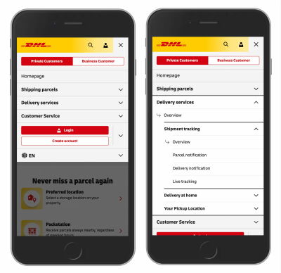
To eliminate the friction caused by split menus, research suggests adopting unified menu targets paired with internal overview links. Logistics carrier DHL provides a practical real-world application of this design principle within its global web platform. Rather than splitting main category rows into dual-action buttons, DHL configures each parent item as a single accordion toggle. Tapping anywhere on the parent category row opens the accordion drawer. To allow users to access the main category landing page, DHL places an explicit "Overview" link at the top of the newly revealed sub-menu. This structural approach ensures that the primary touch target performs one predictable action, granting access to category pages without causing accidental navigation.
Overloaded Symbols: The Limits of Plus Signs and Arrows
While plus (+) and minus (−) signs as well as standard up and down arrows ($uparrow$/$downarrow$) are widely recognized in user interface design, testing shows that both symbol sets carry inherent usability drawbacks due to functional overload.
The plus sign has historically served as a common indicator for expandable tree views in desktop file directories and software applications. However, in contemporary web ecosystems, the plus symbol is assigned to numerous competing actions. Depending on the context, a plus sign might signify adding an item to a shopping cart, saving content to a reading list, zooming in on a document, creating a new record, or opening a modal window.

In complex multi-level navigation structures, using plus and minus icons can generate visual noise. When multiple navigation tiers are expanded simultaneously, screens can become cluttered with competing mathematical symbols. Users may struggle to visually parse whether a minus sign will collapse an immediate child container or close the broader parent section entirely.
Similarly, traditional directional arrows ($uparrow$/$downarrow$) carry conflicting meanings. Arrows are frequently interpreted as indicators for page scrolling, returning to the top of a screen, advancing to a next search result, or navigating horizontal content sliders. Because these symbols are used for widely varying UI mechanics, applying them to accordion containers requires users to spend extra cognitive effort deciphering what will happen when they tap.
The Caret as the Safe Default for Accordion Signifiers
When evaluating icon choices for accordion widgets, research identifies the caret—a stylized, downward-pointing triangle or chevron ($blacktriangledown$)—as the most reliable and effective signifier for expanding and collapsing content.
Unlike tests involving standard arrows or custom graphics, usability data reveals that the presence of a caret alters user interaction patterns in a positive way. While users split their taps evenly between labels and icons for most symbol types, carets prompt a higher proportion of direct taps on the icon itself while clearly signaling the toggle behavior of the entire target row. The caret clearly communicates a directional disclosure model: pointing downward indicates that content will unfold below, while pointing upward ($blacktriangle$) or leftward indicates that the section can be closed.
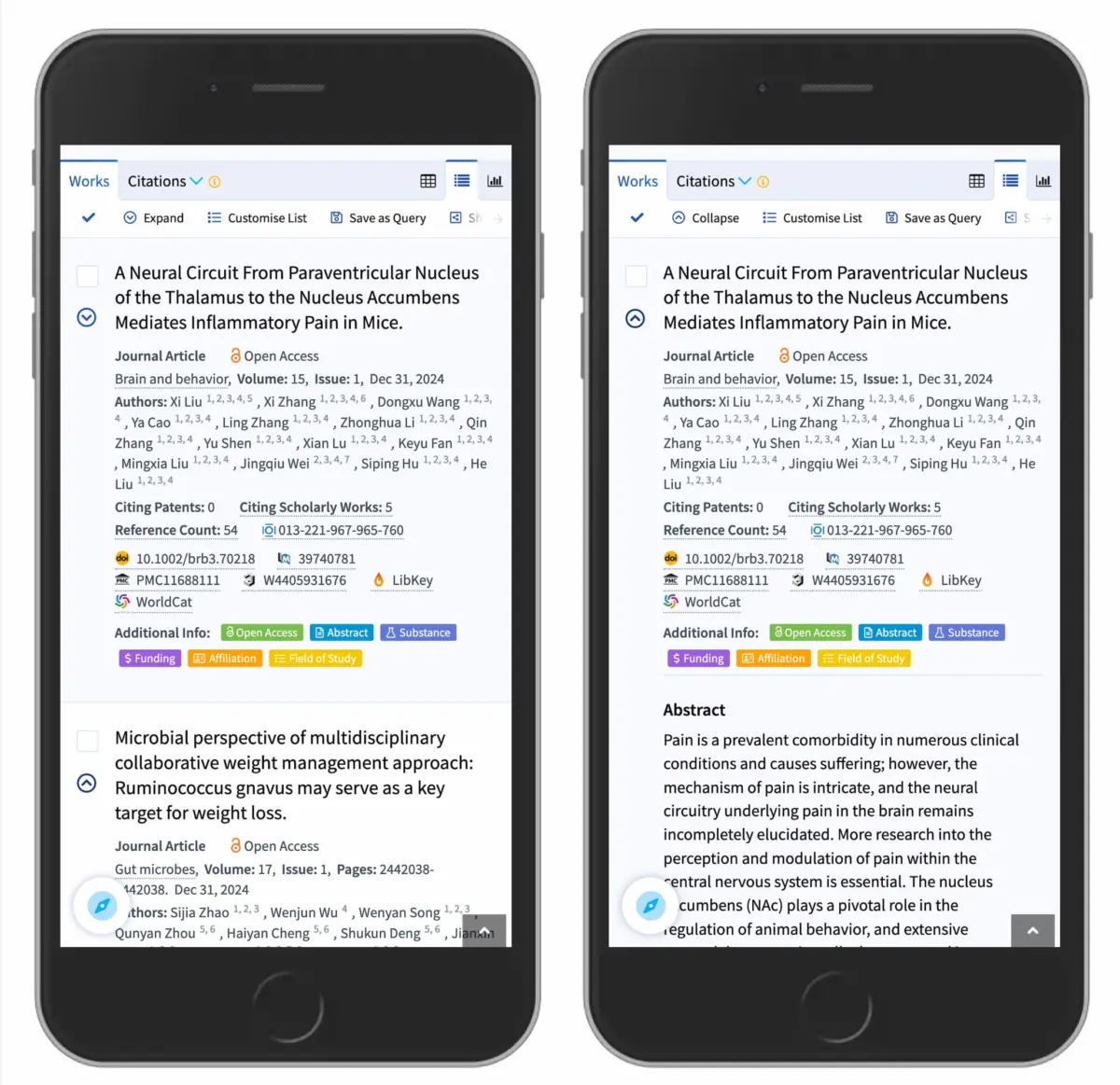
A real-world example of effective caret implementation is visible on the academic research platform Lens.org. When mobile users browse scholarly search results, collapsed items use a subtle downward caret alongside result headers. Selecting a result expands the abstract and publication details inline while rotating the caret upward. This visual state transition offers immediate feedback, signaling that the content block can be collapsed back down without refreshing the page or altering the user’s active search parameters.
The recommended best practice for accordion design is to utilize a downward-pointing caret as the default collapsed state. Upon user interaction, the icon should smoothly transition to point upward or sideways to reflect the expanded state. If an alternative icon set must be used due to design system constraints, standard plus and minus signs remain a secondary option, provided the surrounding interface does not already use plus signs for actions like adding items or expanding search filters.
Principles for Usable Navigation Design
The research compiled by Nielsen Norman Group and Smashing Magazine highlights fundamental rules for modern interface design: visual simplicity and unambiguous affordances consistently outperform complex decorative patterns.
To build intuitive navigation, designers are encouraged to adhere to three primary principles:
- Maintain Single-Action Targets: Avoid split menus that separate text action from icon action on a single line. A menu item should perform one distinct task across its entire hit area.
- Leverage Established Link Styles: If a menu item is meant to navigate directly to a new webpage, rely on traditional styling such as underlined text rather than adding unnecessary directional arrows.
- Standardize Disclosure Indicators: Use simple downward carets to denote collapsible accordion panels, ensuring state changes are reflected by clear icon rotation upon expansion.
By removing ambiguous icons and streamlining menu structures, web teams can significantly reduce misclicks, improve accessibility on mobile screens, and create frictionless digital experiences across all devices.