The intersection of typography, education, and the human act of handwriting has inspired a comprehensive new design project. Type designer Sabrina Lopez has detailed the extensive research and meticulous design process behind Didactica, a versatile superfamily specifically crafted for children, educational materials, and early literacy learning.
The project addresses a fundamental question for type designers venturing into educational spaces: How do letterforms function across the various stages of learning to read and write, from kindergarten through the third year of primary school? To succeed in educational environments, these letterforms must meet specific criteria—they need to be exceptionally easy to recognize, read, and write.

Research as the Starting Point
To establish the parameters for the design, Lopez dedicated weeks to researching handwriting and its pedagogy, examining historical documents and current global practices. Key foundational resources included Typotheque’s research study Modern Handwriting: A Historical Survey alongside Primarium, a contemporary study mapping the handwriting models taught in primary schools across more than forty countries.
Using Primarium, Lopez mapped out the geographical locations of currently active writing models to gain a global perspective on different pedagogical approaches. This investigation highlighted the highly developed educational system in Australia, which utilizes specific digital fonts tailored to each region of the country. Beyond the fonts themselves, the Australian model offers robust support for educators, featuring practical guides, detailed explanations of common errors with corrective strategies, and resources detailing the cognitive benefits of handwriting and its connection to student self-esteem.

A core consideration highlighted in this research is that handwriting functions fundamentally as a system of movements. Consequently, educational frameworks emphasize the live demonstration of letter construction, incorporating "verbalization"—the practice of speaking aloud a description of the physical movements being executed.
Further historical grounding came from Tom Gourdie’s book The Ladybird Book of Handwriting, which serves as a reference for Australian educators and underpins the official bibliography for the Simple Modern Hand method. Promoting italic scripts through a progressive, stage-by-stage teaching method that begins with unconnected letters and culminates in partially connected cursives, Gourdie’s 1960s framework from England heavily influenced Lopez’s project. This led to a deeper exploration of the Italic Revival in England and the historical insights shared by professor Ewan Clayton in his essay A History of Learning to Write.

Clayton divides mid-20th-century italic educational programs into two categories based on their historical starting points. Some models draw from early-16th-century precedents—such as the angular, compact forms of Ludovico degli Arrighi’s La Operina (1522)—while others follow the expanded, cursive parameters proposed by Giovanni Francesco Cresci in 1579, characterized by rounded, inclined, and easily connected shapes. Gourdie’s work aligns with this second group, tracing a lineage back to the Italian chancery scripts of the Renaissance that eventually formed the basis of English handwriting styles up to the mid-20th century.
Taking Shape: From Pencil Sketches to Variable Fonts
Grounded in these historical references and pedagogical insights, Lopez established the design space and rule set for the Didactica project. The goal was to create an unconnected alphabet alongside a partially connected cursive counterpart, matching in form, structure, and proportion. Both variants are paired with simple capitals based on Roman uppercase letters, featuring reduced dynamism in their horizontal proportions.

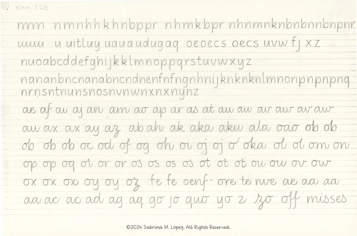
The complete typeface family operates across two main axes: a weight axis ranging from Light to Black, and a slope axis offering vertical and italic options, with intermediate slants accessible via a variable font. Initial sketching began with a pencil, adopting Gourdie’s methodological approach rather than his specific letterforms. Lopez drew lowercase letters with generous counterforms, ample spacing, and a monolinear structure, carefully balancing triangular and oval eyes while maintaining the deep bifurcations characteristic of italic hands.
After experimenting with various guide heights and pencil hardnesses to understand the distinct physical movements and velocities required for vertical versus slanted writing, Lopez selected the optimal letterforms for vectorization and refinement. Vertical proportions were carefully adjusted so that the x-height remained generous without compromising the legibility of ascenders and descenders.

The first phase of the family, featuring the unconnected letter version, was published in 2025. Following an additional year of development and refinement, Didactica Cursive was released, completing the family online through distributors affiliated with The Type Founders, including Typesenses and Typographer.
Both Didactica and Didactica Cursive include color fonts featuring directional arrows that indicate suggested stroke movements for letter construction, alongside guide lines matching the baseline, x-height, ascenders, and descenders. Additionally, alternative directional guidelines for left-handed writers can be accessed by activating stylistic set 4.

Beyond the Classroom
While Didactica was conceived specifically for children’s media and educational contexts, its design parameters should not limit its application. The simple, fluid, and highly legible forms—achieved through rigorous educational research—render the family remarkably versatile for a wide array of visual universes.
Reflecting on the completion of the project, Lopez expressed a deep appreciation for the journey into the world of education, noting that the exploration reinforces the value of handwriting as a fundamental human gesture that deserves preservation amid shifting technological landscapes.