First came the abstract shapes, followed quickly by a wave of sparkles, vibrant gradients, and minimalist redesigns across software ecosystems. Now, the next major branding trend in the artificial intelligence sector has officially arrived. As the biggest technology companies introduce advanced agent capabilities designed to operate autonomously on behalf of users, they are rapidly converging around a shared visual shorthand: cute little guys.
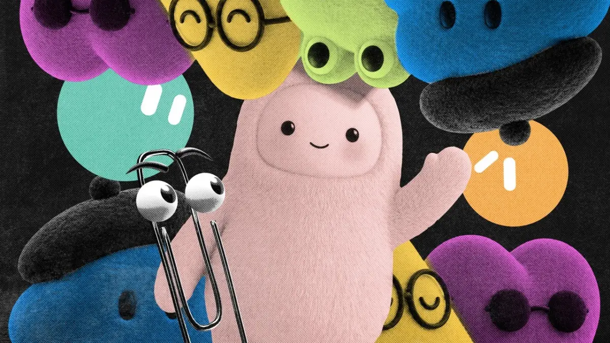
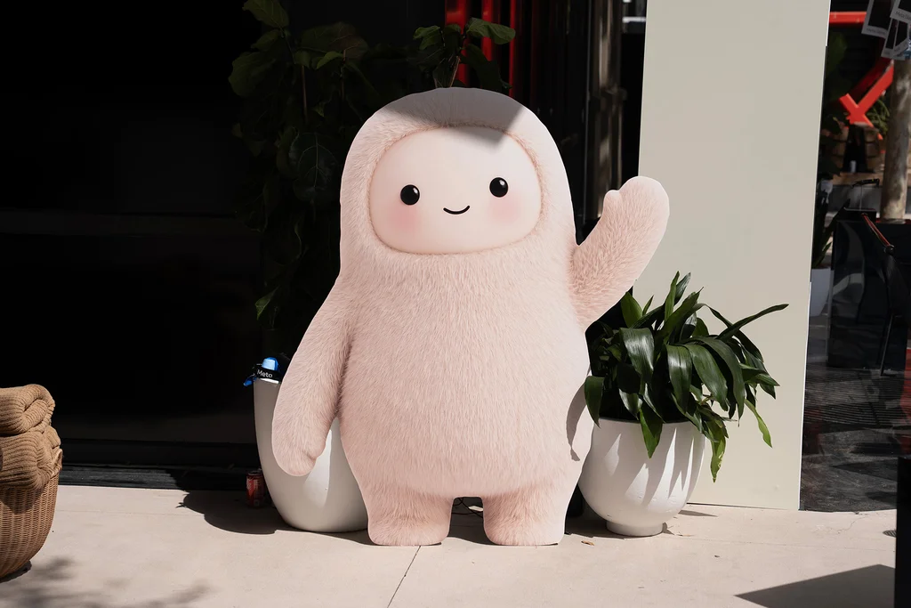
The shift is hard to miss across the industry. On August 11, SpaceXAI—Elon Musk’s artificial intelligence enterprise—unveiled GrokBot, a suite of autonomous agents built to execute complex tasks even when a user’s computer is closed. To visually represent these background workers, the company opted for sleek geometric shapes featuring giant, orb-like eyes. Just weeks later, on September 8, Meta introduced its own prominent AI agent named Muse. Designed with the appearance of a fluffy monster toy, Muse has even broken out of software interfaces and into the physical world, integrated into a Tamagotchi-style keychain that users can carry with them.
The trend continued to gain momentum on September 29, when OpenAI joined the movement by launching a new suite of AI agents known as dots. Reminiscent of customizable Pixar characters, these agents were officially described by OpenAI in public communications as both “remarkably capable” and “remarkably cute.”
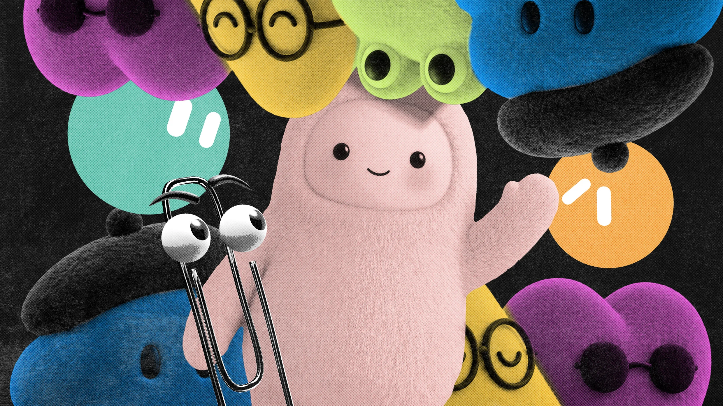
We are now firmly living in the era of the anthropomorphic AI mascot. According to multiple design experts, branding researchers, and creative directors, this sudden convergence makes complete sense within the historical context of technology adoption. Whenever massive tech corporations attempt to drive mass-market adoption for an unfamiliar, highly complex, or potentially intimidating service, they have historically turned to friendly, approachable design strategies to lower psychological barriers.
In an interview with Fast Company, Anthony Cappetta, a partner and creative director at the creative studio Super Okay, shed light on why these emerging visual trends have become so ubiquitous. According to Cappetta, these design choices help companies signal compliance with established digital norms.
“There’s a shared advantage in looking familiar and ‘safe’ within the ecosystem, especially for massive platforms where aesthetic shifts are scrutinized heavily,” Cappetta explained. He noted that in the high-stakes world of Big Tech product launches, visual identity is frequently less about breaking new artistic ground and more about achieving instant legibility and cultivating widespread trust at scale.
Investigating the Big Tech Aesthetic “Gravity Well”
This phenomenon of major corporations independently arriving at the exact same aesthetic conclusions is far from new. Kevin Walker, the chief creative officer at the global creative agency Buck, has had a front-row seat to observe how technology companies repeatedly fall into what he describes as an aesthetic “gravity well.” This theoretical force pulls dominant tech giants toward the same visual symbols whenever they face similar brand positioning challenges.
Reflecting on past industry shifts, Walker recalled when Buck was brought in during the mid-2010s to help a pre-Meta Facebook clean up its interface and overall brand expression. At that time, Walker noted, there was no cohesive idea of what Facebook fundamentally represented or how the platform intended to communicate with its massive global user base. The company needed a visual system that could communicate its core mission of bringing people together from all corners of the earth without having to depict literal, specific individuals.
To solve this challenge, the Buck team developed an illustration style that came to be known as Alegria—derived from the Spanish word for joy. The style featured figurative human characters with slightly wonky, exaggerated proportions that were remarkably easy for internal design teams to replicate across various digital surfaces and marketing materials.

The Backlash Against "Cutewashing"
However, adopting a universally friendly visual shorthand comes with its own distinct set of drawbacks and public relations risks. As artificial intelligence makes its most aggressive push yet into everyday consumer products, it is doing so during a period of unprecedented public anxiety and doomerism surrounding the rapid advancement of the technology. Critics and safety researchers have increasingly raised concerns about the societal impacts, privacy implications, and long-term risks of autonomous systems.
In this climate, deploying endearing mascots to represent powerful and largely untested systems can backfire. The practice risks being perceived as "cutewashing"—a deliberate attempt to mask the complex, disruptive, and potentially high-stakes reality of advanced artificial intelligence behind a veneer of harmless, toy-like charm.
As tech companies continue to refine their consumer-facing agents in the face of both intense market competition and public skepticism, the tension between approachable design and transparent communication remains a defining challenge for the industry. Whether these anthropomorphic mascots will successfully build long-term consumer trust or ultimately face a deeper cultural pushback will depend heavily on how these autonomous agents perform as they integrate deeper into daily digital life.