The ongoing renaissance of front-end development platform CSS-Tricks has reached another milestone. Following the platform’s official return under new ownership earlier this week, the publication has announced the retirement of its on-site editorial column, What’s !important, in favor of a revamped, dedicated email newsletter. The move marks the revival of the official CSS-Tricks newsletter after a four-year hiatus, with the first issue scheduled for distribution on November 10.
While the What’s !important series concludes its run as an on-site article series, the editorial team confirmed that its content—featuring hand-curated links, technical deep dives, and front-end commentary—will transition entirely into the newsletter format. Subscribers will receive exclusive hand-written updates, industry analysis, and curated resources directly in their inboxes.
To mark the final web-based installment of What’s !important, the platform published a wide-ranging overview of cutting-edge front-end developments, showcase projects, and emerging CSS specifications currently shaping modern web design.
High-Profile Scroll Effects and Native Navigation
Interactive scroll experiences continue to push the boundaries of web animation, as demonstrated by Rockstar Games’ promotional website for Grand Theft Auto VI. The site incorporates high-impact, scroll-driven visual effects that rival traditional interactive presentations long favored by tech giants like Apple. Front-end educator Kevin Powell released a comprehensive technical walkthrough analyzing and recreating these dynamic scroll mechanics, providing developers with practical insights into modern scroll-driven animation architecture. Notably, technical observers highlighted performance and rendering variances across engines, including current display issues when rendering the site in Mozilla Firefox.
In parallel with high-end promotional animations, functional page navigation is also benefiting from modern browser capabilities. Frontend engineer Mojtaba Seyedi demonstrated a method for constructing a functional "scrollspy" component using modern CSS techniques. A scrollspy automatically updates navigation links to reflect the reader’s current viewport location as they scroll through document sections. Seyedi’s approach eliminates traditional JavaScript dependencies by leveraging modern selectors and scroll-driven APIs to track document position natively within the stylesheet layer.

random() Demos Explained
Randomness has historically presented a challenge in declarative stylesheet languages, often requiring preprocessors or inline JavaScript to generate varied visual patterns. Author Brecht De Ruyte addressed this evolving space in a technical feature showcasing and explaining functional demonstrations of the native CSS random() function.
De Ruyte’s exploratory work highlights how programmatic randomness can be introduced directly into design systems to create intentional, organic variations—described as "playful imperfection." By generating dynamic values directly in CSS, developers can build visual layouts with randomized rotation angles, irregular grid distributions, dynamic color shifts, and varied animation timings without adding overhead to the application runtime or relying on build-step procedural code.
Implementing Icons on the Web in 2026 and Beyond
Icon implementation remains one of the most foundational yet frequently revised architectural challenges in web development. Web standards expert Lea Verou published an in-depth analysis detailing the current state and future trajectory of rendering icons across web platforms.
Verou’s analysis explores both historical methodologies—such as icon fonts, inline SVGs, and sprite sheets—and prospective CSS primitives designed to simplify asset management. Her technical overview highlights several upcoming browser capabilities and CSS Working Group proposals, including Linked Parameters, the ident() function, CSS mixins via @mixin and @apply, and expanded shorthand syntaxes for @property. These proposed standards aim to allow developers to configure dynamic, theme-aware vector graphics directly through declarative CSS rules, drastically reducing the boilerplate code currently required for responsive icon delivery.
::*? The Case for a Universal Pseudo-Selector
Web developer Kilian Valkhof introduced a proposal aimed at addressing a long-standing limitation in global CSS reset rules: the absence of a universal pseudo-element selector.
In conventional front-end development, global box-model resets routinely rely on a standard universal selector pattern:
*,
::before,
::after
  box-sizing: border-box;
While this snippet targets all standard DOM elements along with generated content pseudo-elements (::before and ::after), it fails to capture the growing surface area of modern pseudo-elements introduced in recent web specifications. Contemporary interfaces frequently render elements like ::backdrop for top-layer dialogs and popovers, or ::details-content for collapsible disclosure elements.
To eliminate the need to manually append new pseudo-elements to global style rules, Valkhof proposed the adoption of a universal pseudo-selector syntax: ::*. Under this proposed syntax, developers could target every current and future pseudo-element across the document tree in a single declarative block, ensuring global layout properties like box-sizing apply uniformly across modern browser features.
New HTML and CSS Features That Are Useful for Design Systems
Design system architecture increasingly relies on native browser primitives to reduce reliance on heavy JavaScript abstractions. Developer Declan Chidlow identified several emerging HTML and CSS specifications that offer immediate value for structural component libraries and broader web projects.
Key features highlighted in the analysis include:
text-box: Provides precise control over inline text leading and vertical metrics, allowing designers to eliminate unwanted whitespace around typographic elements.sibling-index()andsibling-count(): Functional notation helpers that allow elements to query their sequential position and total sibling volume directly within CSS math expressions.@scope: Native style encapsulation rules that allow styles to target specific DOM subtrees without risking specificity leaks or requiring strict naming conventions like BEM.@custom-media: Reusable breakpoint definitions that simplify media query management across enterprise design tokens.
These updates enable design teams to construct more robust, self-contained components while preserving maintainability across large-scale design systems.
Make <textarea>s Adapt to Their Content
Handling multiline text input has historically required custom JavaScript listeners to calculate scrollHeight and adjust container dimensions dynamically. Chrome developer advocate Adam Argyle demonstrated an elegant CSS pattern that allows standard HTML <textarea> elements to automatically resize based on user input, mirroring the fluid behavior of contenteditable elements.
Argyle’s approach leverages native CSS anchor positioning alongside the emerging field-sizing: content declaration. By instructing the user agent to derive input dimensions directly from its active content payload, the form field seamlessly expands and contracts during input, significantly reducing the complexity of custom form controls.
Create Wavy Dividers Using random() and shape()
Creative layout techniques continue to evolve as browser engines expand support for complex clipping paths. Front-end creator Temani Afif introduced a method for generating randomized, dynamic wavy section dividers by pairing the CSS random() function with the native shape() path syntax.
This technique enables developers to generate non-repetitive vector divider paths directly within standard stylesheet declarations. By defining fluid curve coordinates via shape() and introducing variations via random(), layouts can feature unique visual boundaries between content sections without requiring static SVG assets or external image tools.

New Color Contrast Checker: "This Hue Shall Pass"
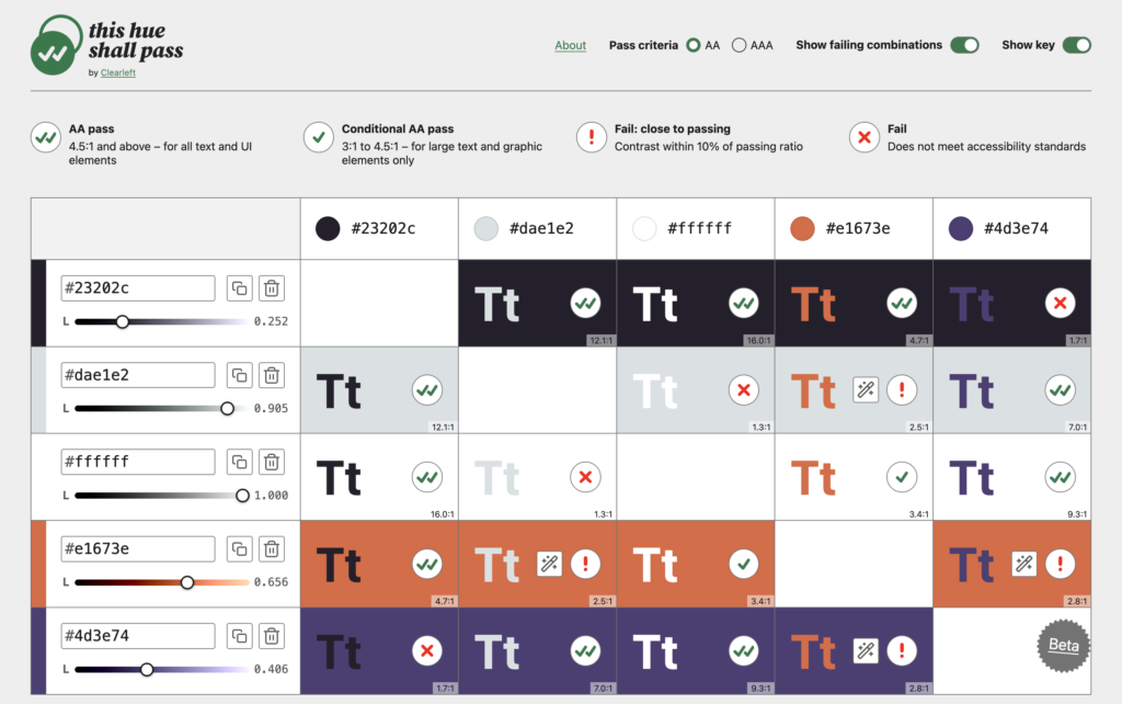
Digital accessibility tools are seeing continuous refinement to align with Web Content Accessibility Guidelines (WCAG) contrast requirements. Web agency Clearleft launched a web-based contrast checking tool titled This hue shall pass.
Unlike basic contrast calculators that evaluate isolated color pairs in a binary pass/fail format, This hue shall pass allows designers to evaluate full color palettes across all possible background and foreground combinations simultaneously. The interface explicitly distinguishes between outright failures and values marked as "Fail: close to passing." Additionally, the tool includes interactive lightness adjustment controls, enabling developers to fine-tune color values in real-time until they strictly conform to WCAG AA and AAA accessibility thresholds.
Gradient Visualizer: Gradient Layers
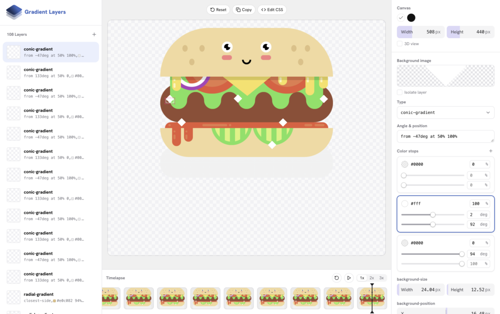
To assist developers working with multi-layered CSS background patterns, developer Ahmad Shadeed released Gradient Layers, a visual web application designed to simplify gradient authoring.
Constructing layered linear, radial, or conic gradients manually in CSS often involves managing lengthy, error-prone strings of color stops and coordinate positions. Gradient Layers provides an interactive graphical workspace where developers can compose, stack, and tweak complex multi-layer gradients visually, generating clean, production-ready CSS code directly from the canvas interface.
Two New Gradient Types on the Way: 2D Gradients
The scope of native CSS image generation is set to expand significantly with the introduction of multi-dimensional gradient primitives. Web standards engineer Josh Tumath published an explainer detailing two proposed additions to the CSS Images Module Level 5 specification: mesh-gradient() and freeform-gradient().

These new functions extend standard linear and radial gradients into multi-point, two-dimensional color interpolations. Under the preliminary draft specification, mesh gradients allow developers to define color values across a structured two-dimensional grid coordinate space:
background-image: mesh-gradient(red, blue; green, yellow);Similarly, freeform gradients permit arbitrary point-based color placements across an element’s bounding box:
background-image: freeform-gradient(red top left, yellow bottom right);These functional primitives bring graphic-design-grade color blending directly to native browser rendering engines, opening up new possibilities for complex decorative visuals without relying on heavy bitmap images or external vector graphics.
Looking Ahead
The transition of What’s !important into a dedicated email publication marks a deliberate shift in how CSS-Tricks delivers curated editorial content to the web development community. Following the launch of the revived newsletter on November 10, readers can expect regular issues covering browser engine updates, front-end specifications, tool releases, and expert tutorials delivered directly to their inbox.
Developers interested in receiving future installments of What’s !important—starting with Issue #21—can subscribe through the official CSS-Tricks newsletter portal ahead of the November launch.