For years, the foundation of modern web design has rested on absolute consistency. Design engineers and front-end architects spend countess hours perfecting design tokens, establishing strict typography scales, enforcing pixel-perfect grids, and ensuring that every component behaves with absolute predictability across viewports. In a professional design system, an unintended 20-pixel shift or an unexpected alignment offset is rarely viewed as creative expression—it is treated as a bug to be logged and resolved.
However, the recent arrival of the native random() function in browser engines is prompting web developers to re-evaluate the strict boundary between rigid uniformity and subtle visual personality. Specified in the CSS Values and Units Module Level 5 specification, the function has officially shipped in Safari, is actively rolling out in Chrome 156, and has received positive signals from Mozilla for Firefox integration.
For design system engineer Brecht De Ruyte, the introduction of native randomness in stylesheets sparked an immediate question: how can web creators incorporate controlled organic imperfection into structured interfaces without relying on heavy JavaScript libraries or preprocessor build loops? To explore the practical boundaries of the specification, De Ruyte constructed a series of experiments demonstrating how subtle variations in typography, card grids, marquee drifts, and depth-of-field effects can bring human warmth back to the digital canvas.
The Charm Of Things Not Being 100% Straight
When stepping away from screen-based interfaces to examine physical objects, complete uniformity is surprisingly rare. Analog print medium carries inherent imperfections—letterpress prints feature slight ink bleeds into paper grain, micro-tilts along typography baselines, and subtle density shifts. A hand-dropped stack of photos on a table forms an uneven, overlapping fan rather than a perfectly aligned grid. Similarly, streetlights flickering in the evening emit uneven patterns of illumination.
On the modern web, high-precision layout engines have made pixel perfection so effortless that digital interfaces can occasionally feel sterile or impersonal. The rise of automated, unguided large language model (LLM) layout generation has accelerated this trend, often producing uniform, squared-off layouts reminiscent of predictable templates from a decade ago. While these layouts are functional and organized, their absolute symmetry can feel mechanical.
The introduction of native randomness offers a way to introduce controlled chaos without discarding structural integrity. Rather than abandoning design tokens or system rules, CSS random() allows developers to introduce micro-variations that mimic real-world tactile properties. Small variations in rotation, spacing, optical blur, or animation timing can make digital surfaces feel dynamic, organic, and distinctly human, proving that controlled messiness can coexist with formal layout systems.
How The CSS random() Function Works
At its technical core, the random() function generates a pseudo-random value natively inside the browser’s CSS evaluation engine. Historically, achieving randomized styling required either client-side JavaScript execution—which risks layout shift or performance overhead—or build-time Sass loops that generated hundreds of lines of static, repetitive CSS rules.
The formal specification defined in CSS Values and Units Module Level 5 outlines the underlying parameter structure:
random( <random-key>?, <min>, <max>, <step>? )
In practical application across current browser implementations, developers can supply basic comma-separated arguments to establish minimum and maximum boundaries across various CSS properties:
/* Generates a random rotation angle between -3deg and 3deg */
rotate: random(-3deg, 3deg);

/* Generates a random width between 20px and 80px in 10px increments */
inline-size: random(20px, 80px, 10px);

/* Generates a random animation duration between 1.5s and 3s */
animation-duration: random(1.5s, 3s, 0.2s);
Matching Units
A fundamental rule of the random() syntax is that minimum and maximum boundary values must utilize identical unit types. The CSS parsing engine requires precise dimensional context to compute the evaluation range. Developers can utilize length units, angles, temporal values, percentages, or raw unitless values:
/* Valid: Both parameters use angle units */
rotate: random(-4deg, 4deg);

/* Valid: Both parameters use unitless numbers */
opacity: random(0.3, 1);

/* Invalid: Mixing rem and px units within boundary arguments */
inline-size: random(2rem, 100px);
When mixing different units is necessary, developers must nest calc() expressions inside the function arguments to ensure both parameters resolve correctly before evaluation.
Stepping And Rounding
The function accepts an optional third parameter representing a step size. When omitted, the browser engine selects a value from a continuous gradient of real numbers. When a step value is defined, the computed output rounds strictly to discrete incremental intervals.
For instance, defining top: random(0px, 60px, 15px) limits the output strictly to 0px, 15px, 30px, 45px, or 60px. This stepping capability is particularly useful for design systems, allowing randomized elements to snap to pre-established spatial grids or baseline units.
Caching Keys: Keeping Things In Sync
By default, every individual property call to random() evaluates independently. While independent evaluation works well for scattered offsets, it introduces challenges when multiple properties must remain correlated. For example, generating a square thumbnail with randomized dimensions requires both inline-size and block-size to evaluate to the exact same value.
To keep properties synchronized across an element, the specification introduces caching keys:
.card-thumbnail
  /* Shared caching key ensures matching inline and block dimensions */
  inline-size: random(--square-size element-scoped, 60px, 120px);
  block-size: random(--square-size element-scoped, 60px, 120px);
Under the specification, using a standalone custom identifier like --square-size shares a global seed across all elements in the document. To link width and height on a specific node while ensuring every individual card maintains its own distinct dimensions, developers pair the caching key with the element-scoped keyword.
Uncached evaluations across width and height result in arbitrary, unpredictable rectangles. Applying a shared element-scoped key guarantees that while each tile receives a unique size, its aspect ratio remains locked to a pristine 1:1 square.
/* Uncached: Properties resolve independently into arbitrary rectangles */
.tile-uncached
  inline-size: random(4.2rem, 8.5rem);
  block-size: random(4.2rem, 8.5rem);
  rotate: random(-3.5deg, 3.5deg);


/* Cached: Shared element-scoped key maintains identical dimensions */
.tile-cached
  inline-size: random(--square-size element-scoped, 4.2rem, 8.5rem);
  block-size: random(--square-size element-scoped, 4.2rem, 8.5rem);
  rotate: random(--tilt element-scoped, -3.5deg, 3.5deg);
Browser Support And Progressive Enhancement
Because browser support is currently transitioning across engine releases, implementing native randomness in production environments requires a progressive enhancement strategy. Developers can isolate experimental properties using feature queries via @supports:
/* Fallback rule for all browsers */
.badge
  rotate: 0deg;


/* Enhanced styling for browsers supporting CSS random() */
@supports (rotate: random(-2deg, 2deg))
  .badge
    rotate: random(-2.5deg, 2.5deg);
The Future random-item() Function
In addition to numerical range generation, the CSS specification details an upcoming companion function: random-item(). While random() handles continuous or stepped numeric ranges, random-item() allows developers to select randomly from an explicit list of non-numeric tokens, keywords, or values.
/* Conceptual selection from defined design tokens */
background-color: random-item(--seed, oklch(75% 0.18 150), oklch(65% 0.22 350), oklch(85% 0.16 85));
Although random-item() does not yet have active browser engine implementation, it represents a promising frontier for selecting randomized color palettes, font weights, or structural tokens directly inside stylesheets.
Practical Experiments: Bringing Imperfection to Life
To demonstrate how native CSS randomness functions in real-world visual designs, De Ruyte authored several targeted CodePen implementations. These experiments highlight how controlled chaos can elevate digital typography, component grids, scroll behavior, and visual focus.
Demo 1: Let’s Just Randomize Letters
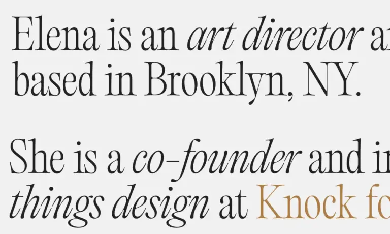
Applying micro-imperfections to display typography mimics the aesthetic of hand-stamped letterpress printing. By breaking a headline into individual character wrappers, each letter can receive subtle rotational offsets, horizontal and vertical nudges, and slight opacity variations:
@layer demo
  .char
    display: inline-block;

    /* Micro-tilt angle */
    rotate: random(-2.8deg, 2.8deg);

    /* Subtle dimensional displacement */
    translate: random(-1.5px, 1.5px) random(-2.8px, 2.8px);

    /* Minor ink density variation */
    opacity: random(0.8, 1, 0.02);

    transition-property: rotate, translate, opacity;
    transition-duration: 0.3s;
    transition-timing-function: cubic-bezier(0.34, 1.56, 0.64, 1);


  /* Reset layout alignment on user hover */
  .word:hover .char
    rotate: 0deg;
    translate: 0 0;
    opacity: 1;
While static display text presents slight organic variations, hovering over the element smoothly transitions every character back into strict baseline alignment, combining playful visual character with clear interactive feedback.
Essential Accessibility Considerations
When structuring custom typography elements, developers must ensure that separating words into character spans does not compromise assistive technologies. Screen readers parsing raw nested spans may pronounce words character-by-character or insert long pauses between letters, degrading the experience for visually impaired users.
To maintain accessibility, visual letter spans should be hidden from screen readers using aria-hidden="true", while the parent container provides the complete text string via aria-label:
<h1 class="word" aria-label="Imperfection">
  <span class="word-inner" aria-hidden="true">
    <span class="char">i</span>
    <span class="char">m</span>
    <span class="char">p</span>
    <span class="char">e</span>
    <span class="char">r</span>
    <span class="char">f</span>
    <span class="char">e</span>
    <span class="char">c</span>
    <span class="char">t</span>
    <span class="char">i</span>
    <span class="char">o</span>
    <span class="char">n</span>
  </span>
</h1>
This pattern ensures that assistive tech processes clean, continuous text while sighted users experience the visual typography effects.
Demo 2: Animating The Letters: Pure Procedural Bounce
Extending randomized typography into keyframe animations creates lively procedural movement. Uniform animation keyframes typically result in synchronized sine-wave motion. By assigning randomized jump heights, durations, tilts, and squash factors to individual characters, text transforms into an energetic, self-orchestrating animation.
@layer demo
  .char
    display: inline-block;
    transform-origin: center bottom;

    /* Procedural animation parameters */
    --jump: random(element-scoped, -35px, -55px, 2px);
    --tilt: random(element-scoped, -8deg, 8deg, 0.5deg);
    --dur: random(element-scoped, 1s, 1.2s, 0.1s);
    --delay: random(element-scoped, -3s, 0s, 0.1s);
    --rebound-squash: random(element-scoped, 1.08, 1.18, 0.02);

    animation: letter-bounce var(--dur) linear var(--delay) infinite;


  @keyframes letter-bounce
    0%
      translate: 0 var(--jump);
      rotate: var(--tilt);
      scale: 1 1;
      animation-timing-function: cubic-bezier(0.65, 0.05, 0.85, 0.35);

    44%
      translate: 0 0;
      rotate: calc(var(--tilt) * 0.2);
      scale: 0.96 1.05;
      animation-timing-function: ease-out;

    52%
      translate: 0 0;
      rotate: 0deg;
      scale: var(--rebound-squash) calc(2 - var(--rebound-squash));
      animation-timing-function: cubic-bezier(0.2, 0.8, 0.2, 1);

    62%
      translate: 0 calc(var(--jump) * 0.2);
      rotate: calc(var(--tilt) * -0.4);
      scale: 0.98 1.03;
      animation-timing-function: cubic-bezier(0.15, 0.85, 0.35, 1);

    100%
      translate: 0 var(--jump);
      rotate: var(--tilt);
      scale: 1 1;
A critical technique in this pattern is applying a negative animation delay (--delay: random(-3s, 0s)). Positive animation delays cause elements to freeze on initial render while waiting for timer execution. A negative delay forces the engine to evaluate the animation as if it were already running, allowing characters to immediately bounce at distinct phase offsets upon page load.
Demo 3: Tilting Cards And Dynamic Shadows
Standard layout grids rely on strict right angles and uniform alignment. While essential for data-dense dashboards, rigid grids can feel uninspired on editorial sites, portfolios, or photo galleries. Assigning slight rotational tilts and vertical shifts creates a casual, physical deck appearance.
Furthermore, dynamic drop shadows can be tied directly to the element’s randomized rotation angle:
@layer demo
  .card
    /* Randomized rotational tilt and vertical displacement */
    --tilt: random(-3.5deg, 3.5deg);
    --shift-y: random(-6px, 6px);

    rotate: var(--tilt);
    translate: 0 var(--shift-y);

    /* Dynamic shadow trajectory matching rotation angle */
    box-shadow:
      calc(var(--tilt) * 1.5)
      calc(10px + abs(var(--tilt) * 1px))
      28px
      oklch(20% 0.02 260 / 0.07);

    transition:
      rotate 0.4s cubic-bezier(0.2, 0.8, 0.2, 1),
      translate 0.4s cubic-bezier(0.2, 0.8, 0.2, 1),
      box-shadow 0.4s ease;

    /* Straighten component on hover or keyboard focus */
    &:hover,
    &:has(.button:focus-visible)
      rotate: 0deg;
      translate: 0 -10px;
      z-index: 10;
      box-shadow:
        0 20px 44px oklch(20% 0.02 260 / 0.12),
        0 2px 6px oklch(20% 0.02 260 / 0.04);
When users interact with a card via pointer hover or keyboard focus, the component smoothly straightens out, elevates along the z-axis, and adjusts its shadow to signal interactive state clear to the user.
Demo 4: Combining Structural Math with Randomness
Randomness yields the best visual results when paired with deterministic mathematical structures. In scroll-driven card fan layouts, pure structural math handles overarching placement, while CSS random() introduces natural human jitter.
Combining CSS Scroll-Driven Animations with sibling-index() structural positioning allows cards to splay outwards smoothly as the page scrolls:
@layer demo
  .deck-card
    position: absolute;

    /* Deterministic fan calculation using sibling index positioning */
    --elevation: sibling-index();
    --base-rot: calc((sibling-index() - (sibling-count() + 1) / 2) * 12deg);
    --base-x: calc((sibling-index() - (sibling-count() + 1) / 2) * 60px);

    /* Organic positional jitter */
    --jitter-rot: random(-3.5deg, 3.5deg);
    --jitter-y: random(-12px, 12px);
    --jitter-x: random(-8px, 8px);

    transform-origin: center 130%;

    /* Scroll-driven animation timeline binding */
    animation: splay-fan linear both;
    animation-timeline: scroll(root);
    animation-range: 0% 80%;

    transition: scale 0.3s cubic-bezier(0.2, 0.8, 0.2, 1);

    &:hover
      scale: 1.05;
      z-index: calc(sibling-count() + 1);


  @keyframes splay-fan
    from
      rotate: 0deg;
      translate: 0 0;
      box-shadow:
        0 1px 3px oklch(20% 0.02 260 / 0.1),
        0 2px 8px oklch(20% 0.02 260 / 0.07);

    to
      rotate: calc(var(--base-rot) + var(--jitter-rot));
      translate: calc(var(--base-x) + var(--jitter-x)) var(--jitter-y);
      box-shadow:
        0
        calc(1px + var(--elevation) * 0.6px)
        4px
        oklch(20% 0.02 260 / 0.1),
        calc(var(--base-x) * 0.15)
        calc(10px + var(--elevation) * 5px)
        calc(18px + var(--elevation) * 7px)
        oklch(20% 0.02 260 / 0.13);
Here, mathematical functions establish balanced spatial distribution across elements, while subtle inline jitter prevents the output from appearing mechanically computed.
Demo 5: Random Velocity
Horizontal marquee text elements drifting across viewports are widespread in editorial and brand-focused web design. Developers traditionally manage these effects by creating static utility classes (.speed-slow, .speed-fast) or calculating transform offsets through JavaScript event listeners.
By pairing random() with mathematical index parity via calc(pow(-1, sibling-index())), developers can achieve varied scroll velocities in pure CSS:
@layer demo
  .drift-line
    white-space: nowrap;

    /* Alternating directional polarity via mathematical index parity */
    --direction: calc(pow(-1, sibling-index()));

    /* Procedural velocity distance */
    --travel: random(15%, 44%);

    /* Page scroll binding */
    animation: tectonic-glide linear both;
    animation-timeline: scroll(root);
    animation-range: entry 0% cover 100%;


  @keyframes tectonic-glide
    from
      translate: calc(var(--direction) * -1 * var(--travel)) 0;

    to
      translate: calc(var(--direction) * var(--travel)) 0;
The mathematical expression calc(pow(-1, sibling-index())) produces alternating direction factors (1, -1, 1, -1), while random(15%, 44%) calculates unique displacement velocities for each row as the user scrolls.
Demo 6: Blurry Randomness
In photographic optics, shallow depth of field isolates subject matter on a focal plane, allowing background and foreground elements to dissolve into soft bokeh. Combining random() with filter: blur(), opacity variations, and scale adjustments recreates this optical camera behavior directly on web elements:
@layer demo
  .focal-item
    /* Randomized depth parameters */
    filter: blur(random(0px, 8px, 1px));
    opacity: random(0.25, 1, 0.02);
    scale: random(0.85, 1.25, 0.05);

    transition:
      filter 0.4s cubic-bezier(0.2, 0.8, 0.2, 1),
      opacity 0.4s ease,
      scale 0.4s cubic-bezier(0.34, 1.56, 0.64, 1);

    /* Smooth focus shift on user interaction */
    &:hover, &:focus
      filter: blur(0px);
      opacity: 1;
      scale: 1.15;
Some elements render at sharp focus (blur(0px)) in the foreground, while others drop into soft background blur. When a user hovers over an un-focused background item, the element smoothly transitions into full clarity, creating a compelling rack-focus effect suitable for hero sections, creative portfolios, or tag clouds.
Strategic Implementation in Production Systems
While native CSS randomness unlocks creative possibilities, introducing non-deterministic styling into enterprise applications requires clear architectural boundaries.
Appropriate Use Cases
Randomized styling works particularly well in decorative, creative, and non-critical presentation layers, including:
- Hero typography and display headlines requiring hand-crafted or letterpress visual character.
- Image galleries, portfolio card stacks, and interactive media presentations where rigid grid layouts feel overly formal.
- Ambient background decorations, floating particle accents, and decorative illustrations.
- Interactive hover transitions, dynamic depth-of-field visual effects, and varied marquee animation velocities.
Contexts to Avoid
Conversely, randomness should be excluded from layout contexts where structural consistency, legibility, and predictability are primary concerns:
- Enterprise dashboards, data tables, and transactional UI components requiring strict alignment.
- Primary navigation bars, dropdown menus, and standard form inputs.
- Body paragraph baseline grids, legal disclaimers, and dense text documentation.
- Enterprise design system tokens governing core structural spacing, grid columns, and contrast themes.
Mandatory Accessibility Safeguards
Beyond structural isolation, implementations utilizing procedural motion or visual offsets must respect user accessibility preferences. Designers must ensure that randomized animations degrade gracefully when users enable motion-reduction settings at the operating system level:
@media (prefers-reduced-motion: reduce)
  .char,
  .deck-card,
  .drift-line
    animation: none;
    rotate: 0deg;
    translate: 0 0;
    filter: none;
Disabling procedural animations and flattening rotational tilts for users requesting reduced motion ensures that decorative personality never compromises comfort or accessibility.
Expanding the Web’s Visual Vocabulary
The integration of random() into browser engines represents a meaningful shift in CSS capabilities. Over the past decade, web engineering focused heavily on mastering structural predictability—building design tokens, enforcing strict components, and establishing reliable layout frameworks.
Now that those architectural foundations are firmly established, native randomness allows developers to introduce controlled, organic playfulness without relying on runtime JavaScript measurements or bloated build step loops. By handling pseudo-random calculations natively inside browser rendering engines, modern CSS provides web creators with the tools to build digital interfaces that are structured yet visually vibrant.