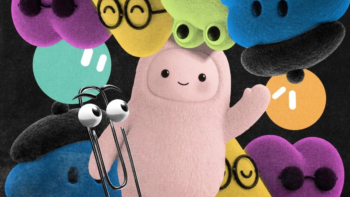
First came the distinct geometric icons, followed swiftly by rolling waves of sparkle emojis and hyper-smooth gradients. Now, the next dominant branding trend in the artificial intelligence sector has officially arrived, and it is taking on a remarkably familiar, lifelike form. As the biggest technology companies on the planet introduce increasingly advanced autonomous agent capabilities, they are all rapidly converging around the exact same visual shorthand: cute little guys.
The shift marks a definitive turn in how artificial intelligence is presented to the everyday consumer. On August 11, SpaceXAI—Elon Musk’s AI-focused enterprise—unveiled GrokBot, a suite of autonomous AI agents engineered to manage complex tasks independently, operating seamlessly even after a user closes their computer. To visually communicate this approachable autonomy, the company chose a design featuring simple shapes anchored by giant, orb-like eyes.
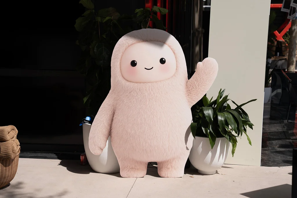
Just weeks later, on September 8, Meta introduced its own flagship agent system, dubbed Muse. This digital entity was styled to resemble a fluffy, friendly monster toy, a concept that Meta extended into the physical world by integrating the character into a Tamagotchi-style keychain. Shortly after, on September 29, OpenAI expanded the trend further by launching its own suite of autonomous AI agents known simply as "dots." These customizable characters bear a striking resemblance to Pixar animations and were officially described by OpenAI in announcements as being both "remarkably capable" and "remarkably cute."
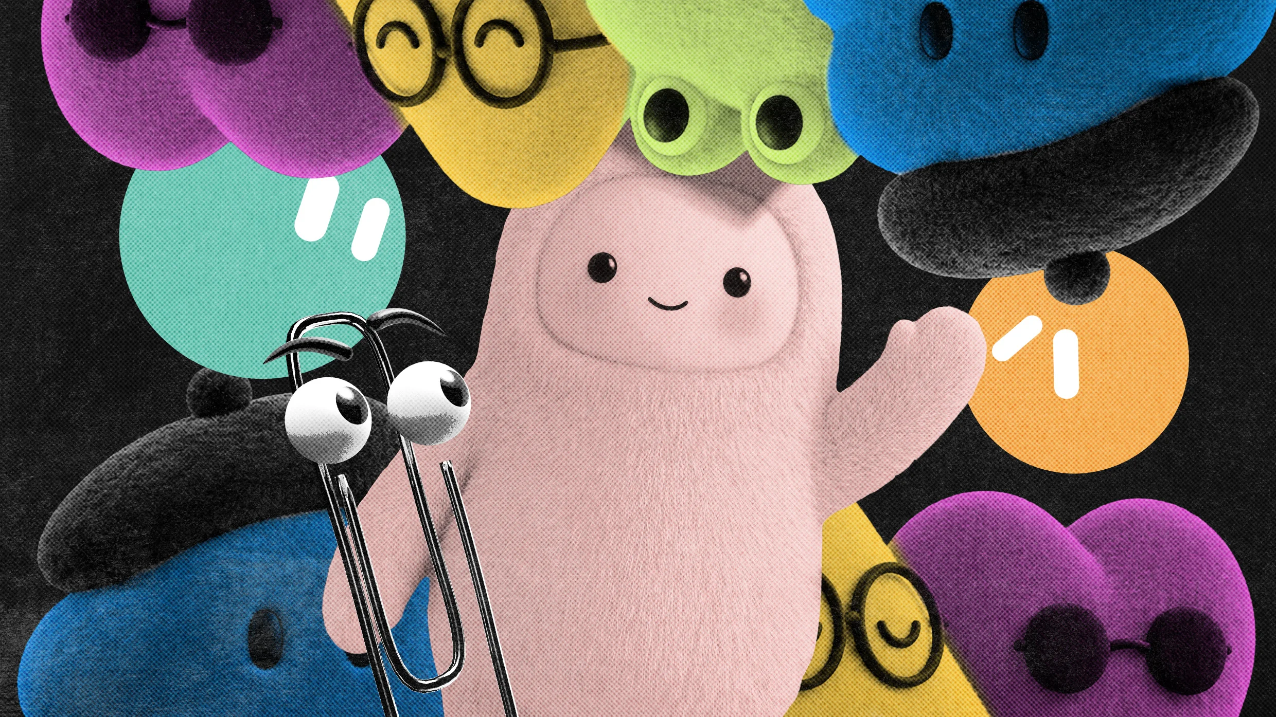
We are now firmly living and operating in the era of the anthropomorphic AI mascot. According to multiple design experts, branding researchers, and creative directors, this widespread convergence makes complete historical sense. Whenever major technology corporations face the challenge of driving mass-market adoption for an unfamiliar, highly complex, or potentially intimidating service, they have historically relied upon friendly, disarming, and deeply approachable design principles to lower consumer friction.
In a recent interview regarding the shifting landscape of digital aesthetics, Anthony Cappetta, a partner and creative director at the creative studio Super Okay, explained that these emerging design trends help massive tech companies effectively "signal compliance" with established digital norms.
"There’s a shared advantage in looking familiar and ‘safe’ within the ecosystem, especially for massive platforms where aesthetic shifts are scrutinized heavily," Cappetta said. "It’s less about being original and more about being instantly legible and trustworthy at scale."
Investigating the Big Tech Aesthetic "Gravity Well"
This phenomenon of massive corporations sliding into the same design choices is not entirely new to the technology industry. Kevin Walker, the chief creative officer at the creative agency Buck, has had a front-row seat to watch major tech companies repeatedly fall into what he describes as the aesthetic "gravity well"—the powerful cultural and corporate phenomenon that causes tech giants to independently coalesce around the exact same visual symbols and illustration styles.
Reflecting on a previous era of digital design, Walker recalled when Buck was tapped in the mid-2010s to help a pre-Meta Facebook clean up its user interface and overall brand expression. At that time, Walker noted, there was no cohesive overarching idea of what Facebook was, nor was there a unified standard for the way the platform intended to communicate with its billions of users. The brand was searching desperately for a visual system that could effectively highlight its core mission of bringing together individuals from all corners of the globe, without necessarily having to show literal, photorealistic individuals that might alienate specific demographics.
The creative team at Buck ultimately landed on an iconic illustration style that came to be known as Alegria—derived from the Spanish word for "joy." This distinct style featured figurative human characters rendered with slightly wonky, exaggerated proportions that were exceptionally easy to replicate across various marketing materials, user interfaces, and corporate communications. While functional and universally understood, it eventually became the ubiquitous aesthetic of the tech boom, demonstrating how easily massive corporations drift toward a shared visual median.

The Pitfalls of Cutewashing Complex Technology
However, this reliance on an identical visual shorthand and comforting aesthetic comes with its own distinct set of drawbacks and risks. As artificial intelligence makes its most aggressive play yet for mainstream consumer adoption, it is doing so during a period of unprecedented public anxiety and doomerism surrounding the rapid advancement of the technology.
Deploying cuddly, anthropomorphic mascots to represent powerful, largely untested autonomous systems can easily backfire. Critics and cultural observers note that "cutewashing" complex, potentially disruptive technologies risks masking underlying complexities, safety concerns, and operational unpredictability behind a facade of harmless playfulness. Yet, as the race to secure consumer trust intensifies among the industry’s largest players, the appeal of the cute little guy appears to outweigh the risks, cementing a whimsical new visual era for artificial intelligence.