Apple Music is rolling out a comprehensive new visual and sonic identity designed to bridge the gap between the platform’s massive scope and the tangible experience of listening to music. The extensive rebrand—encompassing a redesigned wordmark, a custom sonic logo, and a dynamic rippling visual language—is the result of an unconventional collaboration between the internal Apple Music team, bespoke design agency TBWAMedia Arts Lab (MAL), renowned music producer Fred again.., and his collaborator Nest Acoustics.
The new branding begins appearing across Apple Music’s original content and event programming this week, setting the stage for a broader rollout that will eventually span the platform’s marketing campaigns, core product interfaces, and live experiences.
Developing an identity for a service as ubiquitous and expansive as Apple Music presented a unique creative challenge. The new look and sound needed to be universal enough to capture the incredible breadth of the platform’s global music catalog, yet distinct and memorable enough to be instantly recognizable across any medium. Achieving that delicate balance required a months-long experimental process that bypassed digital-only graphics in favor of physical materials, including mineral oil, custom acrylic props, and plenty of liquid.
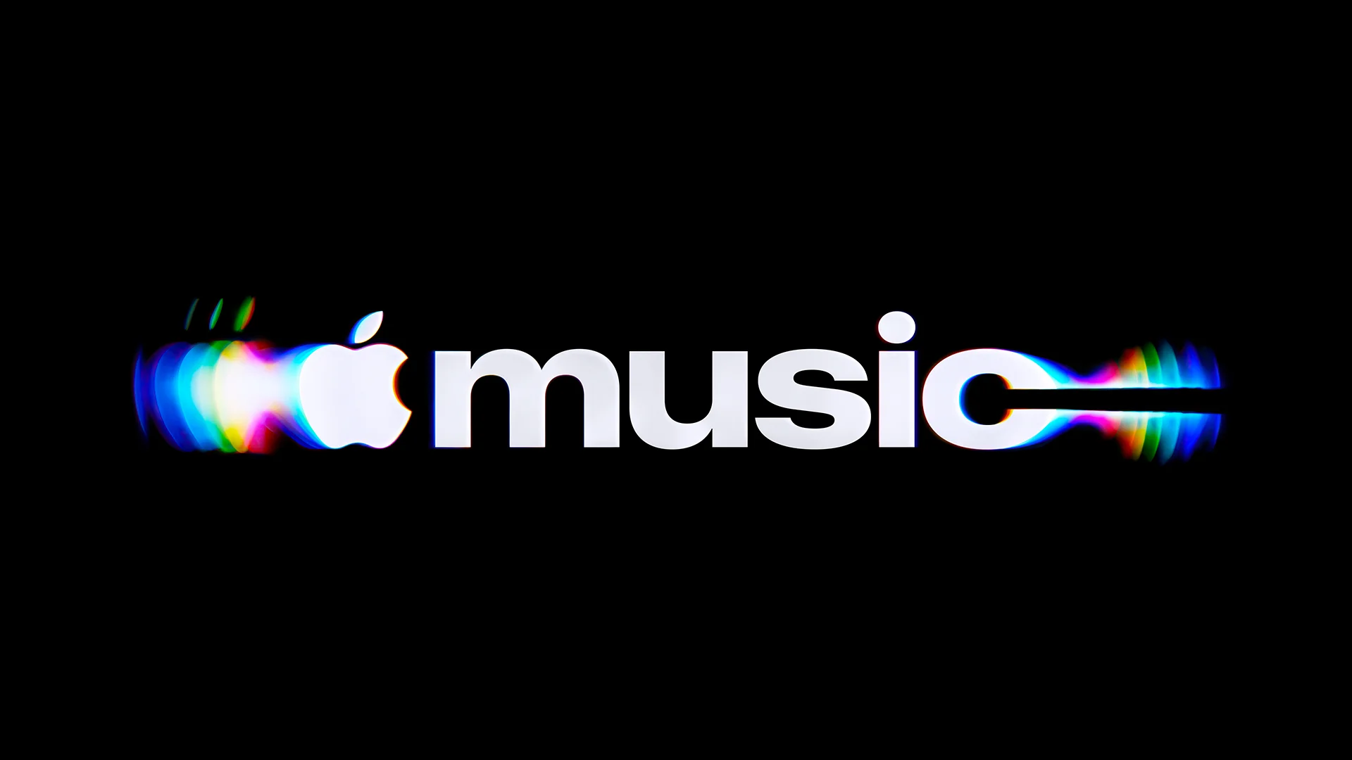
How Apple Music Made Its New Branding by Hand
When the Apple Music design team originally set out to conceptualize the new identity, they shared a clear creative ambition: they wanted the branding to look and feel as though it had been constructed out of actual music. This tactile approach mirrors the strategy deployed by the broader Apple organization late last year when it introduced a practical-effects-driven identity for Apple TV.
For Apple Music, the central design puzzle was figuring out how to develop a signature sonic identity that users could simultaneously visualize. The creative breakthrough came in the form of physical ripples.
To bring this concept to life, the production team engineered a custom hardware rig paired with specialized software designed to control a transducer, a specialized device that converts an audio signal into physical vibrations. By placing the transducer into a liquid bath, the team was able to play various musical frequencies and observe how the liquid reacted in real-time. Musicians and engineers engaged in an iterative, back-and-forth process, testing different notes, chords, and tones while closely monitoring the physical behavior of the liquid.
These initial empirical tests quickly established critical constraints for both the visual language and the sonic logo. The experiments revealed that playing too many notes simultaneously, or utilizing notes pitched too high, created excessive and chaotic movement in the liquid, making the resulting visual patterns difficult to read and interpret. These physical limitations provided the musicians with a rigorous core framework to structure and arrange the final sonic logo, ensuring that what was heard translated cleanly into what would be seen.
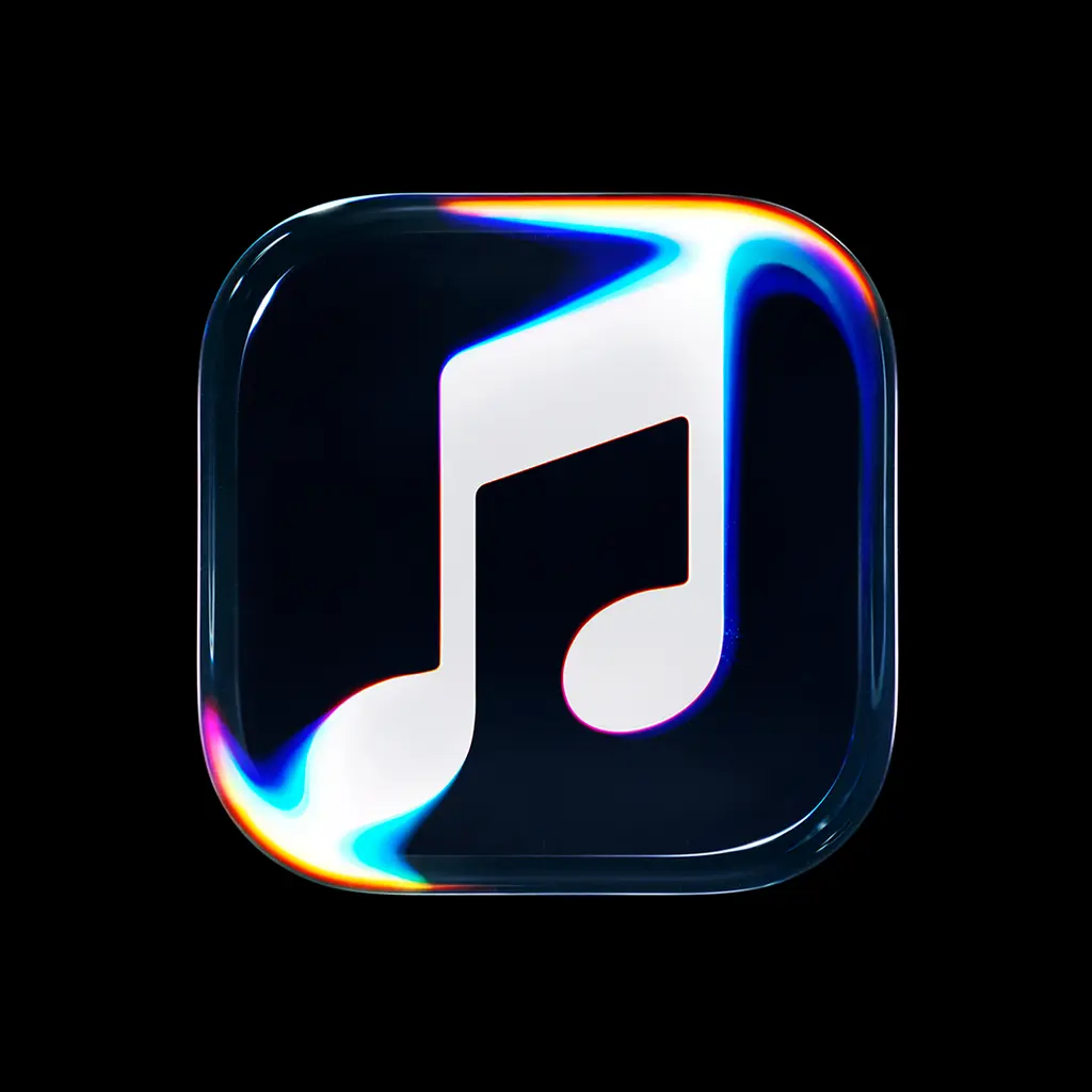
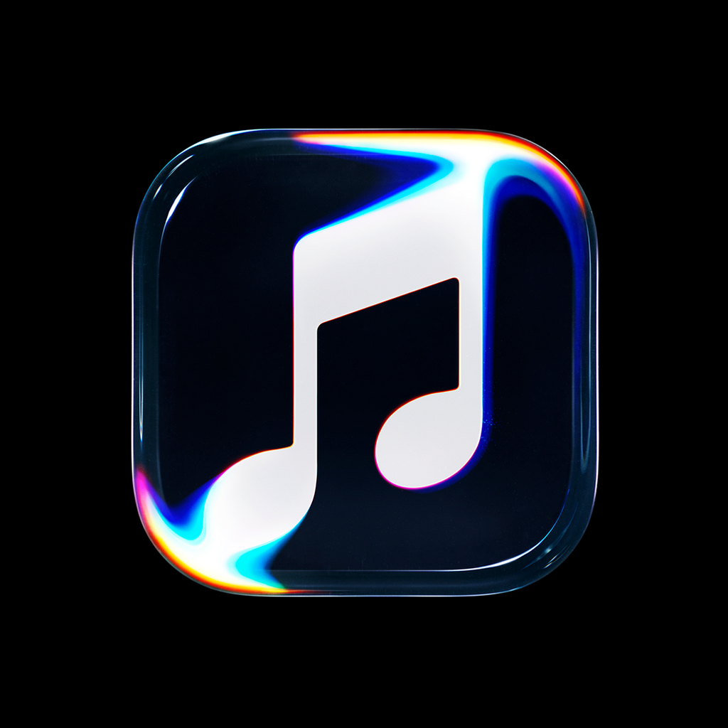
Once the final composition was locked into place, the team transitioned from research and development into practical execution, translating the finished sonic logo into a cohesive visual ripple pattern. To achieve the desired cinematic quality, the transducer was placed into a bath of high-viscosity mineral oil. Mineral oil was specifically selected because its unique viscosity creates the distinct optical illusion of solid glass being gently warped and rippled by sound waves.
Submerged within the oil bath were custom acrylic versions of Apple Music’s iconic note logo alongside a newly updated wordmark. As part of this comprehensive rebrand, the Apple Music wordmark has been modernized with a custom, chunky rendition of SF Pro, Apple’s proprietary typeface. The combination of the heavy typography, translucent acrylic forms, and fluid dynamics creates an organic, living aesthetic that grounds digital streaming in the physical physics of sound.
The integration of this tactile branding into Apple Music’s ecosystem marks a significant shift in how the platform presents itself to listeners worldwide. By anchoring its digital interface and promotional materials in the physical realities of sound waves interacting with matter, Apple Music has crafted an identity that honors the raw, foundational elements of music creation. As the new visual language and sonic logo continue to appear across original programming, upcoming live events, and product interfaces in the weeks and months ahead, users will experience a brand identity that literally puts sound in motion.