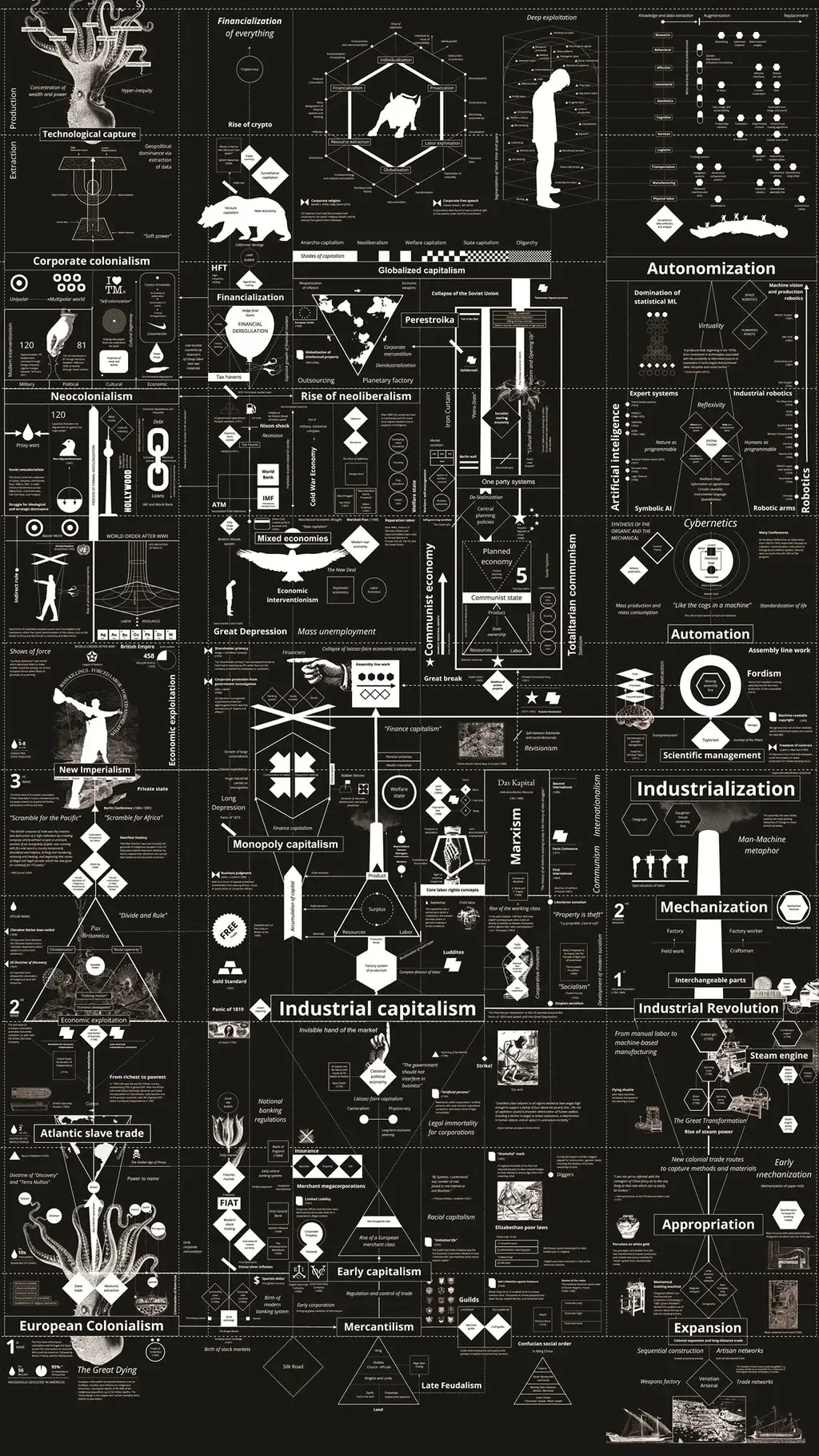
This modern impulse to translate complex realities into visual graphics raises a broader question about how major cultural institutions perceive and reflect contemporary society. What, for instance, is the Museum of Modern Art revealing about itself as an institution with its forthcoming exhibition, Full Disclosure: The Edge of Information Design?
According to Paola Antonelli, the senior curator of architecture and design at New York City’s Museum of Modern Art, the works featured in the exhibition serve as a mirror to the institution’s role in contemporary culture. The pieces of information design gathered in the gallery “tell us the fact that the museum is always ready to understand what’s important to the world in that particular moment, and to try to give the best examples of it,” Antonelli explains. She made these remarks during a walkthrough of the exhibition as she and her curatorial team prepared the galleries for the public opening on September 27. “Having an exhibition about information design shows that we’re continuing our mission to talk about the art in our time, of our time.”
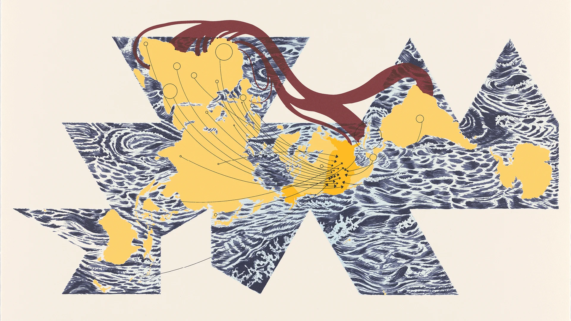
The role of information design in shaping public perception is immediately apparent to visitors as soon as they enter the museum. The very first piece encountered by the public is Warming Stripes, a striking and minimalist creation by climatologist Ed Hawkins. Hawkins developed the visualization because he “wanted to find a way to drill it in people’s brains that global warming is really happening.” The artwork consists of a series of vertical colored stripes that transition progressively over the chronological timeline of the work from a deep, cool blue to an alarming, vibrant red, with each stripe representing the average global temperature of a specific year from 1850 through 2025. At first glance, the imagery resembles a gorgeous, finely woven textile or rug, but upon closer contemplation, it reveals itself to be a massive, undeniable warning sign about the trajectory of the planet’s climate.
For Antonelli, Warming Stripes represents an ideal distillation of what information design can achieve at its highest level. The field, she notes, possesses a unique capacity that “takes phenomena big and small, public and intimate, complex, scientific, and statistically more superficial, and renders them in a way that is comprehensible by a wide audience.” By stripping away confusing jargon and dense numerical tables, these visual artists and scientists translate raw data into a universal visual language that can be intuitively understood by anyone who looks at it.
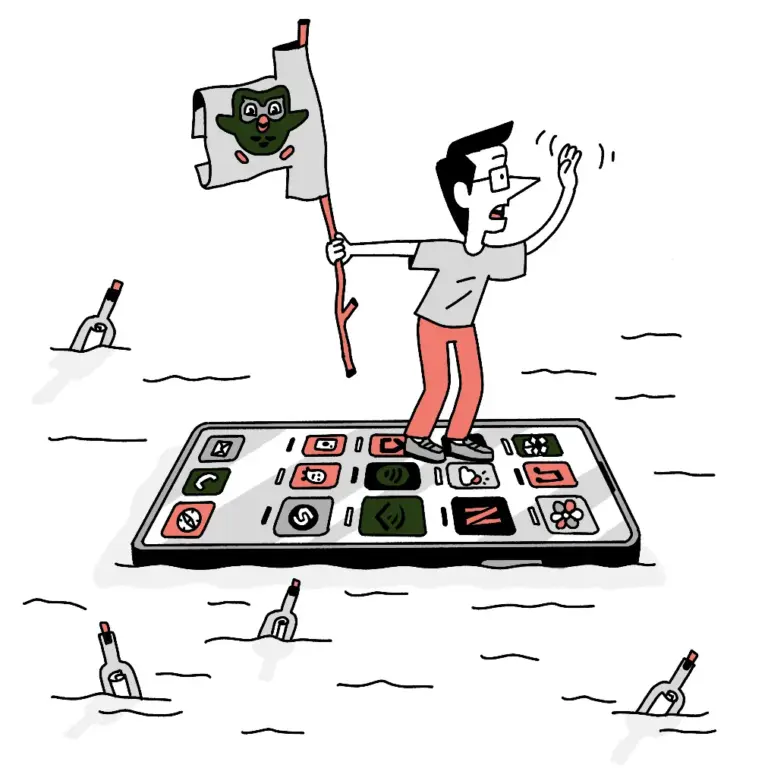
However, the exhibition is careful to demonstrate that information design is not restricted solely to monumental global challenges or weaving massive institutional data sets into legibility. A dedicated portion of Full Disclosure shifts its focus entirely inward, exploring the realm of personal data tracking and self-quantification. This section features a fascinating correspondence between artists Giorgia Lupi and Stefanie Posavec, who famously embarked on a long-term artistic project exploring their everyday lives through data.
In what evolved into their widely recognized Dear Data project, the two designers sought creative, analog ways to visualize deeply personal metrics of their daily routines and habits. For instance, they tracked and mapped out how many times they cursed during a given week, or how they spent their time across various weekly schedules. Through these hand-drawn postcards and charts, the project illustrated how the practice of information design can help individuals connect in a more intimate, reflective, and even playful way with the countless tiny nuggets of numerical data that have come to symbolize and measure modern human existence. Rather than reducing people to cold statistics, these visualizations reveal the human quirks, vulnerabilities, and routines hidden beneath the numbers.
The inclusion of these works at MoMA represents a continuation of a long-standing institutional interest in the intersection of data, design, and human cognition. The museum has been actively collecting works of information design for nearly two decades, tracing back to 2008 when Antonelli curated a landmark exhibition titled Design and the Elastic Mind. That groundbreaking show focused specifically on the ways designers have adapted to revolutionary scientific changes and the exponential growth of human knowledge.
Recalling the origins of that collecting journey, Antonelli notes that during her curation process for the 2008 exhibition, she encountered “all of these different designers that didn’t really have a home” because they were working at the unorthodox intersection of data visualization, art, and science. Reflecting on her decision to bring them into the museum’s fold, she recalls, “I kind of hugged them up.” That early embrace has culminated in a rich institutional repository, with nearly every single piece featured in the new Full Disclosure exhibition proudly drawn directly from MoMA’s own permanent collection, cementing information design’s permanent place within the canon of modern art and design history.