As the autumn season settles in, the global design community turns its collective gaze toward the horizon, attempting to decipher the aesthetic movements and cultural shifts that will define the upcoming year. For both industry professionals and homeowners alike, the annual unveiling of the Color of the Year selections by leading paint manufacturers has become a highly anticipated milestone. These forecasts do much more than simply predict aesthetic preferences for the next twelve months; they serve as a fascinating cultural barometer, drawing inspiration from evolving societal attitudes, shifting perspectives on our built environments, and our changing relationships with the spaces we inhabit every day.
Over time, these influential color pronouncements have evolved into major trendsetters in their own right. Their reach extends far beyond interior walls, ultimately inspiring architecture, furniture manufacturing, high fashion, and commercial product design. While each paint brand approaches the forecasting process through its own distinct brand identity and research methodology, their collective choices often reveal a profound overarching narrative. By examining these palettes in tandem, observers can track broader psychological and cultural shifts in how humanity thinks about color, comfort, and domestic sanctuary.
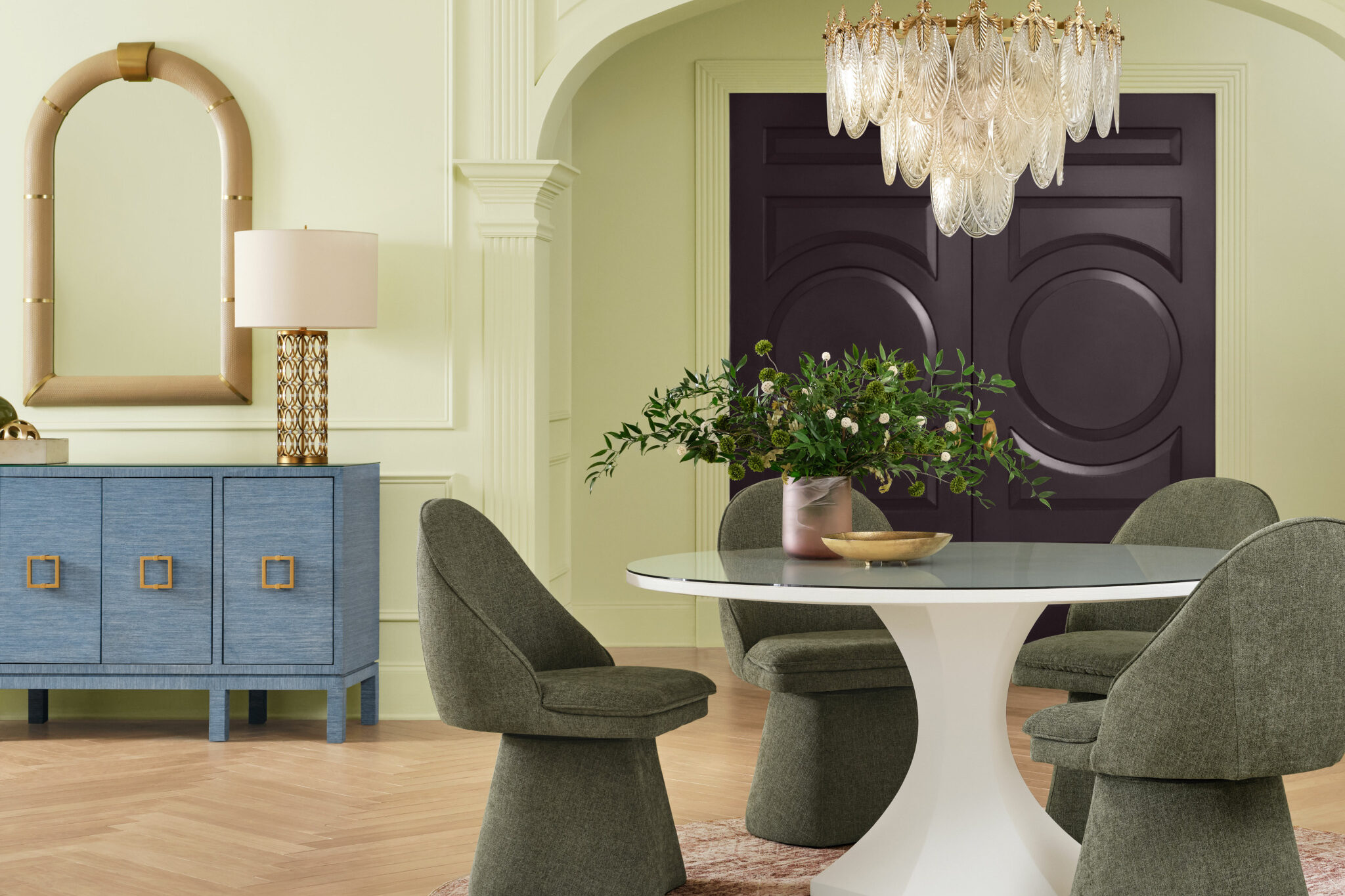
An analysis of the palette choices reveals a dominant theme centered around nature, comfort, and the creation of spaces that feel deeply personal and lived-in. Greens, earthy browns, and muted blues feature prominently across multiple major brands, signaling a widespread desire for organic grounding and personal authenticity. As the industry officially unveils these selections, designers and consumers alike are taking a closer look at the specific shades making their mark, the complex psychological and cultural thinking behind each choice, and what these selections might foreshadow for the broader design landscape in the years ahead.
Cottage Door by Valspar
Drawing directly on the raw, unpolished beauty of natural materials, Cottage Door by Valspar brings a profound sense of familiarity and ease to the residential interior. This muted blue reflects a broader, ongoing shift toward intentional living, highlighting thoughtful design choices as a tangible form of personal self-reflection. Rather than being dictated by fleeting seasonal shifts or rapid micro-trends, Cottage Door boasts an enduring quality that allows it to adapt seamlessly to the natural world’s perpetually changing color palettes. Its understated character gently embraces the beauty of architectural and material imperfection, celebrating the accumulation of memories, patinas, and lived-in details that transform a house into a truly personalized home.

Grounded by Behr
Continuing the widespread embrace of the natural world within the built environment, Behr’s 2027 Color of the Year, Grounded, invites the outdoors directly into everyday living spaces. By skillfully merging mossy olive hues with rich, grounding brown undertones, the shade evokes a deep sense of architectural and emotional stability. Grounded effectively blurs the traditional line between interior architecture and the great outdoors, working to transform standard living areas into restorative, natural sanctuaries that offer a buffer against the fast-paced modern world.
Celery by Sherwin-Williams
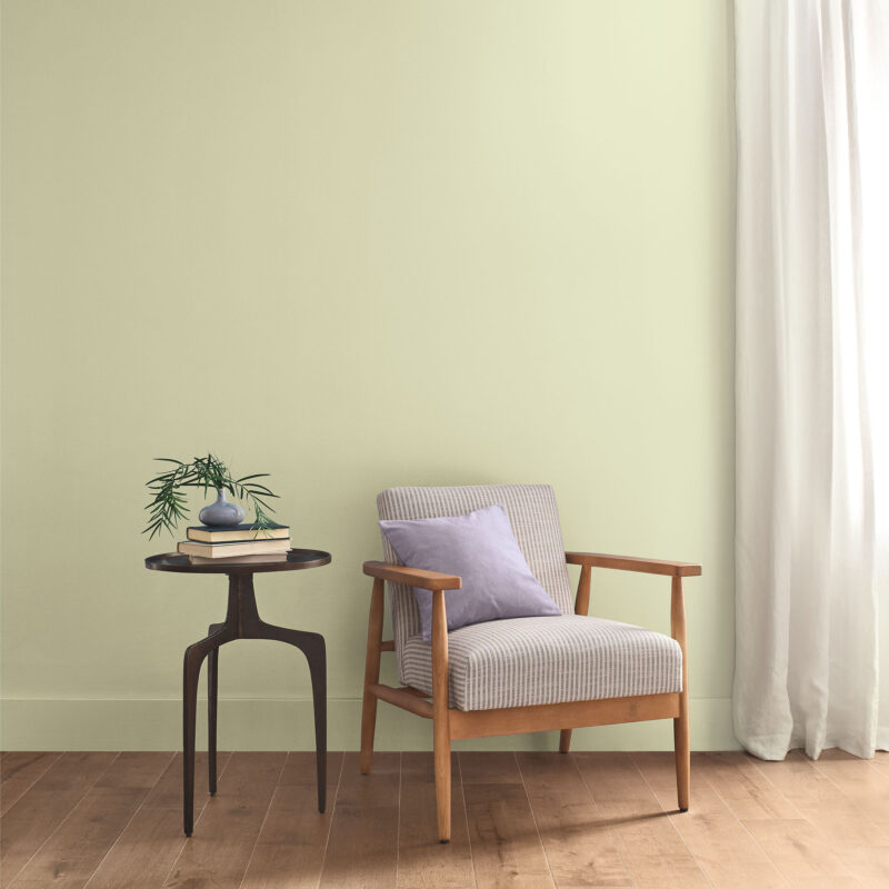
Introducing a fresh, invigorating perspective to residential interiors, Celery by Sherwin-Williams creates an organic and remarkably balanced atmosphere within a room. Its airy, pastel hue delicately bridges the gap between tranquility and vitality, placing a heavy emphasis on the vital relationship between interior design and holistic well-being. Whether it is applied as a quiet, atmospheric background or utilized to anchor a room as a prominent accent, Celery brings a distinctly restorative quality to interiors, striking an effortless balance between organic neutrals and more contemporary color palettes.

Webster Green by Benjamin Moore
Stepping well beyond momentary design trends, Benjamin Moore’s Webster Green carries forward the timeless sophistication and gravitas of classic design principles. By successfully balancing historical tradition with contemporary visual appeal, this elegant green reflects the complexities of the present moment while keeping a steady eye on the future. The rich hue adds an undeniable layer of architectural character and depth to any room it inhabits, proving that traditional shades can be completely revitalized for modern living.
Artifact by Glidden
Artifact, Glidden’s chosen direction for its 2027 Color of the Year, offers a refreshing perspective on interior spaces through a calm, muted aqua hue. Designed to refresh the home environment without requiring the time, expense, and disruption of a complete architectural renovation, Artifact acts as a versatile backdrop for individual expression. The shade effectively reimagines the long-running minimalist white trend, preserving the clean simplicity and spatial openness of white walls while introducing a delicate, sophisticated wash of cooling color.
Marle by Little Greene
Prominent paint and wallpaper brand Little Greene selected Marle as its definitive 2027 Color of the Year, directly mirroring the broader fashion and interior design resurgence of understated, sophisticated browns. This deeply earthy hue is purposefully engineered to foster emotional comfort and physically soften the surrounding architectural space. Describing the shade as sumptuous and impactful, yet relaxed and grounded, Little Greene’s Creative Director Ruth Mottershead highlights the delicate balance between visual richness and visual restraint that ultimately defines the color’s character.
Quiet Peace by California Paints
Quiet Peace by California Paints actively encourages occupants to slow down, disconnect from digital noise, and take in their immediate surroundings. This deep, moody blue creates an immediate sense of profound calm while leaving ample room for personal expression through furniture and decor. Rather than merely decorating a surface, Quiet Peace helps establish a thoughtful, symbiotic relationship between the architectural space, the color application, and the people who inhabit it, offering a much-needed psychological refuge from the chaos of the outside world.

French Press Coffee by Dunn-Edwards
Announcing French Press Coffee as its 2027 Color of the Year, Dunn-Edwards has placed its bet on the continued rise of desaturated, atmospheric hues in the coming architectural cycle. This silky, rich brown evokes a sense of quiet luxury and historical depth, cultivating intimacy through warmth and an understated, worldly sophistication that elevates standard residential schemes.
Deep Rooted by Dutch Boy Paints
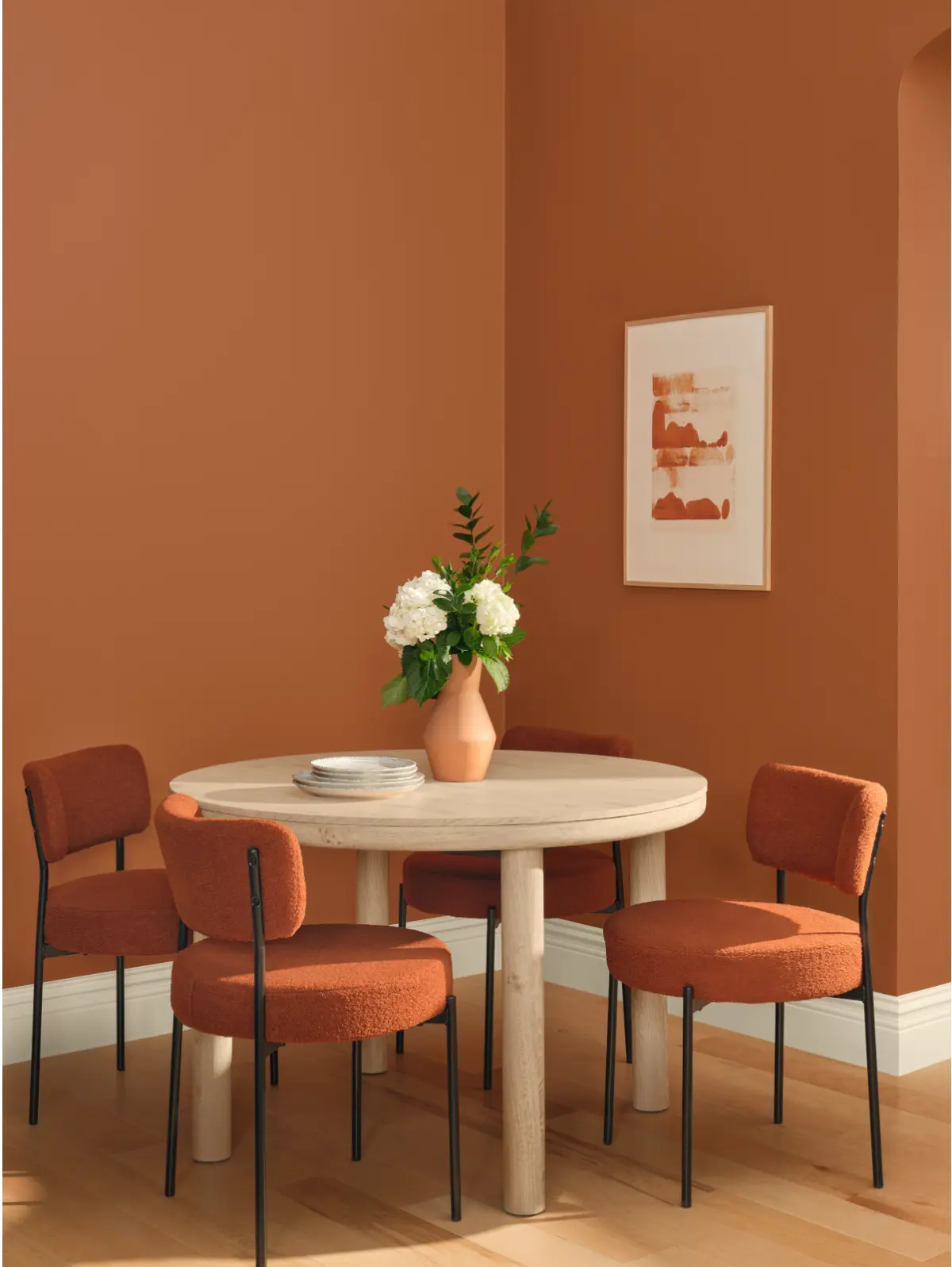
Living up entirely to its namesake, Dutch Boy Paints’ Color of the Year, Deep Rooted, aims to construct a dependable, authentic, and grounded environment within the modern home. Featuring an earthy terracotta hue paired with enveloping warm undertones, Deep Rooted actively encourages the creation of personalized, comfortable, and thoroughly lived-in environments that reject sterile minimalism in favor of genuine warmth.

Vantage Point by Clark+Kensington
For its 2027 contribution, Ace Hardware’s paint brand Clark+Kensington selected Vantage Point, a radiant and luminous blue shade that brings a crisp, refreshing perspective to residential interiors. The color is designed to inject an uplifting, dynamic energy into everyday living spaces, proving that blue can serve as both a calming element and an energetic visual catalyst.
Rose Earth by Graham & Brown
Drawn directly from the natural minerals and historic pigments found in traditional Italian clay deposits, Graham & Brown’s Rose Earth connects contemporary spaces with centuries-old decorative painting practices. This subtle pink, deeply enriched by a warm terracotta undertone, successfully bridges historical influences and modern sensibilities, bringing a timeless, organic warmth into contemporary homes.

Pueblo by C2
Concluding the major industry forecasts for the year, C2’s 2027 Color of the Year, Pueblo, looks past the conventional desire for a domestic retreat and instead explores what it means to feel truly awake and alive within a living space. Featuring an earthy blend of pink and mauve tones, Pueblo encourages physical interaction and tactile engagement with our surroundings, ultimately transforming interiors into dynamic spaces where occupants actively interact with their environment rather than simply retreating from the outside world.