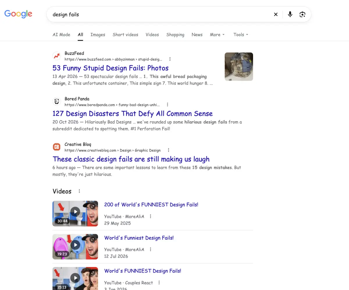
Google has quietly embedded a lighthearted typographic joke into its search engine, surprising users who search for the phrase "design fails." Web users querying the specific term will find that Google alters the display font of its search results page, rendering the standard link titles, snippets, and page text entirely in Comic Sans. The unexpected visual joke directly pairs the concept of flawed visual communication with what is arguably the most fiercely debated and widely mocked typeface in computing history.
The hidden feature represents the latest addition to Google’s extensive library of search engine Easter eggs. Over the years, the technology company has established a long-running tradition of embedding interactive surprises, animated graphics, subtle visual gags, and even fully playable mini-games directly into its search engine software. While many of these digital surprises are launched in tandem with high-profile cultural events, trending news topics, or specific public anniversaries, others are slipped into the algorithm without fanfare. These lower-profile Easter eggs often remain hidden for extended periods, quietly waiting to be stumbled upon by observant users exploring niche search topics.
The discovery has resonated strongly with observers across the visual media and graphic design sectors, where discussions surrounding design missteps represent a frequent topic of debate. Professional design analysts routinely catalog notable visual errors, tracking everything from high-budget corporate rebranding misfires that alienate existing consumer bases to poorly generated artificial intelligence advertising campaigns that highlight the noticeable limitations of automated creative tools. For observers immersed in graphic design culture, Google’s decision to dynamically transform search results for "design fails" into Comic Sans serves as a self-aware nod to decades of industry commentary.
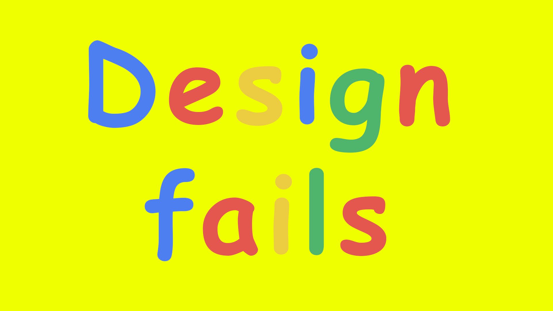
By framing Comic Sans as the visual punchline for a search on design failures, Google taps into a decades-long cultural debate about the typeface’s place in modern typography. Yet, despite its reputation as a default symbol of poor aesthetic judgment, font historians and professional design advocates frequently note that the bad reputation surrounding Comic Sans stems primarily from widespread misuse rather than an inherent failure of its original construction. In recent years, a growing number of designers have publicly defended the typeface, arguing that its foundational structure successfully satisfied the precise design challenge it was created to address.
The history of Comic Sans dates back to 1994, when it was created by Microsoft in-house font designer Vincent Connare. At the time, Microsoft was developing an innovative graphical user interface called Microsoft Bob, which was engineered to make personal computers more accessible and intuitive for novice users. The software presented the operating system as the interior of a virtual house, guided by an animated cartoon dog named Rover who offered instructions and tips to the user through onscreen speech bubbles.
While testing the software interface, Connare noticed that the text inside Rover’s speech bubbles was set in Times New Roman, a classic serif font originally designed for British print journalism. Connare recognized an immediate stylistic mismatch between the formal, rigid typography of traditional newspaper publishing and the whimsical, playful nature of an animated cartoon puppy guiding users through a digital home. Times New Roman felt stiff and unnatural in the context of a casual software assistant, prompting Connare to develop a completely new lettering design specifically tailored for friendly, informal electronic dialogue.
Drawing direct visual inspiration from the hand-lettered dialogue boxes found in classic comic books and graphic novels, Connare drafted a typeface that mimicked the informal cadence of human speech. The resulting typeface, christened Comic Sans, was crafted to convey approachability, levity, and casual communication. Designed with generous letter spacing, distinct letterforms, and warm, rounded shapes, the font was tailored to stand out against both traditional serif typefaces and clinical, neutral sans-serif options. Furthermore, its open structure provided excellent legibility on low-resolution computer monitors, making it exceptionally clear and easy to read for users of all ages.
The intended scope for Comic Sans was strictly informal and educational. It was engineered to thrive in casual environments, such as elementary school learning materials, local community notice boards, informal event flyers, and playful personal messages where formal corporate typography felt unnecessarily dry. However, the trajectory of Comic Sans shifted dramatically when Microsoft decided to include the typeface in its standard system font packages, bundling it directly into widespread operating system releases like Windows 95.
As personal computing exploded in popularity throughout the late 1990s and early 2000s, millions of everyday users suddenly gained access to digital publishing tools without having formal training in typography or visual design principles. Because Comic Sans was friendly, highly distinctive, and readily available on almost every desktop computer, users began deploying it far outside its intended context. The cartoon-inspired lettering soon began appearing on serious corporate announcements, solemn medical warnings, legal documents, official municipal notices, and professional storefront signs.
This widespread misapplication generated intense pushback from the professional graphic design community. Critics argued that using a comic book font for solemn or official matters undermined the authority and clarity of the message, creating an jarring clash between tone and visual presentation. As the internet evolved, this frustration blossomed into widespread digital satire. The font’s notoriety was cemented in popular culture through internet meme formats, most famously epitomized by the widespread "graphic design is my passion" meme, which frequently used raw Comic Sans text over poorly edited images to parody amateur visual design work.
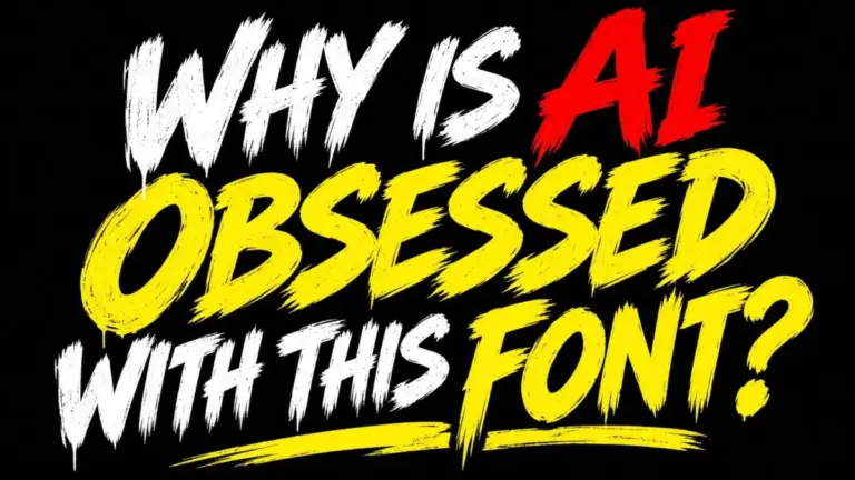
Despite its long history as an internet punchline, modern visual commentators often reassess Comic Sans with greater nuance. Many typography experts emphasize that the font continues to fulfill its original functional purpose effectively, offering superior readability for early readers and individuals with learning differences, thanks to its distinct, easily distinguishable letterforms. Furthermore, some design analysts suggest that contemporary visual culture faces far more pressing aesthetic issues than a classic 1990s system font. Critics frequently point out that the recent surge of generic, mechanically generated "AI fonts" appearing across modern promotional flyers and digital marketing campaigns often lacks the deliberate human craftsmanship and functional clarity that Connare originally built into Comic Sans.
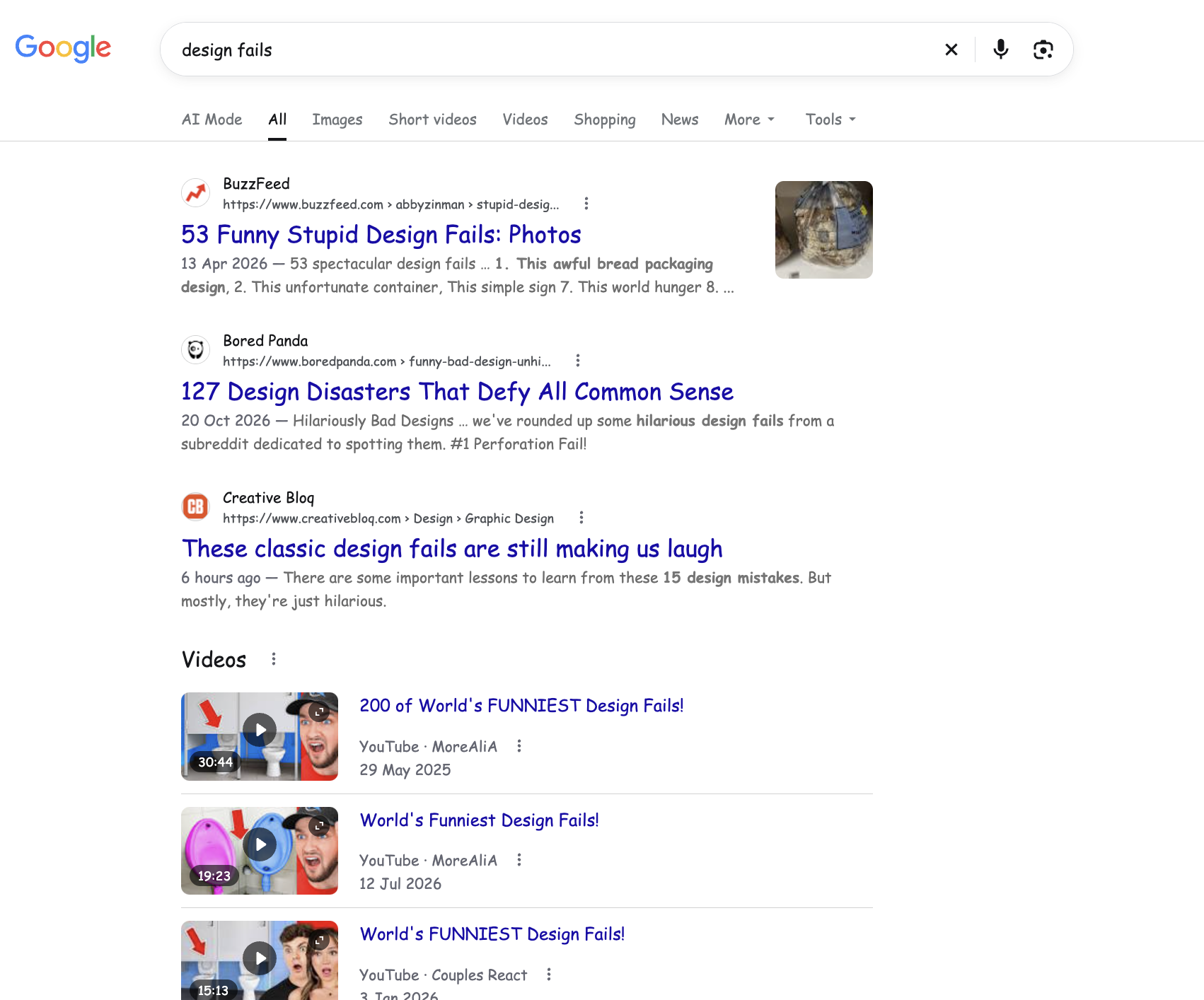
Google’s decision to link Comic Sans to the search query for "design fails" highlights the enduring visual legacy of the thirty-year-old typeface. By converting serious search metadata into comic book lettering with a simple query, the search engine offers a subtle, tongue-in-cheek tribute to the complex history of digital typography, acknowledging how a font created for an interactive software dog became one of the most recognized and debated visual elements in computing history.