Despite achieving broad cross-browser compatibility, CSS Container Queries remain surprisingly underutilized and frequently misunderstood across the web development industry. For years, the ability to style web components based on the size of their parent containers—rather than the dimensions of the entire browser window— topped developer feature requests. Today, even with baseline support in all major rendering engines, adoption lags significantly behind awareness, and many developers who do implement container queries continue to treat them as basic substitutes for traditional media queries.
Understanding the fundamental shift represented by container queries requires re-examining how responsive design has historically operated. Media queries established the web’s responsive paradigm by allowing styles to adapt based on viewport width. However, as modern web development shifted toward modular, component-driven architectures, relying exclusively on the viewport created structural limitations. Container queries resolve these limitations by shifting the layout logic from the external browser screen to the internal context of individual components.
The Adoption Gap in Modern CSS
When CSS Container Queries achieved broad browser availability, reaching approximately 94% browser support worldwide according to Can I Use data, the web development community marked a major technical milestone. For over a decade, adapting layouts to specific container bounds was considered the missing piece of modern component-driven design.
Yet, industry data reveals a distinct gap between developer awareness and actual implementation. According to the State of CSS survey, while 86% of surveyed developers reported being aware of container queries, only 41.4% actively use them in production projects. While survey populations carry inherent sampling biases, the metric offers a clear signal: container queries have not achieved the rapid, ubiquitous adoption that many expected given their historic demand.
This low adoption rate was highlighted by prominent CSS educator Kevin Powell during a presentation at SmashingConf Amsterdam 2026, where he noted that container queries adoption has been surprisingly poor despite years of sitting at the top of community wishlists, such as the CSS-Tricks CSS Wishlist.
The primary factor driving both low adoption and widespread misuse is syntactic and superficial similarity. Because a container query syntax visually resembles a standard media query, developers frequently assume that both features operate on the same architectural principles. In practice, however, they serve fundamentally different functions in layout orchestration.
Container Queries Look Inward
For most of the history of responsive web design, the browser viewport served as a proxy for available space. Media queries ask the browser a direct question about the overall window context:
@media (min-width: 1024px)
  .card
    display: flex;
In this traditional model, the query checks whether the user’s screen is at least 1024 pixels wide. If that condition evaluates to true, the browser applies horizontal flexbox styles to the card component.
This approach breaks down when modular components are placed inside complex, multi-column layouts. If a .card element defined by the media query above is placed inside a narrow sidebar or a grid column measuring only 300 pixels wide on a 1920-pixel desktop monitor, the media query still evaluates to true. Because the viewport width exceeds 1024 pixels, the browser forces the 300-pixel card into a wide horizontal layout, leading to cramped text, broken image aspect ratios, and visual overflow.
As Kevin Powell noted on CSS-Tricks: "Media queries are dumb. Not dumb in terms of the concept, but dumb in that they don’t know very much. In fact, most people assume that they know more than they do."
Container queries address this issue by shifting the reference point. Instead of asking the browser window for its dimensions, a container size query asks the parent element how much space is available in that specific location:
.card-wrapper
  container-name: card;
  container-type: inline-size;


@container card (min-width: 450px)
  .card
    display: flex;
    flex-direction: row;
In this implementation, the card component evaluates its layout based entirely on its immediate container, designated here by container-type: inline-size. If .card-wrapper provides at least 450 pixels of inline space (horizontal space in standard left-to-right writing modes), the card renders horizontally. If placed in a narrow sidebar offering less than 450 pixels, it remains in its stacked block layout—regardless of whether the desktop screen is 1920 pixels wide or 4K resolution.
“Macro” Layout Vs. “Micro” Layouts
A clear operational distinction between media queries (@media) and container queries (@container) lies in the scope of layout management: categorizing design structure into "macro" and "micro" layouts.
Macro layouts represent the top-level structural framework of a web page. This includes major page layout grids, full-width site headers, footers, primary content columns, user device preferences (such as @media (prefers-color-scheme: dark)), and hardware capabilities (such as touch input detection). Media queries excel at managing macro layouts because these structural elements are directly bound to the overall dimensions and state of the browser window.
Micro layouts represent the self-contained UI components that inhabit those macro structures—cards, widgets, search forms, dynamic navigation blocks, and user profiles. Container queries are designed specifically for micro layouts, allowing individual elements to adapt fluidly to whatever space their parent container allocates to them.
Relying strictly on media queries for micro layouts forces developers to write increasingly fragile CSS, maintaining custom class overrides or complex utility chains for components based on where they appear on a screen. This problem is compounded by extreme screen fragmentation. Empirical data from projects analyzing web client viewports, such as viewports.fyi, recorded over 2,300 unique viewport sizes across 120,000 data points. Attempting to manage component-level layouts across thousands of display variations using global viewport breakpoints is structurally unfeasible.
Container queries remove viewport dimensions from component logic, ensuring that components manage their own layout boundaries based directly on available content area.
Example: Fluid Typography Inside A Component
Viewport-based relative units, such as vw (viewport width) and vh (viewport height), have long been used to achieve fluid typography that scales automatically with the screen size using CSS functions like clamp():

.card-title
  font-size: clamp(100%, 1rem + 2vw, 24px);
While effective for full-page hero headers, this technique introduces layout defects when applied to reusable components. If a card featuring this title styling is embedded within a narrow widget placed on a wide display, the 2vw calculation evaluates to a large value based on the wide screen. Consequently, the font scales up dramatically, overwhelming the small container.
Container queries introduce container-relative length units, including cqi (container query inline size), cqw (container query width), and cqb (container query block size). One cqi unit equals 1% of the query container’s inline size. By coupling these units with CSS clamp(), components can implement fluid typography that scales strictly relative to the component’s parent container:
.card-title
  font-size: clamp(1rem, 0.5rem + 3cqi, 2rem);
With container-relative units, if the container shrinks, the font scales down proportionately. If the container expands, the typography scales up seamlessly within its lower and upper boundaries, maintaining visual balance across all layout contexts.
Example: Flexbox Wrap Detection
Container queries can also assist with layout state challenges, such as detecting when Flexbox items wrap onto a new line.
While CSS Flexbox handles content wrapping natively via flex-wrap: wrap, CSS historically lacked a mechanism to apply conditional styles specifically when a flex item wrapped. Browsers do not offer a native selector like :wrapped, and media queries cannot detect line wraps because media queries only monitor screen dimensions rather than element reflows. Previously, detecting wrap states required monitoring element widths via JavaScript ResizeObserver instances.
By nesting container queries inside flex items, developers can create a CSS-only technique to style wrapped states, leveraging patterns demonstrated by CSS educators like Kevin Powell. The technique relies on allowing a flex item to act as an inline container while using flex-grow: 1 to alter its size upon wrapping.
/* The flex parent layout */
.flex-layout
  display: flex;
  flex-wrap: wrap;


/* Register each flex item as an inline container */
.flex-item
  container-type: inline-size;
  flex: 1 1 390px; /* Item grows to fill space, wrapping when below 390px */


/* Base card styling for narrow / side-by-side states */
.card
  display: flex;
  flex-direction: column;
  background: #f4f4f4;


/* Styles applied when sufficient space allows expansion */
@container (min-width: 600px)
  .card
    flex-direction: row;
    align-items: center;
    background: #e2f0d9;
Under this layout rule, when multiple .flex-item elements fit on a single horizontal row, their available individual width remains below 600 pixels, retaining the default stacked card style. When the container contracts and forces a flex item to wrap onto its own line, flex-grow: 1 expands that wrapped item to fill the full width of the parent layout. That sudden width expansion crosses the 600-pixel inline container threshold, triggering the @container query and applying the expanded horizontal layout automatically without JavaScript overhead.
Technical Constraints and Side Effects
While container queries offer significant structural advantages, they introduce technical constraints and potential side effects that developers must account for during implementation.
1. Self-Querying Limitations
An element cannot evaluate a container query against its own size to style itself directly. The following CSS example fails to execute:

/* DOES NOT WORK */
.card
  container-name: card;
  container-type: inline-size;


@container card (min-width: 400px)
  .card
    display: flex;
Allowing an element to change its own display property based on its own computed size would introduce infinite layout loops. For instance, changing an element from display: block to display: flex might alter its width, which would then invalidate the container query condition, causing the layout engine to alternate continuously between states.
To apply container queries, the targeted element must be a child or descendant of the declared container wrapper:
.cards-wrapper
  container-name: cards;
  container-type: inline-size;


@container cards (min-width: 400px)
  .card
    display: flex;
2. Layout Collapsing with Full size Containment
Declaring container-type: size instead of container-type: inline-size can cause unexpected layout collapses:
/* Causes height to collapse to 0px without explicit sizing */
.hero-banner
  container-type: size;
When container-type: size is defined, the browser calculates both the horizontal and vertical dimensions of the container independently of its child content to prevent circular height dependencies. Unless an explicit height, min-height, or aspect-ratio is defined on .hero-banner, the container’s computed height collapses to 0 pixels. For the vast majority of web design use cases, container-type: inline-size is the appropriate declaration, as it monitors horizontal space while permitting standard vertical flow.
3. Lack of Support for CSS Custom Properties in Query Declarations
Container query thresholds currently cannot accept CSS Custom Properties (var()) directly within the query expression:
:root
  --breakpoint-lg: 1600px;


/* DOES NOT WORK */
@container (min-width: var(--breakpoint-lg))
  .card
    /* ... */
This restriction stems from how custom properties resolve along the DOM cascade. Because container queries evaluate context dynamically at runtime, allowing variable definitions inside query declarations could trigger circular dependencies where a container query modifies the custom property value that defines the query itself.
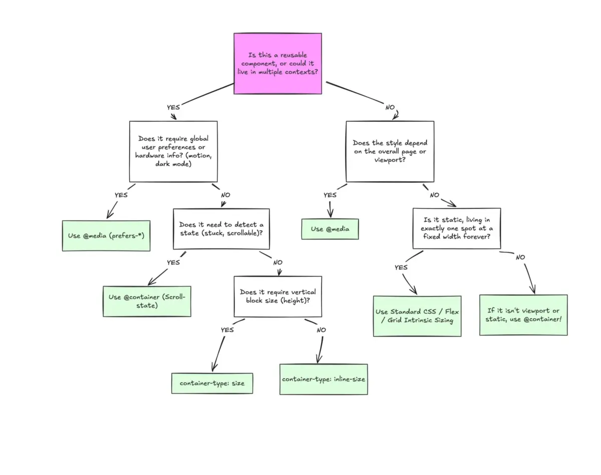
Architectural Decision Framework
Modern CSS architecture does not dictate replacing @media queries with @container queries entirely. Instead, scalable component design relies on establishing a clear separation of responsibilities between viewport-level rules and container-level rules.
                    Is the element a macro layout
                    or global page-level structure?
                               |
               +---------------+---------------+
               |                               |
              YES                              NO
               |                               |
       Use @media Queries            Is the component used in
    (Viewports, preferences,        multiple layout contexts?
       top-level grids)                        |
                                       +-------+-------+
                                       |               |
                                      YES              NO
                                       |               |
                             Use @container Queries    Evaluate structural stability
                              (Micro layouts, cards,   (Use @media or flex/grid rules)
                                dynamic widgets)
Media queries remain the primary tool for page-level, macro layout orchestration. Global navigation bars fixed to the top of the viewport, primary page layout columns, site-wide themes via prefers-color-scheme, and accessibility settings like prefers-reduced-motion are inherently tied to the global context of the screen.
Container queries are the primary tool for independent, micro UI components. When building elements intended to be reused across varying contexts—such as grid cards, dashboard widgets, embedded media blocks, or inline forms—container queries ensure that component logic remains self-contained, predictable, and resilient to context changes across modern web layouts.