As the web platform continues to evolve at a rapid pace, frontend developers and CSS practitioners are witnessing a steady stream of new browser features, specification proposals, and inventive layout techniques. The latest developments across the web standard ecosystem showcase a clear momentum toward declarative HTML and CSS solutions for problems that once required complex JavaScript workaround logic. From refined user experience patterns for interactive tooltips to native syntax highlighting and deep layout calculations embedded directly within style sheets, modern browser capabilities are transforming standard engineering workflows.
Rethinking Tooltip UX with Interest Invokers and Delays
User interface micro-interactions often present subtle engineering challenges, and tooltips are a prime example. Developer Abhishek Jakhar recently analyzed the interaction design of contextual tooltips, arguing that optimal tooltips should feature an initial trigger delay followed by instant dismissal. The primary rationale behind this two-phase timing behavior is collision avoidance: an intentional delay prevents tooltips from inadvertently popping up when a user swiftly moves their cursor across the viewport. Conversely, once the user moves away from an active trigger, the overlay should unmount immediately so it does not obstruct adjacent UI elements.
However, Jakhar also highlighted an essential edge case regarding hit-target geometry. When the hoverable region of a trigger element is particularly small, brief cursor deviations can accidentally cause the tooltip to close prematurely. In such cases, preserving a minor delay before complete de-triggering helps maintain UI stability without frustrating the user. Building on this practical UI analysis, web developer Chris Coyier explored a modern implementation that leverages native browser capabilities rather than relying heavily on custom JavaScript timing loops.
Coyier pointed to the emerging "interest invokers" specification, which introduces two novel CSS properties designed specifically to handle contextual interface triggers: interest-delay-start and interest-delay-end. These properties allow developers to define explicit start and end delay thresholds directly within stylesheet rules, establishing native lifecycle management for popovers and tooltips. Although full engine implementation is currently limited primarily to experimental releases of Google Chrome, the technique represents an ideal candidate for progressive enhancement, allowing developers to build robust, native-first tooltips that gracefully fall back in unsupported user agents.
<geolocation> and How to Use It Today
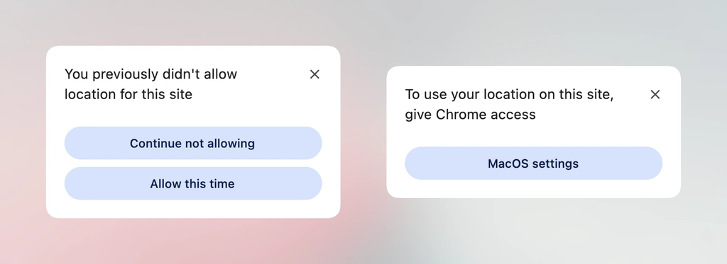
Integrating location-aware functionality into web applications has historically presented significant developer friction. The traditional Geolocation API depends heavily on underlying system hardware—ranging from GPS satellites and Wi-Fi triangulations to cellular tower signals—and managing user permission states can be remarkably complex. Once a user grants or denies location permissions within a browser, altering that preference often requires navigating buried browser settings, creating a sub-optimal user experience.
The proposed <geolocation> HTML element aims to streamline these interactions by encapsulating location prompts directly into standard markup. However, this native abstraction introduces its own operational traits, including strict browser-enforced styling restrictions designed to prevent UI spoofing and malicious clickjacking attempts. Permission UI elements rendered by the browser must maintain explicit visual boundaries to ensure users understand precisely when and how their location data is being accessed.
Because the native <geolocation> element is currently confined to Chrome, developers looking to adopt the tag today must rely on hybrid architecture. By pairing the experimental <geolocation> element with the legacy JavaScript Geolocation API, engineering teams can implement progressive enhancement strategies immediately. Under this approach, modern engines render the native declarative element while fallback scripts ensure uninterrupted functional coverage across legacy environments.
MicroLighter: A ::highlight()-Based Syntax Highlighter
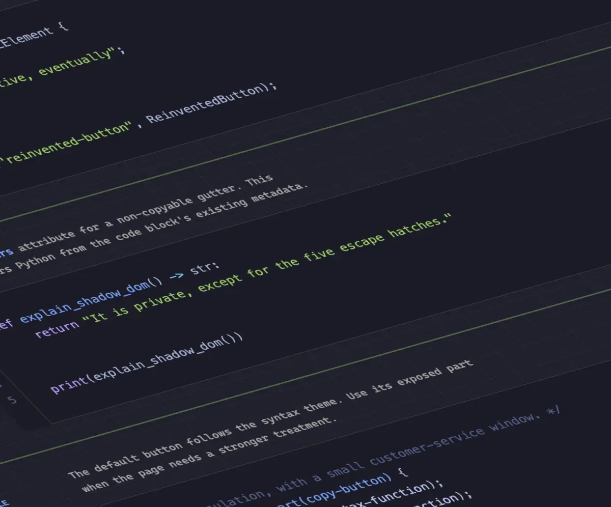
Code syntax highlighting on the web has traditionally required heavy DOM manipulation libraries that parse code blocks and wrap individual tokens in dozens—or hundreds—of inline <span> tags. This approach bloats the document tree and introduces measurable rendering overhead on long technical documents. Developer Dave Rupert demonstrated a lightweight alternative with MicroLighter, an experimental syntax highlighter built on top of the web platform’s modern Custom Highlight API.
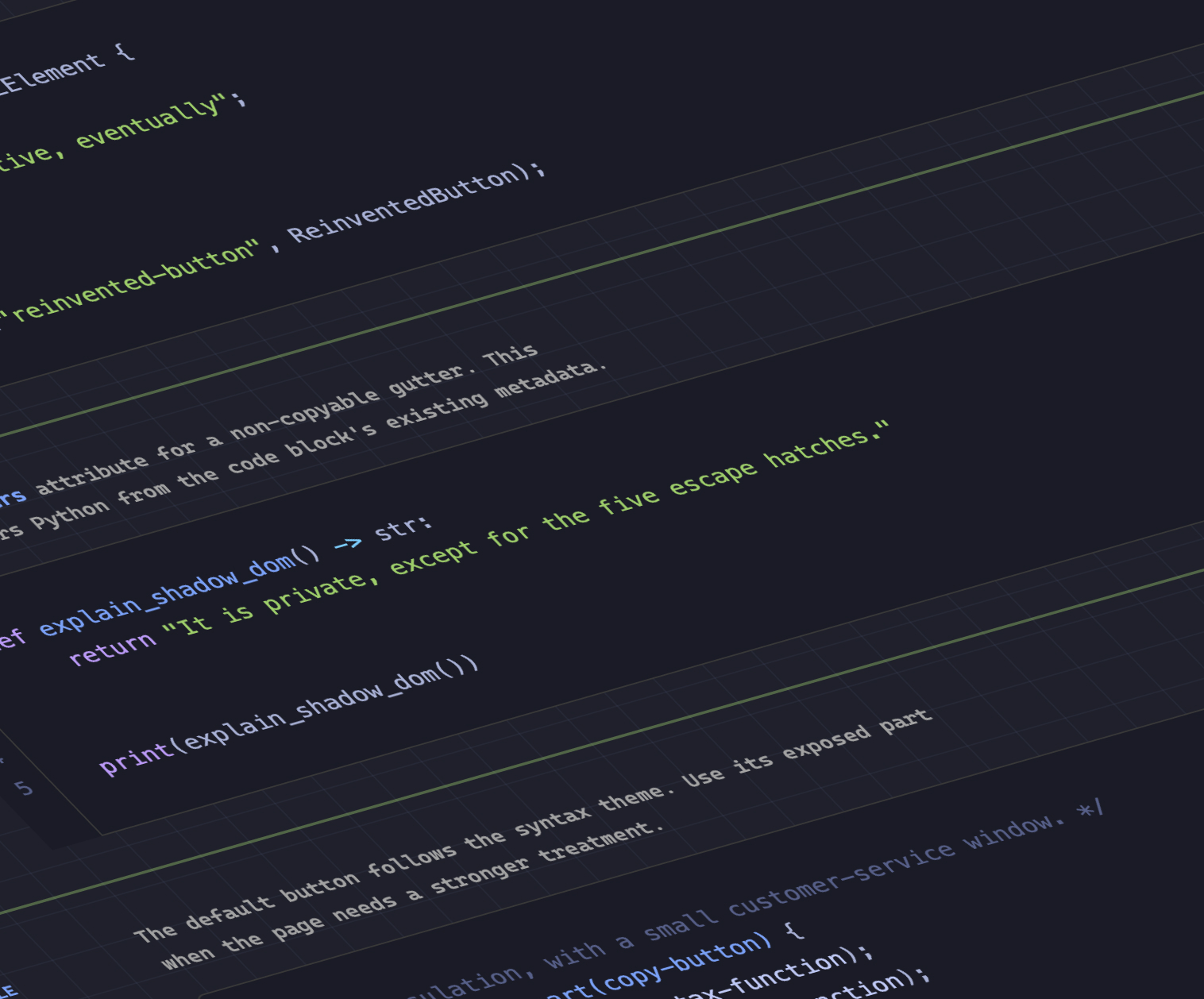
By utilizing the CSS ::highlight() pseudo-element, MicroLighter separates code tokenization from DOM element creation. Instead of altering the underlying markup by inserting presentational spans, the highlighter programmatically defines programmatic text ranges via JavaScript and styles those ranges using CSS native highlight rules. Developer Geoff Graham also highlighted the project, noting how this paradigm shift yields cleaner HTML trees, reduces layout recalculation costs, and vastly simplifies document structure. The technique demonstrates how low-level CSS rendering APIs can streamline common web tasks that previously demanded heavy script runtimes.
How to Get CSS Grid Information into CSS Variables
CSS custom properties (commonly known as CSS variables) have dramatically increased the dynamic capabilities of stylesheets. However, extracting structural layout metadata directly from a CSS Grid layout into custom properties has long been considered out of reach without DOM-measuring scripts. Developer Temani Afif recently demonstrated a pure CSS technique that extracts grid dimensional data—specifically total row counts, column counts, and individual cell coordinates (x/y indexes)—and maps them directly into CSS variables.
The primary structural constraint of Afif’s current implementation is that target grid columns must maintain equal width distributions. Despite this geometric limitation, the ability to store spatial grid coordinates directly inside variable scope opens up compelling visual possibilities. For example, Afif demonstrated how these mapped cell coordinates can be leveraged to calculate mouse hover proximity across a grid system entirely within CSS. As layout specifications advance and modern CSS mathematical functions evolve, similar variable-based spatial calculations are expected to become even more flexible across irregular and dynamic grid tracks.
Dark Mode: Two-State or Tri-State?
The architectural design of color scheme toggles continues to be a point of active debate among interface designers and front-end architects. The central question revolves around how explicitly user preferences should interact with operating system-level color schemes.
Developer Lea Verou advocates for a streamlined two-state model (Light vs. Dark), arguing that simple binary toggles reduce mental load for users and streamline preference persistence logic. Conversely, browser engineer Bramus presents the case for a tri-state toggle model (Light, Dark, and System Default). The tri-state approach provides explicit user control while preserving the ability to delegate theme handling back to automatic OS schedule shifts.
Offering an alternative perspective, developer Vale.Rocks outlined an "auto-until-overridden" two-state paradigm. In this hybrid model, the interface seamlessly follows system-level color scheme preferences by default without presenting a complex three-way switch. However, the moment a user manually triggers the theme toggle, the application registers an explicit preference override, effectively locking the state until the user chooses to reset it. This pattern offers a middle ground, balancing system synchronization with user control.
An Introduction to the Class Prefix Selector
Targeting groups of related CSS classes has historically required reliance on attribute selectors. While effective, attribute matching can introduce syntax verbosity and performance trade-offs. Bramus recently highlighted a proposed addition to the CSS selector specification: the class prefix selector.
Using the proposed syntax, developers can target class families with a clean wildcard convention:
.something-*
  /* Applied to any class starting with "something-" */
This dedicated syntax replaces cumbersome attribute queries that rely on string-matching rules. Under current specs, matching prefixed classes requires broader attribute selector strings:
[class^="something-"]
  /* Matches class="something-xxx" */


[class*=" something-"]
  /* Matches class="xxx something-xxx" */


[class*="something-"]
  /* Matches class="my-something-xxx" */
As Geoff Graham noted in a review of the proposal, the class prefix selector offers a cleaner, more readable syntax while allowing browser parsing engines to optimize class-matching routines natively. Although browser engines have not yet shipped implementation flags for the selector, its straightforward design and utility have generated optimism for quick adoption once finalized by standard bodies.
Feature Detection with the named-feature() Function
Feature queries via @supports have long allowed developers to conditionally apply styles based on property and value support. However, certain complex browser behaviors—such as visual rendering quirks or specification sub-features—cannot be easily verified by checking a simple property-value pair.
To address these edge cases, Bramus showcased Chrome’s implementation of the @supports named-feature() function. This extended feature query mechanism allows developers to directly interrogate browser engines regarding support for specific, granular features that were previously impossible to detect reliably through CSS alone.
A practical application includes detecting whether a browser engine properly respects CSS transform functions when rendering anchored elements using the new CSS Anchor Positioning API. By exposing these underlying engine behaviors to conditional CSS logic, named-feature() enhances the capability of feature queries, giving developers finer control over progressive enhancement strategies.
How to Balance Wrapped Flex Items Across Rows or Columns
Achieving visually balanced layouts in wrapping flexible box container structures has historically required complex custom math or JavaScript layout recalculations. Following the success of text-wrap: balance for multi-line typography, Google Chrome has introduced support for flex-wrap: balance.
Layout expert Ahmad Shadeed published a detailed technical breakdown explaining the practical mechanics of flex-wrap: balance. When flex items wrap across multiple lines or columns, the browser automatically balances the layout distribution to equalize the number of items or space consumed per row. This prevents awkward visual orphans—such as a single flex item stranding on a final row while preceding rows remain packed—resulting in cleaner visual symmetry for cards, navigation menus, and media grids.
Moving Toward Native Browser Execution
The ongoing enhancements across HTML and CSS reflect a clear direction in web development: shifting user interface responsibility away from script-heavy abstractions and directly into standard web engines. Whether through native syntax highlighting APIs, refined visual layout controls like flex-wrap: balance, or declarative HTML tags for hardware services like location tracking, modern specs continue to simplify frontend development. As these standards stabilize and vendor implementation spreads, developers gain access to an increasingly capable toolkit for building fast, resilient, and responsive web applications.