In the software development and user experience ecosystem, an old computer science adage continuously proves its validity: naming things remains one of the most difficult challenges in the industry. The language design and engineering teams adopt does not merely serve as label text in a repository or Figma file; it fundamentally shapes how cross-functional teams conceptualize products, communicate intent, and build digital experiences.
When naming conventions fail, the consequences ripple across an entire organization. Names that are overly generic create ambiguity, leaving developers and designers unsure of a component’s true purpose. Conversely, names that are hyper-specific create rigid structures that resist customization and inhibit code reuse. This misalignment leads to fragmented design systems, duplicated efforts, and conflicting dialects between designers, engineers, product managers, and end-users.
To address these persistent friction points, digital creators and design system architects across the tech industry have developed specialized methodologies, taxonomies, and open-source tools. From raw color codes and interface layers to complex enterprise design tokens and product features, structured naming practices are becoming an essential discipline within modern software production.

How to Name Things Across Code and Markup
Finding terms that balance clarity with flexibility in front-end development often requires stepping outside traditional technical jargon. When authoring HTML class names, CSS properties, or JavaScript functions, developers frequently default to rigid visual descriptions that become outdated as soon as a design changes.
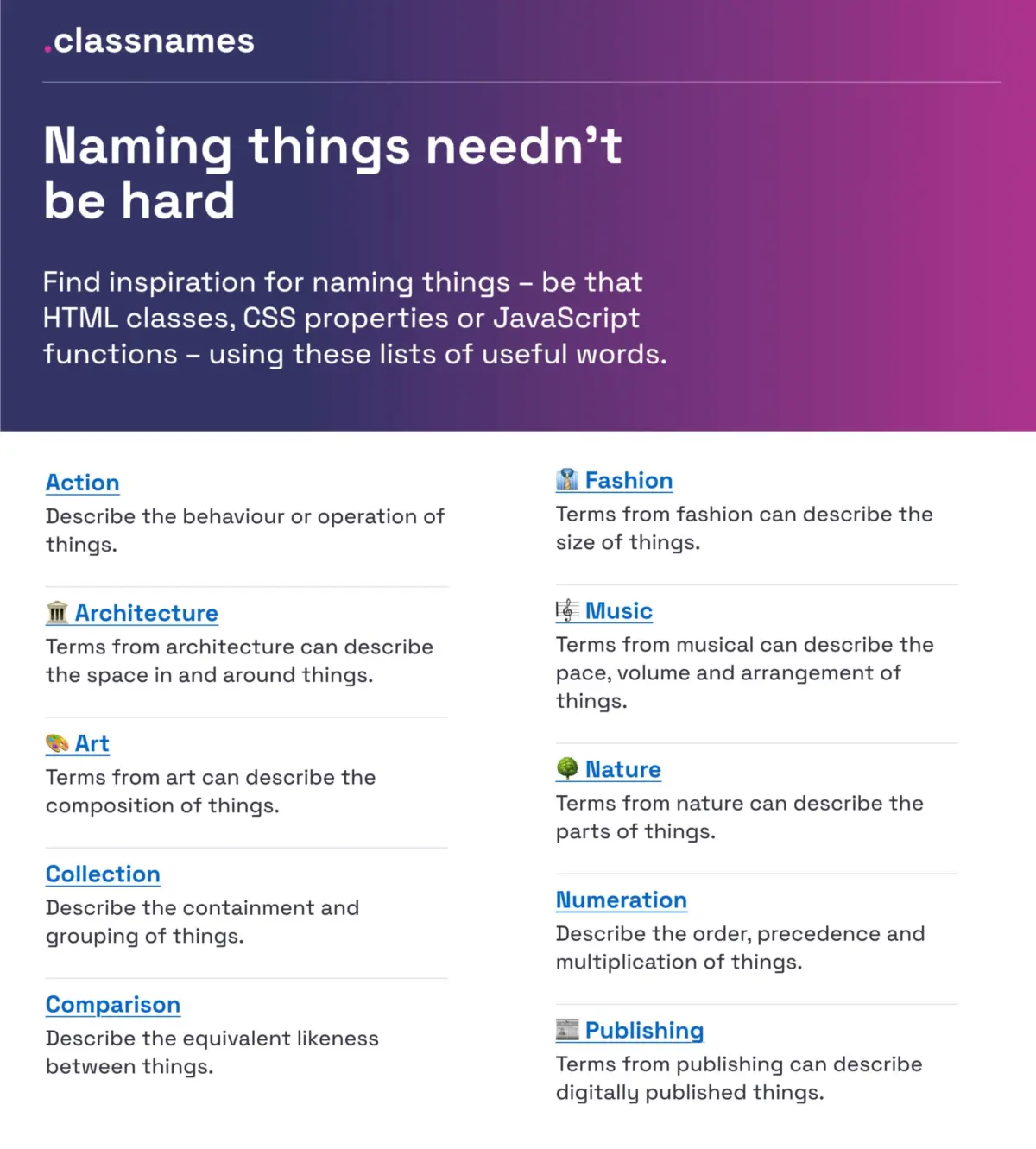
To combat this, tools like Classnames, developed by Paul Robert Lloyd, offer structured approaches to help technical teams diversify their vocabulary. The resource groups words by thematic association, providing developers with alternative linguistic frameworks to describe application behavior, component relationships, ordering, and structural grouping.
Rather than relying purely on standard technical terms, these thematic collections draw inspiration from external disciplines, including music, architecture, theater, fashion, publishing, art, and nature. By leveraging concepts from these domains, front-end engineers can establish semantic class names that remain stable even when visual styling shifts, encouraging more abstract and reusable code architectures.

Systems for Naming Colors at Scale
Color management presents a unique naming challenge within design systems. While hexadecimal values, RGB triplets, and HSL strings provide precise mathematical definitions for rendering engines, they are entirely unreadable to human collaborators and fail to convey functional context.
To bridge this gap, developer David Aerne curated a comprehensive color name repository that currently cataloged 30,355 unique color names. Built through a combination of historical reference materials and thousands of community contributions, the initiative standardizes how specific hues are identified across digital applications.
Supported by dedicated color pickers and automated identification tools such as Color Parrot, this expansive dataset allows teams to assign consistent human-readable descriptors to precise visual values. By establishing a shared baseline for color identification, teams can convert raw aesthetic choices into structured assets that align across design software and code repositories.

Best Practices for Layer, Group, and Component Naming
Within design tools like Figma or Sketch, loose layer management often creates organizational debt that complicates handoff to development teams. Unstructured layer names like "Frame 412" or "Rectangle Copy 3" obscure layout intent and slow down production schedules.
UX designer Javier Cuello established a set of core guidelines aimed at creating scalable, meaningful naming conventions for design assets. According to Cuello’s framework, an effective asset name must possess a logical structure, remain brief yet descriptive, be understood universally across disciplines, and avoid tight coupling to temporary visual attributes.
Cuello’s recommendations outline practical rules for organizing design layers, component groups, and sizing tokens. By discouraging references to specific visual details—such as hardcoding a color or fixed pixel size into a layer’s name—designers create flexible master components that can adapt to light and dark modes, responsive screen layouts, and multi-brand themes without requiring systemic renaming.

Architecting Design Token Taxonomies
As organizations grow to manage multiple products, establishing a unified design language becomes increasingly complex. Intuit, the parent organization behind major software platforms including Mailchimp, QuickBooks, TurboTax, and Mint, faced the challenge of building a unified design system capable of serving diverse brand identities without sacrificing centralized governance.
In a technical case study detailing Intuit’s systemic overhaul, design architect Nate Baldwin outlined the creation of a multi-tiered design token taxonomy. The project targeted structural weaknesses in traditional token systems, which often fail when tasked with supporting disparate brand guidelines across mobile and desktop environments.
Intuit’s revamped taxonomy separates abstract design decisions from specific application contexts. By organizing design tokens into structured layers—spanning base primitive values, semantic purpose, and component-specific contexts—the organization created a flexible foundation. This multi-layered structure ensures that global updates to core brand attributes can propagate efficiently across all product lines without breaking localized interface logic.

Cataloging UI Component Naming Across Design Systems
A recurring source of friction between design and engineering teams stems from mismatched terminology for standard user interface elements. What one team labels a "Flyout," another may call a "Drawer," a "Popover," or a "Modal."
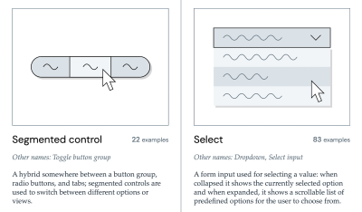
To document industry standards and resolve these dialectical differences, developer Iain Bean created the Component Gallery. The resource serves as a centralized reference cataloging real-world design system implementations across more than 50 standard UI component types, ranging from common accordions to specialized utility structures like visually hidden elements.
By aggregating usage examples from established design systems across the tech industry, the platform highlights the alternate names components go by across different organizational ecosystems. Complementary tools, such as the visual dictionary Name That UI, further assist teams in identifying standard component patterns, helping cross-functional groups establish a shared vocabulary during early product architecture discussions.
Strategic Feature Naming for User Adoption
Naming challenges extend beyond internal development workflows and directly impact end-user engagement. New product features frequently suffer from low user adoption simply because their intent, value proposition, or location within an application is poorly communicated by their label.
UX specialist Erin Gannon analyzed this adoption bottleneck, illustrating how successful feature integration relies on a clear linear progression: a feature must first be discovered, then understood, tested, mastered, and finally integrated into a user’s regular daily workflow. If the initial feature name fails to signal its practical utility, users will routinely bypass the functionality entirely.
Gannon’s research emphasizes that feature naming should be driven directly by user needs and underlying problem spaces rather than internal engineering codenames. Effective labels highlight the specific outcome or "job-to-be-done" that the feature enables. To achieve this, product teams are advised to conduct user research to capture the exact phrasing target audiences use naturally when describing a task, directly incorporating that native vocabulary into the user interface.

Mapping Variables in Complex Enterprise Environments
For multi-brand enterprise platforms operating across distinct global markets, variable management requires precise architectural mapping. The Vodafone UK Design System team addressed this complexity by publishing their Variables Taxonomy Map, a practical framework designed to manage multi-themed digital environments.
Building upon foundational design token research by systems expert Nathan Curtis, Vodafone’s model breaks down token structures into an interconnected matrix of four primary collections. The framework maps the lineage of design variables as they translate from raw brand primitives to semantic utility tokens, component-level variables, and eventually page-specific layouts.
This structured mapping allows designers and developers to determine a variable’s exact scope, purpose, and visual rendering rules simply by reading its systematic name. By establishing strict naming syntax across all variable tiers, enterprise systems can support dynamic multi-brand switching while preventing style leakage and code redundancy.

Practical Frameworks and Inventories for Design Tokens
Implementing design token conventions requires systematic tools that assist teams in configuring, auditing, and maintaining their variable libraries over time. Design system consultant Romina Kavcic developed the Design Token Naming Guide + Builder to help organizations systematically construct custom token structures.
Kavcic’s tool provides an interactive environment where teams can define token hierarchies by combining elements such as component targets, functional categories, interactive states, and theme roles. This structured approach prevents common implementation errors, such as mixing semantic meaning with primitive visual descriptors.
To complement the building framework, Kavcic also published the Design Token Names Inventory, a standardized spreadsheet layout structured around four primary operational levels. The inventory gives design system maintainers a comprehensive overview of their token architecture, allowing teams to filter variables across multiple themes, visual modes, and asset classes without losing track of systemic relationships.

Naming Products and Services
Beyond software architecture and code variables, naming physical products, digital platforms, and corporate services presents a broader strategic challenge. Organizations often struggle to balance creative branding with searchability, trademark compliance, and linguistic resonance.
To streamline this exploratory phase, the open-source repository Onym organizes naming resources into a centralized reference guide. The project aggregates specialized tools, etymological dictionaries, brainstorming methodologies, legal vetting frameworks, and sprint guidelines aimed at guiding teams through the product naming lifecycle.
By compiling case studies alongside analytical frameworks, the platform assists entrepreneurs and product strategists in evaluating potential brand names against criteria such as global cross-cultural clarity, phonetic stability, and domain availability before launching new offerings to market.

Bridging Communication Gaps Across Product Teams
Ultimately, the goal of any naming strategy is to eliminate communication friction across multidisciplinary teams. Significant operational time is lost when designers, front-end engineers, product managers, and end-users refer to identical interface elements using entirely different internal dialects.
When a design system experiences low adoption or high error rates during developer handoff, the root cause often traces back to ambiguous, contradictory, or overly rigid naming conventions. Identifying naming conflicts early and logging them within a team’s continuous improvement backlog provides a clear path toward reducing organizational drag.
Establishing intentional, shared language across digital product teams transforms design systems from isolated libraries into active, collaborative tools. By adopting structured naming frameworks for code, colors, components, and design tokens, digital organizations can significantly improve cross-functional alignment and build more cohesive, scalable user experiences.