In an industry defined by the intangible, translating spiritual energy and psychic connection into a coherent visual and verbal system poses a singular challenge for brand strategists. When psychic services platform Purple Garden commissioned creative agency Mother Design to develop a new brand identity, the team bypassed conventional design frameworks in favor of an experimental, intuition-driven methodology. Moving beyond standard brand audits and market research decks, the agency engaged in séances, chakra readings, and automatic drawing sessions, culminating in a serene visual identity rooted in continuous growth and authentic spiritual practice.
The rebrand was developed under Mother Design’s "Wild Card" initiative, an agency program designed to encourage creative teams to step outside traditional workflows and explore unfamiliar disciplines. To ground the project in genuine experience, the agency partnered directly with a holistic practitioner from the Purple Garden platform. The creative process began with a collaborative group workshop where team members surrendered conscious control, using paper and charcoal to engage in automatic drawing and writing exercises guided by chakra readings.
This non-traditional inception drew direct inspiration from art history, specifically the early 20th-century spiritist practices of pioneering Swedish artist Hilma af Klint and "The Five"—a collective of women artists who conducted séances to enter trance states, allowing higher consciousness to guide their mark-making. Af Klint’s radical abstract works predated famous modernist pioneers such as Wassily Kandinsky and Piet Mondrian, establishing a precedent for capturing invisible energies through spontaneous visual forms.
Jo Tulej, creative director at Mother Design, emphasized that capturing the essence of psychic services required an immersive approach tailored to the platform’s core audience while establishing a commanding presence in the market.
"Transferring something as intangible as psychic power into a brand identity was a chunky challenge that we wanted to get right," Tulej explained. "It had to begin with the audience. Purple Garden is aimed at people who have had spiritual readings and practices, and the business objective was to cement the brand’s place as the leader in the category. Therefore, we had to create something visual and verbal that would feel familiar and resonate with these ‘seasoned seekers’, but in a fresh way, that would communicate Purple Garden’s elevated offering."
Tulej noted that experiential understanding was essential to achieving authentic design decisions, regardless of individual team members’ prior exposure to spiritual practices.
"In order for us to tap into that, we knew we had to experience it ourselves to understand and make something that felt authentic," Tulej said. "Some of the Mother Design team had experience with spirituality; others didn’t, so we enlisted the help of a holistic practitioner from the platform to guide us through a chakra reading and automatic drawing and writing workshop. A brand audit with a twist, you might say!"
Detailing the conceptual lineage of the workshop, Tulej referenced the historical connection between spiritism and abstract art that informed their creative session.
"The word séance comes from the words sitting or session," Tulej continued. "We were inspired by Hilma af Klint and The Five, a group of women who would come together and enter trance states to bypass conscious thought and draw and write freely. They believed they were connecting with a higher consciousness and receiving messages which translated into the marks they were making. Af Klint is a pioneer of Western abstract art, and her work predates the likes of Kandinsky and Mondrian."
The exploratory marks produced during the workshop served as the foundational bedrock for the entire identity system. Days after the initial session, the design team reconvened to evaluate the charcoal drawings and written reflections, analyzing recurring patterns, textures, and emotional resonances.
"We wanted to immerse ourselves in spirituality and see if that could be baked into a design process in order to create great work," Tulej shared. "The chakra reading and automatic drawing/writing took place as a group workshop in which the whole team participated. We then came back a few days later and sat alongside the drawings and writing and discussed what we were seeing and noticing. To have had this experience with an advisor from Purple Garden was an invaluable way to gain insight as well as an invigorating creative process."
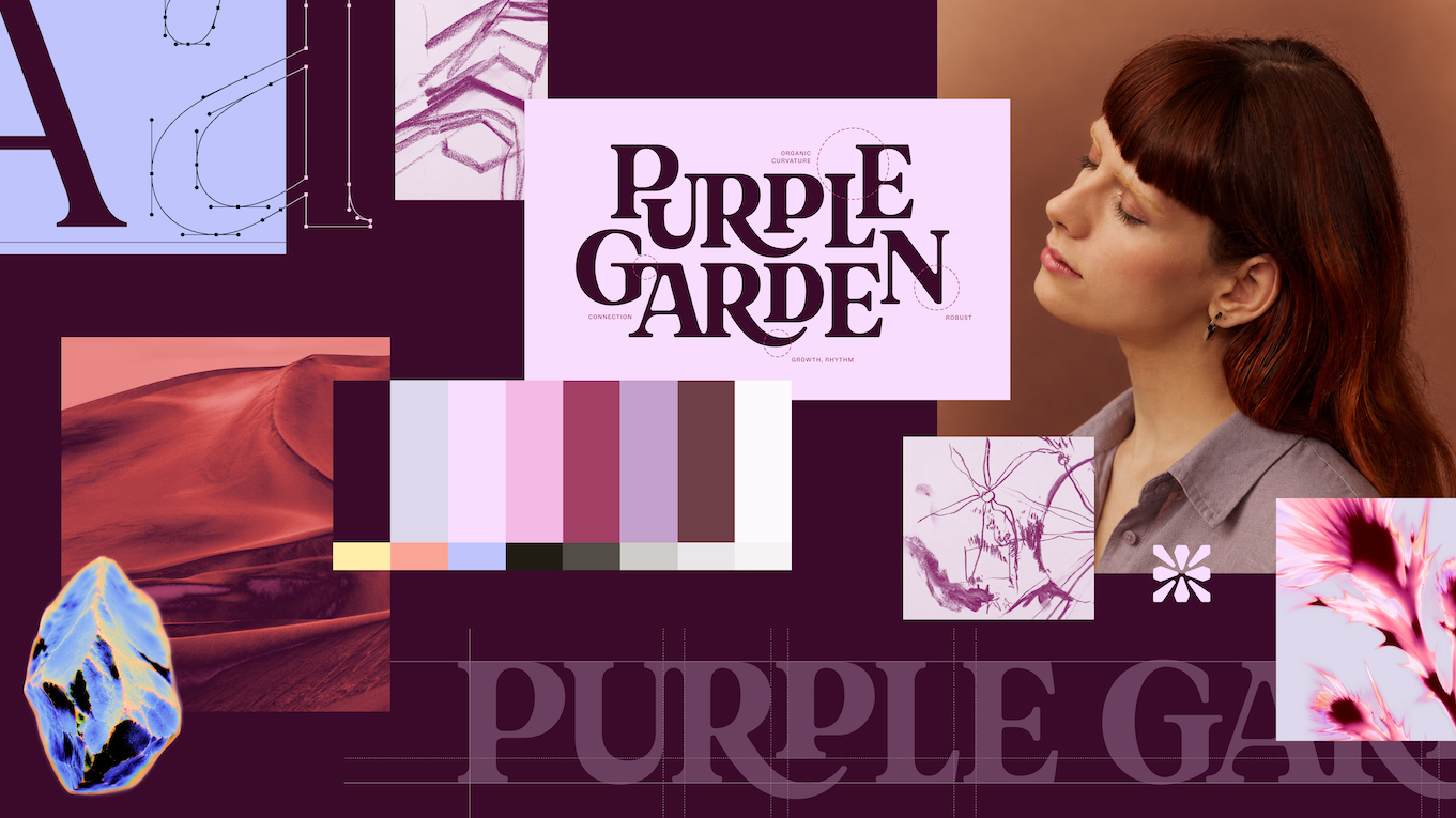
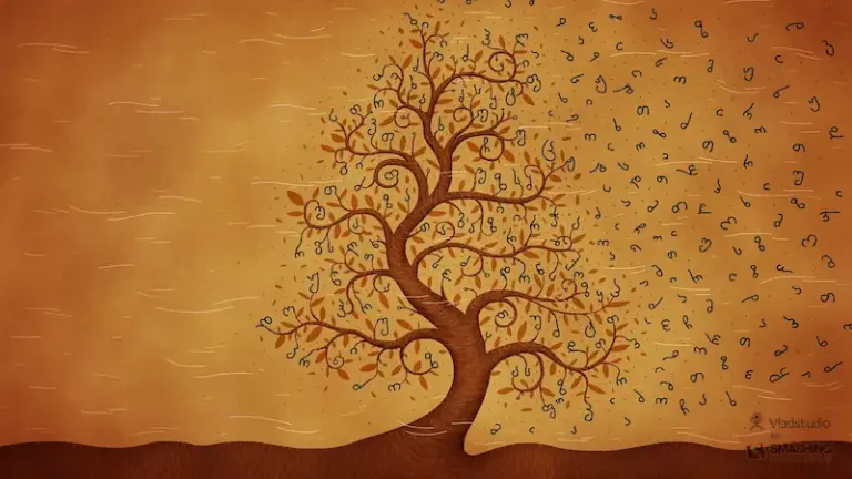
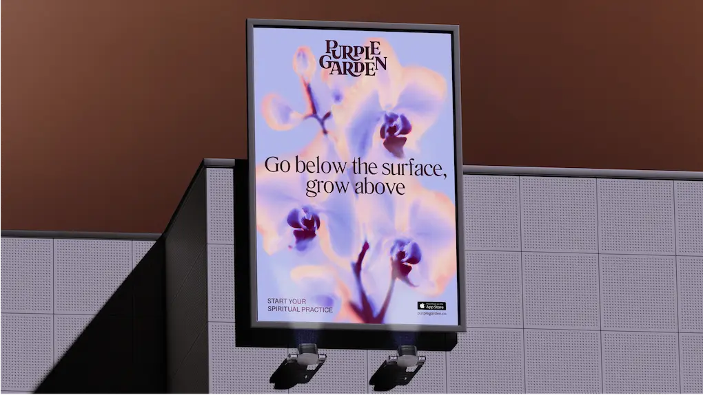
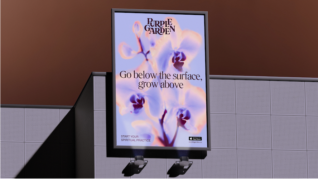
The resulting visual identity reflects the overarching theme of a "Living Practice," blending fluid, natural forms with structured typography to embody "grounded guidance." Central to the system is a bespoke wordmark characterized by elegant serifs and curved junctures designed to evoke organic growth. Interconnecting letter placements and sprouting ligatures reinforce the idea of continuous evolution. This organic wordmark is balanced by a digital-first glyph shaped like a faceted crystal, anchoring the brand in modern mobile environments.
Typography plays a critical role in balancing practical usability with creative flair. Mother Design paired Literatura Present with ABC Social, combining expressive, whimsical typographic nuances with high functional legibility across digital applications.
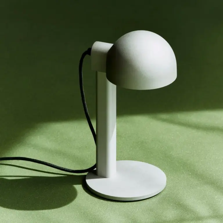
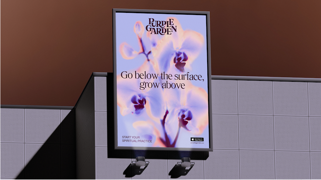
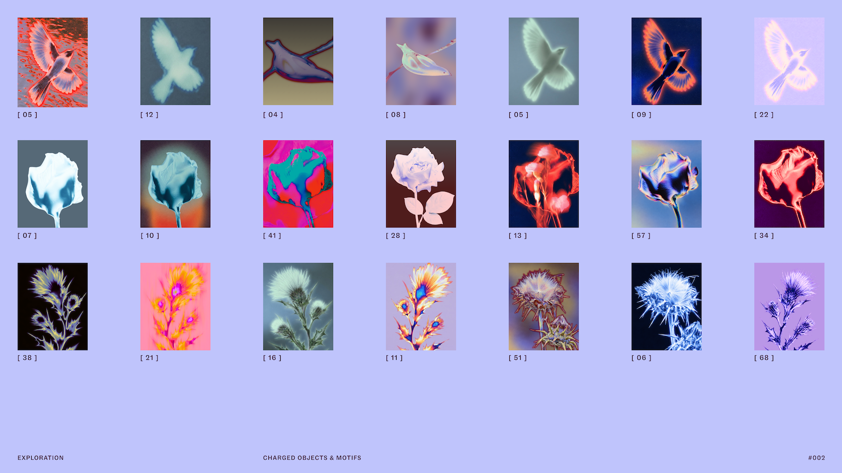
The visual language extends into imagery and color strategy. Moving away from standard stock imagery, the platform introduced art-directed photography featuring "charged objects" to symbolize specific services such as psychic readings and dream analysis. These subjects are captured through solarised glows and flame-like light ripples, visually representing the unseen energy exchange that occurs between a practitioner and a client. While imagery frequently incorporates natural elements, the solarisation treatment transforms ordinary landscapes and objects into luminous, otherworldly visuals.
To further distinguish Purple Garden within a crowded market, Mother Design carefully recalibrated the brand’s color strategy. While purple is traditional within the spiritual category—long associated with intuition, perception, and higher consciousness—the agency avoided flat single-tone applications in favor of a nuanced, seven-hue palette built from deep, earthy tones.
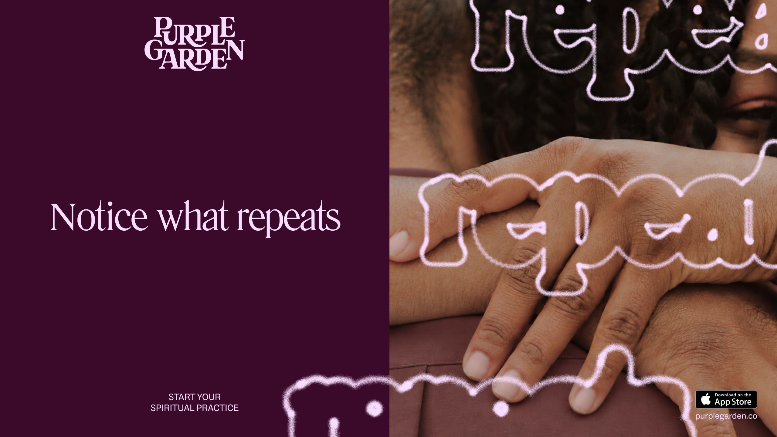
This thoughtful approach extended to Purple Garden’s verbal identity. Standard commercial practices in the spiritual app market often rely on high-pressure call-to-action language. Mother Design deliberately rejected those aggressive tactics, developing a brand voice built on the concept of "Active Contemplation." This tone is structured to meet users where they are emotionally, offering either gentle encouragement to move forward or space to pause for deeper reflection, steering clear of tropes like "Act now" or "Book fast."
Remarkably, the Purple Garden project marked Mother Design’s second major rebrand of a spiritual platform within a single year, following their previous work for psychic network Keen. Tulej reflected on the divergent outcomes achieved for both platforms, attributing the distinction to deep audience analysis and tailored creative exploration.
"This year we’ve been so lucky to rebrand not one but two psychic services platforms (Keen and Purple Garden)," Tulej remarked. "What has surprised me is how different the two product/brands now feel, and how divergently we’ve been able to explore and push their identities. Again, this all comes down to getting under the skin of the audiences and aims of the business in order to sharpen the creative ideas and design expression."
Tulej noted that dedicating time to unconstrained creative experimentation fundamentally altered the strategic trajectory of the project.
"For the Purple Garden process specifically, I was struck by how the initial séance experiment gave us a totally different way of starting a branding project," Tulej stated. "It was slow, unclear and required a lot of trust and to a certain extent, vulnerability, from our team. By protecting this time, and removing a traditional ‘KPI’ from the output, I believe it gave our client a much richer, robust output, sensitive to the category and its audience. So often in the branding process we have less time that we’d like, and the more intangible ideas can get pushed to the side, but at Mother Design we always try to protect this ‘wild card’ time and encourage our brilliant team to experiment."
Navigating the traditional conventions of the spiritual sector required striking a precise balance between familiarity and innovation.
"One challenge we faced was how to create a world that feels of the spiritual category and familiar to its fans, but also fresh and exciting, avoiding the clichés whilst drawing on symbolism that would feel universal," Tulej explained. "So we did use the category (and namesake) purple, of course, but built out a much earthier, richer palette of 7 hues to stand out against the category’s usual flatter tone. We also used pictures of nature, but they appear transformed through these solarised glows, so they have a new, magical quality to them."
Addressing the verbal framework, Tulej added, "Similarly, in messaging we had to find the right balance of engaging customers to take action without falling into the category tropes of urgency and pressure, ie. Book fast. Get answers. Act now. Instead, we created a voice based around a duality: Active Contemplation, that can meet you where you are and either guide you forward or slow down for more reflective moments."
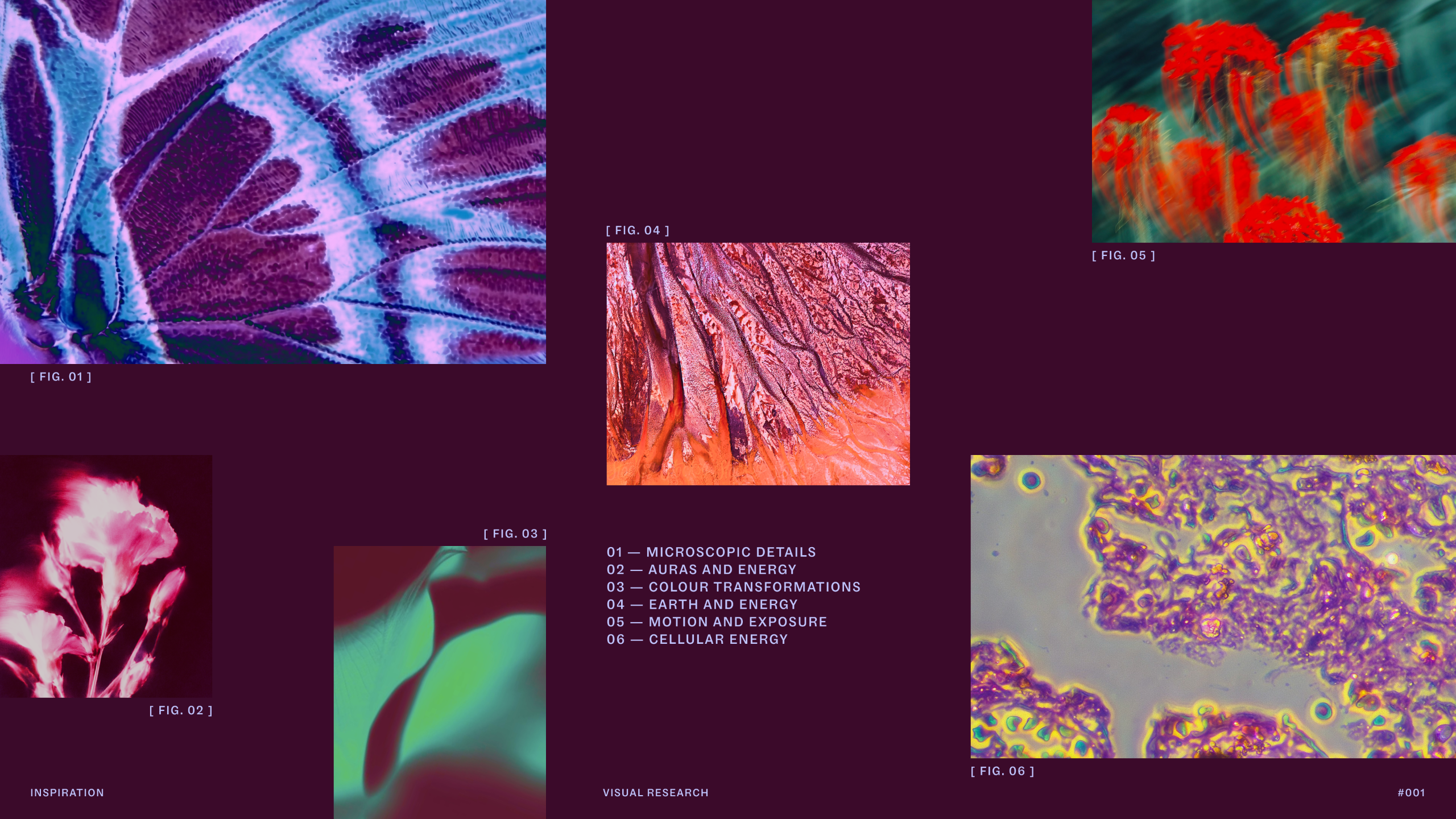
The final identity stands as a unified design system where typography, photography, color, and copy align seamlessly around the central narrative of personal discovery and spiritual growth.
"There’s a ton of detail and craft that went into everything, for example, creating a wordmark with ligatures that feel as though they’re sprouting, and the organic, interconnecting letter placement," Tulej said. "The team spent a long time experimenting with lots of different processes and tools till they found a visual style for the charged objects that felt right for depicting spiritual experiences. I’m really proud of all those details that emerge the more you engage with the identity and the impact it has."
Summarizing the overarching success of the rebrand, Tulej concluded, "I’m also proud of the way each part of the identity, from the charged objects, to the living type, to the guiding voice, all work together to express the Living Practice idea and sense of continual growth; so it really feels like a world as opposed to disparate elements."