In recent years, out-of-home advertising has undergone a dramatic transformation, driven by brands eager to cut through the digital noise with increasingly daring and unorthodox campaigns. Marketers have moved away from conventional, clutter-heavy displays in favor of high-concept visual experiments. From major international brands intentionally removing their own iconic logos to high-stakes guerrilla marketing tactics designed specifically to trend online, the outdoor advertising landscape has become a arena for radical creativity. Yet, a striking new billboard installation from productivity and artificial intelligence company Notion may well take the crown as one of the most confident and polarizing marketing moves in recent memory.
By electing to place its own visual identity directly shoulder to shoulder with its fiercest industry rivals, Notion has launched a strikingly minimalist campaign that asserts its position within the competitive AI landscape. The bold outdoor campaign has deeply divided design critics, industry observers, and everyday consumers alike. With its radically stripped-back aesthetic and deliberate lack of explanatory text, the billboard serves as a compelling case study in visual branding, demonstrating how creative bravery and calculated risk can prove invaluable when attempting to capture attention in an increasingly overcrowded marketplace.
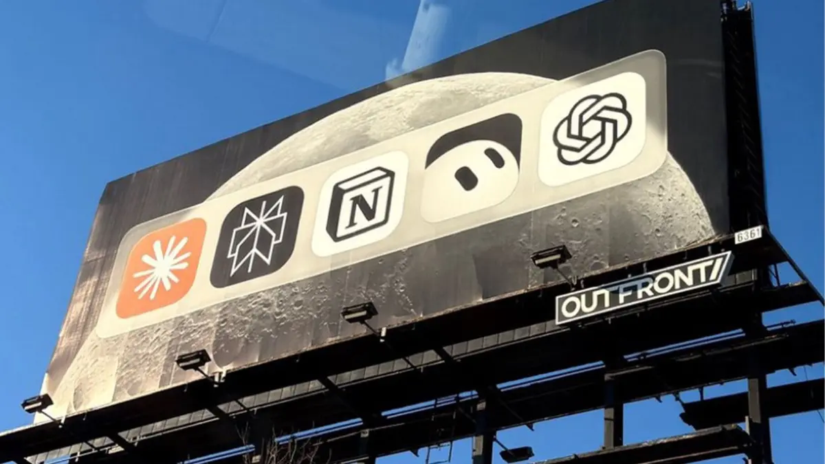
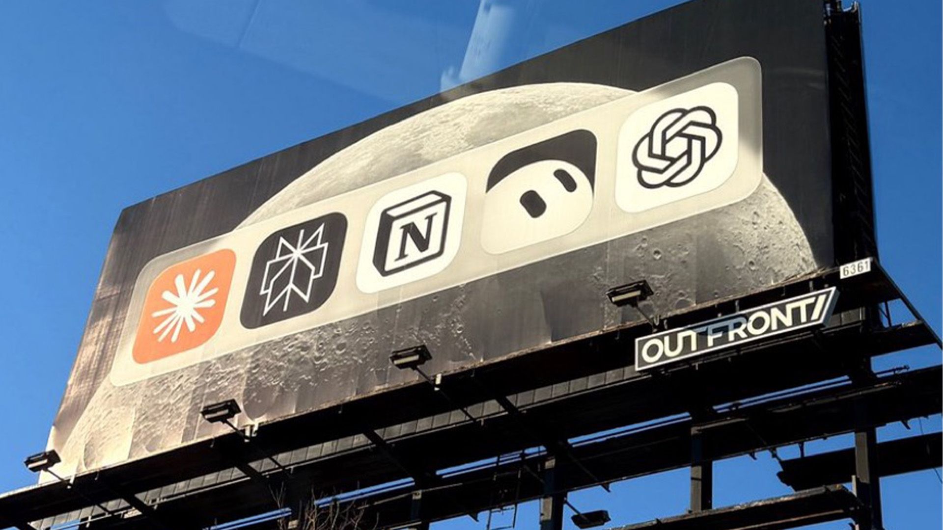
The billboard in question eschews traditional marketing conventions entirely. Rather than displaying a catchy headline, a corporate slogan, a feature checklist, or even a promotional web address, the massive display presents nothing more than a stark, minimalist lineup of prominent artificial intelligence logos set side by side. Rendered across the expansive surface are the recognizable brand marks of prominent AI platforms, including Anthropic’s Claude, Perplexity AI, xAI’s Grok Bot, and OpenAI’s ChatGPT. Positioned squarely in the center of this elite roster sits Notion’s own emblem.
At first glance, dedicating expensive physical advertising space to showcase a collection of direct competitors might appear counterintuitive, if not entirely misguided. Conventional advertising wisdom dictates that a company should highlight its unique selling propositions and keep public focus strictly on its own product. However, it is precisely this quiet defiance of marketing norms that gives the installation its distinct power. By placing itself right at the heart of the AI conversation alongside the industry’s most recognized standalone models, Notion leverages sheer visual association to communicate an unshakeable sense of confidence.
As photos of the physical display began circulating across social media platforms, particularly on X (formerly Twitter), the campaign quickly ignited a fiery online debate regarding the effectiveness and clarity of high-concept advertising. The sheer ambiguity of the installation left some passersby and online viewers thoroughly perplexed. "i can’t even tell who the billboard is for," one user confessed on X, capturing the immediate reaction of viewers who found themselves puzzled by the total absence of explanatory context or clear brand attribution.
Despite the confusion experienced by casual observers, many visual strategists and creative commentators praised the campaign for its restraint and psychological intrigue. The intentional vagueness of the display proved to be its greatest catalyst for engagement, compelling viewers to stop, analyze the image, and research the message behind it.
"As much as I hate to admit it, this is a really great ad," noted another X user evaluating the campaign’s subtle brilliance. "No words, just app icons. There’s mystery over who paid for it. There’s controversy over why certain apps should be there. It’s bold and makes a statement." The commentator pointed out that by hiding the sponsor’s identity behind a shared visual lineup, the ad creates an immediate puzzle that demands viewer participation.
This tension between minimalist art direction and functional marketing clarity led to intense debate across design circles, prompting one observer to neatly summarize the community’s divided consensus by asking whether the effort was "super cool and smart, or super dumb?"
For those in the industry who view the campaign as a triumph of modern visual communication, the ad’s success lies in how effortlessly it solves a growing design dilemma within the technology sector. In recent years, graphic designers and branding experts have frequently pointed out a pervasive homogenization across artificial intelligence visual identities. A vast majority of AI platforms have converged around remarkably similar design tropes, relying heavily on organic swirls, glowing gradients, abstract starbursts, and complex geometric loops to signify machine intelligence.
When set against this sea of uniform, fluid AI icons, Notion’s simple, monochrome letterblock logo immediately commands visual attention. The structural simplicity of Notion’s emblem provides a stark, grounding contrast to the elaborate curves and intricate shapes of its peers. By placing all these marks onto a single, neutral plane, the design allows Notion’s clean geometric icon to pop naturally, subtly reinforcing the idea that the platform offers a distinct, structured alternative to conventional, chat-centric AI interfaces.
Furthermore, the strategic placement of the Notion logo at the dead center of the lineup functions as a powerful piece of non-verbal narrative craft. Rather than positioning itself as an outsider or a secondary utility attempting to keep pace with specialized AI research labs, the layout visually anchors Notion as the focal point around which the rest of the ecosystem revolves. It silently suggests that while standalone AI models like ChatGPT, Claude, Grok, and Perplexity provide raw underlying intelligence, Notion serves as the foundational workspace where these technologies converge into practical, daily application.
Critics of the billboard contend that such extreme minimalism risks alienating general consumers who may not immediately recognize every app icon on display. Without explicit copy explaining what Notion actually does or why it belongs alongside generative search engines and large language models, skeptics argue that the billboard wastes precious outdoor real estate on an inside joke tailored primarily to tech insiders and industry enthusiasts.
However, advocates for daring street-level marketing argue that the modern media environment has fundamentally changed how outdoor ads function. In an era dominated by information overload, traditional billboards featuring dense blocks of text, listicles of features, and explicit calls to action are frequently ignored by commuters. The most memorable and effective contemporary campaigns are often those that intentionally generate digital spillover, sparking lively public discussions that far outlast the physical presence of the billboard itself.
By choosing intrigue over exposition, Notion successfully transformed a standard physical media buy into a viral conversation starter. The display does not merely advertise a software product; it invites active debate regarding brand positioning, market relevance, and the visual language of the artificial intelligence boom. Far from being a flaw, the ad’s subtle ambiguity serves as its core strength, proving that creative confidence and visual simplicity remain invaluable tools for any company striving to stand out in an increasingly crowded digital landscape.