The ongoing dialogue surrounding contemporary type design, typography, and lettering received a fresh visual update this week with the release of a new header design on Alphabettes. Published by type designer and author Andrea Leksen, the latest showcase highlights a continued exploration into the art and craft of letterforms, bringing renewed attention to the meticulous work happening within the global typography community.
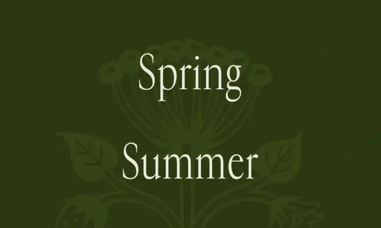
The update, shared on the platform on October 15, 2026, features a custom-crafted typographic header titled "Alascripty." Designed by Leksen through Leksen Design, the piece serves as both an aesthetic anchor for the site’s header section and a standalone testament to modern digital lettering. By focusing closely on the subtleties of type design, the release bridges the gap between functional web presentation and artistic expression, offering visitors an engaging visual introduction to the platform’s broader conversations on lettering and typefaces.
Alphabettes, widely recognized as a collaborative platform celebrating the work of women and non-binary individuals in lettering, type design, and typography, frequently serves as a canvas for such creative interventions. The integration of Leksen’s new header aligns with the platform’s mission to champion diverse voices and exceptional craftsmanship in the field. Through tags such as "letterlove," "loveletters," "type design," "typeface," "typefaces," and "typography," the post contextualizes the new artwork within a passionate community of designers dedicated to the preservation, innovation, and celebration of written forms.

The release also arrives alongside ongoing discussions on the evolution of digital typography. As type designers continue to push the boundaries of how digital fonts render across various viewports and screen resolutions, custom headers like the one produced by Leksen demonstrate the technical and artistic versatility required in modern design practice. The accompanying imagery for the post showcases the header across multiple scales and dimensions, emphasizing the responsiveness and careful spacing inherent in high-end digital type design.
While the primary focus of the update remains visual, the post has naturally invited engagement from the broader design community. Readers and fellow typographers visiting the Alphabettes platform are provided with standard interactive features, including a comment section designed to facilitate professional feedback, discussions, and expressions of appreciation for the newly unveiled work. As with many professional design journals, the platform maintains a moderated environment utilizing modern anti-spam protocols to ensure constructive dialogue among contributors and readers alike.
The transition from previous visual identities on the platform to Leksen’s new contribution marks another chapter in Alphabettes’ ongoing editorial and design evolution. Positioned directly following previous retrospectives on type and lettering, the update reinforces the platform’s commitment to showcasing dynamic, original work from its community members. Designers, enthusiasts, and typography scholars can view the full header design directly on the Alphabettes website, where the piece continues to serve as the visual signature for the ongoing collection of articles, interviews, and community highlights.