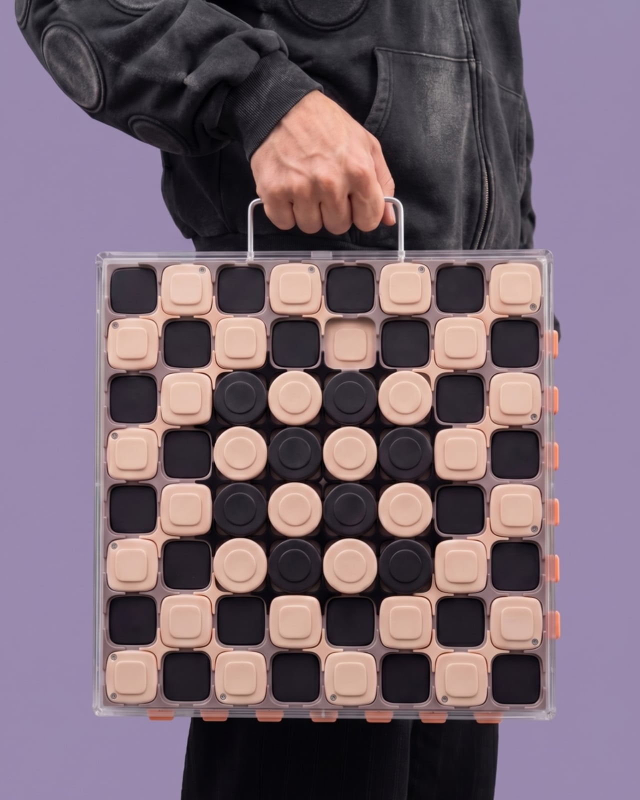
The traditional chessboard occupies an awkward space in domestic design. Leave it set up on a table, and it permanently claims a significant chunk of valuable surface area; pack it away in a closet, and the barrier to entry rises, turning a casual match into an administrative chore involving unpacking pieces, unfurling folding boards, and setting up positions. It is a friction point that industrial design rarely addresses, treating the centuries-old game as an artifact frozen in time rather than an active domestic object. Designer Jess Wiseman has taken a fresh look at this spatial and functional dilemma with CHEKT, a chessboard design that confronts domestic friction through a clear outer enclosure equipped with a carrying handle, while simultaneously shifting the familiar checkerboard’s visual personality closer to a contemporary desk accessory than a formal tournament set.
At the core of the design is a conscious effort to solve a smaller, highly relatable problem for modern consumers: choosing a physical board usually means committing to a single aesthetic indefinitely. Wooden inlay, polished marble, or stark minimalist acrylics all lock the owner into a permanent design choice. CHEKT bypasses this limitation by introducing a modular shell system. Documentation of the design showcases four distinct transparent outer shells, each featuring a different graphic treatment. This layered approach suggests an innovative way to change the board’s visual appearance over time without having to replace or discard the underlying object. For design enthusiasts who value objects that leave room for evolving personal taste—particularly items like chessboards that spend as much time sitting idly on a surface as they do being actively played—this flexibility offers a compelling alternative to the traditional finished wooden slab.
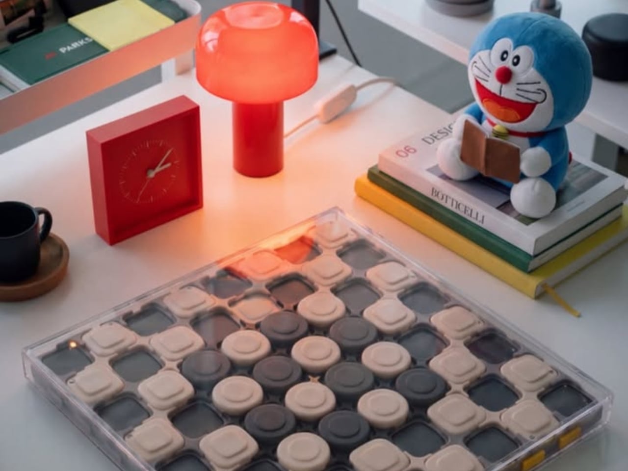
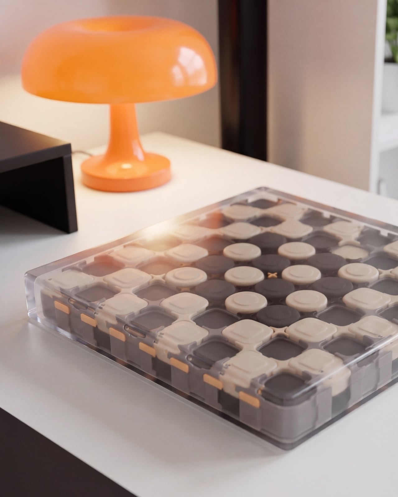
Beneath these interchangeable clear shells, the CHEKT board features a meticulously detailed eight-by-eight grid composed of black and pale peach forms. Wiseman has softened the rigid geometry typically associated with chess equipment by incorporating rounded corners, giving the raised surface an aesthetic texture that evokes an oversized, tactile computer keyboard. Circular details anchor the middle area of the grid, while square forms dominate the outer parameters. While the available imagery does not establish whether these individual components serve a mechanical purpose—meaning they cannot definitively be described as functional buttons or switches—they successfully provide the board with a visual depth and rhythmic complexity that a flat, printed checkerboard simply cannot achieve.
The transparent outer enclosure deliberately exposes these internal layers rather than hiding them behind a uniform, finished exterior. Splashes of small orange details along the edges punctuate the contrasting black-and-peach color palette, while a slim, silver-colored handle lends the entire apparatus a faint, sophisticated briefcase quality. The result is a playful aesthetic that avoids relying on novelty shapes or gimmicks. In promotional imagery showing the board resting on a desk beside an orange mushroom lamp, the set demonstrates an effortless ability to share space with other curated objects chosen specifically for their interior design merit.
The expressive potential of the CHEKT chessboard truly unlocks through its interchangeable graphic shells. Each shell introduces a completely different visual temperament. One option frames the playing squares with sharp yellow outlines, another introduces dark diagonal hatching for a more textured look, and a third incorporates red, dot-built illustrations of chess pieces. The fourth variant features bold blue circles paired with angular linework. These options offer varying degrees of visual complexity, an essential consideration for functional game design. A graphic pattern that looks striking and attractive when viewed from across a room might prove distracting or overwhelming when a player is trying to read a complex tactical position during a match. Consequently, users can easily opt for quieter or busier shells depending on their immediate needs.
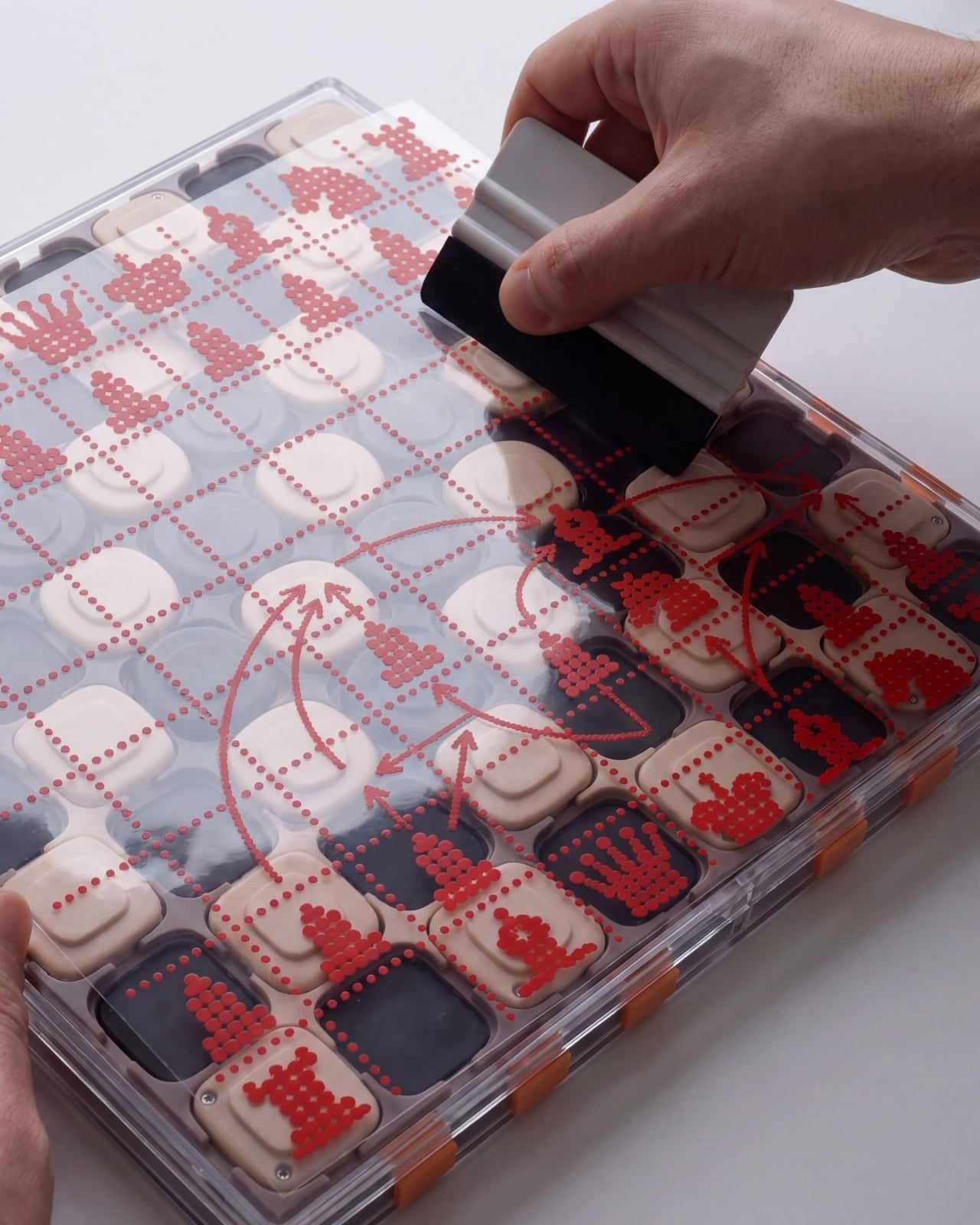
One of the most intriguing details captured in the design’s imagery shows a hand physically wiping drawn red arrows from the surface of an illustrated shell. This interaction hints at a valuable secondary role for the board: functioning as an active workspace for working through moves, explaining tactical concepts, or marking strategic ideas before wiping them clean. For casual learning and coaching, this capability is particularly appealing, as discussions and analysis can take place directly over the physical board without permanent alteration. Although the precise writing tools compatible with the surface and the exact mechanics of the material are not fully detailed in the current presentation, this pictured interaction gives the transparent overlay a practical purpose that extends far beyond a simple color scheme change.
This annotation capability elevates the concept from a novelty gadget to a genuinely useful analytical tool. It is easy to envision two players tracing a possible continuation or debating a positional nuance directly on the shell rather than struggling to explain complex variations through gestures and verbal descriptions alone. While it does not replace the fundamental process of learning the rules or recognizing classical patterns, it makes those conversations significantly easier to follow and visualize. This is where the graphic design transitions from something merely decorative to an active component of gameplay.
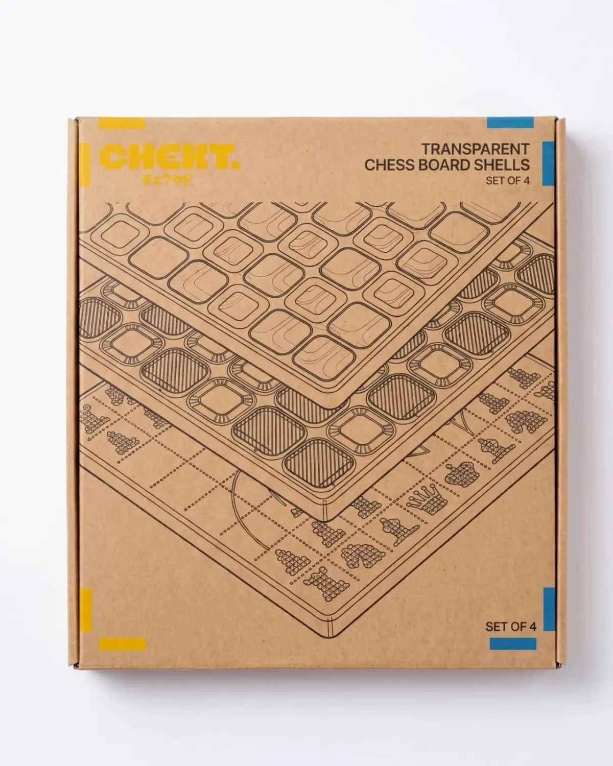
The packaging for CHEKT carries this same thoughtful attitude through to the unboxing experience. Featuring oversized yellow typography, blue corner accents, playful chess-piece drawings, and clear diagrams of the layered board structure, the boxes adopt a lively, hobby-kit character. The specific packaging for the interchangeable shells explicitly labels its contents as a set of four, making the customization concept immediately legible to a buyer before the box is even opened. This clarity demonstrates an understanding of product communication, ensuring the physical packaging actively explains the object rather than forcing branding to carry the entire weight of the presentation.
While questions remain regarding how the shells mechanically attach, how durable their surfaces are against scratching, and whether the added graphics ever visually complicate competitive play, the foundational appeal of the project is already evident. CHEKT successfully integrates a traditional game into a casual, contemporary living environment with an appearance that remains entirely impermanent. By offering a chessboard that users can easily carry, customize, and annotate upon, Jess Wiseman has created a compelling reason to take the game off the shelf and keep it integrated into daily life.