In digital product development, few challenges are as persistent or quietly damaging as the problem of naming. Language does far more than label elements on a screen; it structures conceptual thinking, governs team workflows, and shapes the direct conversation between a product and its end users. When product teams struggle to establish clear terminology, the resulting confusion spreads across every layer of the build—from design tokens and HTML classes to JavaScript variables, visual layer groups, and user-facing feature titles.
The core dilemma of naming often stems from two opposing errors: names that are either excessively generic or overly specific. Overly generic labels fail to communicate an element’s precise function or scope, while overly restrictive titles limit modularity, preventing code reuse and forcing developers to invent redundant variations. To resolve this friction, software architects, design system engineers, and UX researchers have developed structured frameworks, repositories, and standardized taxonomies aimed at bringing order to digital product vocabularies.
Architectural Frameworks for Classnames and Core Code Concepts
Establishing a shared vocabulary begins at the baseline of the code base, where developers must continuously label CSS properties, HTML classes, and functional JavaScript components. When software projects scale, reliance on arbitrary or improvised class names inevitably leads to codebase bloat and styling conflicts.

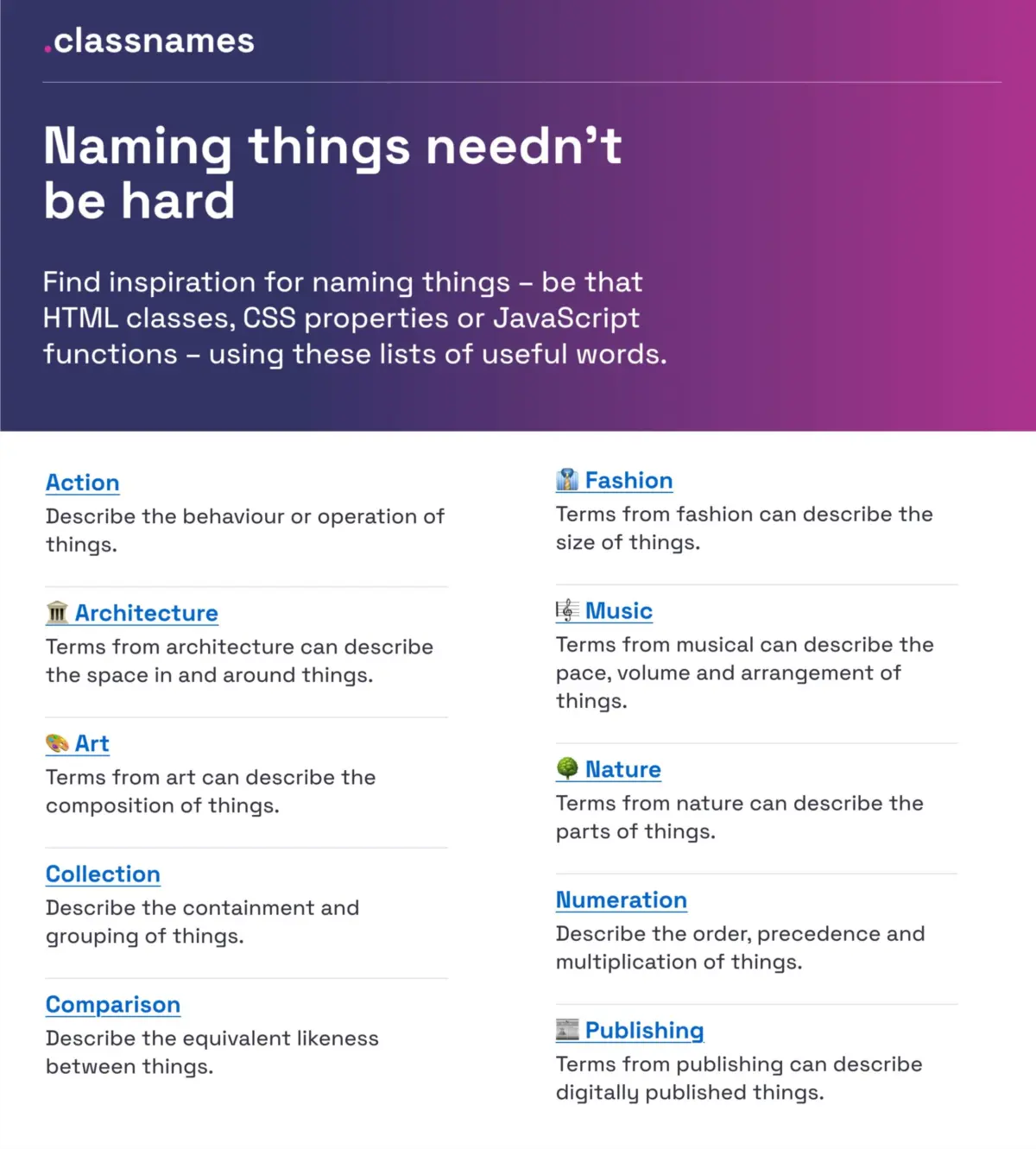
To push developers toward more creative and structured conceptualization, resource tools such as Paul Robert Lloyd’s Classnames project offer structured linguistic inspiration. Rather than relying solely on repetitive functional descriptions, the repository categorizes terminology into thematic groupings designed to broaden how engineers think about relationships between UI elements.
The tool organizes words according to behaviors, structural order, associations, and physical likenesses. Crucially, it draws from external domains not typically associated with frontend code—including classical architecture, visual art, publishing, theatrical staging, fashion, and natural ecosystems. By referencing established classification systems outside of software engineering, development teams can construct intuitive semantic structures that remain legible over time, improving long-term maintainability across large engineering organizations.
Establishing Precision in Color Taxonomy
Color naming presents a unique challenge within design systems. While raw hex codes and RGB values provide mathematical precision for rendering, human collaborators require descriptive semantic identifiers to collaborate effectively. Identifying a color simply as "blue" or "dark-red" quickly breaks down when managing complex multi-brand applications with dozens of subtle shade variations.

To solve this precision gap, open-source maintainer David Aerne compiled a massive central repository of color names, bringing together 30,355 unique color titles gathered from community contributions and historical color dictionaries. Accessible via dedicated web tools such as Color Parrot and specialized color pickers on CodePen, the project translates numeric color values into distinct human-readable titles.
In modern enterprise design systems, establishing an extensive color dictionary allows teams to bridge the gap between absolute visual values (such as #1A73E8) and contextual semantic layers. Rather than hardcoding ambiguous color titles into style sheets, teams can map precise shades to functional roles, ensuring that visual updates propagate systematically without disrupting component logic.
Standardizing Layers, Groups, and Design Workspace Files
The confusion caused by imprecise naming is not restricted to production code; it also impacts design workspaces within tools like Figma and Sketch. Disorganized canvas layers, arbitrarily grouped frames, and cryptic component labels slow down onboarding, increase handoff friction between design and engineering, and lead to duplicate assets.

Design strategist Javier Cuello outlined a structured framework for layer and group hygiene aimed at establishing scalable workspace conventions. According to these guidelines, an effective visual asset name must follow a logical hierarchy, remain concise, convey unambiguous meaning to all team members, and strictly avoid tying itself to temporary aesthetic properties.
A common pitfall in canvas organization is naming a component after its current visual appearance—such as labeling a button red-rounded-button—rather than its functional intent. When visual updates later turn that button blue, the legacy name creates immediate technical debt. Cuello’s framework emphasizes semantic naming that focuses on role, state, and size tier, establishing clear guidelines for distinguishing between background containers, primary interactive components, and utility groups. Adopting these standard practices prevents workspace sprawl and ensures that design files mirror the systematic architecture of production software.
Multi-Brand Design Token Taxonomies
As organizations grow to encompass multiple product lines, design systems must scale beyond single-brand implementations. This architectural challenge was highlighted by the global software company Intuit—the parent organization behind diverse digital platforms including Mailchimp, QuickBooks, TurboTax, and Mint. Intuit needed to move away from rigid, single-brand token structures and build a unified token taxonomy capable of supporting disparate brand identities while maintaining systemic consistency.

Nate Baldwin documented the creation of Intuit’s flexible design token taxonomy, detailing how the engineering team addressed the architectural vulnerabilities of their legacy system. The primary goal was to establish a systematic naming convention that separated foundational brand attributes from higher-level component applications.
By decoupling primitive tokens (such as raw brand palette values) from semantic tokens (which dictate functional purpose like color-background-interactive-active), Intuit created an adaptable framework capable of serving multiple distinct product lines. This systematic separation ensures that global brand refreshes or accessibility adjustments can be executed at the token level without breaking downstream UI layouts or requiring manual overrides across individual product codebases.
Standardizing UI Component Nomenclature across Design Systems
When building a centralized UI component library, teams frequently debate what to call individual user interface patterns. A component referred to as a "Flyout" by one developer might be called a "Drawer," "Off-Canvas," or "Sidebar" by another. This lack of standardization leads to duplicate components, confusing documentation, and fragmented user experiences.

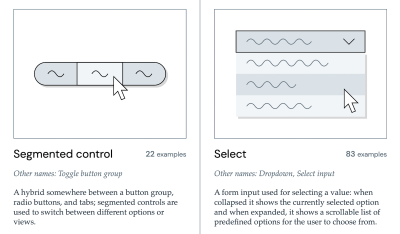
To bring clarity to UI component terminology, researcher Iain Bean built The Component Gallery, an expansive catalog that surveys real-world design systems across the tech industry. The resource indexes over 50 distinct UI component types—ranging from standard accordions and modal dialogs to background utilities like visually hidden accessibility wrappers.
Beyond showcasing concrete implementation examples, The Component Gallery documents the common alternative names and aliases used across different enterprise design systems. This aggregate data allows product teams to analyze industry trends and adopt widely accepted component labels rather than inventing obscure, proprietary titles. For teams seeking a visual interface reference, tools such as Name That UI act as visual dictionaries, allowing designers and developers to align on component definitions based on structural UI characteristics.
User-Centric Frameworks for Naming New Features
While system-level naming impacts internal developer velocity, feature-level naming directly influences user adoption and retention. Software features frequently suffer from low engagement not due to poor functional utility, but because poor discoverability prevents users from recognizing their value. When a feature title relies on internal company acronyms, engineering jargon, or vague marketing terminology, users fail to incorporate the tool into their daily workflows.
UX strategist Erin Gannon authored a practical framework addressing this adoption bottleneck, emphasizing that effective feature naming must be rooted directly in user mental models and job-to-be-done frameworks. A successful feature title should clearly convey the practical outcome or value proposition delivered to the user rather than describing the underlying technical mechanism.
To establish user-aligned feature names, product teams are advised to conduct user research where participants describe the feature’s capability in their own unscripted language. Adopting the exact phraseology and terminology used by target users eliminates cognitive friction during product onboarding, ensuring that newly deployed features are immediately discovered, understood, and integrated into existing user workflows.
Variable Taxonomy Mapping in Complex Multi-Theme Systems
At the enterprise level, managing design variables across dark modes, multi-brand themes, and varied platform viewports requires a formal structural blueprint. The design system team at Vodafone UK developed a comprehensive Variables Taxonomy Map released to the Figma community, demonstrating how complex multi-theme token architectures can be effectively structured and maintained.

Building on the design token methodology popularized by system architect Nathan Curtis, Vodafone’s model breaks token naming down into a multi-tiered hierarchy. The system organizes design variables across four core layers:
- Brand and Primitive Tokens: Core raw values representing the foundational style choices of the brand (such as base color palettes, fixed pixel measurements, and font families).
- Semantic Tokens: Contextual variables that assign purpose to primitives, defining how values should be applied across broad functional categories (such as context-driven feedback states or interactive background fills).
- Component Tokens: Highly specific variables tied directly to individual UI patterns (such as header heights, card borders, or primary button padding).
- Page and Layout Tokens: Top-level structural variables governing page-level layouts, viewports, and application shells.
By organizing tokens into this explicit hierarchy, the variable’s name itself communicates its architectural level, scope, and intended usage context. A developer inspecting a variable can immediately discern where it originates, where it can be safely reused, and what semantic role it fulfills within the visual hierarchy.
Interactive Tools and Inventories for Design Token Management
To assist product teams in constructing custom token structures from scratch, design system consultant Romina Kavcic created The Design Token Naming Guide + Builder. The interactive web tool guides teams through configuring custom naming structures by assembling essential contextual tiers, including component types, visual categories, interactive states, and functional roles.

To complement the interactive builder, Kavcic developed a standardized Design Token Names Inventory framework, utilizing a streamlined four-tier spreadsheet model. This approach provides design system maintainers with a high-level view of their entire variable catalog.
By structuring token inventories across clean, predictable tiers, teams can easily add new color modes, dark themes, or brand variations without breaking existing component relationships. The spreadsheet format allows maintainers to filter, cross-reference, and audit token coverage across various UI components, identifying naming conflicts or redundant definitions before assets are published to production libraries.
Methodologies for Naming Brands, Products, and Services
When product naming expands beyond individual UI elements to encompass entirely new digital services, software products, or standalone applications, teams require structured ideation and vetting frameworks. Selecting an overarching product title requires balancing creative branding with legal domain checks, international linguistic considerations, and search engine discoverability.

The open-source repository Onym serves as a curated library of resources designed specifically for service and product naming initiatives. The platform organizes tools, guides, and methodologies covering every stage of the naming lifecycle—from initial brainstorming exercises and etymological research to brand sprint guides, legal vetting procedures, and directories of specialized naming agencies.
By providing structured prompts and historical case studies, Onym helps product leaders avoid common branding pitfalls, such as choosing names with negative cultural connotations or trademark overlaps. Utilizing these systematic vetting tools ensures that new product titles resonate with target audiences while remaining defensible from a legal and technical standpoint.
Unifying Team Dialects to Eliminate Technical Debt
Ultimately, the goal of establishing disciplined naming conventions is to break down communicative silos between cross-functional product stakeholders. Within many digital product organizations, teams spend significant energy translating between isolated internal dialects: the designer’s dialect, the software engineer’s dialect, the product manager’s dialect, and the end user’s dialect.

When these dialects clash, friction inevitably follows. Low component adoption, redundant code commits, visual regressions, and user confusion are rarely random accidents; they are frequently the direct consequence of naming conflicts and fragmented terminology. Resolving these discrepancies requires treating naming decisions as critical system architecture rather than superficial polish.
When naming conflicts surface during development, product teams should log them into dedicated technical debt backlogs to be formally reviewed and refactored. By committing to shared, well-documented naming structures across design tools, code repositories, and user interface copy, organizations build a common language that streamlines collaboration, accelerates feature delivery, and provides a cohesive user experience.