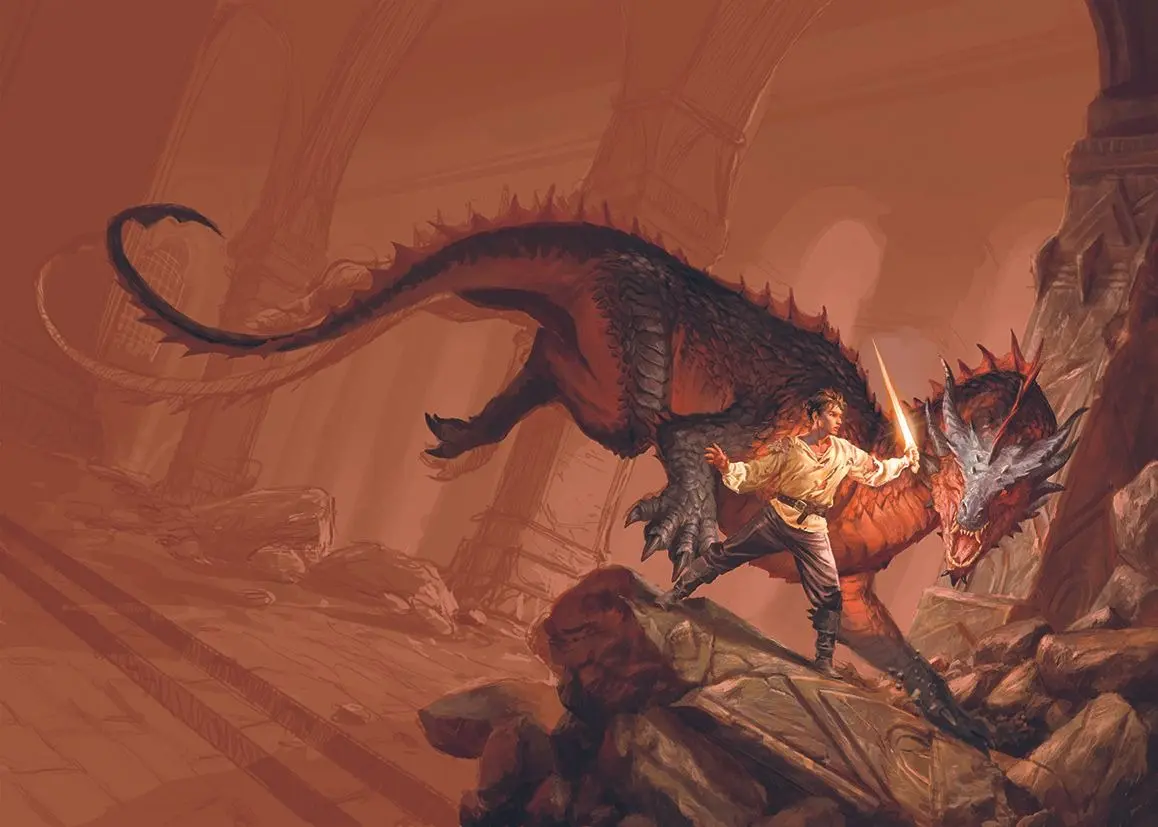
In the highly competitive world of fantasy publishing, a book’s cover is far more than an aesthetic wrapper; it is the first gateway into an imagined universe. For a debut novel, the visual presentation carries even greater weight, serving as the critical hook to capture the imagination of prospective readers. This was the creative challenge presented when the Italian publishing house Armenia Edizioni commissioned a bespoke cover illustration for RF Obsydios’s highly anticipated debut fantasy novel.
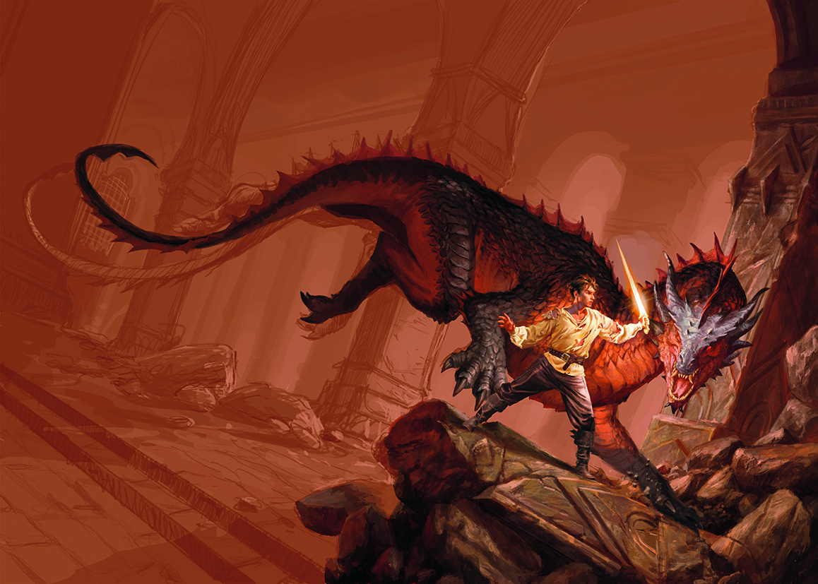
The brief from the publisher was evocative and precise. It demanded a scene that immediately established high stakes and raw physical tension: a young warrior, visibly battle-scarred, wounded, and wearing a torn shirt, standing defiantly against an overwhelming threat. His opponent was to be a colossal, wingless dragon covered in thick, reptilian scales of deep red and black. The battleground was to be an imposing, gloomy fortress characterized by massive, vaulted columns and littered with the fresh ruins of an intense conflict.
To bring this dramatic confrontation to life, the artist drew deep from the well of classic epic fantasy. This particular aesthetic—defined by grand scale, dramatic lighting, and a tangible sense of history—represented the very foundation of the illustrator’s creative upbringing. It was a visual language shaped by the works of master fantasy illustrators of past decades, making the task of conceptualizing the scene both a natural progression and a deeply personal project.
The publisher requested a warm, dramatic color palette dominated by rich reds and fiery oranges, citing the atmospheric tone of Joe Abercrombie’s novel The Devils as a primary reference point. Translating these thematic requirements into a finished digital painting required a methodical, multi-stage creative process, utilizing professional digital art software and high-performance drawing tablets to achieve the necessary depth and detail.
Start with a sketch
For many digital artists, the preliminary phase involves generating dozens of variations, but a streamlined workflow can often yield more cohesive results. In this case, the development process began with just one or two focused black-and-white sketches. The primary goal of this initial phase was not to finalize fine details, but to establish a clear structural foundation.
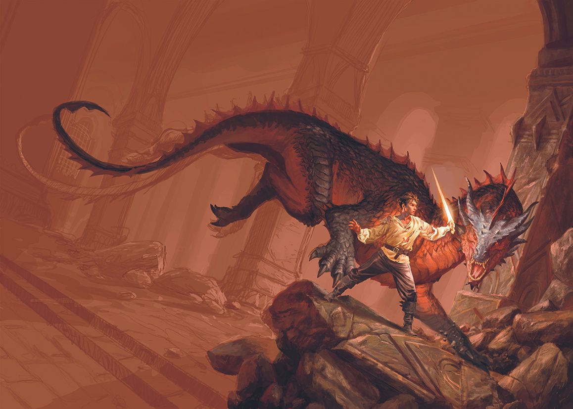
By working strictly in grayscale, the artist could focus entirely on the core pillars of visual storytelling: composition, lighting, and volume. This minimalist approach is highly effective for commercial commissions. It allows the illustrator to present a clear, unambiguous creative direction to the publishing house without the distracting influence of color.
Through these early value studies, the placement of the warrior, the sweeping curve of the wingless dragon, and the towering architecture of the ruined fortress were defined. Once the client approved the compositional framework, the complex task of rendering could begin in earnest.
Painting the figure
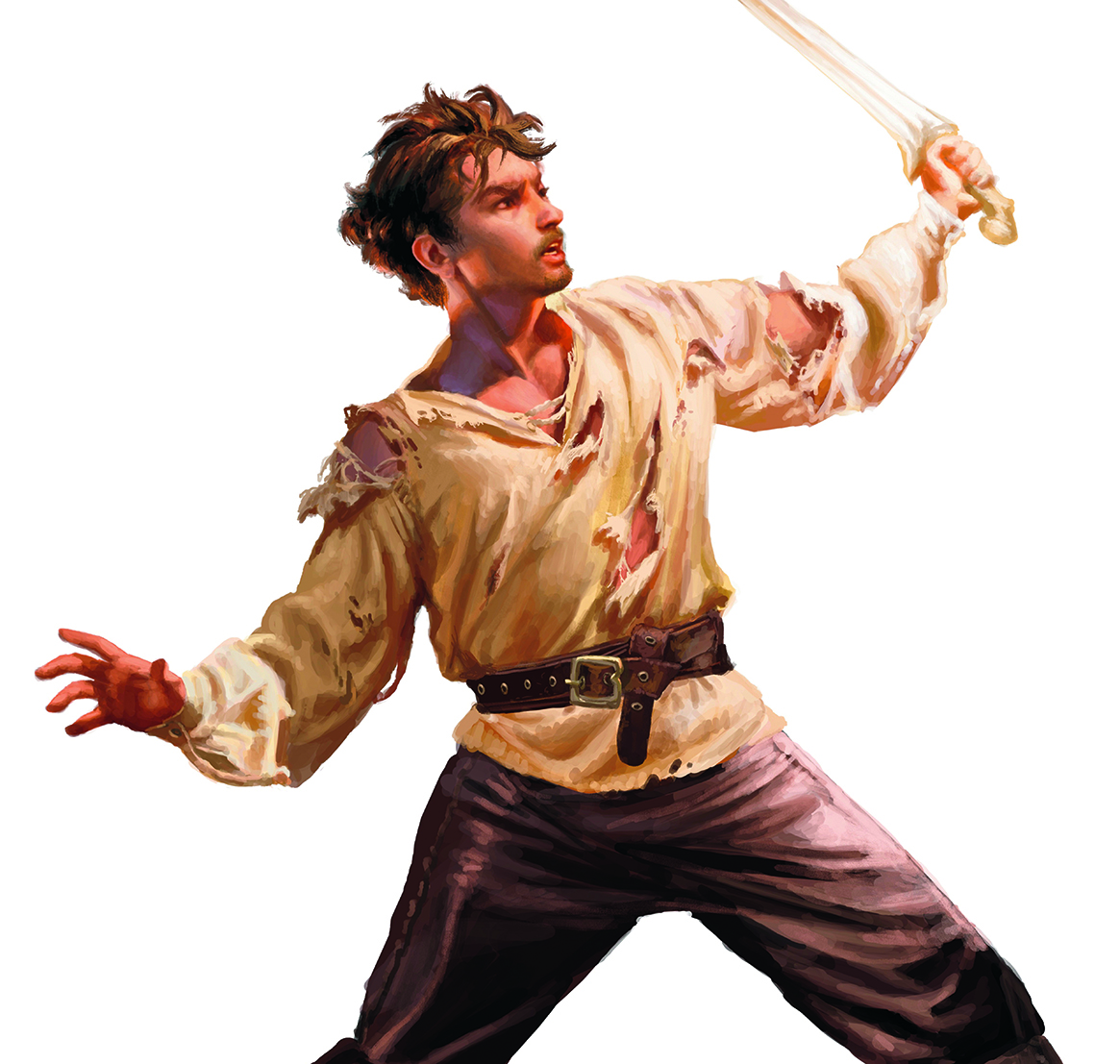
The central emotional anchor of the cover is the young warrior. To ensure this character received the focus and detail required to carry the narrative weight of the scene, the artist opted to paint the figure in isolation.
By working on the character separately in a larger, high-resolution format, the artist could concentrate on the nuances of anatomy, the texture of the battle-worn skin, the tears in the fabric of his shirt, and the reflective qualities of the sword blade. This isolated workflow prevents the artist from being distracted by the surrounding environment, ensuring that the focal point of the entire cover is rendered with maximum precision.
Once the painting of the warrior was fully realized, the layer was resized, rotated, and positioned into the master composition. This digital flexibility allowed for perfect integration into the broader scene while preserving the high-fidelity details established during the isolated rendering phase.
Building the scene
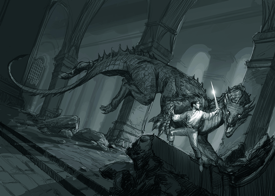
With the central figure established, the focus shifted to constructing the interactive environment. A successful book cover relies on a cohesive relationship between all of its moving parts, meaning the character, the monster, and the background must feel as though they occupy the same physical space.
The illustrator prioritized establishing the primary narrative elements first—the warrior, the dragon, and the immediate ruins around them. This stage is crucial for evaluating the overall balance of the image. By block-rendering these elements early on, the artist can assess whether the spatial relationships are working and identify any compositional imbalances before investing time in fine detailing.
Observing how the light from the unseen, fiery sources bounced off the warrior’s skin and the dragon’s dark scales helped solidify the integration of the characters into the atmospheric, ruined fortress.
Forming the legs
One of the most complex technical challenges of the illustration lay in designing the anatomy of the wingless dragon, particularly its massive hind legs. Unlike winged dragons, which often borrow anatomical cues from bats or birds, a wingless, terrestrial dragon demands a heavy, grounded muscular structure reminiscent of large apex predators or prehistoric reptiles.
The goal was to make the creature’s body express dynamic movement and tension. The artist carefully designed the curvature of the dragon’s hindquarters and legs to form a sweeping visual line. This curve serves a dual purpose: it conveys the immense physical power of the beast as it corners its prey, and it acts as a subtle compositional tool, naturally guiding the viewer’s gaze back toward the main confrontation between the dragon and the warrior. Achieving this balance of anatomical believability and compositional utility required multiple iterations and careful anatomical study.
Creating the column
To ground the fantasy elements in a believable reality, the environment required a sense of ancient history and physical weight. The artist dedicated significant attention to the fallen column lying in the immediate foreground, using it as a key element of environmental storytelling.
To convey the rough, weathered texture of ancient stone, the illustrator utilized digital "dry" brushes and subtle, organic color variations. By painting fine scratches, deep fractures, and battle-inflicted cracks onto the surface of the pillar, the stone was given a tangible, tactile quality.
The broader concept for the fortress itself was heavily inspired by the monumental, subterranean architecture of the Mines of Moria from classic fantasy lore. The goal was to make the environment feel dark, colossal, and ancient—a place where grand civilizations once stood, now reduced to a grim arena for a desperate struggle.
The angle
Compositional choices dictate how a viewer feels when looking at an image. To amplify the inherent danger of the confrontation and heighten the emotional stakes, the artist employed a tilted camera shot, often referred to in cinematography as a Dutch angle or canted frame.
By deliberately tilting the horizon line, the artist stripped the scene of stability and comfort. This compositional technique is incredibly effective for emphasizing dynamism and drama. It creates a sense of immediate imbalance, making the viewer feel as though they have stepped directly into the middle of a chaotic, fast-moving battle where the outcome is entirely uncertain.
Period detail
In the digital art age, the value of physical reference material cannot be overstated. Over years of professional practice, the artist accumulated a collection of historical-style clothing, armor pieces, and various fabric scraps specifically for this purpose.
For this cover, these physical items proved invaluable. By draping the fabrics and assembling makeshift costumes, the artist was able to take real-life reference photographs under controlled, specific lighting conditions. This process provided accurate visual data on how fabric folds, how tension affects drapery, and how shadows fall across complex surfaces. Bridging the gap between physical reality and digital imagination in this manner allowed the artist to inject a high degree of realism into the warrior’s clothing and the overall atmospheric lighting of the final piece.
Today’s best drawing tablet deals
For digital artists looking to replicate this traditional-meets-digital workflow, having the right hardware is essential. Achieving the delicate brushwork seen in the weathered stone columns or the complex rendering of the dragon’s scales requires a drawing tablet with high pressure sensitivity and pen precision.
The professional landscape offers a wide array of options, from pen displays that allow you to draw directly onto a screen to highly portable pen tablets that connect to external monitors. Investing in the proper tools, combined with a dedicated study of composition and lighting, remains the foundation for creating compelling, industry-standard fantasy illustration.
This article originally appeared in ImagineFX. Subscribe to ImagineFX to never miss an issue, with print and digital subscriptions available worldwide. You can also download the Creative Bloq app for iOS or Android for streamlined access to the latest news, tutorials, and inspiration from the worlds of art, design, and technology.