Introduction: From Blank Screen to Superfamily
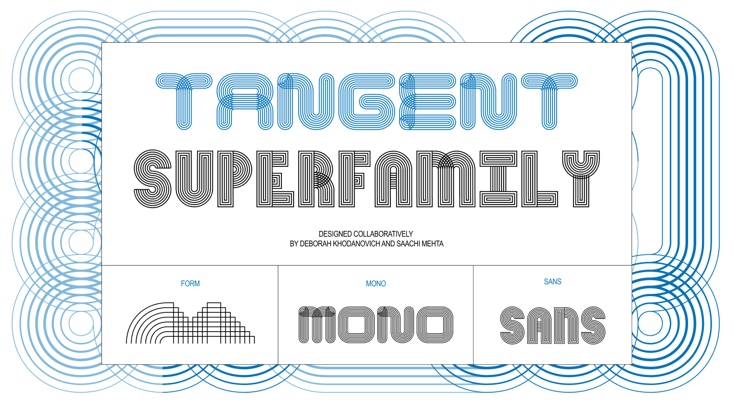
In the fast-paced world of experimental typography, collaborative projects often begin with a single spark of inspiration, a shared obsession, or an open-ended classroom prompt. For designers Deborah Khodanovich and Saachi Mehta, the journey that led to the creation of Tangent—an intricate, on-going generative type system—started in a classroom setting and quickly evolved into a sprawling typographic ecosystem. What began as a modest exploration of modular shapes under the guidance of instructor Kelsey Elder transformed into a comprehensive superfamily encompassing multiple weights, styles, and a sophisticated five-axis variable framework.
Written in the conversational, reflective style of a design-duo detailing their own creative retrospective, the story of Tangent highlights the unpredictable nature of modern type design. It is a narrative about embracing generative rules, exploring digital scripting, leveraging physical prototyping, and discovering how two distinct creative skill sets can harmonize to build something entirely unexpected.
Pit Stop 1: (Crossed) Pathways
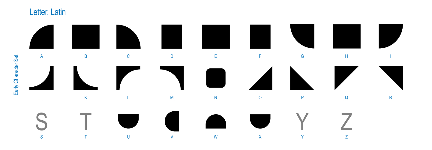
The genesis of Tangent dates back to Kelsey Elder’s Variable class at the Rhode Island School of Design (RISD), specifically during an assignment titled Kit-Car. The brief challenged students to look closely at the world around them, drawing inspiration from toys, family heirlooms, optical illusions, and everyday patterns. Channeling the spirit of artist Sister Corita Kent—whose philosophy famously urged students to learn to see the world one piece at a time—the assignment required designers to break down visual sources into fundamental shapes, create modular components, and assemble a set of static glyphs.
From the outset, Deb and Saachi knew they wanted to collaborate. They sought a starting point that was inherently modular, allowing them to pass files back and forth seamlessly. At the time, both designers were independently circling a shared conceptual obsession: stories, dialogue, gossip, and the fascinating ways that ideas converse, connect, and evolve from one person to another.
This thematic focus raised a compelling design question: what would a typeface look like if every individual glyph remained physically and conceptually connected to its neighbors? To answer this, they began drawing the simplest modules possible. Saachi found inspiration in the continuous, twisted over-under qualities of ribbons, while Deb explored custom path-drawing mechanics found within video game environments like Animal Crossing. Despite exploring different rabbit holes, both designers arrived at the same destination, gravitating toward textile-inspired forms such as knitting, weaving, and embroidery.
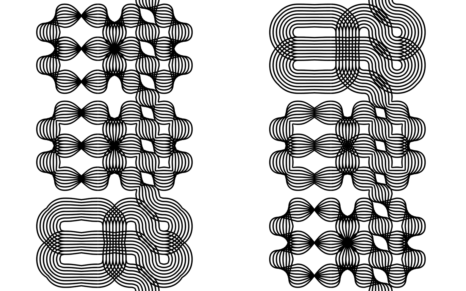
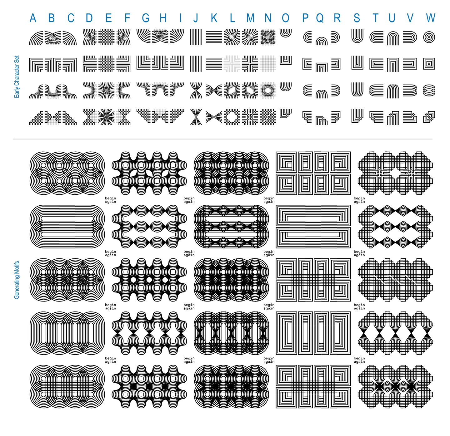
They quickly transitioned from solid connected shapes to layered strings of parallel lines capable of weaving in and out of one another like thread. This weaving concept formed the core mechanic of the first official version of the project: a single weight, single axis, completely modular pattern-making font built on round, square, twisted, and untwisted components.
The underlying conceptual framework explored how oral storytelling and gossip shift shape, mutate, and twist over time as information travels through dialogue. Armed with this conceptual foundation, Deb and Saachi began sketching side-by-side on the same screens and physical sheets of paper, establishing an initial grid of parts designed to link together fluidly. Once the basic connections functioned correctly, the collaboration truly took off.
Pit Stop 2: (Finding Our) Axes
As the modular system began to take shape, instructor Kelsey Elder posed a crucial practical question: how does a person actually type with a system like this? While a twisting, modular, connecting system is an exciting conceptual exercise for its creators, sitting down to type standard text with it presents significant usability hurdles.
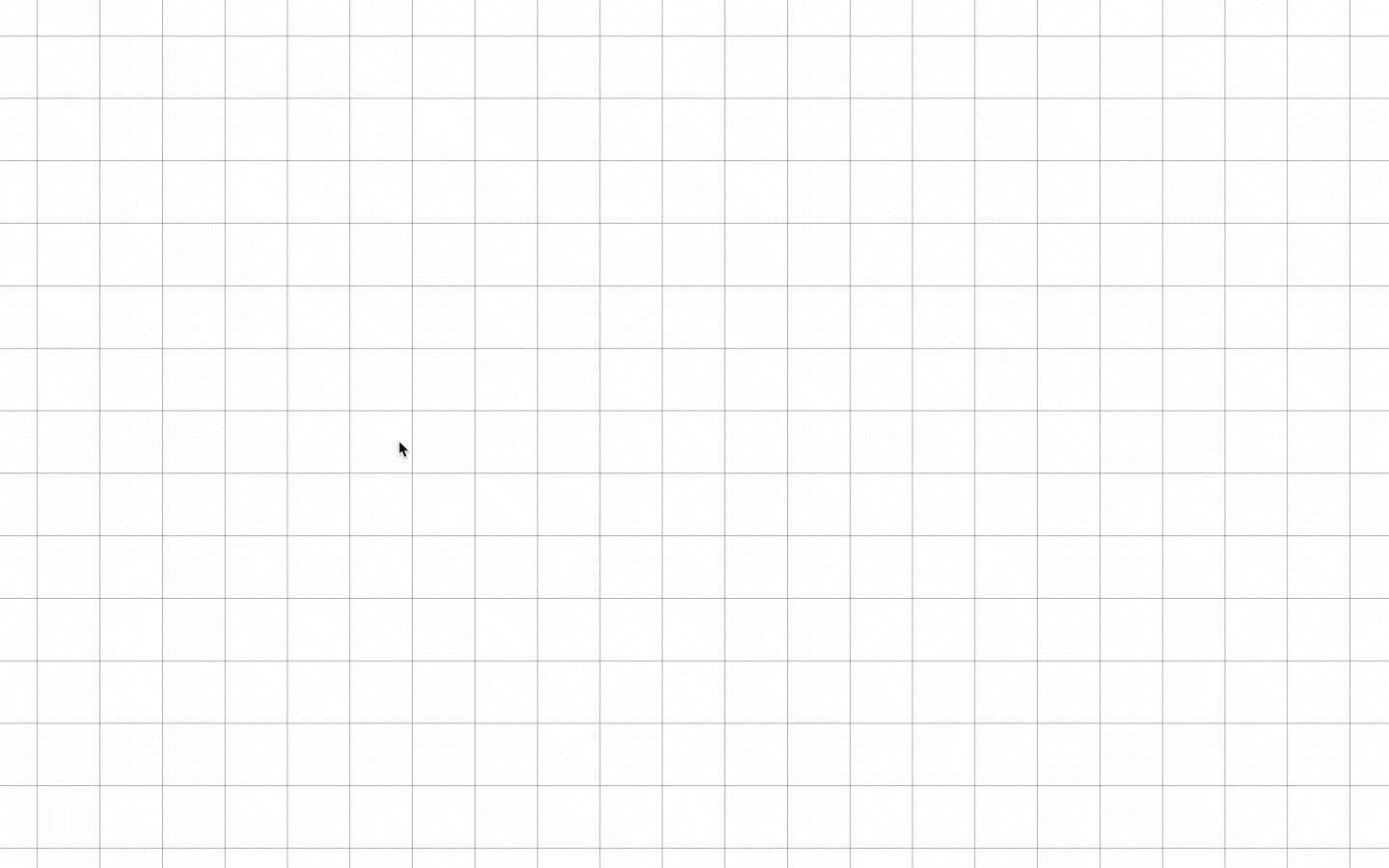
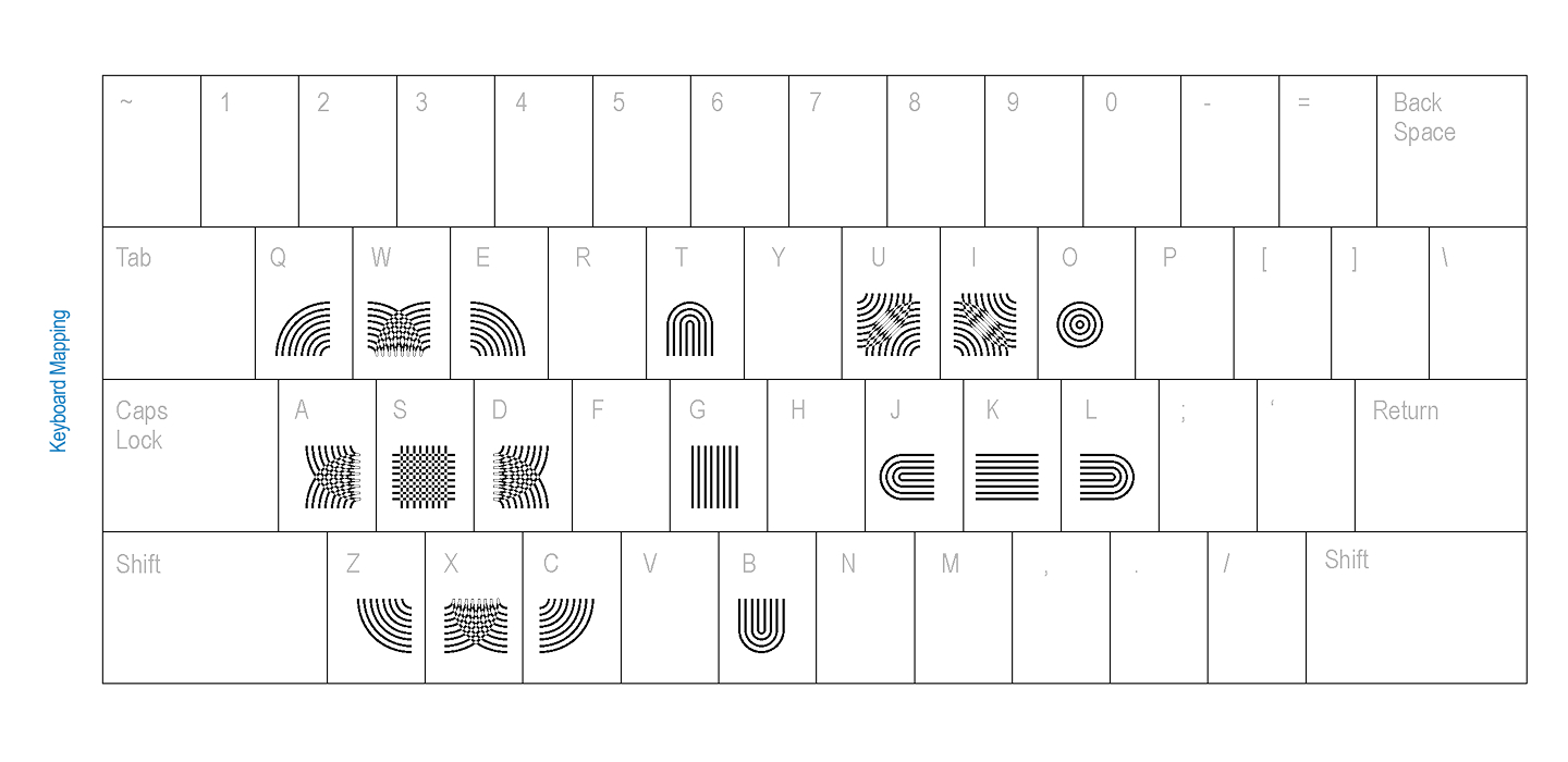
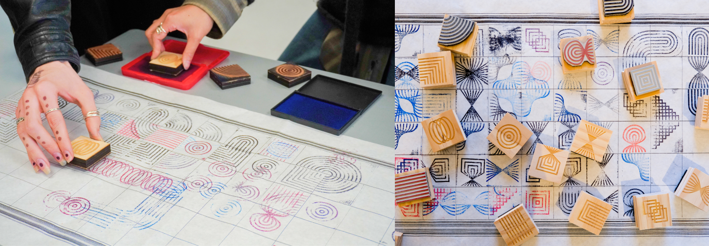
To solve this challenge, Elder suggested running keyboard mapping tests with their peers. By looking at how digital games handle complex inputs, the designers sought to determine the most intuitive ways to assign connecting parts to specific keys. Alongside digital mapping, the duo embraced physical prototyping. They manufactured custom rubber stamps, inviting peers to stamp the glyphs onto long physical grids to experience the modularity tactilely rather than purely on a screen.
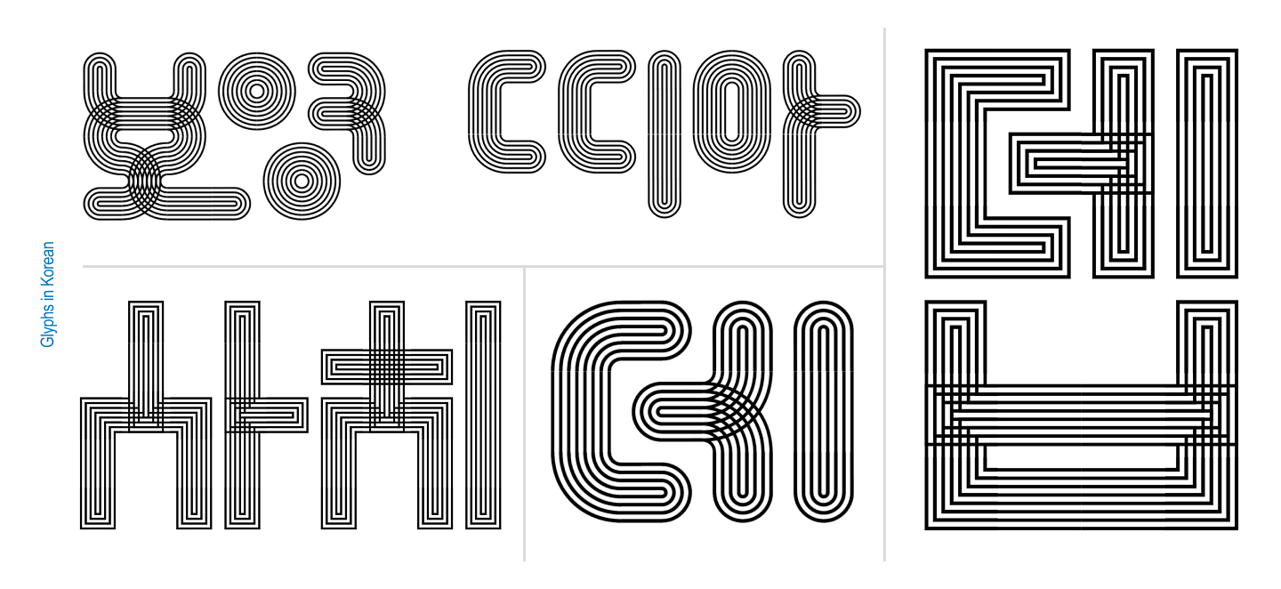
They also experimented with alternative input methods, developing a Processing sketch that allowed users to draw their way into the system rather than relying on traditional keyboard typing. Interestingly, because the workspace was populated by graphic designers, a spontaneous behavior emerged. Without any prompting from Deb or Saachi, participants immediately began arranging the modules into recognizable Korean and English letterforms.
Pit Stop 3: (Going off on a) Tangent
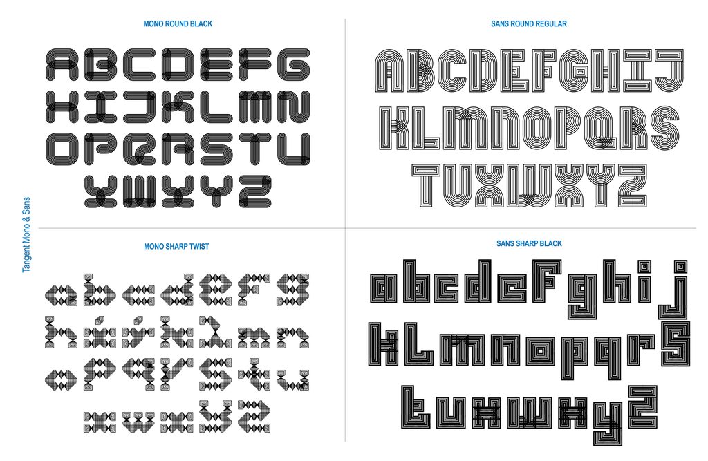
The instinctive urge of their peers to form letters served as a major turning point for the project. Recognizing this natural pull toward typography—especially within the context of a variable type class—the designers expanded their grid dimensions and began constructing full alphabets equipped with contextual alternates. They tested vibrant color combinations and attempted to design a sans-serif variant. At this stage, the project crossed the threshold from an experimental modular pattern system into a fully realized typeface named Tangent.
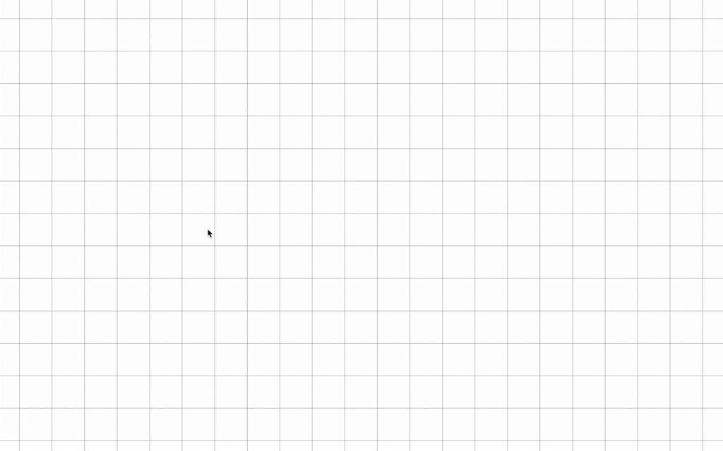
The generative nature of the work soon invited deeper computational exploration. Challenged by Elder to explore what would happen if a computer were instructed to generate every possible permutation of the system, the designers established strict rules. They utilized a three-by-three grid requiring every spot to be utilized, demanding that all elements connect, placing a strict cap on empty slots, and prohibiting the rotation of pieces to cheat the system.
Deb collaborated extensively with Claude to refine the underlying script. Eventually, the script successfully generated 971 unique glyphs. True to their background as type designers, the creators immediately began identifying letterforms hidden within the generated noise, an exploration that ultimately gave birth to the Mono version of the typeface.
Pit Stop 4: (It takes a) Superfamily!
With the sans and mono variants established, Elder introduced yet another provocation: what happens when the typeface moves? This question pushed the project firmly back into variable typography territory. Deb and Saachi built out a comprehensive five-axis system incorporating twist, weight, amplitude, stretch, and radius across both the Sans and Mono versions of the typeface.
Managing a complex five-axis variable workflow proved to be an arduous technical challenge. The design software Glyphs frequently rebelled against their intricate setups, occasionally refusing to export the typeface files correctly. In those moments of frustration, the collaborative partnership proved invaluable. Whenever one designer hit a roadblock with the software, they simply passed the file to the other. With a fresh pair of eyes, the receiving partner could step in, untangle the technical logic, and solve the problem.
Because the project remained inherently generative, the designers maintained a running list of potential new axes and spinoff versions that the superfamily could grow into. Even when they believed the work was finished, new concepts continuously emerged.
Reflecting on the journey, Deborah Khodanovich and Saachi Mehta opened the project up to the broader creative community. They extended an open invitation for fellow designers to experiment with Tangent for posters or other creative projects by reaching out for font files. Furthermore, they positioned the completed superfamily as a unique typographic solution for brands seeking a weird, connective, and story-driven visual identity.
About the Designers
Deborah Khodanovich
Deborah Khodanovich (she/her) is a Toronto-born designer and educator based in Providence, Rhode Island, having recently completed her Master of Fine Arts in Graphic Design at the Rhode Island School of Design. Her creative practice explores gossip as a distinct method for producing and sharing knowledge, closely examining information networks and intimacy as foundational design methodologies. Working across typography, textiles, and publishing, her work questions traditional structures of knowledge creation, circulation, and value attribution.
Saachi Mehta
Saachi Mehta (she/her) works at the intersection of visual design, motion graphics, and complex systems, translating conceptual ideas into cohesive visual experiences across identity, environmental, and editorial applications. Drawn to building scalable design systems, she has also shared her expertise in education, having taught Motion Design at the Rhode Island School of Design, where she earned her MFA in Graphic Design. Her professional background includes graphic and motion design work for organizations such as the RISD Museum, Netflix, and HP.