The intersection of typography, history, and early childhood education offers a rich landscape for graphic design. For type designer Sabrina Lopez, this intersection became the foundation for a deeply researched, multi-year project: the creation of Didactica, a comprehensive typeface family specifically tailored for children’s literacy, learning materials, and educational publishing.
Designed to navigate the nuances of how children learn to read and write from kindergarten through the early years of primary school, the project bridges centuries of handwriting evolution with modern digital typography. The resulting superfamily stands as a testament to the complex requirements of educational design, balancing legibility, historical precedent, and the physical realities of how humans form letters.
What to Design Next? The World of Early Literacy
The journey began with a fundamental question familiar to many designers seeking a meaningful brief: what should come next? Lopez wanted to tackle a design challenge that involved a rich graphic universe and a compelling subject—handwriting. The goal was to create a typeface explicitly intended for children, destined for play-based, didactic, and educational materials.

This ambition required stepping back to examine how letters are taught during the various stages of literacy acquisition. Young learners need letterforms that are exceptionally easy to recognize, read, and—crucially—write by hand. To establish the parameters of her design, Lopez dedicated weeks to researching historical documents, contemporary teaching methods, and global handwriting models.
Key resources included Modern Handwriting: A Historical Survey by Typotheque and Primarium, a comprehensive study mapping the handwriting models taught in primary schools across more than 40 countries. Utilizing the geographic insights provided by Primarium, Lopez gained a global perspective on diverse educational approaches and the varying standards used around the world.
Learning from Global Models and Historical Roots
Among the global educational systems examined, Australia’s highly developed teaching framework stood out. The country utilizes specific digital fonts tailored to individual regions, accompanied by extensive support resources for educators. These materials include practical guides detailing common student errors and solutions, articles on the cognitive benefits of handwriting, and insights into how writing connects to student self-esteem.

Crucially, these educational materials treat writing not merely as a static visual output, but as a dynamic system of movements. Instruction emphasizes live demonstrations of letter construction alongside verbalization—the practice of speaking aloud the description of the physical movements being executed.
Much of the official Australian bibliography draws inspiration from Tom Gourdie’s The Ladybird Book of Handwriting. Originating in England during the 1960s, Gourdie’s Simple Modern Hand method promoted the use of italic scripts through a progressive, staged approach. Instruction begins with disconnected letterforms and culminates in a partially connected cursive. Throughout the process, the structural integrity of the letters remains consistent; the only variable is how they connect.
This historical thread led Lopez to England to study the broader phenomenon of the "Italic Revival." As her former teacher Ewan Clayton explains in his essay A History of Learning to Write, mid-20th-century educators developed various italic-based programs branching from two primary historical starting points. Some programs drew inspiration from early 16th-century models characterized by angular, compact letterforms, such as those by Ludovico degli Arrighi in his 1522 work La Operina. Others looked toward the more expansive, cursive forms proposed by Giovanni Francesco Cresci in 1579, featuring rounded, slanted shapes designed for seamless connection. Gourdie’s work aligned closely with this latter, more fluid tradition.

Italy occupies a foundational place in this lineage, as modern cursive roots trace directly back to Renaissance models. The Italian chancery hand eventually evolved into the English roundhand style that dominated writing education until the middle of the twentieth century. Tracing this 500-year trajectory demonstrates how shifting tools, writing supports, pedagogical methods, and cultural contexts continuously reshape letterforms over time.
Taking Shape: Translating Research into a Design Space
Armed with historical insights and contemporary pedagogical principles, Lopez established strict rules for the Didactica design space. The plan called for two primary companions: a disconnected alphabet and a partially connected cursive alphabet, sharing identical underlying forms, structures, and proportions. These were paired with simplified capital letters derived from Roman capitals, but restrained in their horizontal proportions to better suit young readers.
The resulting typeface family spans a robust design space defined by two main axes: a weight axis ranging from Light to Black, and a slope axis supporting vertical and italic options, with intermediate slants accessible via variable font technology.

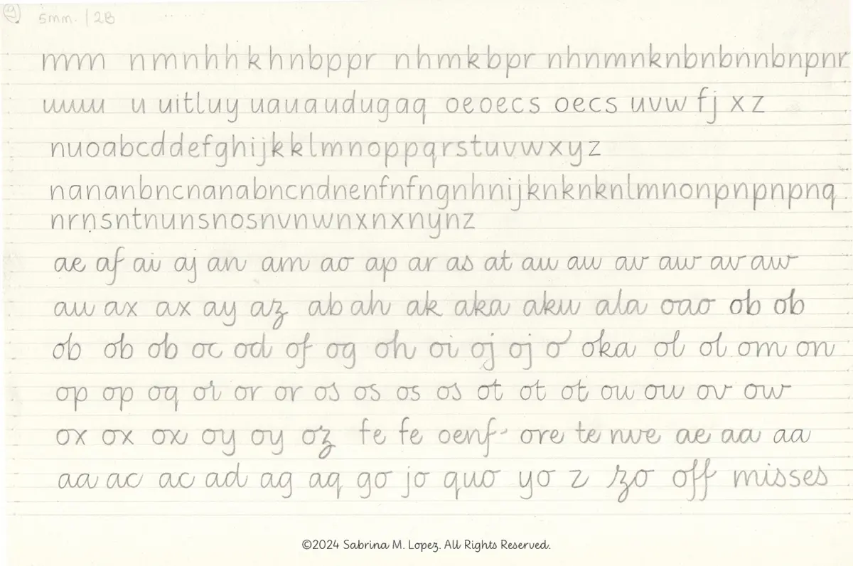
Initial sketching followed Gourdie’s methodological spirit rather than his exact shapes. Lopez drew monolinear lowercase letters featuring generous counterforms and wide spacing. She sought a delicate balance between triangular and oval-shaped eyes while retaining deep bifurcations—a hallmark gesture of italic traditions. Experimenting with various pencil hardnesses, baseline guides, and writing speeds, she explored both vertical and slanted forms, as well as the mechanics of connected versus isolated strokes.
The selected forms were subsequently digitized and refined. Vertical proportions were carefully calibrated: the x-height is notably generous, yet carefully balanced to ensure that ascenders and descenders remain distinct and legible.
The non-connected version of the family was published first, followed a year later by the release of Didactica Cursive, completing the typographic ecosystem. Both versions include color fonts featuring directional arrows that indicate recommended stroke sequences for letter construction, alongside guide lines aligned with the baseline, x-height, ascenders, and descenders. An alternative set of directional instructions tailored for left-handed writers can be accessed by activating stylistic set 4.

Beyond the Classroom
Although Didactica was conceived specifically for children’s educational media, its designer emphasizes that its utility should not be artificially restricted. The clean, fluid, and highly legible forms—honed through rigorous educational research—render the family versatile enough for a wide range of visual communication contexts.
For Lopez, the project served as an enriching entry point into the world of education, sparking a desire to continue contributing to the field. More broadly, the project underscores a foundational belief in the enduring value of handwriting as a deeply human gesture—one worth preserving and celebrating alongside the rapid evolution of digital technology.