When scaling a financial institution across international borders, establishing operational infrastructure such as customer support teams, credit card issuance platforms, and digital onboarding interfaces represents a clear, objective path forward. These are tangible components that a fintech company can systematically check off a development roadmap. But shaping a distinctive brand identity in a crowded, mature market like the United States is an entirely different challenge.
As cofounder Cristina Junqueira explained to Fast Company, crafting the brand is ultimately the hardest undertaking because there is simply no established playbook to follow.
Founded in 2013 with a distinctive purple outline logo composed of mirrored shapes forming the letters for "nu," the company experienced explosive growth over the span of just over a decade. Driven by a digital-first approach that removed traditional banking friction, Nubank’s customer base expanded rapidly until it reached a monumental milestone: serving more than half of all Brazilian adults. Today, the digital bank commands a massive footprint with more than 140 million customers distributed across Brazil, Mexico, and Colombia.
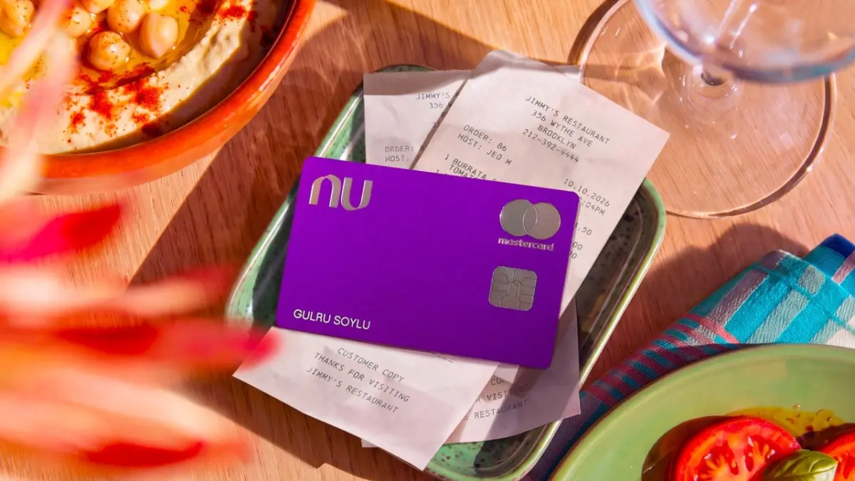
Despite this immense growth and widespread consumer adoption, the company historically kept its visual identity remarkably stable. Throughout its history, its only major brand refresh occurred in 2021, when the firm updated its visual presentation by color-filling its iconic logomark in solid purple. Now, as the organization looks toward the horizon with ambitions for broader international expansion, leadership recognized an urgent need to modernize and sharpen its visual brand for a global audience.
The motivation behind this visual evolution stems from a common phenomenon in the modern technology and finance sectors: over time, unique brand attributes gradually morph into standard category attributes. According to Junqueira, the company’s signature brand color—which once felt bold and disruptive—had effectively become an industry-standard shade across the entire financial technology landscape.
Arthur Foliard, NYC executive creative director at Koto, the creative agency tasked with designing the new visual identity, noted this exact saturation during the development process. Purple, Foliard observed, is everywhere in fintech, appearing more and more frequently as startups and legacy institutions alike attempt to signal modernity, trust, and digital savvy through color choice.
Faced with a sea of competitors adopting similar aesthetic choices, the bank decided against abandoning its signature shade entirely. Instead, the institution chose to keep but thoughtfully refine its industry-defining color. To complement this foundational hue and ensure the brand could stand apart in an increasingly crowded market, the design team introduced a brand-new secondary color palette that interacts dynamically alongside the updated purple. Rather than relying solely on color to make an impression, Nu and Koto opted to evolve a wide array of other core brand elements to secure a distinct position in the market.
Among the most significant visual upgrades is the introduction of a new proprietary typeface, aptly named Nu Sans. This custom font was meticulously engineered to project a friendly, approachable demeanor while serving a dual operational purpose. It functions seamlessly as a large, expressive headline font capable of capturing attention in marketing materials, yet it remains remarkably legible when scaled down to micro-sizes, such as inside a smartphone app interface.
Complementing the typography is a refreshed illustration style designed to project a whimsical and optimistic personality. These visual assets appear across various touchpoints, including a welcoming physical touchpoint: a newly designed welcome kit sent to customers. The kit features physical metal credit and debit cards, opens with a satisfying magnetic closure, and includes custom stickers that reinforce the brand’s playful ethos. Furthermore, the motion graphics developed for digital assets, ranging from kinetic typography animations to smooth app user experience transitions, were engineered to possess a distinct sense of bounce and lively personality.
Reflecting on the overarching aesthetic of the redesigned identity, Foliard noted that the visual language successfully captures a vibrant energy. It feels fun, colorful, and exciting, which may be where the distinct Brazilian heritage subtly shines through. At the same time, the creative teams made a conscious, deliberate choice not to artificially Americanize the brand. Instead of tailoring the aesthetic to fit a narrow regional stereotype, the goal was to craft a sophisticated visual identity that reads as genuinely global, positioning Nu as a borderless financial companion ready to take on the complexities of the American market without losing the soul that fueled its meteoric rise in Latin America.