In software development and user interface design, few challenges are as notoriously persistent as naming things. The terminology chosen to describe design tokens, HTML classes, UI components, code variables, and software features directly shapes how cross-functional teams conceptualize products and collaborate. When naming systems break down, digital product development suffers. Misaligned terminology leads to confusion, redundant work, fragile codebases, and friction between design and engineering teams.
The core challenge often lies in striking the right balance between abstraction and specificity. Names that are too generic fail to convey clear intent, making it difficult for engineers and designers to understand a component’s specific purpose. Conversely, names that are overly specific leave little room for component reuse or system flexibility, forcing teams to write duplicate styles or continuously refactor code. As modern digital products scale across multiple brands, themes, platforms, and teams, establishing systematic naming conventions has evolved from a matter of convenience into a critical operational discipline.
To address this challenge, creators across the web design and development ecosystem have established a variety of specialized tools, open-source repositories, structural frameworks, and tactical guidelines. These resources help product teams establish shared vocabularies, streamline design token architecture, improve feature discoverability, and eliminate the organizational dialects that undermine product velocity.
Understanding the High Cost of Terminology Friction
When product teams operate without a standardized vocabulary, team members naturally create localized dialects. A designer might refer to an interface element as a "banner," an engineer might code it as a "hero-box," a product manager might track it as a "promotional header," and an end-user might perceive it simply as an "announcement." This fragmentation generates hidden operational drag across the product lifecycle.

This disconnect is particularly visible in design systems, where design tools must synchronize seamlessly with front-end code repositories. When a variable name in a design environment like Figma does not match the corresponding variable in a code repository, simple updates require manual interpretation, increasing the likelihood of visual bugs and architectural drift.
Moreover, naming issues extend beyond internal team workflows to directly affect user adoption. When software features are named based on internal technical logic rather than user mental models, discovery drops significantly. Users struggle to understand the utility of a tool if its label fails to clearly articulate its outcome or function.
Expanding Conceptual Vocabulary for Code and Markup
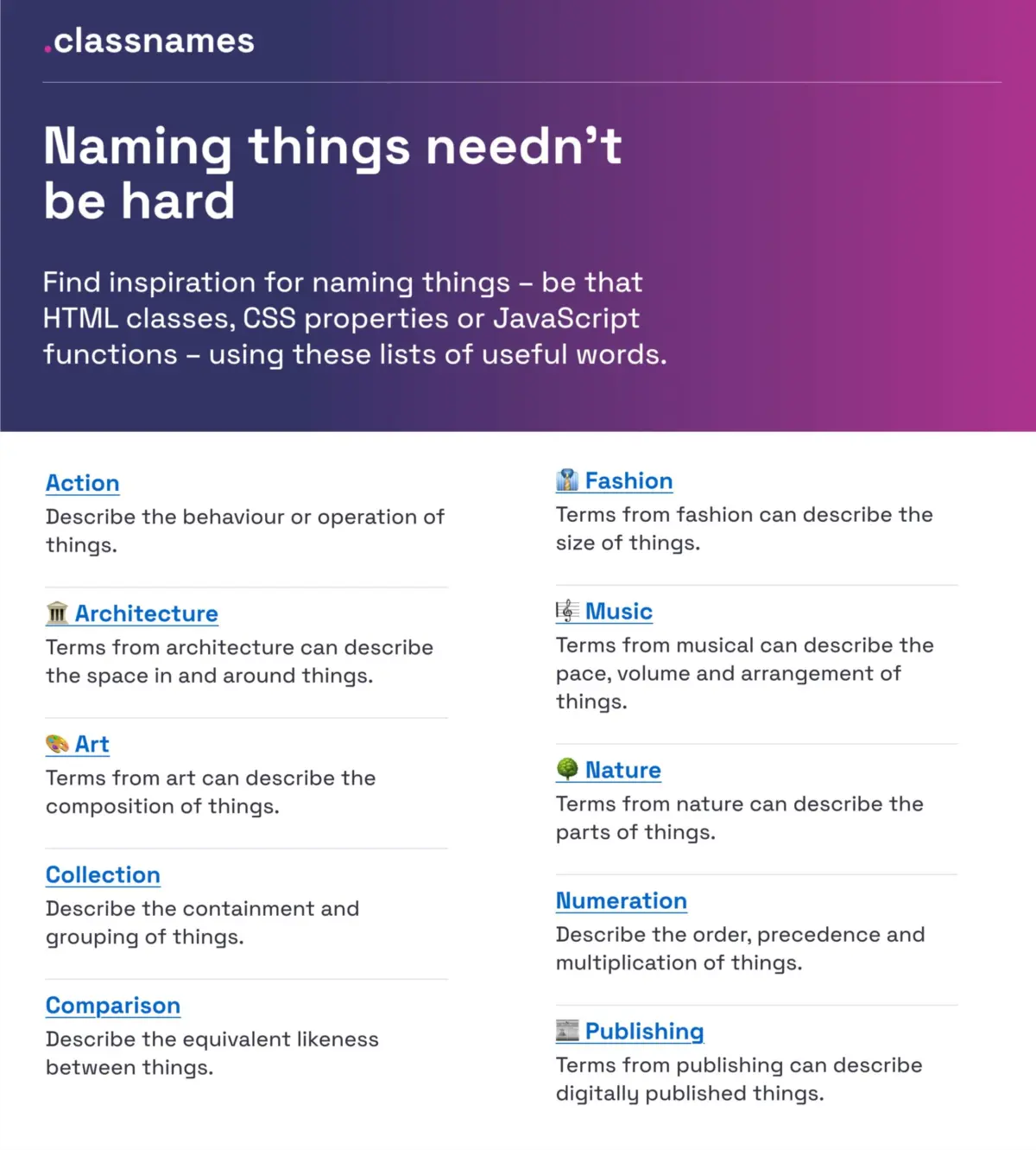
When naming HTML classes, CSS properties, or JavaScript functions, developers frequently default to overused, uninspired terms that fail to reflect structural nuance. To encourage broader conceptual thinking, web developer Paul Robert Lloyd created Classnames, a resource designed to help engineers look beyond conventional nomenclature when building web interfaces.
Classnames provides thematically grouped word lists organized around concepts such as behavior, likeness, sequential order, structural grouping, and conceptual association. Rather than relying solely on standard technical jargon, the directory introduces terminology drawn from varied disciplines, including nature, art, theater, music, architecture, fashion, and print publishing.

By borrowing metaphors from established structural and creative fields, developers can construct semantic class structures that are both descriptive and adaptable. For example, architectural terms can offer intuitive models for spatial layouts, while theater or music terminology can inspire nuanced labels for state changes, orchestrations, and interactive sequences in code.
Establishing Systematic Precision in Color Naming
Color palettes represent one of the earliest friction points when scaling a design system. Assigning literal visual names like dark-blue or generic identifiers like blue-02 quickly leads to management issues when brand guidelines evolve or dark modes are implemented. To establish clarity at the base layer of color management, developer David Aerne maintains an extensive open-source color name repository containing over 30,000 unique color identifiers.
Derived from diverse reference materials and thousands of community contributions, the repository couples algorithmic precision with human readability. To make this vast database actionable for designers and developers, the project features a dedicated color picker, name search tools, and specialized utilities such as Color Parrot—a tool that returns precise semantic names for any submitted color code.
While primitive color names serve as a foundational reference, systematic product design requires abstracting these raw values into semantic tokens. However, having access to a standardized visual dictionary allows teams to clearly differentiate subtle palette variations before binding them to functional application states.

Structuring Layers, Groups, and Visual Assets
In design environments such as Figma, layer organization frequently degrades into a chaotic mix of default labels like "Frame 402" or visually descriptive names like "Red Button Big." Design practitioner Javier Cuello has outlined a comprehensive set of naming best practices aimed at creating maintainable, scalable structures for layers, groups, and components.
According to Cuello’s principles, an effective layer or component name must follow a predictable logical structure. It should be concise, clear, easily understood across disciplines, and explicitly decoupled from hardcoded visual characteristics. Defining a component by its visual appearance—such as its color or absolute size—creates immediate technical debt if those visual properties change during a redesign.
Cuello’s guidelines emphasize structural rules and provide practical comparisons of effective and ineffective naming approaches:
- Avoid visual dependency: Name components based on their function or semantic role rather than their visual style (e.g., using
button-primaryinstead ofblue-large-button). - Establish predictable hierarchies: Use structured forward-slash or dot notations to denote context, variant, and state (e.g.,
component/card/article/hover). - Maintain cross-functional alignment: Ensure that layer structures in design files closely mirror the component DOM trees and object models used by front-end engineers.
- Standardize token variations: Apply consistent naming rules for sizing scales, spacing units, and structural groupings across the entire component library.
By enforcing these practices, product teams can maintain clean design files that export cleanly into code, drastically reducing manual handoff effort.

Enterprise Design Token Taxonomies: Insights from Intuit and Vodafone UK
As organizations scale to support multi-brand and multi-product ecosystems, design token architecture becomes the critical bridge between design intent and engineering execution. Design tokens—key-value pairs representing design decisions like color, typography, elevation, and spacing—require a systematic hierarchy to remain manageable across multiple applications.
At enterprise financial software giant Intuit—parent company of products including QuickBooks, TurboTax, Mailchimp, and Mint—design systems manager Nate Baldwin documented the transition to a unified design token taxonomy. The team needed to replace a legacy token structure that struggled to support diverse brand identities and complex application needs.
Intuit’s revamped taxonomy decoupled brand-specific visual attributes from underlying core platform mechanics. By establishing multi-tiered token relationships—moving from raw primitive values to semantic aliases and component-specific tokens—Intuit created a flexible system capable of driving distinct visual identities across vastly different financial platforms without sacrificing core engineering consistency.
In a similar effort, the Vodafone UK Design System team published their Variables Taxonomy Map, an open-source Figma community resource built upon established design token methodologies, including foundational work by design systems leader Nathan Curtis.

The Vodafone UK framework maps out four distinct token collections that organize design variables from baseline primitives to contextual page layouts:
- Global Primitives: The foundational layer containing raw, un-contextualized values such as raw hex codes (
color-red-500) or fixed pixel values (pixel-16). - Semantic Aliases: Abstrations that assign functional purpose to primitives based on context (
color-background-dangerorspacing-layout-medium). - Component Tokens: Highly specialized variables scoped directly to specific UI patterns (
button-primary-background-default). - Page and Theme Contexts: High-level configurations that handle multi-brand overrides, dark mode toggles, and view-specific structural rules.
This structured architecture allows any designer or developer to instantly understand a token’s intent, scope, and implementation context simply by reading its systematic name.
Mapping Component Lexicons Across Industry Design Systems
One of the most efficient ways to establish a clear naming strategy for user interface elements is to examine industry standards. Because different design systems frequently assign varying names to identical UI structures, analyzing existing enterprise implementations provides invaluable perspective.
To eliminate the need for manual research across hundreds of documentation sites, design system engineer Iain Bean created The Component Gallery. This resource aggregates interface patterns from dozens of real-world design systems across the web development landscape.
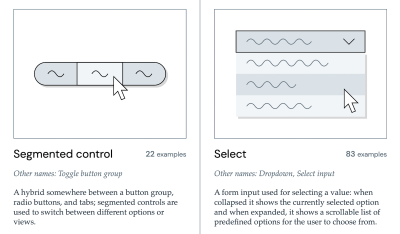
Organized across more than 50 standard UI component categories—ranging from simple accordions and breadcrumbs to complex data tables and visually hidden utility wrappers—The Component Gallery indexes the structural variations and diverse naming conventions used by major technology organizations. For instance, a component serving an alert function might be designated as a "Toast" in one system, a "Snackbar" in another, or a "Notification Banner" in a third.
Complementing this functional index is "Name That UI," a visual dictionary that helps product creators map visual interface patterns to their widely accepted industry terminology. By referencing these aggregate tools, product teams can select naming conventions that align with established industry norms rather than inventing custom, non-standard terms.
Aligning Feature Naming with User Mental Models and Adoption
While component and variable names govern internal code and design architecture, public-facing feature names dictate how users navigate and value a software product. Low feature adoption often stems not from poor engineering or layout design, but from obscure feature labels that fail to convey utility.
UX writer and strategist Erin Gannon addresses this challenge in her feature-naming guide titled "What Do We Call This Thing?" Gannon highlights that feature adoption requires a clear sequence: users must first discover the feature, understand its purpose, attempt to use it, master its workflow, and ultimately integrate it into their routine habits.

If a feature is named using internal project code, overly technical jargon, or obscure marketing fluff, users struggle at the discovery phase. To fix this, Gannon outlines core tenets for feature naming:
- Focus on Outcomes: Name features based on the primary job-to-be-done or desired user outcome rather than the underlying mechanism driving it.
- Leverage User Lexicons: Conduct qualitative user research to observe the natural language, verbs, and phrases target audiences use when describing the problem the feature solves.
- Balance Familiarity and Innovation: Use established domain terminology for common utility features, reserving distinct branding only for truly differentiated capabilities.
- Ensure Contextual Clarity: Ensure feature labels remain clear within secondary UI contexts, such as compact navigation menus, mobile views, and transactional push notifications.
When feature labels match user mental models, discoverability improves, reducing reliance on invasive onboarding tours or complex contextual help prompts.
Interactive Frameworks and Tools for Brand and Token Architecture
To further assist teams building design system pipelines from scratch, independent creators have published specialized interactive builders and organizational tools designed specifically for token taxonomy planning.
Design system designer Romina Kavcic built the Design Token Naming Guide and Interactive Builder, a web tool that guides teams through configuring custom token structures step-by-step. The platform breaks down token strings into configurable attributes—including namespace, object category, sub-component, variant, state, and theme mode—allowing teams to preview and test their taxonomy rules before writing code.

Additionally, Kavcic released the Design Token Names Inventory spreadsheet, a pre-structured matrix organized around a clean, four-level hierarchy. This inventory tool provides a bird’s-eye view of an organization’s entire token ecosystem, allowing teams to filter, manage, and audit variables across complex multi-brand or multi-theme configurations without losing sight of foundational dependencies.
For macro-level decisions, such as naming entire software products, enterprise services, or digital ventures, the open-source directory Onym compiles naming methodologies, research frameworks, brainstorming tools, linguistic etymology databases, and domain vetting resources. By standardizing high-level brand research workflows alongside micro-level variable architecture, product teams can build cohesive brand-to-code pipelines.
Bridging Organizational Dialects to Drive Scalable Product Delivery
At its core, standardizing the language of interface design is about far more than resolving trivial aesthetic debates. It is a strategic effort to eliminate operational friction and improve cross-functional collaboration across software organizations.
When designers, software engineers, product managers, and end-users all operate within a single, unified vocabulary, product development becomes markedly more efficient. Technical handoffs become smoother, design systems scale with far less friction, and digital products become fundamentally easier for end-users to navigate and adopt.

By leveraging structured design token taxonomies, semantic color systems, user-centric feature labels, and community-driven component directories, modern product organizations can eradicate the hidden costs of terminology friction. Investing time in establishing clear, logical, and resilient naming conventions builds a lasting operational foundation—ensuring that design systems and codebases remain adaptable as software products continue to evolve.