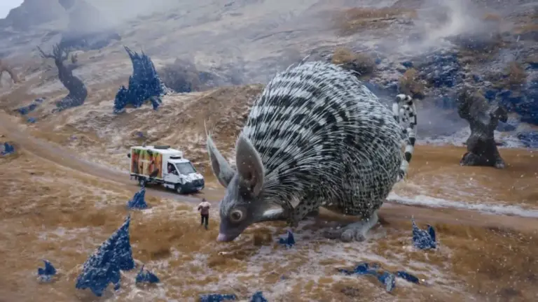
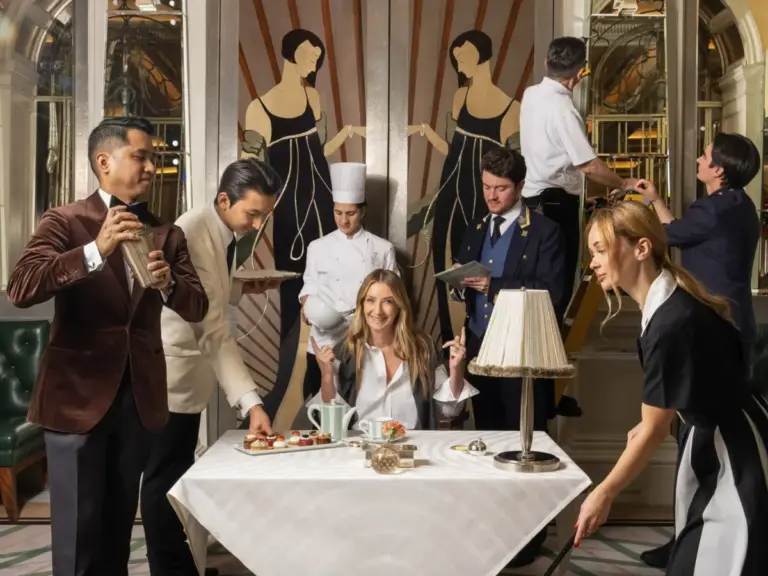
Alphabettes, the prominent international platform celebrating and promoting the work of women in lettering, typography, and type design, has officially debuted a striking new visual identity for its online header. Published on October 1, 2026, the fresh artwork was designed by Samar Zureik, bringing a renewed aesthetic energy to the digital community. The launch marks a continuation of the platform’s ongoing commitment to showcasing exceptional creative work from diverse voices within the global type design industry.
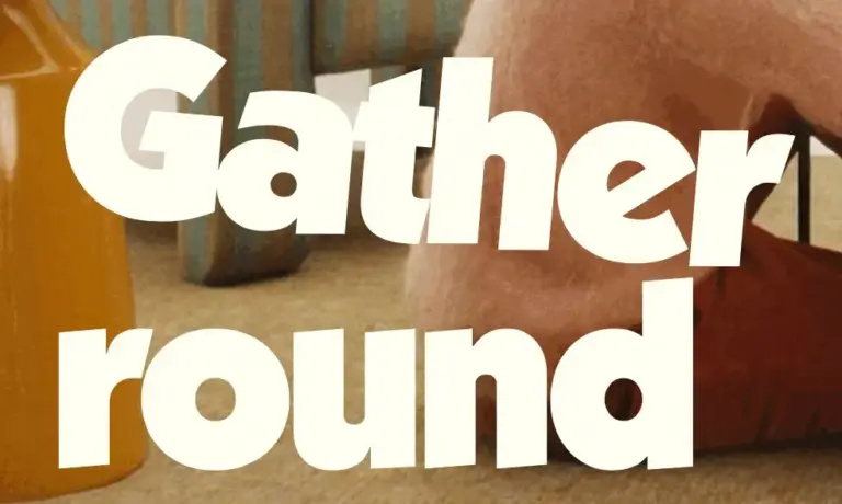
The newly introduced header, integrated seamlessly into the main layout of the Alphabettes website, serves as a visual anchor for the platform. Known for spotlighting specialized disciplines such as custom lettering, love letters, and intricate typeface development, Alphabettes relies heavily on dynamic visual branding to represent its vibrant community. Zureik’s design captures this ethos through a sophisticated arrangement that underscores the intricate artistry involved in shaping letters. The header is featured prominently across the site’s primary pages, greeting visitors with a refreshed artistic perspective that aligns with the collective’s core mission of fostering visibility and connection among women and non-binary professionals in the field.

As a community-driven initiative, Alphabettes has long functioned as a vital hub for typographic discourse, offering insights into type design, educational resources, and professional networking. The introduction of Zureik’s header design arrives as part of the platform’s continuous evolution in its digital presentation. The artwork bridges traditional typographic craftsmanship with contemporary digital aesthetics, reflecting the broad spectrum of styles and applications practiced by the platform’s members. From delicate hand-lettering to robust commercial typefaces, the imagery encapsulates the passion—frequently celebrated under community tags such as #letterlove and #loveletters—that drives contemporary typographers.
The update follows a series of notable creative contributions and discussions hosted on the platform, including earlier explorations of typographic concepts such as the "Tangent Superfamily." By maintaining a steady stream of specialized content curated by contributors from around the world, Alphabettes reinforces its position as an essential resource for both emerging and established designers. Zureik’s header design not only refreshes the site’s immediate visual appeal but also re-centers the platform’s dedication to highlighting the individual artistry that defines modern lettering and type design.
Visitors to the Alphabettes website can now view the new header design across various desktop and mobile viewports, where it scales dynamically to accommodate different screen resolutions. The platform continues to invite engagement from its readership through its active comment section, where community members can share their thoughts, participate in ongoing typography discussions, and connect with fellow enthusiasts and professionals. As the digital space for type design continues to grow, updates like Zureik’s header design ensure that foundational platforms like Alphabettes remain visually engaging and reflective of the talent driving the industry forward.