Home baking packaging infused with a distinct sense of personality is far more likely to capture a consumer’s attention and spark an immediate craving for a sprinkle-topped cake than standard, soul-less packaging that blends into the background. Recognizing this psychological connection between visual appeal and appetite, the baking brand Food Thoughts has leaned into this dynamic with a comprehensive visual redesign that makes the traditional supermarket baking aisle seem instantly more engaging and fun.
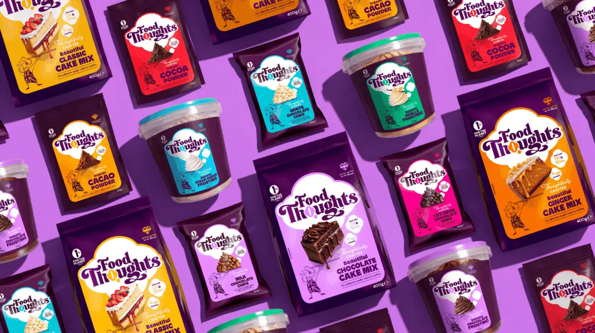
The strategic brand transformation was brought to life by Into the Light, a creative agency tasked with modernizing how shoppers perceive and interact with home baking essentials. At the heart of the redesign is a clever conceptual shift that reimagines the brand’s logo by transforming it into a literal thought bubble. This playful yet clever geometric modification immediately reinforces the brand name while establishing a memorable visual anchor for consumers scanning crowded grocery shelves.
Surrounding this redesigned logo are bright, vibrant color panels meticulously chosen to differentiate the product line. These dynamic panels ensure that every baking mix, frosting, and chocolate variant is exceptionally easy to spot from a distance, reducing friction in the shopping experience and guiding consumers effortlessly to the specific ingredient they need. The color coding serves both a functional purpose for inventory navigation and an emotional purpose, injecting energy and excitement into what has traditionally been a somewhat utilitarian product category.
Adding to the approachable and narrative-driven charm of the packaging is a line-drawn chef character who makes appearances throughout the entire product range. Reminiscent of a beloved character plucked from an old, well-loved family cookbook, the illustrated chef adds a reassuring touch of culinary authority and expertise to the brand. Crucially, the design achieves this without slipping into the overly nostalgic, stuffy, or cliché bakery worlds that can sometimes alienate contemporary home bakers looking for modern convenience and fresh inspiration.
The overall packaging architecture relies on a carefully calibrated combination of playful lettering, rich and inviting colors, and highly indulgent product imagery. Together, these elements allow Food Thoughts to occupy a unique sweet spot in the market. The brand successfully straddles the line between serious, high-quality baking ingredients that deliver professional results and the simple, unadulterated joy of making a really good cake at home.