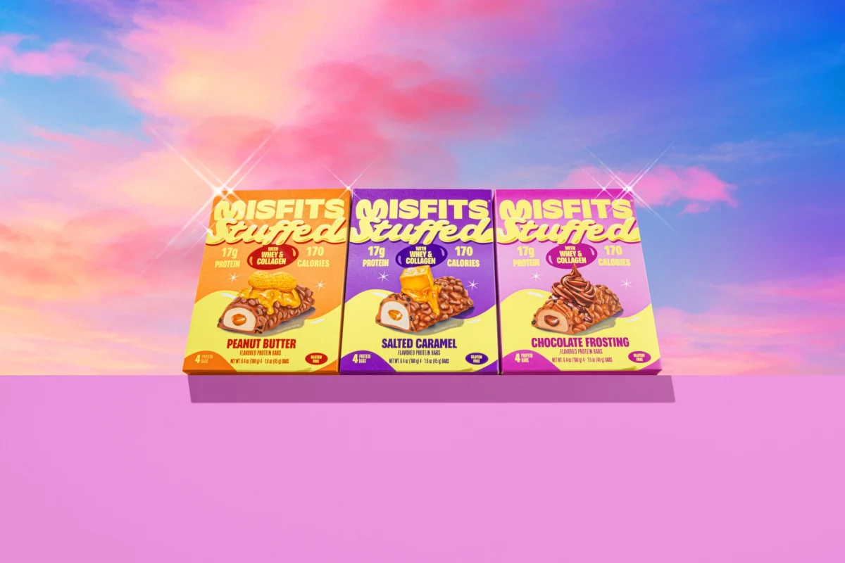
Misfits, a prominent name in the plant-based protein snack market, has recently rolled out a striking brand refresh developed in collaboration with design agency Interact Brands. The updated visual identity deliberately pushes functional snacks out of their traditional clinical or wellness-focused category and directly into candy territory. By wrapping each flavor in punchy color combinations and oversized, creamy yellow lettering, the redesign captures the soft, swollen character of classic confectionery logos. This strategic shift reimagines how plant-based bars can present themselves on crowded retail shelves, prioritizing indulgence and sensory appeal without compromising on nutritional transparency.
At the core of the new packaging design is a departure from the typical, austere aesthetics that have long dominated the protein-bar aisle. For years, functional snacks relied on minimalist layouts, earthy green tones, and stark typography to communicate health, clean eating, and athletic utility. Misfits and Interact Brands have flipped this convention on its head. Instead of signaling dietary restriction or post-workout recovery, the revamped wrappers evoke the unadulterated joy of visiting a candy shop. The color palettes are vibrant and high-contrast, designed to instantly catch the eye of consumers browsing retail shelves or scrolling through digital storefronts.
A key element of this confectionery-inspired transformation is the typography. The brand name and flavor descriptions feature oversized, creamy yellow lettering that boasts a soft, swollen dimension reminiscent of vintage candy packaging. This dimensional typography creates a tactile illusion on a flat wrapper, making the text look as though it has been shaped from soft fondant or molded chocolate. Furthermore, the newly introduced "Stuffed" script curls gracefully across the wrapper, mimicking the appearance of piped icing. These intricate graphic details work in tandem to create a mouth-watering visual experience before the consumer even reaches for the product inside.

Flavor illustrations also play a heavy role in captivating the audience and driving appetite appeal. Rather than featuring abstract shapes or simple ingredient callouts, the new wrappers showcase detailed, vibrant depictions of the bars overflowing with rich fillings. Consumers are greeted with visual promises of oozing caramel, thick frosting, decadent peanut butter, and chunky cookie fillings bursting from the center of the snack. These illustrations reinforce the product’s decadent profile, reassuring buyers that choosing a plant-based, high-protein option does not mean sacrificing rich, dessert-like flavors.
Despite the heavy emphasis on visual indulgence and confectionery styling, the redesign ensures that vital functional information remains immediately accessible. The protein numbers are kept easy to spot, allowing health-conscious consumers and fitness enthusiasts to quickly verify nutritional metrics without having to hunt across the packaging. This balance is critical for modern functional food brands. Buyers want the emotional reward and sensory satisfaction of a treat, but they still demand accountability regarding their macronutrient intake. By making the protein content clear while swathing the rest of the wrapper in candy-shop aesthetics, Misfits successfully bridges the gap between nutrition and desire.
This major visual overhaul arrives at a particularly timely moment for the consumer packaged goods industry. Across the market, brands are increasingly blurring the lines between functional food and everyday treats. Consumers, particularly younger demographics, are moving away from rigid dietary categorizations in favor of a more flexible approach to eating that accommodates both health goals and emotional well-being. Protein bars, once confined to gym bags and specialized nutrition shops, are now impulse purchases found next to traditional sweets in convenience stores, coffee shops, and supermarket checkout lanes.
The collaboration with Interact Brands has allowed Misfits to lean heavily into this cultural and retail shift. Interact Brands has established a reputation for optimizing food and beverage packaging for an era where emotional connection and visual disruption are paramount. By analyzing evolving consumer behaviors and shifting retail landscapes, the agency helped Misfits craft a brand identity that speaks directly to shoppers looking for permissible indulgence. As functional snacks continue to evolve and compete directly with traditional confectionery, this redesign positions Misfits not just as a dietary supplement alternative, but as a genuinely desirable snack option that leads with pleasure first.