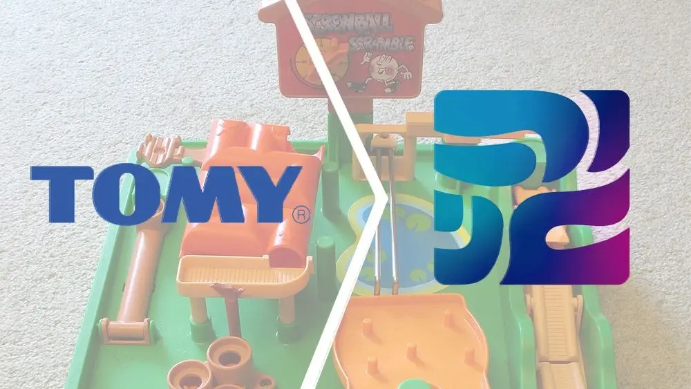
Japanese toy giant Tomy has officially unveiled a comprehensive global rebrand, marking its most significant corporate identity transformation in two decades. As part of this sweeping overhaul, the iconic manufacturer is eliminating its regional naming split, unifying all international operations under a single corporate name—Takara Tomy—and introducing a dramatically redesigned visual identity. Replacing the legacy white and blue logos that have graced store shelves and toy boxes for generations, the new brand architecture introduces a modernized wordmark alongside an abstract geometric icon defined by vibrant color transitions. The announcement represents a major strategic pivot for the enterprise as it seeks to harmonize its global footprint and modernize its corporate image for an evolving international entertainment landscape.
For generations of consumers around the globe, the name Tomy has been virtually synonymous with inventive mechanical toys and tabletop puzzle games. The company’s roots stretch back to 1924, when founder Eiichirō Tomiyama established the enterprise, taking the brand name directly from an abbreviated variation of his own surname. Over the decades that followed, Tomy built an enduring global reputation by pioneering mechanical puzzle games, action toys, and novelties. By the 1980s, products like Pop-up Pirate and Screwball Scramble had secured the brand’s status as a household staple across Western markets. These classic games featured intricate clockwork mechanisms, marble-guiding obstacle courses, and tactile thrill elements that defined the childhoods of millions. Even as play styles shifted toward digital media in subsequent decades, Tomy maintained a robust physical presence in toy stores worldwide.
The organizational landscape of the manufacturer underwent a pivotal structural change in 2006, when Tomy officially merged with Takara, another prominent Japanese toy maker famous for its own rich portfolio of entertainment properties. Following the merger, the consolidated entity adopted the corporate title Takara Tomy across its domestic Japanese market and broader Asian territories. However, outside of Asia, the enterprise chose to retain the simplified "Tomy" moniker for international trade, keeping intact the brand recognition it had cultivated in Western markets over prior decades. This dual-identity model persisted for twenty years, allowing the company to maintain localized familiarity while operating as a combined corporate entity behind the scenes.
The newly announced rebrand brings an end to this long-standing regional bifurcation. Under the updated branding blueprint, the company will standardize its name to Takara Tomy across all global territories without exception. According to official corporate communications, this identity harmonization is designed to align with a broader strategic transition. Takara Tomy is actively repositioning itself from a traditional "toy company" into a modern "play company." To anchor this corporate evolution, the firm is adopting the overarching motto "One Takaratomy," reflecting a centralized approach to global brand management, product development, and customer engagement across all operating regions.
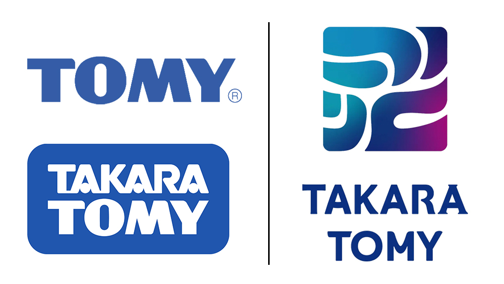
At the heart of this comprehensive rebrand is a striking new visual identity that completely departs from the heritage logos previously used by both Tomy and Takara Tomy. Gone are the familiar blue and red rectangular block wordmarks that characterized the brand for decades. In their place, the company has introduced a minimalist visual mark anchored by a sleek, abstract symbol and a custom typographic wordmark. The color strategy for the new logo relies on two core elements: a primary blue tone designated by the company as "Quality Blue," and a dynamic teal-to-magenta spectral transition officially termed "Quality Gradation." This modern gradient gives the emblem a contemporary aesthetic designed to stand out across digital platforms and physical packaging alike.
Although the central geometric icon appears enigmatic at first glance to an uninitiated audience, Takara Tomy has explained that the mark is grounded in a deep linguistic and cultural concept. The abstract linework of the symbol is directly derived from the Japanese Katakana characters forming the word "asobi." In Japanese, "asobi" is a multifaceted term encompassing concepts of play, recreation, amusement, and leisure. By geometrically deconstructing and reassembling the letterforms of "asobi," the design team crafted an emblem that serves as a literal yet highly stylized embodiment of the brand’s fundamental mission. Through this approach, the company aims to embed the spirit of Japanese play culture into a universal symbol intended for global recognition.
The underlying ethos of playfulness extends beyond the graphic icon and directly into the bespoke typography of the main wordmark. While the all-caps lettering of "TAKARA TOMY" presents a clean, reserved, and structurally balanced silhouette when viewed from a distance, a closer inspection reveals intricate typographic variations intentionally engineered into individual characters. Specifically, the letterforms feature subtle asymmetries designed to inject personality into the visual branding. The company name contains three instances of the letter ‘A’ and two instances of the letter ‘T’, yet individual characters carry distinct styling nuances.
In the new wordmark, the first ‘A’ in "TAKARA" features a crossbar with a subtle downward curvature. The second ‘A’ reverses this gesture, incorporating a crossbar that arches slightly upward. The third ‘A’ departs even further from standard sans-serif geometry by introducing pronounced serifs at both its base feet and its apex point. Meanwhile, structural variations are also subtly applied across the letter ‘T’ characters. This intentional character-level diversity ensures that while the wordmark maintains an overall impression of corporate cohesion and modern elegance, it harbors a layer of structural rhythm and understated visual quirkiness when examined up close.
Despite the detailed design rationale provided by the company, the radical visual shift has elicited a wide spectrum of reactions from consumers, design enthusiasts, and industry observers. The dramatic departure from established brand cues has sparked lively debates on social media platforms such as X (formerly Twitter), where users in both Japan and international markets have expressed surprise over the new look. Many commentators have noted that the abstract nature of the icon makes it difficult to decipher without prior knowledge of its Katakana origins, leading to a variety of alternative interpretations online.
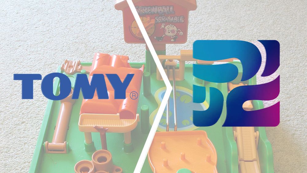
Across social media discussions, observers have offered creative takes on what the new gradient symbol resembles. Some users remarked that the metallic-looking geometric shapes resemble the golden contact chip found on a standard credit card. Others quipped that the stylized blue and magenta mark bore a visual similarity to corporate logos commonly associated with seafood processing facilities or industrial tech firms. Among long-time fans of the brand’s classic toy catalog, some lighthearted commentators pointed out that the complex, looping structure of the emblem looks faintly reminiscent of the convoluted marble tracks seen in the classic Screwball Scramble game.
Further fueling online discussion is the unusual timeline announced for the complete worldwide rollout of the new corporate identity. Takara Tomy announced that the unified branding will officially take full effect across global markets on April 1, 2027. The selection of April 1st—a date traditionally associated with April Fool’s Day pranks—combined with a lead time spanning multiple years, led some social media users to question whether the entire rebrand announcement might be an extraordinarily early seasonal hoax. However, corporate information confirms that the multi-year implementation strategy is a genuine operational initiative aimed at systematically aligning global inventory, packaging, digital assets, and corporate structures over a controlled timeframe.
To accompany the announcement and clarify the design thinking behind the visual identity, Takara Tomy released an official promotional video illustrating the geometric evolution of the logo. The video demonstrates how the structural lines of the Katakana word "asobi" transform into the finalized modern emblem, highlighting the precise grid and color transitions involved in its creation. Through this visual showcase, the manufacturer reinforces its ambition to translate its century-long legacy in toy manufacturing into a unified, modernized global brand identity built around the universal concept of play.