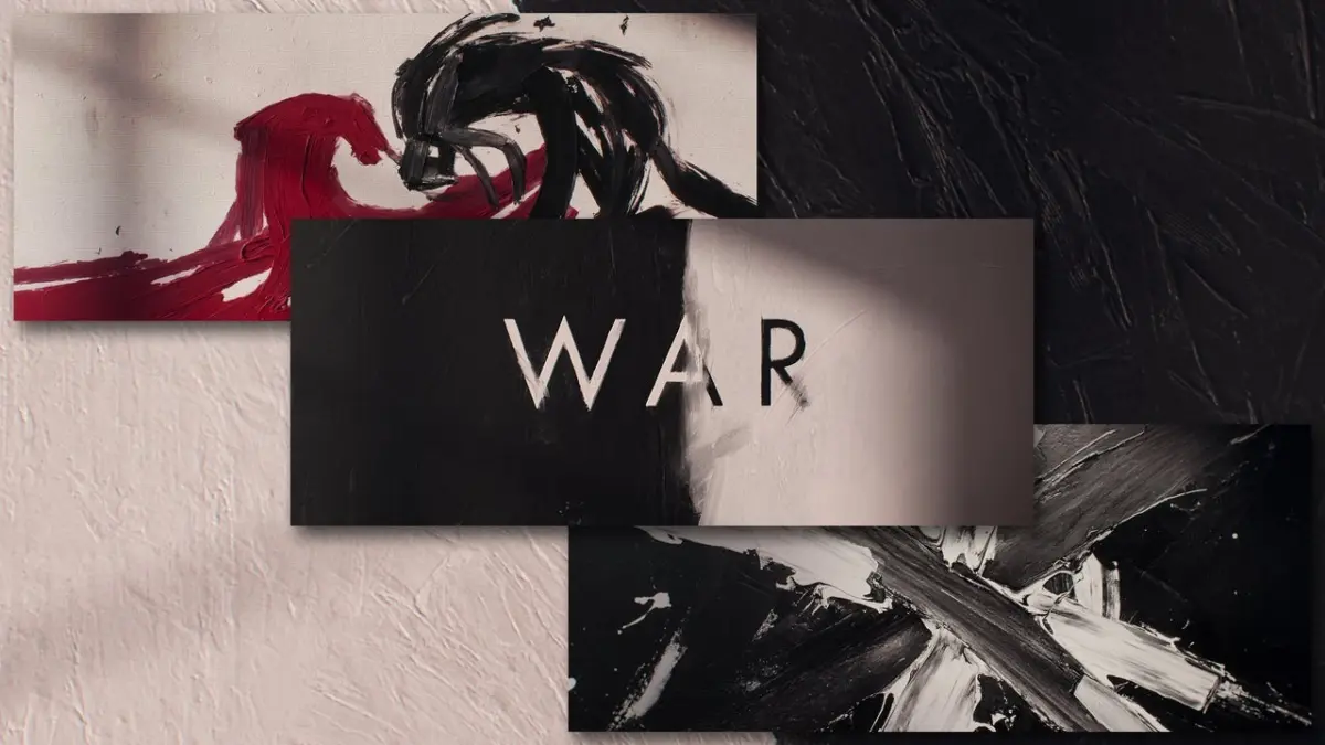
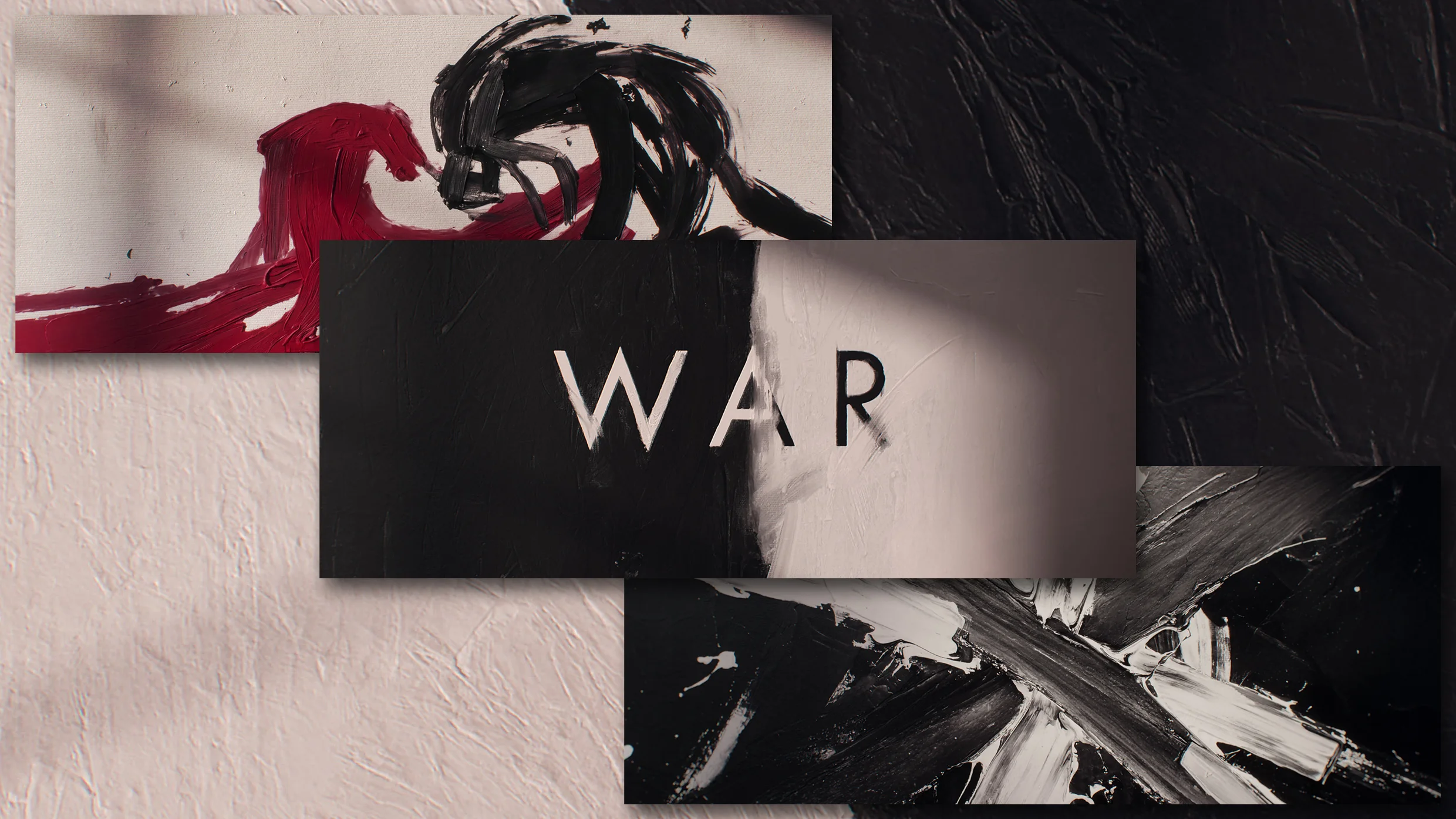
When the acclaimed production studio Imaginary Forces set out to design the main title sequence for War—HBO’s high-stakes legal drama centered on a bitter, multimillion-dollar divorce—the creative team knew they needed to visually encapsulate the themes of polarity, escalating conflict, and relentless tension. To achieve this, the designers turned to abstract expressionism, utilizing clashing colors, kinetic brush strokes, and a stark visual language that feels as though it is actively battling on screen.
Set against the backdrop of elite London society, War stars Dominic West as the founder of a fictional, wildly successful social media platform named Zephyr, and Sienna Miller as his wife, a celebrated movie star whose latest project is a period drama titled The Milliner. As their high-profile marriage dissolves, the ensuing legal battle rapidly deteriorates into a winner-take-all, scorched-earth conflict. To reflect the extreme wealth and emotional volatility of the characters, the design team decided that playing with fine art and aggressive visual motifs would serve as the most natural, visceral vehicle to introduce the series.
Imaginary Forces is widely recognized across the entertainment industry for crafting some of television and film’s most iconic title sequences, including memorable intros for Stranger Things, Mad Men, and the branding for the 2026 Milan Cortina Games. For War, the studio wanted to express the literal and figurative nature of the show’s title in a way that felt entirely abstract and impressionistic, avoiding literal representations of the characters or their luxurious lifestyles in favor of pure emotional resonance.
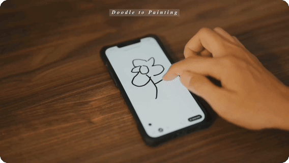
To realize this vision, Ronnie Koff, creative director at Imaginary Forces, and his team engaged in extensive internal testing and experimentation. Initially, the designers experimented with physically painting on glass, pushing pigments around to capture spontaneous reactions. However, to accelerate their workflow and iterate more rapidly through different creative directions, the team eventually pivoted to digital painting tools, utilizing the Procreate app on the iPad to fine-tune the motion and texture of the brushwork.
During the early stages of development, the creative team looked closely at mid-20th-century abstract expressionism for inspiration, specifically drawing from the work of painter Franz Kline. Kline was renowned for using bold, slashing black-and-white abstract brushstrokes to capture deep emotion through stark line quality and the careful balance of positive and negative space. However, Koff notes that while Kline’s work offered a powerful aesthetic starting point, it did not entirely capture the specific, confrontational energy that Imaginary Forces wanted to convey for the HBO drama.
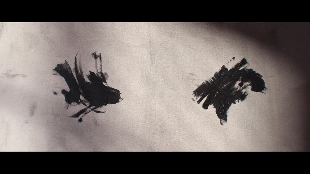
“At the very beginning it wasn’t working,” Koff explains. “My challenge was, how do you take something that is purely abstract where you just get an emotion from it, and give it a literal, almost anthropomorphized quality where it feels like there’s tension through the animation that you create.”
To solve this creative hurdle, Koff’s team shifted their conceptual framework, beginning to reference the visual dynamics of boxing. By studying the mechanics of a fight—specifically the rhythm of a punch and an immediate counterpunch traded between two determined opponents—the designers were able to establish a structured choreography for the abstract elements. The resulting title sequence mirrors these boxing-inspired movements, visually reinforcing the concept of a brutal, unyielding match where neither side is willing to concede ground.
The color palette was intentionally kept sparse to maximize this confrontational impact. The sequence relies primarily on stark black and white, a classic pairing designed to instantly communicate the idea of opposing forces locked in combat, punctuated by a sharp accent of red to introduce a visceral, bloody quality to the animation.
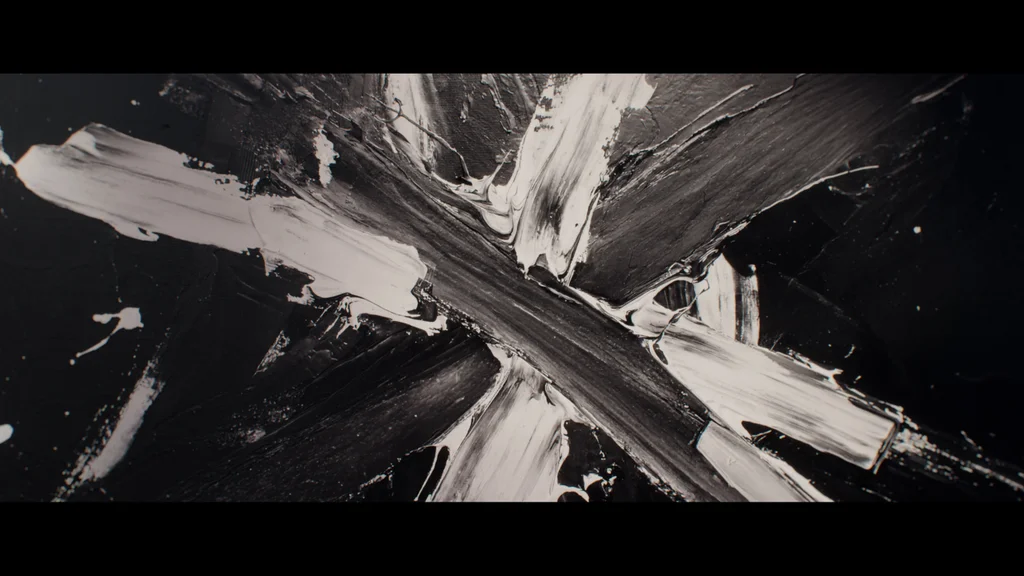
Beyond the motion and color theory, the paint strokes themselves possess a distinct, three-dimensional physical texture. Koff notes that this tactile quality was heavily inspired by the scratch-board aesthetic of the legendary 1996 title sequence for Se7en, directed by Kyle Cooper. That landmark project served as the catalyst that led Koff and his colleagues to co-found Imaginary Forces nearly three decades ago.
That foundational project helped demonstrate to the entertainment industry that creative, thoughtfully crafted title sequences could do far more than simply display credits—they could actively contribute to a show’s overarching narrative and emotional tone. Yet, as Koff observes, navigating modern production environments and rapidly evolving technology can sometimes make achieving that level of narrative cohesion harder than ever. Despite these modern shifts, the work on War demonstrates that the core principles of evocative design, tension, and artistic experimentation remain as potent as ever in setting the stage for prestige television.