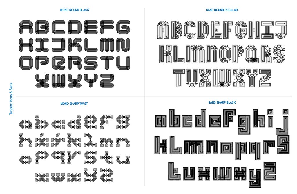
What does a typeface look like when every single glyph is intrinsically tethered to its neighbors? For designers Deborah Khodanovich and Saachi Mehta, answering that question became an immersive journey into modularity, oral storytelling, and generative programming. Born out of an academic assignment, their project eventually evolved into Tangent—a sprawling, five-axis variable superfamily complete with both sans and monospaced iterations.
Reflecting on their journey, the two designers recently detailed the iterative, highly collaborative process that took them from a simple classroom brief to a complex, multi-dimensional typographic system.
Pit Stop 1: (Crossed) Pathways
The origins of Tangent trace back to Kelsey Elder’s Variable class at the Rhode Island School of Design (RISD), specifically during an assignment titled Kit-Car. The brief encouraged students to look to the world around them for inspiration—drawing from toys, optical illusions, and the repeating patterns found in family heirlooms—in the spirit of artist Sister Corita Kent. Kent’s foundational philosophy, "learn to see the world by looking at the world one piece at a time," served as the conceptual compass for the project.
Khodanovich and Mehta knew early on that they wanted to collaborate, which meant establishing a modular framework that could easily be passed back and forth between them. Coincidentally, both designers were already exploring the conceptual umbrella of stories, dialogue, and gossip in their respective thesis work—specifically examining how ideas converse, connect, and transform as they pass from person to person.
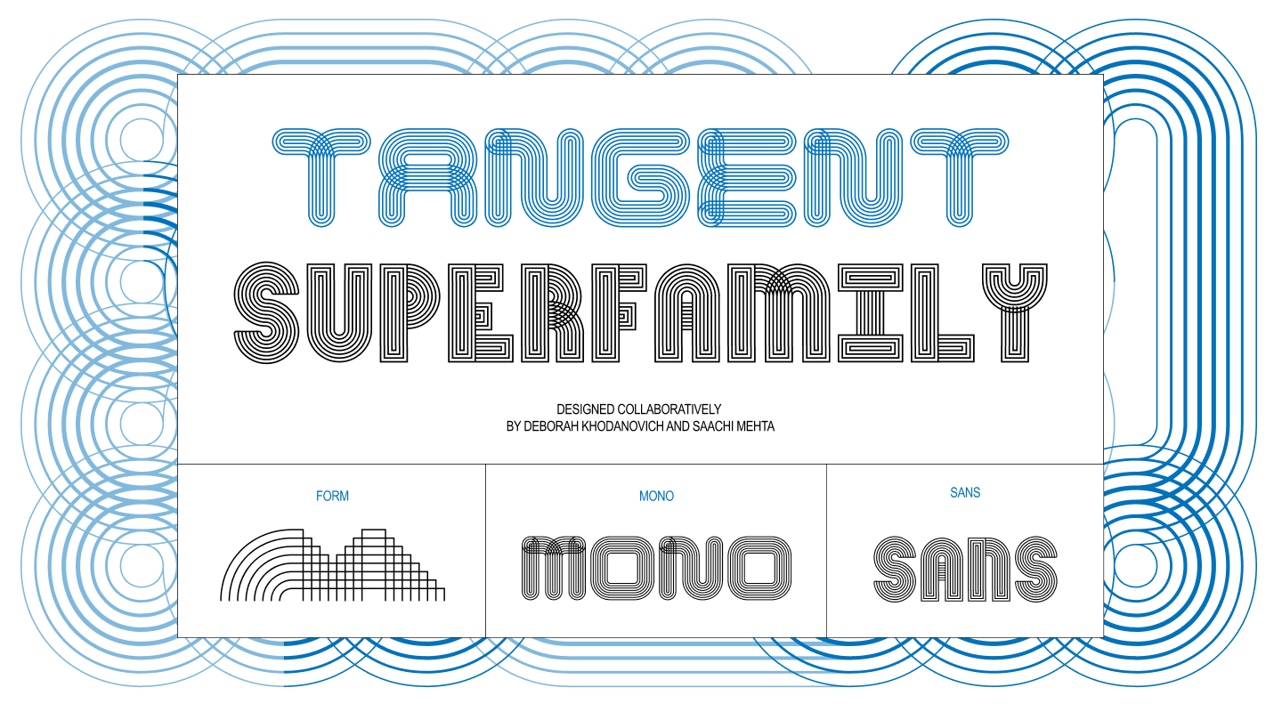
This thematic focus raised a compelling design question: what would typography look like if physical glyphs mirrored the shifting, evolving nature of human conversation?
Drawing inspiration from diverse sources—Mehta was exploring the continuous, twisted quality of ribbons, while Khodanovich was deep into custom path-drawing in Animal Crossing—both creators found themselves circling textile arts like knitting, weaving, and embroidery. These explorations quickly transitioned from solid shapes to layered strings of parallel lines that could weave in and out of each other like thread.
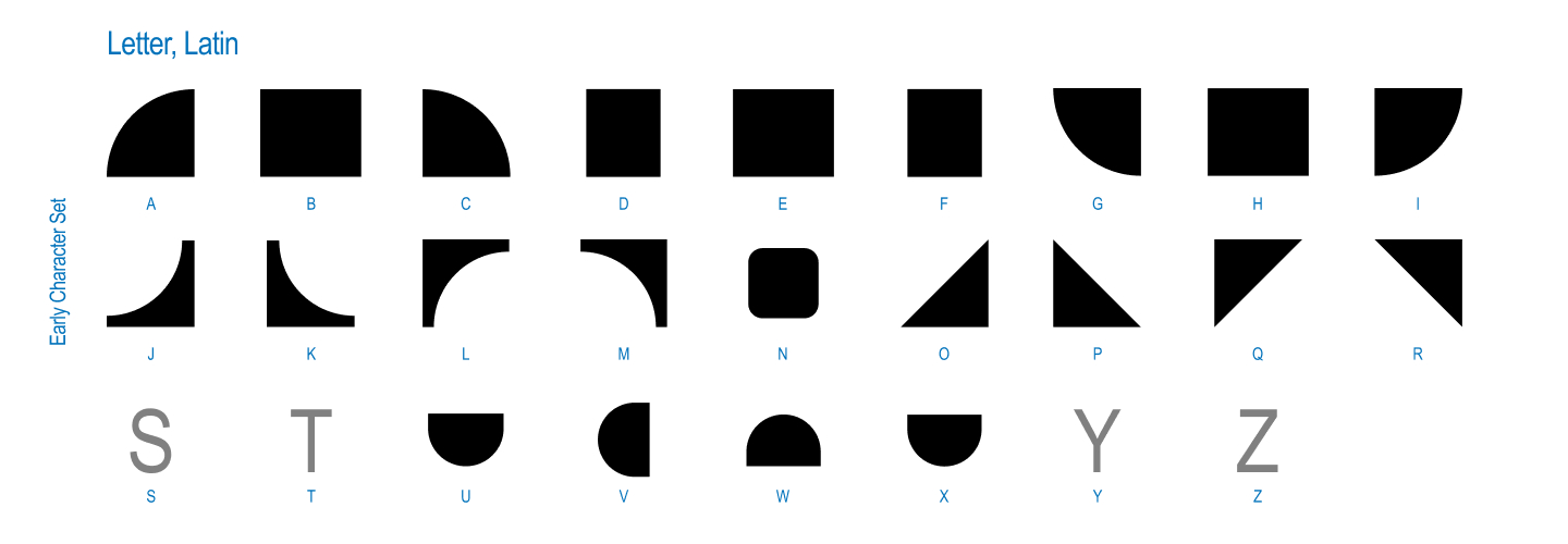
This weaving concept birthed the first true iteration of the project: a single-weight, single-axis modular system built on patterns that always connected to themselves, twisting through round or square geometries. Working side-by-side on the same screen and sharing physical sketchbooks, the duo established a harmonious rhythm, blending their distinct skill sets to tackle the initial grid of connecting parts.
Pit Stop 2: (Finding Our) Axes
Once a working system was established, instructor Kelsey Elder posed a crucial usability challenge: how does one actually type with a modular, twisting, and connecting system? While Khodanovich and Mehta could use the prototype intuitively, translating that fluidity to others required rigorous testing.
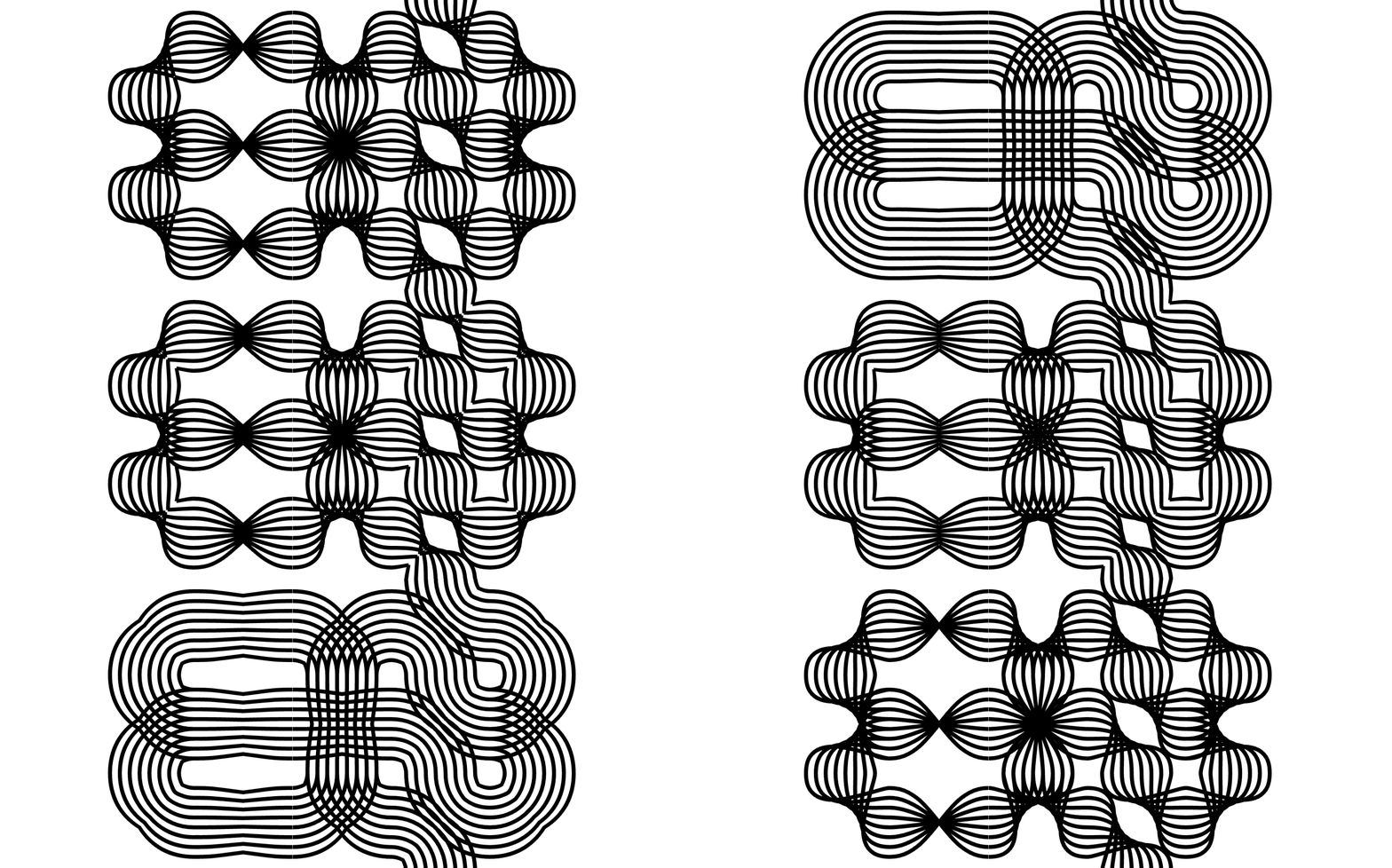
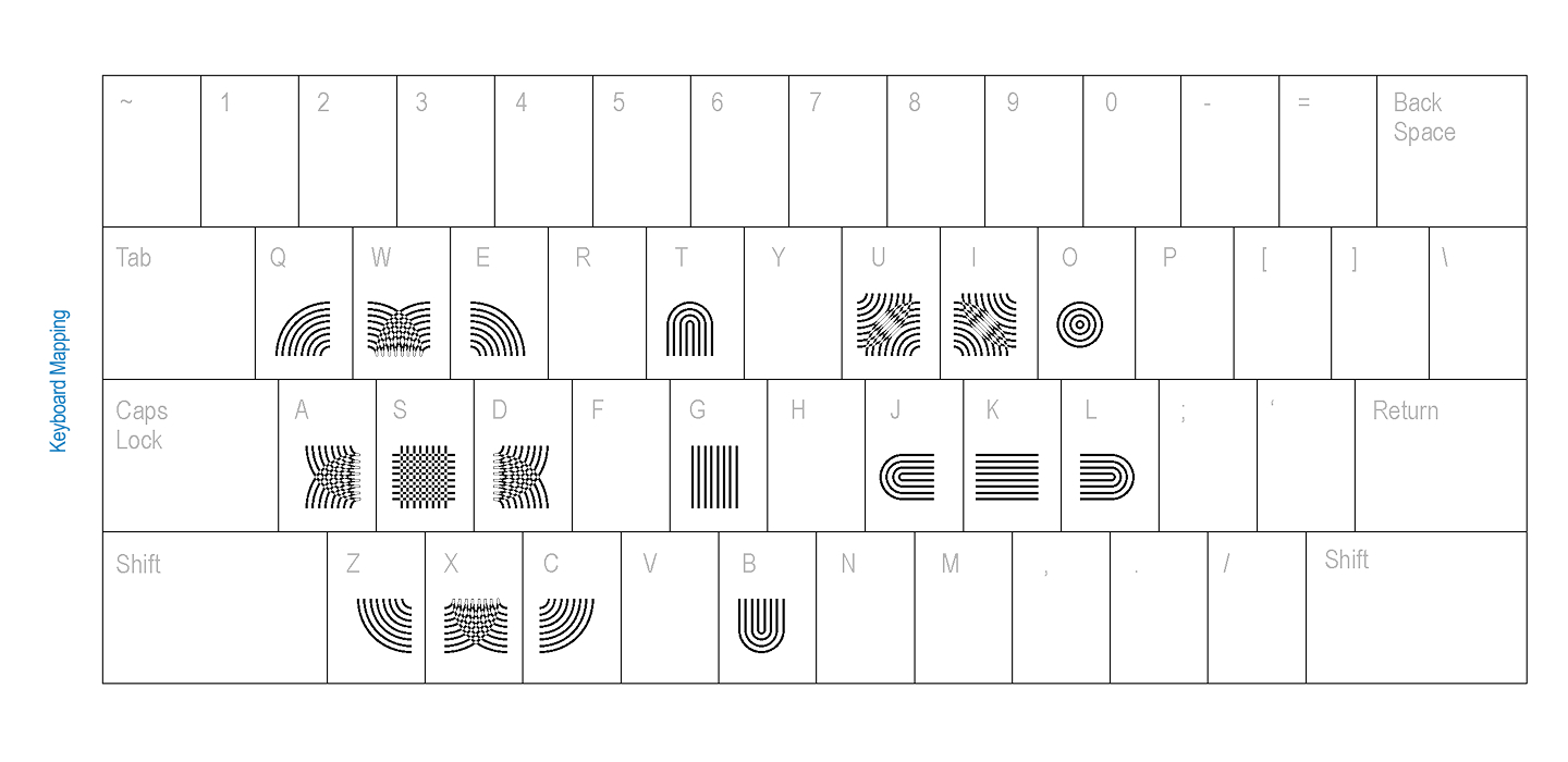
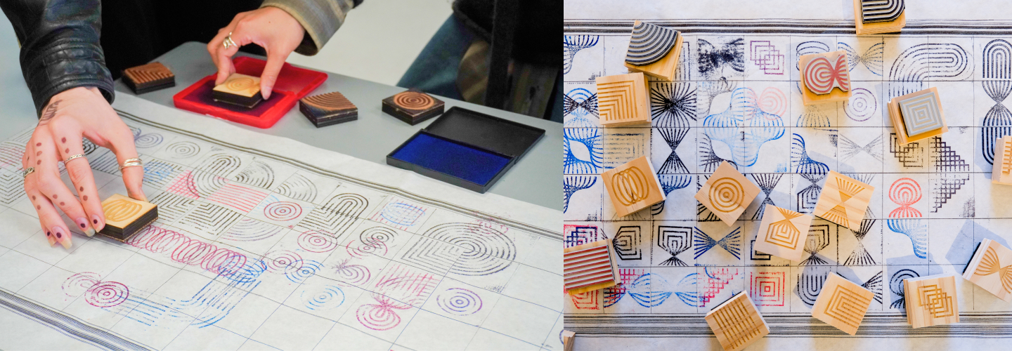
To solve this, the designers conducted keyboard mapping experiments with their peers, drawing inspiration from digital games and interactive media. They also took the project into the physical realm by creating rubber stamps, allowing people to stamp glyphs onto extensive physical grids to feel the modularity tactilely rather than digitally.
In addition to stamps, they developed a Processing sketch that allowed users to draw their way into the typographic system instead of relying on traditional typing mechanics. Surrounded by graphic designers, the creators noticed an instinctive reaction: whenever people were handed the modules, they immediately defaulted to constructing recognizable English and Korean letterforms.
Pit Stop 3: (Going off on a) Tangent
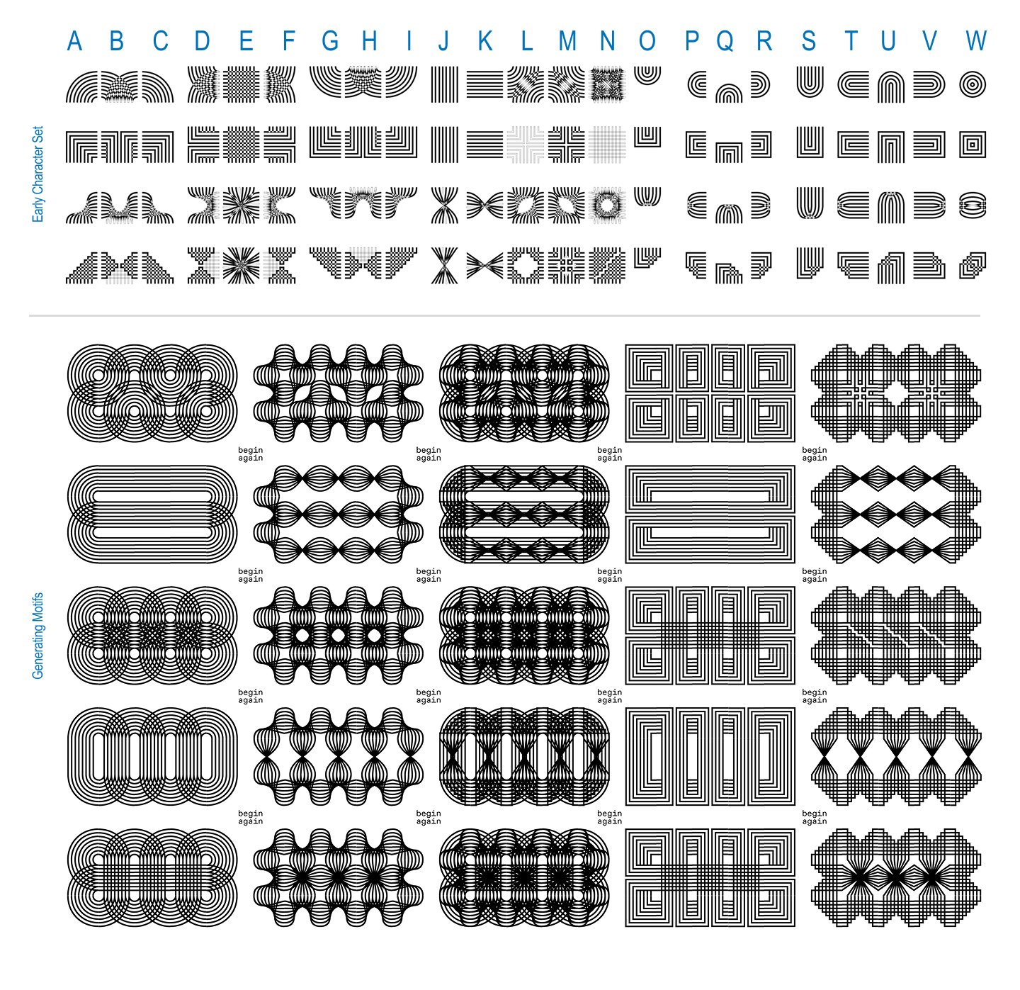
That instinctive urge to form letters marked a major turning point. Capitalizing on the fact that they were enrolled in a variable type class, Khodanovich and Mehta expanded their grid dimensions and began constructing full alphabets equipped with contextual alternates. They experimented with color variations and attempted a sans-serif version, officially crossing the threshold where a modular pattern-making system became a true typeface.
The project took another generative leap when Elder challenged them to task a computer with generating every possible permutation of the system. Operating under strict rules—utilizing a 3-by-3 grid, requiring every spot to be used, ensuring total connectivity, capping empty slots, and prohibiting piece rotation—Khodanovich collaborated with Claude to write a script capable of generating 971 unique glyphs. As trained type designers, they immediately began spotting letterforms within the computational noise, an exploration that ultimately gave rise to the Mono version of the typeface.
Pit Stop 4: (It takes a) Superfamily!
The evolution did not stop at static digital forms. Prompted to explore motion, the designers returned to variable architecture, developing a comprehensive five-axis system defined by twist, weight, amplitude, stretch, and radius across both the Sans and Mono variations.
Navigating the technical limitations and occasional software rebellions of Glyphs proved challenging, but the collaborative partnership offered a safety net. When one designer hit a roadblock with the complex workflow, passing the file to a fresh set of eyes invariably unlocked a solution.
Because the project is inherently generative, the pair maintains a running log of potential new axes and spinoff variations, ensuring that Tangent remains open to ongoing expansion.
For those interested in exploring the system, the creators have extended an open invitation for experimental projects and posters.
Deborah Khodanovich is a Toronto-born designer and educator based in Providence, Rhode Island, having recently completed her MFA in Graphic Design at RISD. Her practice explores gossip as a method of producing and sharing knowledge, examining information networks and intimacy as design methodology. Working across typography, textiles, and books, she investigates how ideas circulate and how value is attributed along the way.
Saachi Mehta works at the intersection of visual design, motion graphics, and systems, translating concepts into visual experiences across identity, environmental, and editorial contexts. A recent MFA graduate in Graphic Design from RISD, she has taught motion design at the institution and brings professional experience from organizations including the RISD Museum, Netflix, and HP.