When type designer Sabrina Lopez set out to create a typeface tailored for children, ludic materials, and educational environments, she knew the project required more than just drawing appealing letterforms. It demanded a deep dive into how children learn to read and write, spanning the earliest days of kindergarten through the third year of primary school. The result of this extensive research and meticulous design process is Didactica, a versatile and comprehensive superfamily built to support early literacy while remaining remarkably adaptable for broader visual universes.
What Shall I Design Now?
The genesis of the project lay in a long-held ambition: designing a typeface that engages with the rich graphic universe of handwriting and education. To establish the parameters of her design, Lopez dedicated weeks to researching the history and current landscape of handwriting instruction. Her studies drew heavily on foundational industry resources, including Typotheque’s Modern Handwriting: A Historical Survey and Primarium, a contemporary study cataloging the handwriting models taught in primary schools across more than 40 countries.
Using Primarium, Lopez mapped out the geographical locations of various handwriting models currently in use worldwide. This global overview allowed her to examine different pedagogical approaches and extract representative examples from diverse educational systems.

Among the systems studied, Australia’s highly developed educational framework stood out. The country utilizes specific digital fonts tailored for each region, supported by extensive resources for educators. These resources range from practical guides detailing common errors and solutions to articles explaining the cognitive benefits of handwriting and its direct connection to student self-esteem. A core principle running through this material is that handwriting is fundamentally a system of movements. Consequently, educational methods emphasize live demonstrations of letter construction alongside "verbalization"—the practice of speaking aloud a description of the movements being performed.
Historical Inspiration and the Italic Revival
Australian educators frequently reference Tom Gourdie’s The Ladybird Book of Handwriting, a text rooted in his Simple Modern Hand method. Developed in mid-20th-century England, Gourdie’s progressive, stage-by-stage teaching method begins with unjoined letters and culminates in a partially connected cursive. Throughout the process, the structural and formal qualities of the letters remain consistent; only their connectivity changes.
Lopez drew inspiration from Gourdie’s methodology, looking back to England and the broader Italic Revival of the 20th century. As her professor, Ewan Clayton, noted in his essay A History of Learning to Write, educators during the mid-20th century developed several programs based on italic handwriting. Clayton categorizes these programs by their starting points: some drew from early 16th-century models like Ludovico degli Arrighi’s La Operina (1522), resulting in angular, compact letterforms, while others looked to the broader, more cursive parameters proposed by Giovanni Francesco Cresci in 1579, characterized by rounded, sloping, and easily connected shapes. Tom Gourdie’s work fell firmly into the latter group.

Italy holds a foundational place in this historical trajectory. The cursive script traces its roots directly to Renaissance models, specifically Italian chancery hand, which eventually laid the groundwork for the English round hand that dominated handwriting instruction until the middle of the 20th century. By tracing this 500-year evolution, Lopez gained critical insight into how tools, writing supports, teaching methods, and pedagogical goals have continuously reshaped letterforms over centuries.
Taking Shape: The Design Process
Informing her approach with insights from her historical and pedagogical research, Lopez established strict parameters for the Didactica project. She resolved to create both an unjoined alphabet and a partially connected cursive alphabet, ensuring they shared consistent shape, structure, and proportion. Both variants were designed with simple uppercase letters based on Roman capitals, but with restrained horizontal proportions.
The complete typeface family incorporates two primary axes: a weight axis ranging from Light to Black, and a slope axis offering vertical and italic options, with intermediate slops accessible via variable font technology.

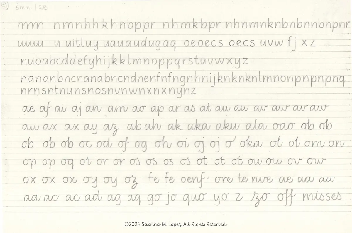
Beginning with pencil sketches on paper, Lopez adopted Gourdie’s pedagogical methodology rather than his exact forms. She drew lowercase letters with generous counterforms, wide spacing, and a monolinear structure, balancing triangular and oval eyes while preserving the deep bifurcations typical of italic scripts. After experimenting with various writing implements, line heights, and lead hardnesses—and analyzing the distinct movements required for vertical versus slanted writing—she selected the strongest forms for vectorization and refinement.
Vertical proportions were carefully calibrated during the digital refinement phase, ensuring the x-height was sufficiently generous without compromising the legibility of ascenders and descenders.
The Complete Didactica Superfamily
The rollout of the project occurred in stages. The first part of the family, featuring the unjoined letterforms, was published in 2025. A year later, the cursive version joined it, completing the core Didactica family.

Both Didactica and Didactica Cursive feature color fonts equipped with directional arrows to guide letter construction, alongside baseline, x-height, ascender, and descender guide lines. Additionally, an alternative directional mode tailored for left-handed writers can be accessed by activating stylistic set 4, providing dedicated guidance for diverse learners.
The entire Didactica superfamily is available through distributor platforms including Typesenses and Typographer, both associated with The Type Founders.
Although conceived specifically for children’s educational materials, Lopez emphasizes that the typeface should not be restricted to youth-oriented projects. The simple, fluid, and highly legible forms—honed through rigorous educational research—grant the superfamily a remarkable versatility suited to a wide array of visual communication contexts. For Lopez, the project has provided a rewarding entry point into the world of education, reinforcing her belief that handwriting remains a deeply human gesture worth preserving alongside emerging technologies.