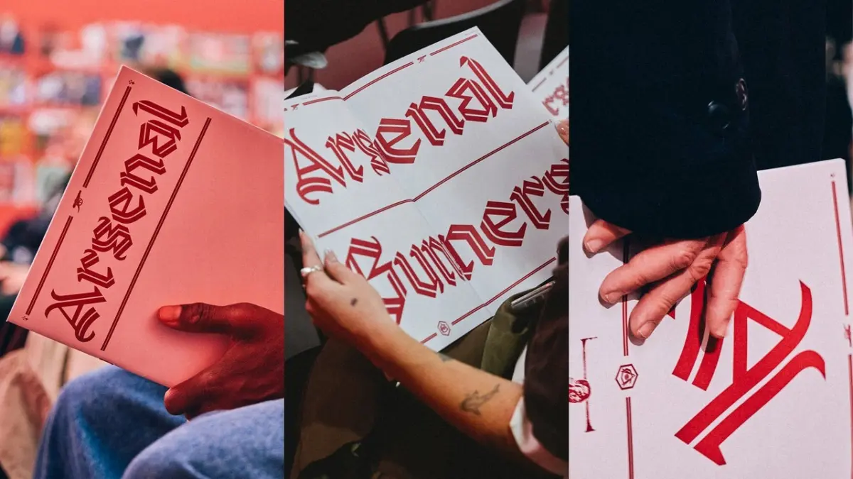
English football giant Arsenal has introduced a striking new modern gothic typeface as part of a sweeping, multi-font branding strategy designed to honor the club’s 140-year heritage while looking firmly toward contemporary culture.
The club officially unveiled the new font, named “Rocastle,” during a special pop-up exhibition hosted this month at the Design Museum in London. The typeface carries deep emotional resonance for the club and its global fanbase, as it is named in honor of the beloved late Arsenal midfielder David Rocastle, affectionately known to supporters as "Rocky," who played for the club from 1985 until 1992 and tragically passed away in 2001 at the age of 33.
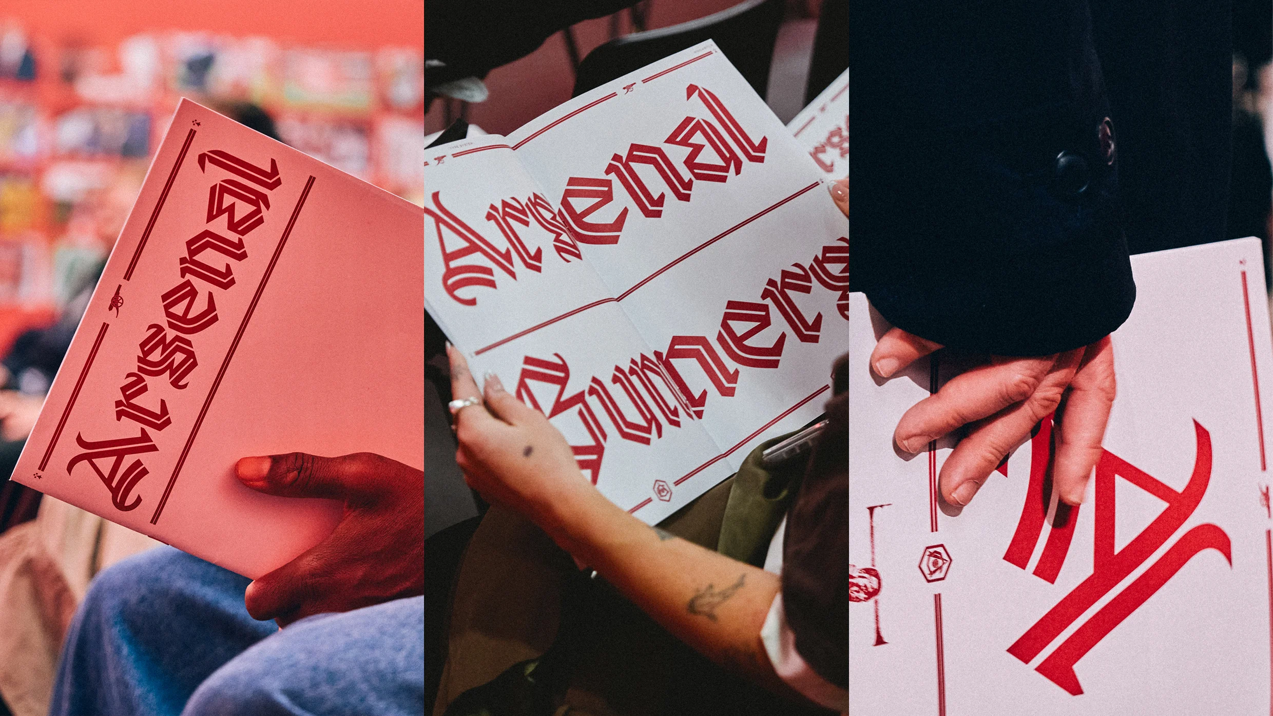
Rocastle was created by type designer and researcher David Rudnick, founder of the design studio terrain, alongside fellow designer Léa Bruneau. For Rudnick, a lifelong supporter of the North London club, the commission represents the culmination of a deeply personal journey. Describing his lifelong allegiance, Rudnick noted that he would only ever have agreed to work with one football club in the world.
The typeface is the result of an intensive four-year collaboration between the designers and the club, during which Rudnick served as the architect behind a bespoke font book for Arsenal. The broader project sought to establish a cohesive and authoritative typographic language that could span across every facet of the historic organization.
When designing Rocastle, Rudnick faced the immense challenge of balancing historical gravitas with the practical demands of modern visual communication. According to the designer, the typeface had to accomplish a series of contradictory objectives. It needed to be sufficiently distinctive, bold, and proud to act as a glorious pinnacle of the club’s visual identity, yet it also had to remain simple, legible, modern, and versatile enough to function like any contemporary corporate typeface.
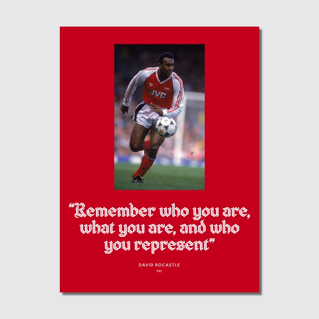
The resulting letterform is unmistakably rooted in traditional blackletter tradition, yet it is thoroughly re-imagined for the 21st century. By incorporating subtle design elements such as an inline weight and sweeping flourishes that evoke the shape and dynamic flow of pennants fluttering in the wind, the font achieves a unique visual rhythm. Rudnick explains that these careful stylistic choices help create a sense of something that feels distinctly chivalric and knightly, tying back to traditional English iconography and heraldry.
Arsenal’s typography overhaul actually began quietly in 2022, laying the groundwork for a comprehensive visual restructuring. Over the course of the four-year development phase, the design team combed through hundreds of pieces of historical Arsenal memorabilia and vintage type specimens stored within the club’s archives.
The research ultimately led them to the lettering found on the club’s retro VCC crest, which stands for Victoria Concordia Crescit—the Latin phrase meaning "victory grows through harmony." Elements from this historic crest heavily influenced not only the Rocastle font itself, but also a newly introduced blackletter “A” mark. This striking monogram has now been elevated to become one of the club’s three primary official logos, sitting proudly alongside the traditional club crest and the iconic cannon.
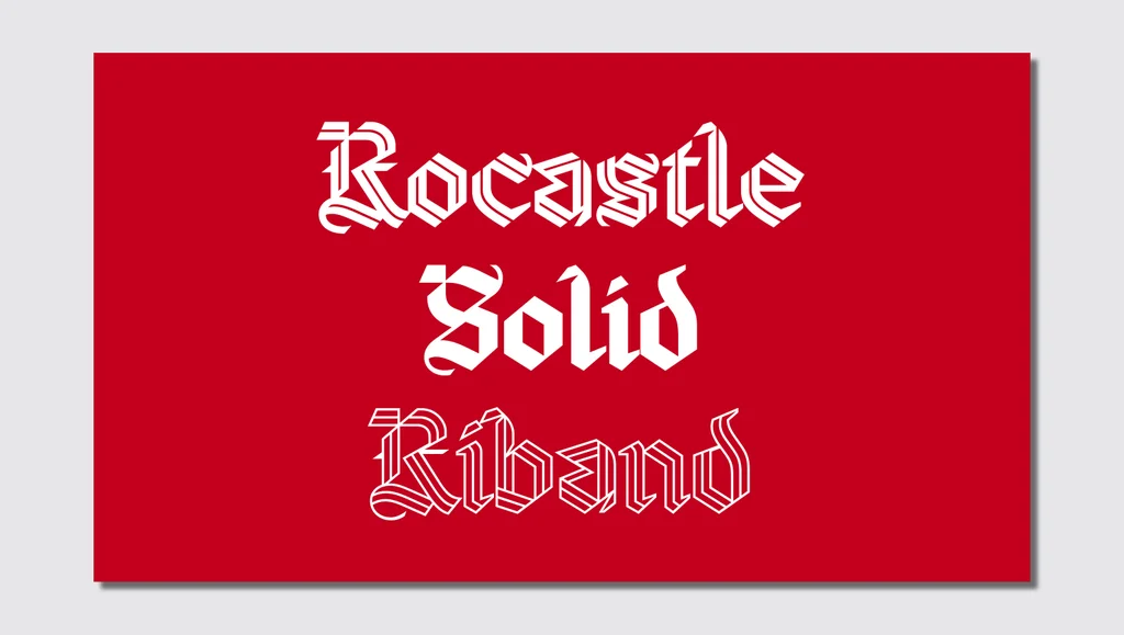
Within Arsenal’s broader multi-font branding strategy, the typography has been categorized around three foundational pillars: team, community, and culture. While other fonts in the system serve the functional needs of the squad and its everyday engagement with supporters, Rocastle is specifically designated to represent “culture.” Exhibition curators explain that this pillar embodies the space where football intersects directly with fashion, art, music, and the broader cultural zeitgeist.
This versatility is precisely what makes Rocastle so effective within the club’s new brand architecture. The typeface is designed to look entirely at home whether it is featured on a high-end limited fashion collaboration drop, printed across merchandise, or displayed on the gallery walls of a prestigious design museum exhibition. It successfully straddles the line between contemporary design innovation and deep-seated club heritage.
The London exhibition at the Design Museum serves as a public showcase of this exhaustive design process, offering fans and design enthusiasts alike an intimate look at the craftsmanship behind Arsenal’s visual transformation. By anchoring a modern design movement in the memory of a legendary player like David Rocastle, Arsenal has ensured that its 140-year history remains a living, breathing part of the club’s identity as it moves into the future.