Type design and typography enthusiasts have a new creative feature to explore as designer Andrea Leksen introduces her latest work on Alphabettes. Published on October 15, 2026, the new header showcase brings fresh artistic energy to the platform, highlighting the intricate craftsmanship and ongoing evolution of contemporary typeface creation.
The update, shared directly by Leksen under the site’s header category, adds to the growing collection of typographic art hosted by Alphabettes—an international platform celebrating the work of women and non-binary individuals in lettering, typography, and type design. Known for spotlighting exceptional creative contributions to the field, the platform serves as a vital hub for professionals and hobbyists alike who share a deep appreciation for the written letterform.
Celebrating the Art of Type Design and Lettering
At the core of Leksen’s latest contribution is a profound celebration of letterforms, categorized by the platform under tags such as "letterlove," "loveletters," "type design," "typeface," "typefaces," and "typography." These tags reflect the deep passion and meticulous attention to detail required in the discipline of crafting custom fonts and alphabets. Type design is a specialized artistic and technical endeavor that bridges historical traditions with modern digital tools, requiring creators to balance readability, aesthetic harmony, and structural consistency across entire families of characters.
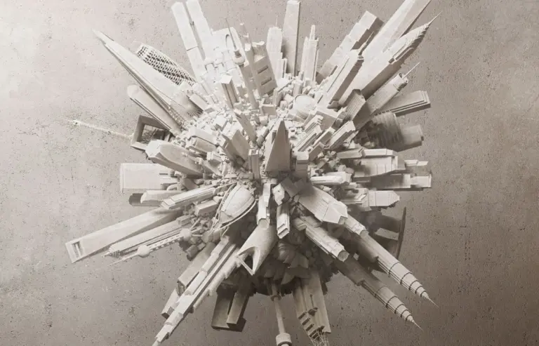
The newly featured header artwork demonstrates these principles clearly. Designed by Leksen, the visual element showcases fluid lines and carefully considered proportions that embody both technical precision and creative expression. By integrating this piece into the site’s design framework, Alphabettes continues its tradition of displaying dynamic, community-driven typographic art that inspires fellow designers and visitors.

Continuing a Legacy of Creative Collaboration
Alphabettes has long functioned as a collaborative space where designers can exchange ideas, showcase their portfolios, and discuss developments within the broader typography and lettering communities. Contributions from established practitioners like Andrea Leksen help maintain the platform’s vibrant atmosphere, offering fresh perspectives on how letterforms interact within digital and physical spaces.
This latest feature follows a succession of creative highlights on the platform, including earlier explorations bridging traditional type and contemporary lettering practices. As typography continues to evolve alongside new technologies and digital mediums, works that emphasize the fundamental beauty of the alphabet remain essential to the cultural fabric of design.
Engaging the Design Community
Alongside the visual update, the platform maintains its active engagement channels, inviting community members to participate in ongoing discussions through its commenting system. Visitors are encouraged to share their thoughts, insights, and feedback on the latest features while adhering to standard community guidelines supported by anti-spam protections.
As the design community responds to Leksen’s latest contribution, the update stands as a testament to the enduring appeal of thoughtfully crafted typography. Whether viewed by professional type designers or typography enthusiasts browsing the site’s extensive archives, the new header underscores the creative vitality that continues to drive the field forward.