
Green continues to hold a prominent position in contemporary interior design, but paint giant Sherwin-Williams is opting for a significantly lighter, more subtle approach for the year 2027. The renowned paint manufacturer, working alongside HGTV Home by Sherwin-Williams, has officially named Celery as its 2027 Color of the Year. Described as a soft, herbal green infused with delicate yellow undertones, the hue is engineered to feel fresh and rejuvenating without coming across as overly vibrant or saturated.
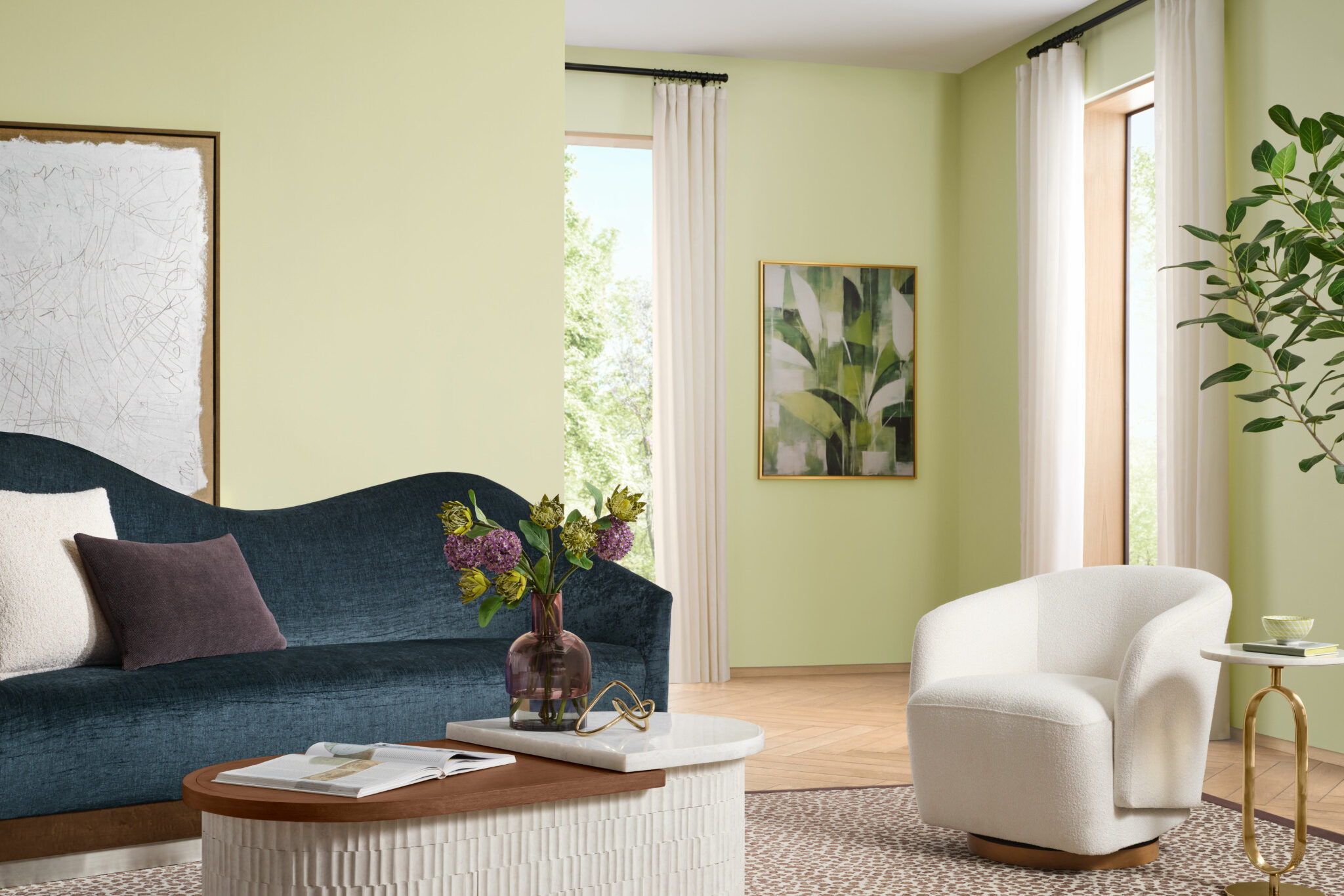
Unlike the deeper, moodier greens that have dominated residential and commercial interiors over the past several years—ranging from forest greens to deep, dramatic olives—Celery (SW 6421) leans into an understated, highly approachable interpretation of nature-inspired color palettes. Its muted yellow-green character introduces a distinct layer of warmth to a space while simultaneously maintaining an airy, light-filled quality. This makes it an ideal, low-risk option for homeowners and designers who are looking to introduce meaningful color into a room without overwhelming the existing architecture or furnishings.
According to the design team behind the selection, the choice of Celery directly addresses contemporary lifestyle shifts and shifting consumer values. Ashley Banbury, color marketing manager at Sherwin-Williams, notes that the color was chosen because it genuinely reflects today’s highest priorities, which center heavily on wellness, personal balance, and a deeper connection to the natural world. As modern homeowners and professional interior designers increasingly prioritize wellness within the home, there is a rising demand for soothing, restorative environments that actively support mental health and overall daily well-being.
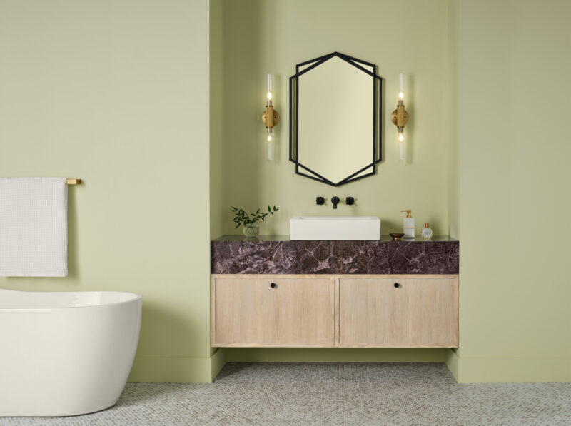
The selection of Celery was spearheaded by the Sherwin-Williams Trendsight Team, and the hue serves as a core component of the company’s broader 2027 Colormix Trend Forecast, titled "Rewild." This expansive annual forecast reflects a growing, sustained consumer interest in interiors that feel exceptionally comfortable, organic, and lived-in rather than meticulously curated or overly styled. The colors chosen for this forecast draw abstract inspiration from the natural world, avoiding overly literal or obvious botanical references in favor of tones that ground a room while keeping it visually expansive.
That delicate balance between a soothing atmosphere and an energizing undertone is central to Celery’s overall design appeal. The shade possesses just enough yellow pigmentation to prevent it from feeling cool, sterile, or subdued, while its muted green base offers a softer, more sophisticated alternative to brighter, highly saturated green hues. Because of this carefully calibrated formula, the color lends itself seamlessly to a wide variety of design styles, including contemporary, transitional, and even more traditional architectural aesthetics. Whether applied to kitchen cabinetry, bathroom walls, or accent furniture, the shade adapts fluidly to its surroundings.
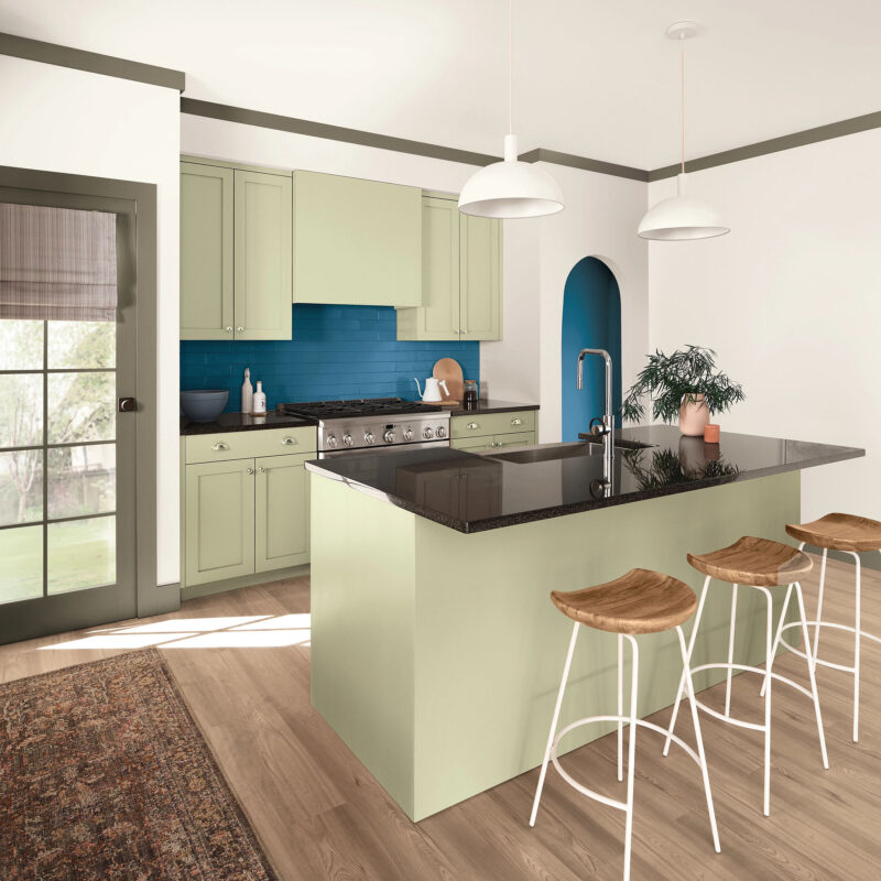
To properly complement Celery, Sherwin-Williams has developed an extensive, carefully curated companion palette that moves dynamically between earthy neutrals, deeper complementary greens, and more expressive, high-contrast accents. Neutral foundations like White Flour and Woven Wicker provide a quiet, versatile backdrop, while deeper tones such as Artichoke, Cocoon, and Georgian Bay introduce greater visual depth, weight, and architectural contrast to a space.
For those looking to create bolder, more adventurous combinations within their interiors, shades like Kirsch Red and Plum Brown bring rich warmth and historical resonance. Meanwhile, softer, unexpected pairings are introduced through hues like Potentially Purple and Cosmos. Expanding the nature-inspired approach beyond paint and into architectural finishes, the comprehensive palette also incorporates Minwax Pickled Oak—the dedicated wood stain brand’s own 2027 Color of the Year—allowing designers to coordinate wood tones with the broader color scheme.
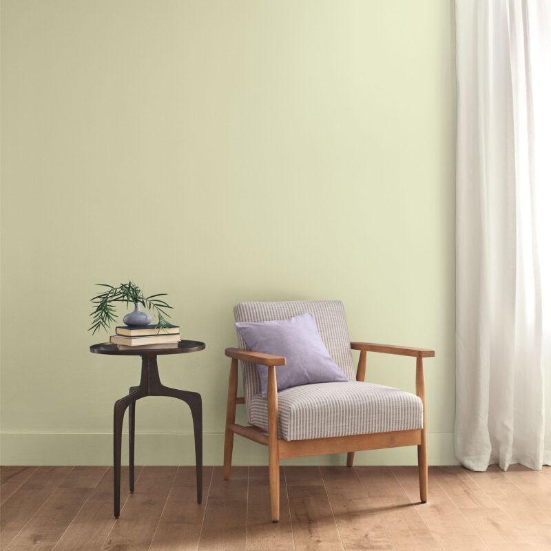
Explaining the versatility of the overarching collection, Banbury emphasizes that Celery truly shines when it is utilized as part of a thoughtfully curated palette of rich, grounding hues designed to layer depth and dimension into everyday living spaces. Rather than relying on dramatic statements or jarring color choices, the Sherwin-Williams 2027 color selection suggests that even a relatively quiet, understated shade can noticeably and profoundly shift the atmosphere of a room.
Celery is available as SW 6421 through official Sherwin-Williams retail stores nationwide, and as HGSW6421 through HGTV Home by Sherwin-Williams, available exclusively at Lowe’s locations.