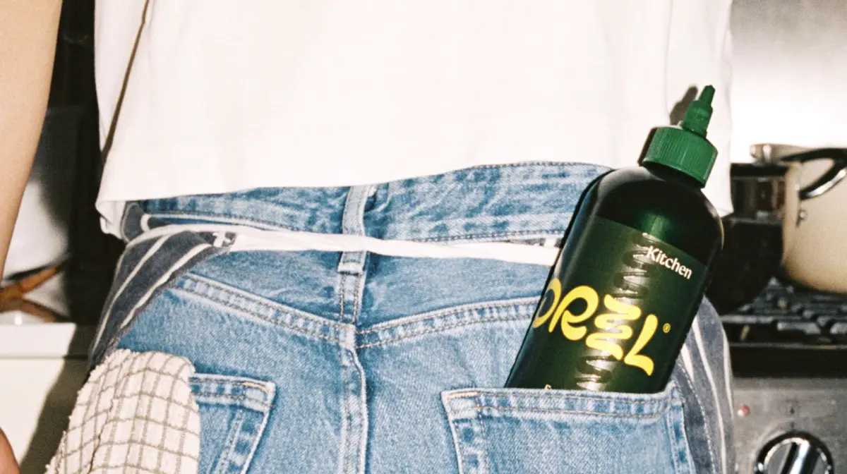
The resulting visual identity manages to strike a careful balance between familiarity and bold disruption. At first glance, the packaging retains a nod to traditional expectations through its dark green squeeze bottle, a color choice that pays homage to the familiar hues traditionally associated with high-quality olive oil. Yet, this traditional foundation is quickly upended by vibrant, juicy orange and yellow lettering that immediately captures the eye. Complementing this color palette is a playful, custom wordmark designed by Studio Drama, featuring a distinctive stacked double Z. This clever typographic element is meticulously crafted to visually expand, mimicking the appearance of oil being smoothly squeezed across a plate.
This sense of fluid motion is not restricted to the logo alone. The same squiggling drizzle motif is ingeniously transformed into a dynamic graphic device that stretches across both the product label and the shipping packaging. By incorporating this flowing element, the design system achieves a palpable sense of movement and energy without having to resort to the tired, clichéd imagery that so often populates the category. Meanwhile, classical typography makes a subtle appearance, providing a respectful nod to the oil’s genuine Italian origins, ensuring that the brand’s heritage is acknowledged without dictating the entire aesthetic.
Ultimately, the overarching design philosophy behind DRZZL taps directly into the contemporary consumer appetite for pantry products that behave less like anonymous groceries and more like curated lifestyle objects. In an era where kitchen aesthetics matter just as much as culinary performance, everyday items are increasingly expected to double as countertop decor. With its striking, countertop-ready identity and modern visual language, DRZZL has firmly positioned itself where it can be seen and appreciated, ensuring that consumers certainly will not find this bottle hidden away between the flour and sugar in the dark recesses of their cupboards.