Paint trends are usually declared well before most of us ever pick up a brush or even begin thinking about redecorating a room. Major paint manufacturers announce their coveted colors of the year, industry forecasters carefully identify emerging global palettes, and interior designers make their own bold predictions about what styles, moods, and shades are coming next to the market. For decades, this top-down approach has driven the conversation around home decor, guiding consumers toward specific curated collections and seasonal palettes. But this traditional model raises a fundamental question about modern consumer behavior: What happens when you look not at what people say they like in interviews, or what they eventually purchase at the checkout counter, but rather at the colors they actually consider, test, and compare along the way?
That exact premise serves as the driving force behind the newly released Samplize American Paint Color Report, an extensive data-driven study that sheds entirely new light on how homeowners approach interior design decisions. Rather than relying on speculative forecasts or post-purchase sales data, the report analyzes millions of paint samples ordered across the United States during the first six months of the years 2024, 2025, and 2026. By examining real-time consumer curiosity and indecision, the data spans three of the industry’s most influential and widely specified brands: Benjamin Moore, Farrow & Ball, and Sherwin-Williams. This comprehensive cross-brand approach allows Samplize to observe which specific colors homeowners are considering side by side in their own living spaces before they finally commit to purchasing gallons of paint for their walls.
Makenna Lutz, partnerships lead at Samplize, explains that analyzing this crucial sampling stage reveals three vital insights into contemporary consumer psychology and interior design planning. According to Lutz, looking at sample orders unveils the full shortlist a person actually weighed, which specific colors get rigorously tested against each other under domestic lighting conditions, and how that final or intermediate shortlist successfully spans across competing brands rather than sticking to a single manufacturer.
Across those millions of tracked samples, one massive macroeconomic and aesthetic shift stands out above all others. Warm colors grew nearly three times faster than cool colors over the observed three-year period, marking a significant psychological and visual pivot in American homes. Today, warm shades account for a commanding 69.4% of everything tested on Samplize, rising steadily from 64.3% just two years earlier. Furthermore, the data reveals that fully half of all American paint shortlists now contain no cool colors at all, a noticeable increase compared to the 43% recorded at the very beginning of the study’s timeline.
It would be easy for casual observers and design commentators to interpret this sweeping trend as simply another predictable swing back toward pale beige and soft cream—shades that have historically dominated periods when homeowners sought safe, neutral backdrops. However, the granular data gathered by the report suggests something far more nuanced, complex, and sophisticated is happening behind closed doors.
The genuine surprise was in the split by depth, Lutz notes, pointing out that initial industry assumptions did not match the reality of consumer behavior. Designers and forecasters largely expected the collective warming trend to show up primarily as a lightening of interiors—a retreat into airy, washed-out spaces. As it turns out, that is not what happened at all. Warm shades outgrew cool shades at every single level of depth, and perhaps most surprisingly, the deepest and most saturated warm tones actually grew the fastest of all, expanding roughly six times faster than deep cool tones over the same period.
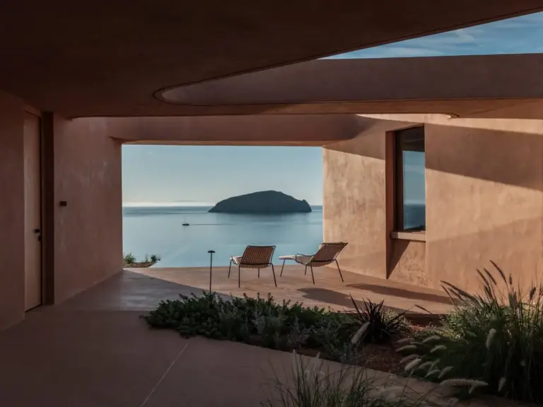
This unexpected appetite for depth within a warm palette manifests in fascinating ways across the current design landscape. At one end of the spectrum, homeowners are gravitating toward blush-toned plasters and delicate warm creams, such as Farrow & Ball’s Setting Plaster, Benjamin Moore’s Proposal, and Sherwin-Williams’s Malted Milk. At the exact opposite end of the spectrum is Benjamin Moore’s Classic Burgundy, which stands out as one of the darkest and most dramatic colors included in the entire study. Strikingly, Classic Burgundy grew at a pace comparable to its lighter counterparts. This demonstrates that homeowners have certainly not lost their appetite for dark, moody, and dramatic interiors; rather, the fundamental temperature of that drama is undergoing a profound shift away from cool charcoals and navy blues toward enveloping, rich warmth.
The behavior of brown shades reinforces this broader shift, growing faster than any other color family tracked in the study and now appearing in 13.4% of all shortlists, up significantly from 9.2%. Yet, a closer look at the data reveals that the specific colors driving this remarkable growth are not saturated chocolate browns or bright terracotta tones that might evoke heavy retro aesthetics. Instead, the frontrunners are muted greiges, warm grays, and stone-like shades such as Sherwin-Williams’s Warm Stone and Urbane Bronze, Farrow & Ball’s London Clay, and Benjamin Moore’s Smokey Taupe. These sophisticated hues offer the grounding feel of brown without the visual weight of traditional dark wood tones, acting as versatile bridges between neutrals and richer chromatic expressions.
Meanwhile, green appears to have firmly settled into the American domestic palette, losing none of its recent momentum. After rising sharply during the previous home-renovation boom, green has successfully held its higher market position and now appears in an impressive 34.6% of shortlists. The scope of greens being tested is broad, encompassing everything from muted sages and earthy mosses to much deeper, moody botanical greens that bring a sense of the outdoors inside.
The underlying behavioral patterns observed in the report also suggest that color temperature may ultimately matter much more to homeowners than individual color families or strict design categories. The data shows that two-thirds of all shortlists contain colors drawn from only one temperature group. Specifically, half of all shortlists are entirely warm, while only about a third of consumers actively mix warm and cool shades during their decision-making process. This points to a decisive mindset among renovators, who appear to be narrowing their focus early on rather than hedging their bets across conflicting color temperatures.
There are also clear signs that the warming palette may be getting progressively more colorful over time, moving beyond simple neutrals. Pink and red emerge as the fastest-growing color families when measured from smaller starting points, capturing the adventurous spirit of homeowners willing to experiment with bolder hues. Notably, the combination of warm-and-deep was identified as the fastest-growing combination of temperature and depth across the entire dataset, proving that consumers are increasingly drawn to spaces that feel both cozy and intensely saturated.
That statistical reality does not automatically make burgundy the new beige, nor does three years of sample data pretend to predict with absolute certainty what American walls will look like several years down the line as tastes continue to evolve. However, the underlying shift is unmistakable and extends well beyond a simple swing toward lighter, quieter neutrals. From soft, tactile plaster pinks to weathered, stony browns and deeply dramatic reds, Americans are actively exploring warmth across the entire spectrum of interior design.