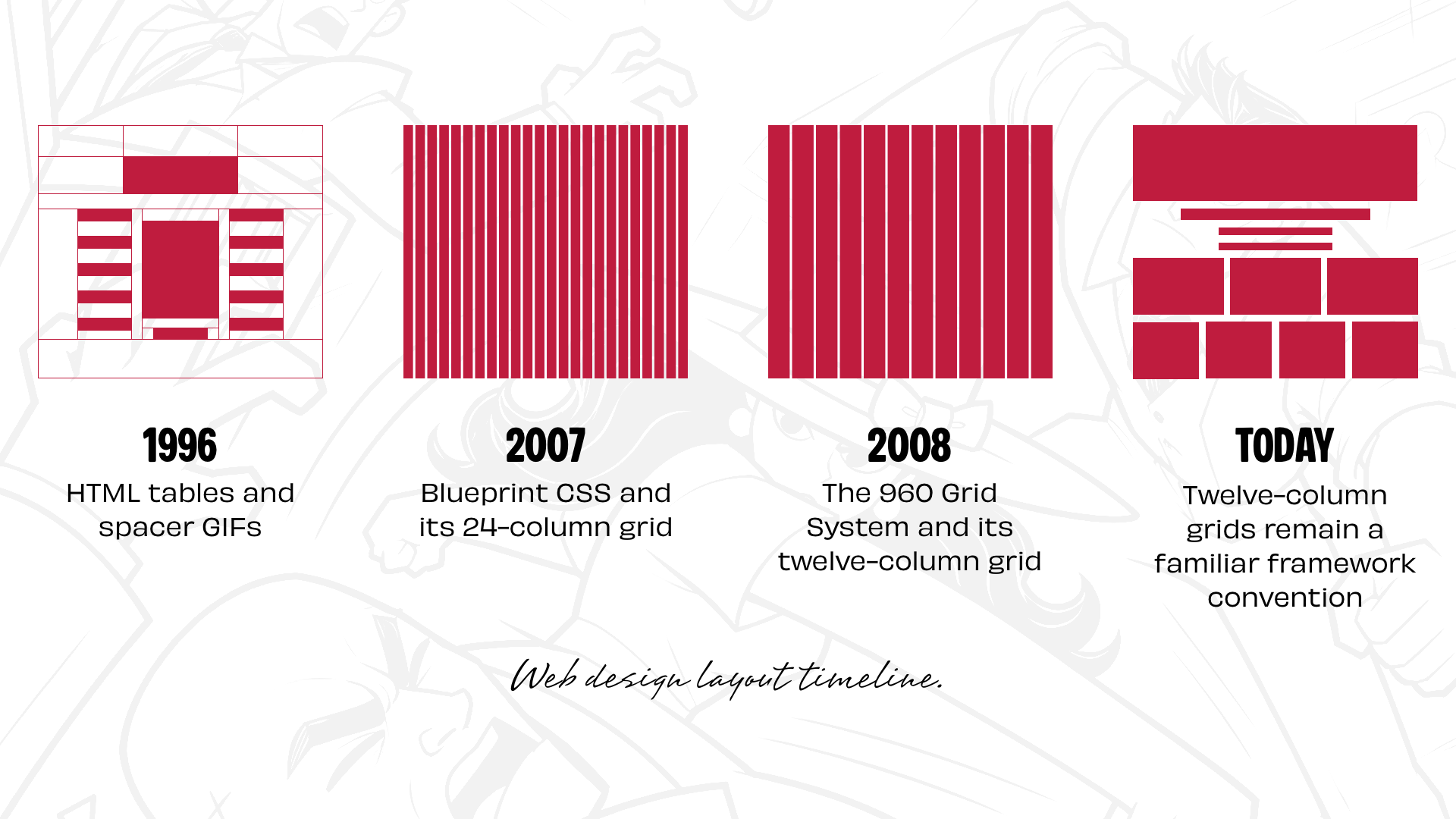
Thirty years ago, layout design on the World Wide Web was defined by clever workarounds and structural compromises. When designer David Siegel published Creating Killer Web Sites, the book famously popularized using nested HTML tables and transparent spacer GIFs to control layout presentation. For the first time, web authors could force text and imagery into precise visual alignment, though at the cost of fragile, semantic-free code.
As web standards evolved, Cascading Style Sheets (CSS) introduced floats and positioning rules. While these properties offered developers vastly improved control over rendering, neither was originally architected for macro page layout. Inconsistent rendering engines across competing browsers frequently turned CSS positioning into a frustrating exercise. Despite those technical headaches, an entire generation of web designers built the modern web using float-based structural frameworks.
The architectural landscape shifted significantly with the arrival of dedicated CSS frameworks offering ready-made layout systems. Frameworks like Blueprint CSS introduced structured 24-column frameworks, while Nathan Smith’s 960 Grid System provided popular 12- and 16-column options. By providing standardized visual structural guidelines, these tools created a common language for developers and designers alike, streamlining visual planning and implementation.
The reliance on twelve-column systems was far from a modern digital invention. Print graphic designers had relied on modular and column-based grid systems for decades. Mathematically, twelve represents a uniquely versatile integer for composition. It divides cleanly into halves, thirds, and quarters without requiring complex fractional math, facilitating the standard 2-up, 3-up, and 4-up component blocks that quickly populated the digital web.
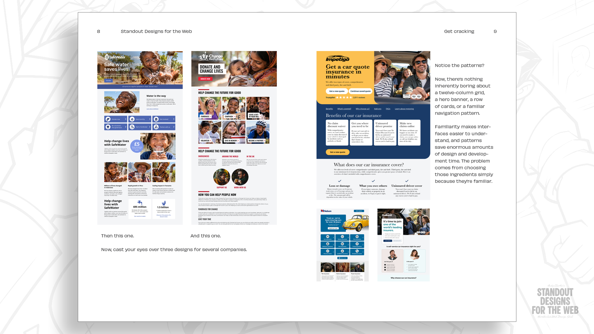
Subsequent frontend frameworks, such as Bootstrap and Foundation, solidified the twelve-column grid as the undisputed default standard for web page construction. While this standardized structure simplified development workflows across large teams, it gradually led to a unintended side effect: layout predictability. The default tool for starting a design project quickly turned into the default mental model for how every website should look.
Even with the introduction of modern CSS Grid layout specifications—which grant unprecedented programmatic control over visual space—many designers continue to approach layout design by dividing a viewport into twelve uniform columns first and fitting content into them second. While the resulting web pages are structurally functional, they frequently share a visual monotony that erases the distinct visual identity of the brands they represent.
Re-evaluating modern layout strategy does not require abandoning twelve-column grids entirely, but rather reconsidering when and why grid systems are selected. By prioritizing content requirements and brand identity over default architectural templates, designers can build digital experiences that feel purposeful, distinct, and tailored to the stories they need to tell.
Every company has a story worth telling
Before selecting a specific grid density or layout structure, a design process must evaluate the foundational characteristics of the brand being represented. Establishing clear visual parameters requires addressing core positioning questions: What visual qualities separate the enterprise from its market competitors? What central message should visitors retain after leaving the site? How can structural composition express brand personality?
Page layout does far more than arrange UI components across a screen. The relative scale, structural positioning, and spatial relationships between design elements directly influence how users perceive and interact with a website. A quiet, perfectly symmetrical composition communicates stability, formality, and restraint. Conversely, an asymmetric, high-contrast visual hierarchy can convey energy, movement, and innovation.
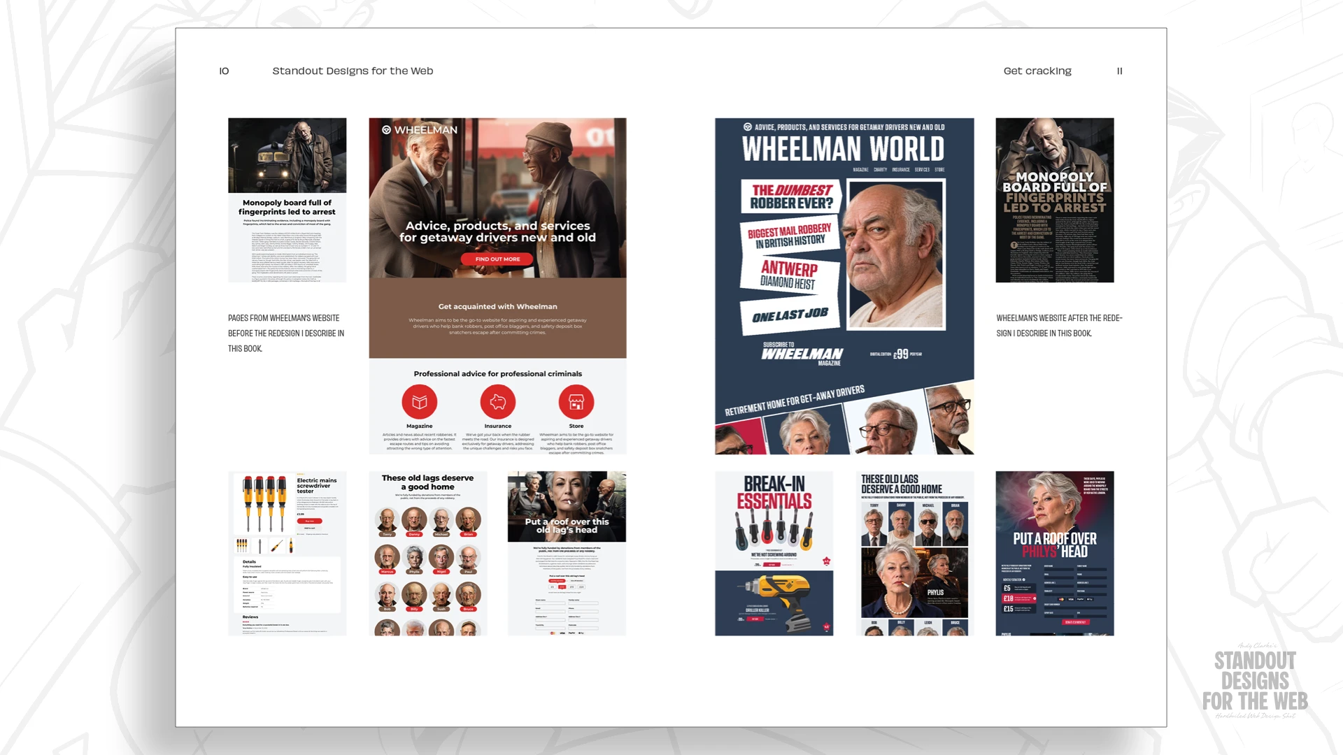
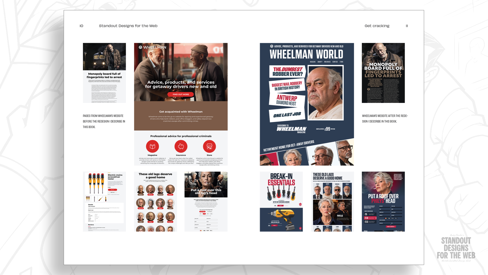
To illustrate how layout reflects identity, consider Wheelman, a conceptual business developed for the upcoming design book Standout Designs for the Web. Wheelman is portrayed as a commercial service provider catering to high-stakes getaway drivers, offering specialized legal advice, robbery insurance coverage, an e-commerce storefront for specialized tools, and an editorial magazine detailing life behind the wheel.
Although Wheelman operates as a conceptual project, the visual and structural design challenges it presents reflect real-world client requirements. Wheelman is not a conventional enterprise, and its visual interface should not mirror a standard corporate design template. The organization operates with professional execution yet maintains a bold, unconventional identity. It leans into a rebellious brand voice without becoming unapproachable, serving a clientele that demands extreme reliability wrapped in a distinct aesthetic.
Expressing that personality does not mean creating chaotic or unusable layouts for the sake of novelty. Users still need clear navigational paths, intuitive information structures, and frictionless conversion flows to purchase products and services. However, achieving functional clarity does not require settling for generic component arrangements. Layout decisions can actively reinforce brand positioning while upholding high standards of usability.
Starting with content, not columns
Designing a dedicated landing page for an online storefront highlights the practical differences between column-first and content-first layout methodologies. A typical product landing page might feature key featured items, prominent typographical headlines, imagery, pricing details, and interactive shopping utility modules.
A content-first layout approach delays grid selection until the structural relationships between these elements are thoroughly mapped out. Before assigning structural boundaries, a designer must evaluate critical content questions:
- Which visual element serves as the primary focal point of the page?
- How do secondary product attributes support the core promotional message?
- What visual path should guide the user’s focus through the transaction process?
Only after establishing visual hierarchy do composition questions come into play: Would an expansive photographic background establish the necessary narrative setting? Should typographic contrast be amplified to command attention? How can white space be strategically deployed to guide the reader’s eye and provide visual rest? How can text and imagery integrate into a cohesive composition?
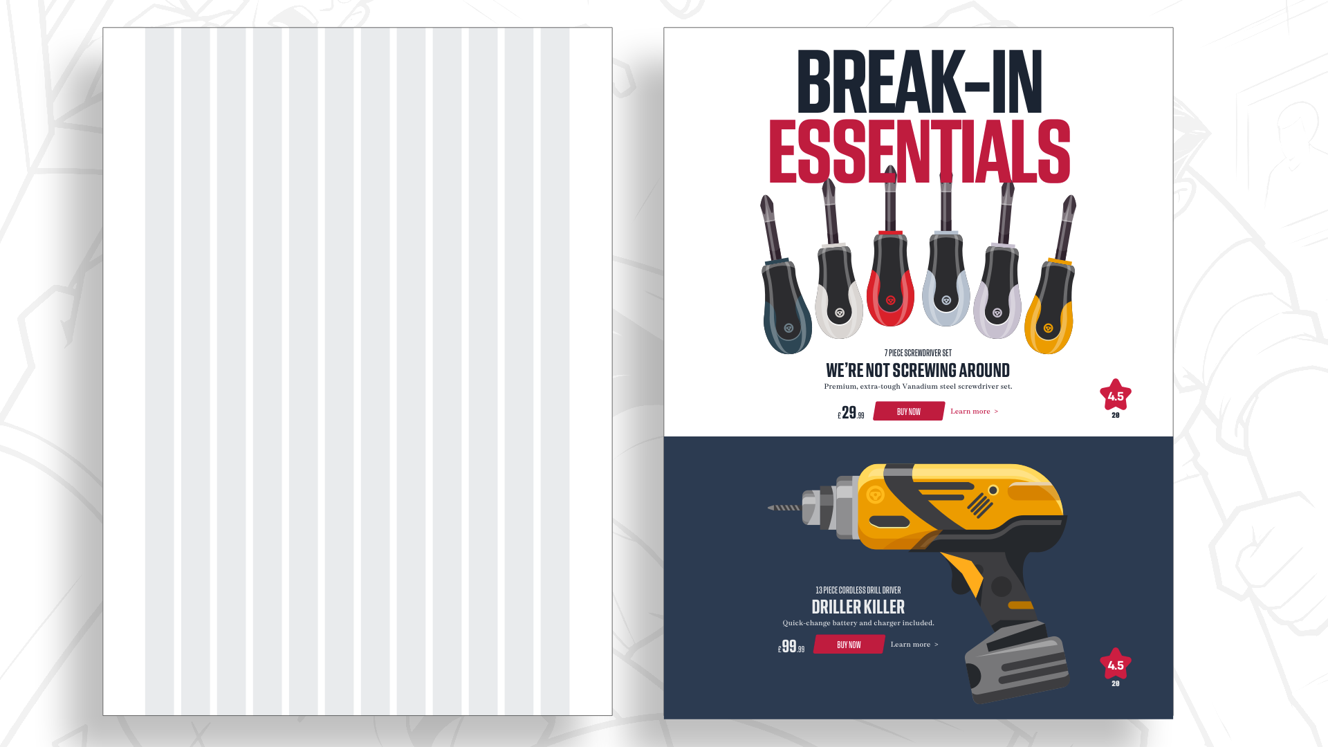
Answering these structural questions defines what the design must accomplish prior to picking a supporting grid.
While arranging content into a single centered column provides a straightforward, highly readable experience that simplifies responsive mobile styling, it may fail to capture a brand’s dynamic character. For a brand defined by high energy and boldness, a more dynamic compositional structure is required.
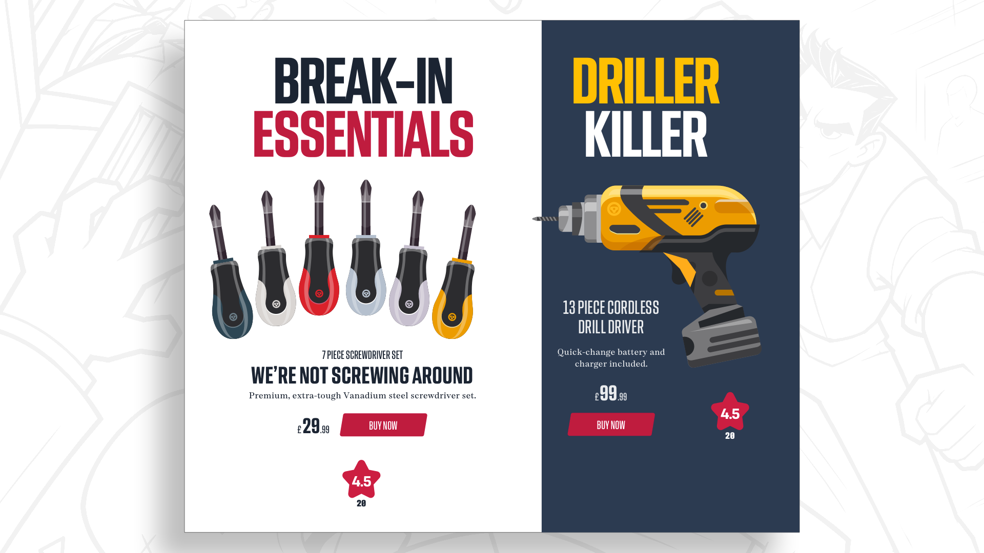
Creating visual hierarchy relies on manipulating scale and proportional balance. Setting up two equal-width structural columns assigns equal weight to adjacent content blocks. Modifying those column proportions—allocating a dominant two-thirds span to one section while placing supporting content within a narrower one-third area—instantly creates structural hierarchy without altering the internal dimensions of individual components.
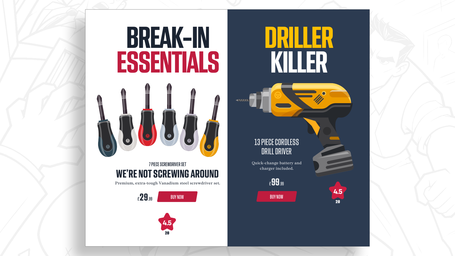
Rather than snapping these proportional decisions straight into a standard twelve-column container, designers can explore multi-dimensional grid structures that manipulate horizontal space alongside vertical flow.
Adding another dimension with modular grids
Standard column grids segment visual space exclusively along a vertical axis. Introducing horizontal rows intersects those vertical divisions, creating a two-dimensional matrix of spatial blocks known as modules.
Modular grids unlock flexible structural possibilities. By combining individual modules into larger spatial zones, designers gain refined control over negative space, visual scale, and compositional rhythm across a page layout.
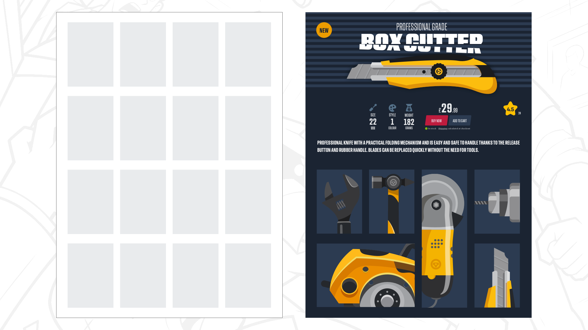
A four-by-four modular grid provides sixteen individual spatial units across the canvas. Designers do not need to populate every module with content. Unoccupied modules serve as intentional negative space, directing user attention toward key content blocks and preventing complex interfaces from feeling cluttered.
Within a 4×4 modular system, structural drama can be created by expanding a key graphic headline and hero image across four contiguous modules, while placing auxiliary product data and transactional UI controls into single modules nearby.
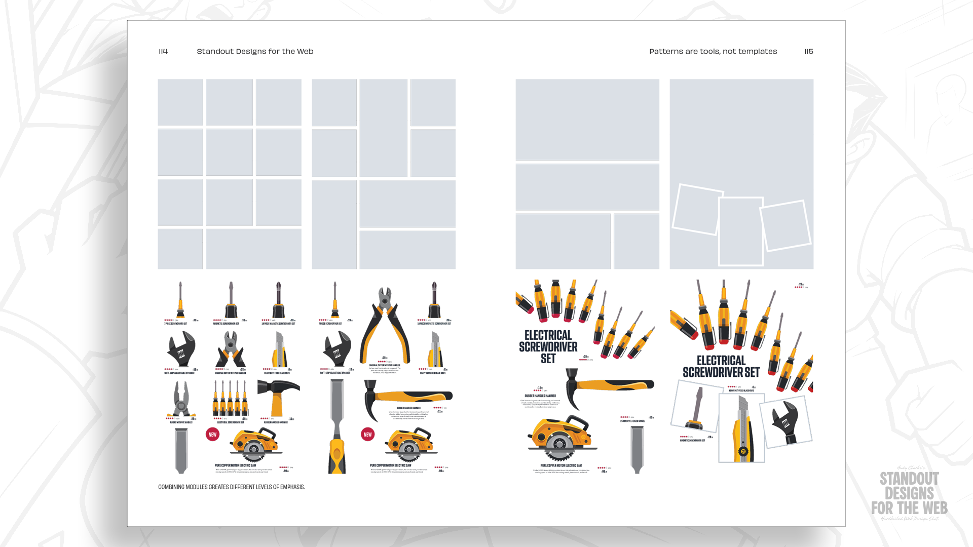
The modular logic extends naturally to supporting product grids. Rather than displaying uniform product cards in an identical matrix, individual products can span single modules while featured items occupy two modules horizontally or vertically. Varying module coverage breaks visual monotony, establishes clear content hierarchy, and preserves a clean, organized visual alignment.
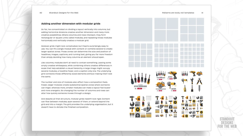
This approach yields a functional commercial interface with clear reading paths and adequate room for visual elements to breathe, while departing from standard layout templates. Because a single modular configuration may not translate across every viewport, the density and dimensions of modules can adapt across break points to optimize legibility on desktop, tablet, and mobile displays.
Mixing grids to create compound layouts
Digital platforms often house diverse content types, including editorial articles, commercial storefronts, and service directories. Pouring distinct types of content into identical visual templates across every subpage can mute a brand’s voice and dilute the user experience.
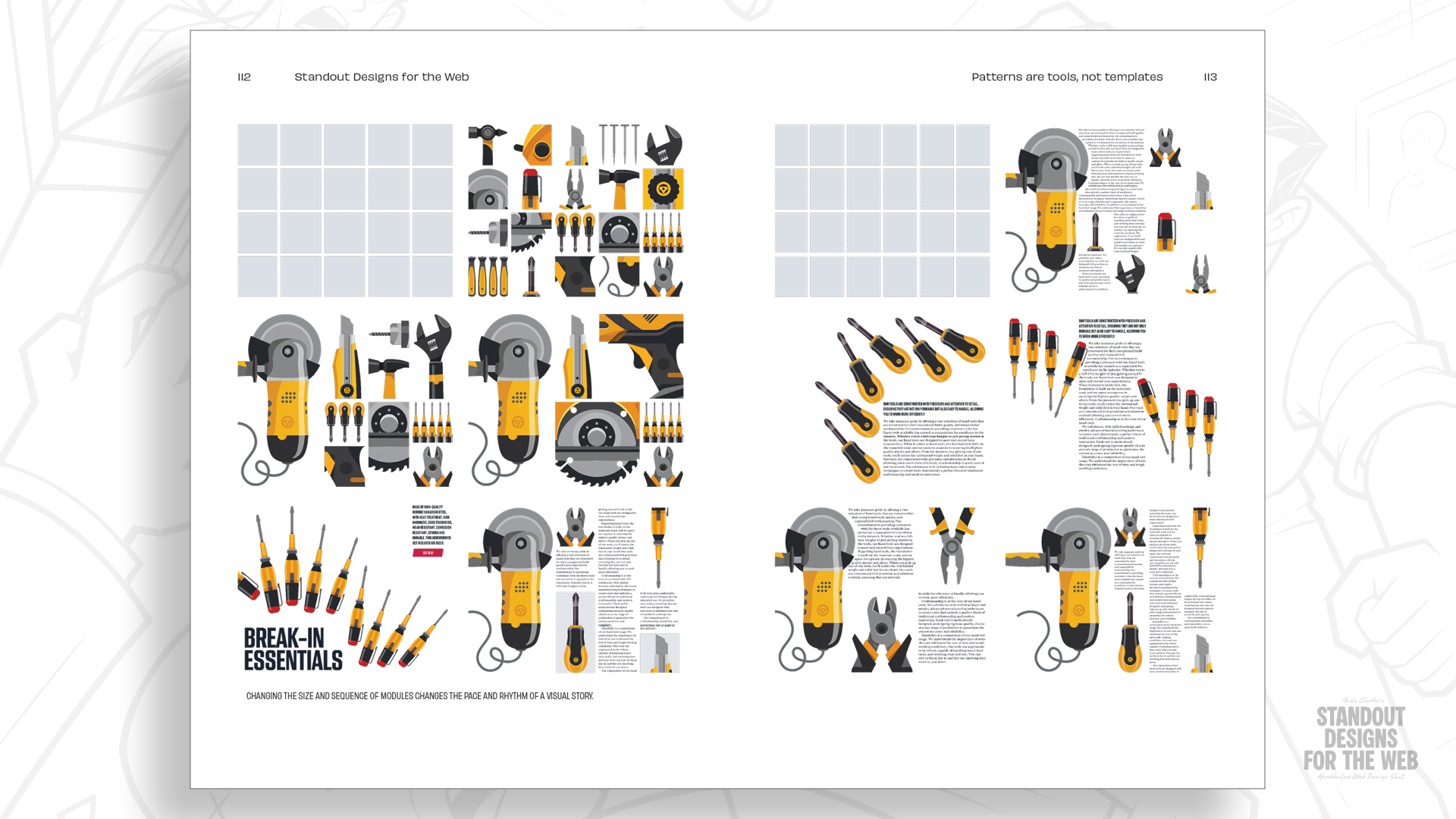
Compound grids address this challenge by providing structural discipline while allowing for layout variety. A compound grid is formed by overlaying, stacking, or placing two or more grid structures—whether column, modular, or hierarchical—within the same design canvas. Combining different grid counts generates intersecting reference lines that offer layout options unavailable in a single uniform grid.
Overlapping a simple two-column grid with a three-column grid creates a compound layout with four unequal columns. The resulting framework offers varied structural widths while maintaining an underlying mathematical relationship.
These varying spatial widths offer nuanced layout options. A wide column can house hero photography or heavy display typography, while an adjacent narrow column comfortably accommodates supporting metadata, pull quotes, or side notes. Subsequent pages can leverage the same underlying compound grid while grouping the column divisions differently, ensuring visual variety across site sections while maintaining brand consistency.
Scaling compound grids to mix higher column counts, such as combining four-column and five-column structures, provides even richer compositional possibilities. This structural flexibility allows complex web properties to tailor individual page layouts to their specific content requirements while preserving a shared design language across the entire platform.
Don’t let familiarity make choices for you
Twelve-column grid systems remain valuable tools within modern web development, and moving beyond default layouts does not require abandoning them entirely. However, relying on a single layout structure by default limits visual possibilities before the unique narrative requirements of a project are fully evaluated.
Standard multi-column component patterns—such as uniform 2-up, 3-up, and 4-up grids—serve specific functional needs well. The challenge arises when these patterns are implemented automatically, leaving little room for the distinct visual character that makes a web experience memorable.
Layout choices represent just one aspect of a unified design system. The same content-driven evaluation should guide choices in typography, color palettes, art direction, and interactive behavior. When structural and visual choices originate from brand strategy rather than pre-packaged code templates, the resulting digital experiences feel tailored to the organizations behind them.
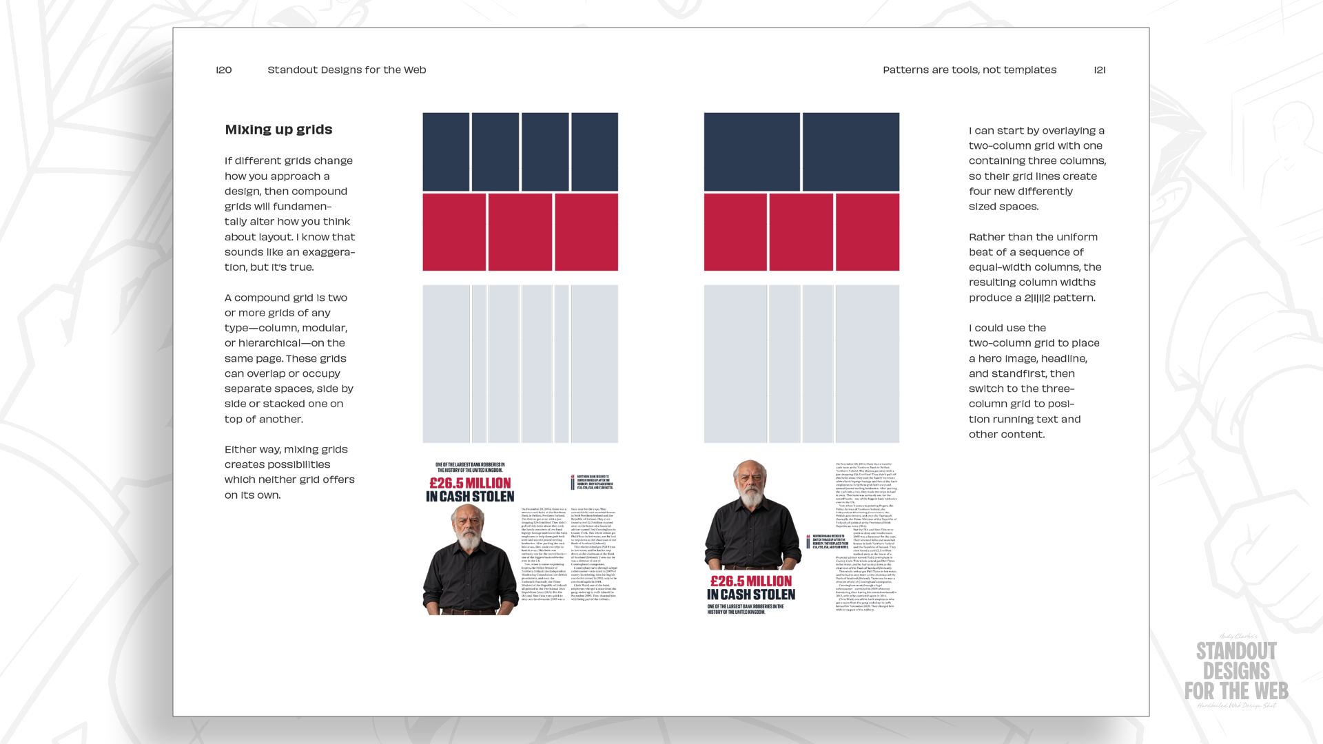
This philosophy forms the foundation of Standout Designs for the Web, a new book aimed at encouraging designers and developers to look beyond conventional frontend defaults and make deliberate choices across layout, visual hierarchy, imagery, and typography.
Pre-orders for Standout Designs for the Web are currently open in the CSS-Tricks store. All pre-orders include a complimentary copy of the Hardboiled Client Interview Guide, a practical handbook designed to help practitioners ask targeted discovery questions and uncover the core attributes that make a company distinct. The book officially launches on November 20, priced at $14.99 for DRM-free EPUB and PDF editions.