While green has become a familiar, almost ubiquitous fixture in the annual color forecasting cycle across the interior design and paint industries, Benjamin Moore is looking far beyond passing trends for its upcoming selection. For its 2027 Color of the Year, the renowned paint and coatings brand has selected Webster Green (HC-130), a choice that draws directly on the enduring appeal of a classic, mid-tone green. In doing so, the company is offering a sophisticated shade that feels equally at home nestled within historic interiors or applied to sleek, contemporary spaces.
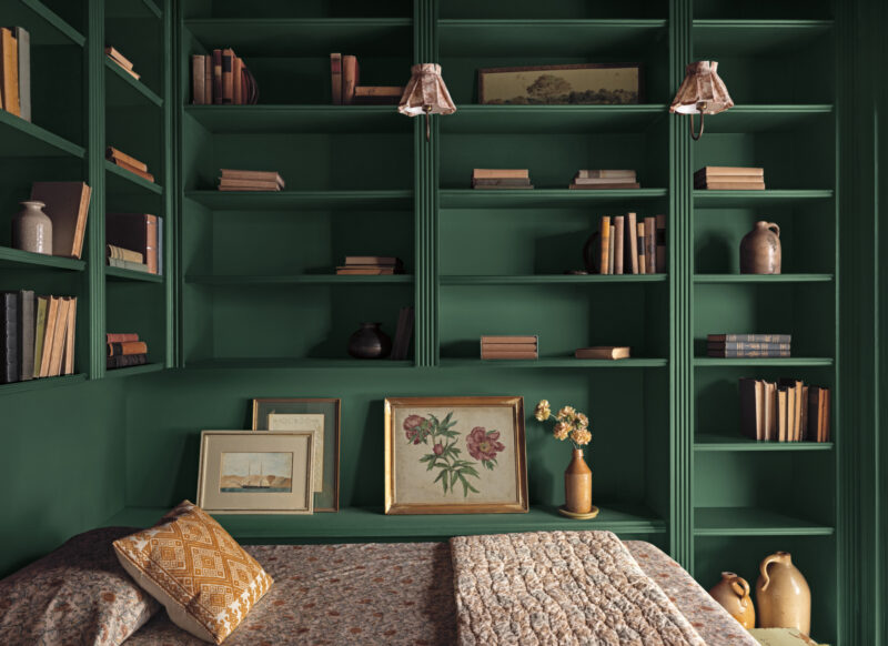
The paint brand’s deliberate choice reflects a broader, growing interest among designers, architects, and homeowners alike for colors with genuine staying power. Webster Green possesses a muted, slightly gray quality that effectively softens its inherent richness without ever diminishing its visual presence. It is a hue that carries enough substance to successfully envelop an entire room from floor to ceiling, yet remains restrained enough to work harmoniously alongside intricate architectural details, natural materials, and a wide array of complementary color palettes.
This focus on timelessness is central to the company’s vision for the year ahead. Andrea Magno, Vice President of brand, color, and integrated marketing at Benjamin Moore, notes that the strategic planning for this cycle began with a deep dive into the color families that have defined the past while holding promise for the future.
“For 2027, our focus centered on the green color family,” Magno explains. “When we looked across the past, present, and future of color trends, variations on green consistently demonstrated remarkable staying power.”
Expounding on the character of the selected shade, Magno describes Webster Green as a color that successfully bridges the gap between familiar comfort and a sense of fresh architectural possibility. Its balanced nature is designed to feel both deeply rooted and forward-looking. According to the brand’s leadership, the hue possesses the unique capability of enhancing interior spaces in a way that feels inherently distinctive, thoughtfully collected, and continually new to those who inhabit them.
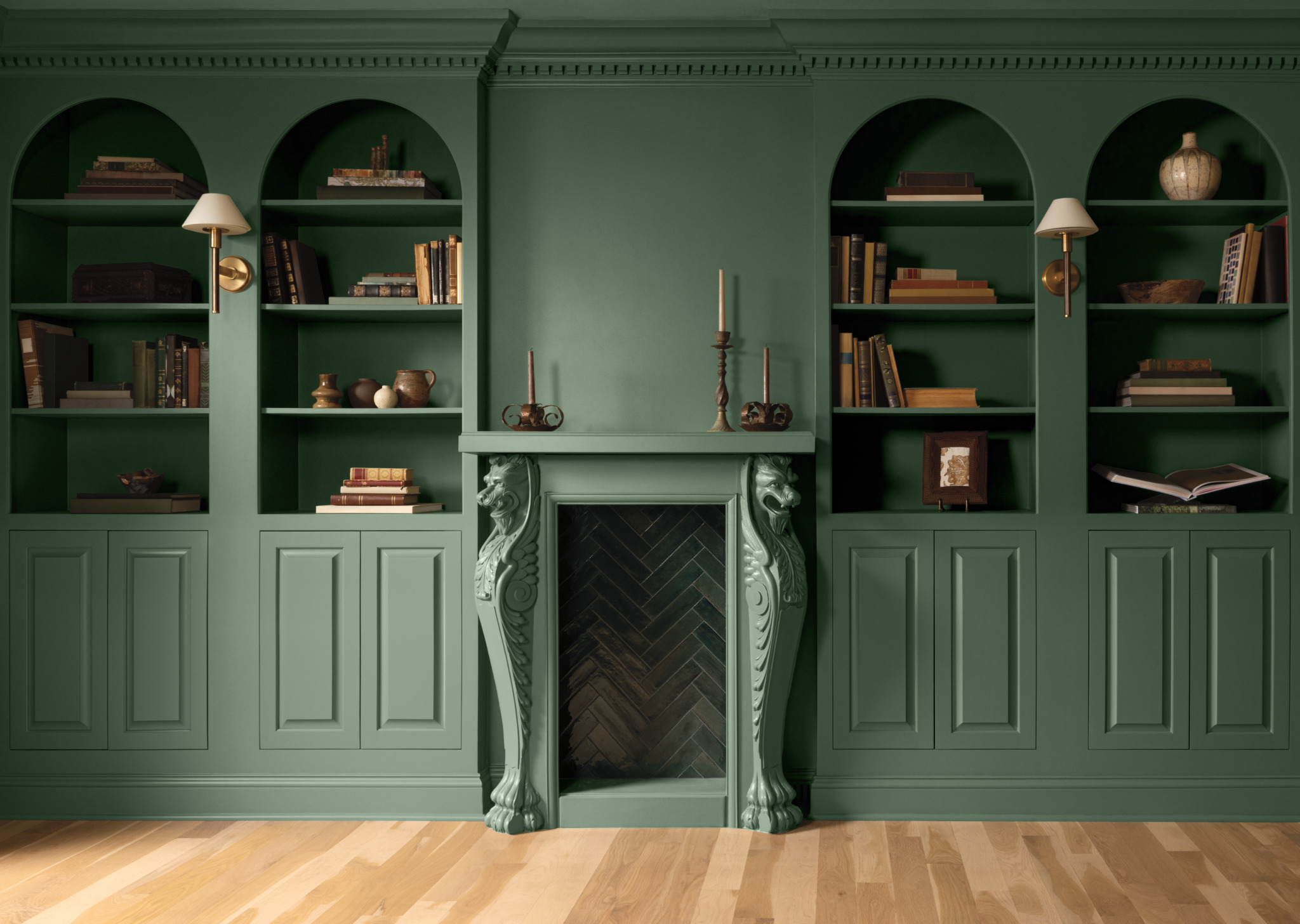
The practical applications of Webster Green showcase its exceptional adaptability across various architectural styles and room typologies. In one traditional residential setting highlighted by the brand, the rich color completely envelops a classic library, creating a cohesive and enveloping atmosphere by unifying built-in shelving, paneled walls, and a prominent fireplace surround into a single, immersive environment.
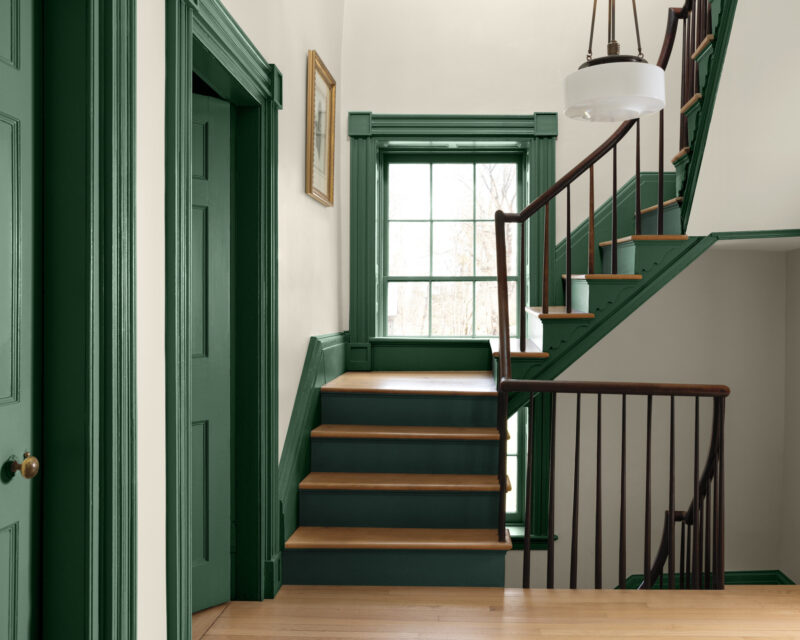
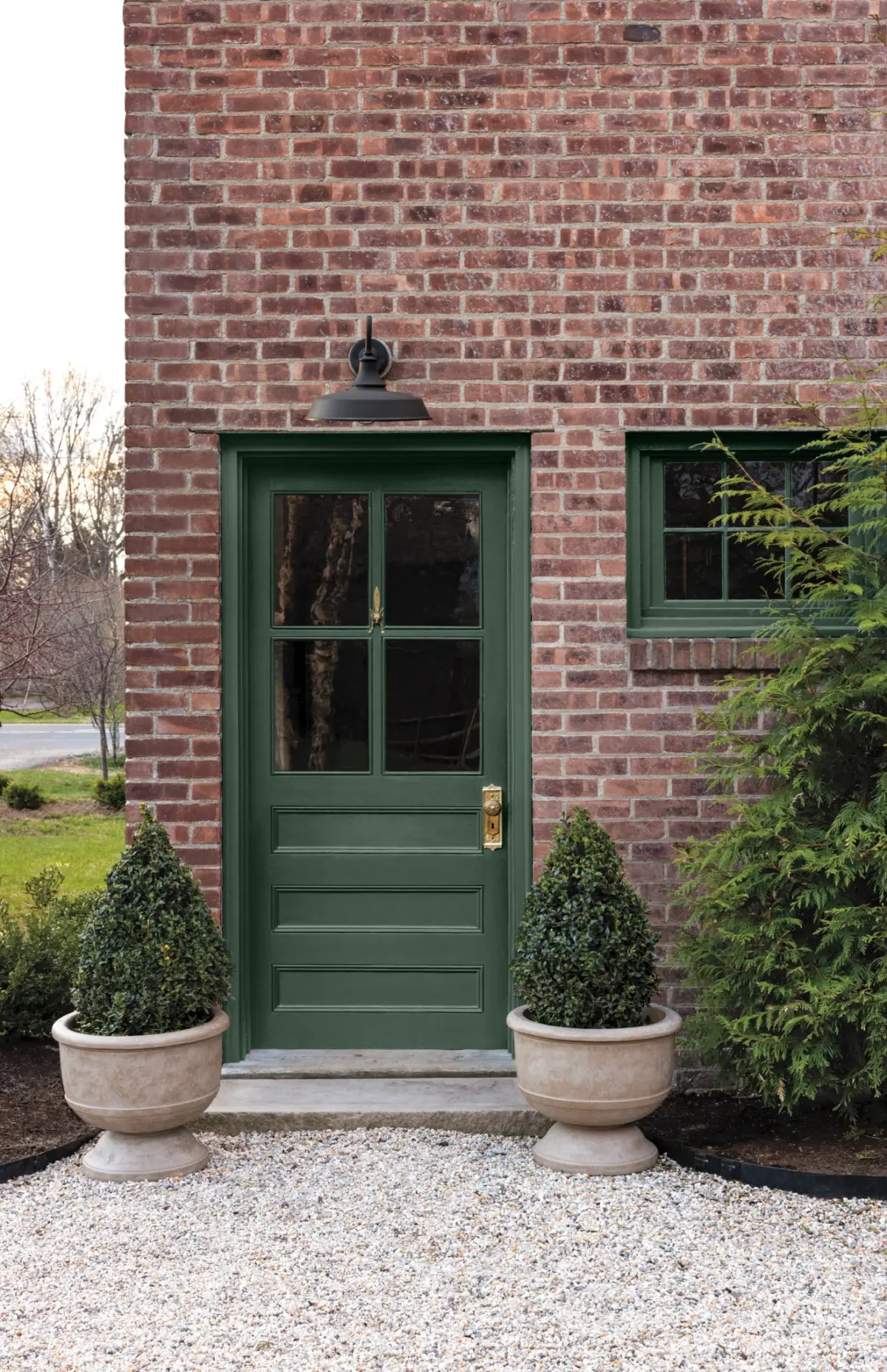
Conversely, the exact same paint color brings an entirely different, more contemporary sensibility when applied to a modern bedroom setting. In that space, Webster Green is paired with crisp, clean white trim and a contrasting pale blue ceiling, demonstrating how the color’s underlying versatility allows it to move comfortably and seamlessly between deeply traditional and ultra-modern interiors. Its application even extends to the exterior of the home, where a rich green front door adds a welcoming and grounded focal point to a classic brick facade.
Webster Green serves as the foundational anchor for Benjamin Moore’s broader Color Trends 2027 palette, a carefully curated collection of eight distinct hues drawn directly from the company’s extensive historical library of more than 3,500 colors. This comprehensive palette is designed to provide designers and consumers with a versatile toolkit for residential and commercial projects alike.
The seven accompanying shades in the 2027 palette offer a nuanced spectrum of tones intended to work in concert with Webster Green. Among them is White Down, a soft and inviting off-white; Nelson Blue, a pale, watery blue that introduces an airy quality; and Shakespeare Tan, a warm, golden neutral. Moving further into expressive territory, Wild Aster introduces a muted pink infused with subtle gray undertones, while Antique Copper brings a warmer, reddish-brown note that adds depth and tactile richness to the collection.
Rounding out the deeper end of the palette are Durango, a sophisticated dark neutral featuring strong olive undertones, and Townsend Harbor Brown, a rich burgundy that leans heavily toward a deep, earthy brown. Together, this curated octet of colors offers design professionals and DIY enthusiasts ample opportunities for both subtle, tonal combinations and more dramatic, expressive color contrasts.
To further articulate the conceptual roots of the palette, Benjamin Moore commissioned illustrator Tanu Vasu to create a series of hand-drawn illustrations. These artistic works explore the underlying inspirations of the Color Trends 2027 collection, reinforcing its deep connection to historical design principles, craftsmanship, and personal creative expression.
By positioning Webster Green as its definitive Color of the Year for 2027, Benjamin Moore is making a compelling and confident case that a color does not need to be entirely unprecedented or radically novel to feel deeply relevant in contemporary life. Instead, the brand is championing a return to thoughtful, enduring hues that honor architectural heritage while remaining wide open to the future of interior design.