Introduction: From Blank Canvas to a Superfamily
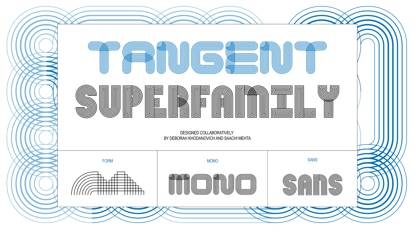
When designers Deborah Khodanovich and Saachi Mehta set out to write about their collaborative journey, they found themselves looking back at how quickly an abstract experiment could snowball into a sprawling, complex digital ecosystem. What began as an empty screen under the guidance of instructor Kelsey Elder quickly materialized into a robust superfamily of fonts known as Tangent.
To hear them tell it, the transition from having virtually nothing to managing a fully realized variable font system felt instantaneous. Yet, looking closely at their trajectory reveals a deliberate, step-by-step evolution driven by shared obsessions, rigorous testing, and the inevitable friction of turning a conceptual art piece into a functional typographic tool.
Pit Stop 1: (Crossed) Pathways
The journey of Tangent originated in Kelsey Elder’s class, appropriately titled Variable, through an assignment named Kit-Car. The brief drew inspiration from the ethos of Sister Corita Kent, encouraging students to observe the world around them, identify a foundational source, and break it down into modular components. Kent’s guiding philosophy—learning to see the world by looking at it one piece at a time—served as the conceptual north star for the entire project.
From the outset, Khodanovich and Mehta knew they wanted to collaborate, which required a modular foundation that could be easily passed back and forth between them. Coincidentally, both designers were already circling similar thematic obsessions from different directions for their respective theses: stories, dialogue, gossip, and the organic ways ideas converse, connect, and evolve from one person to another.
This conceptual framework raised a compelling design question: what would a typeface look like if every single glyph remained physically and conceptually connected to its neighbors? They began by sketching the simplest modules imaginable. Mehta found herself captivated by ribbons and their continuous, over-under twisted qualities, while Khodanovich explored custom path-drawing mechanics within the digital landscape of Animal Crossing.
Though they were exploring different conceptual rabbit holes, they arrived at the same destination. Both were drawn heavily to textiles, including knitting, weaving, and embroidery. These tactile explorations quickly transitioned from solid connected forms into layered strings of parallel lines designed to weave in and out of one another like thread. This breakthrough marked the inception of multiple parallel strokes.
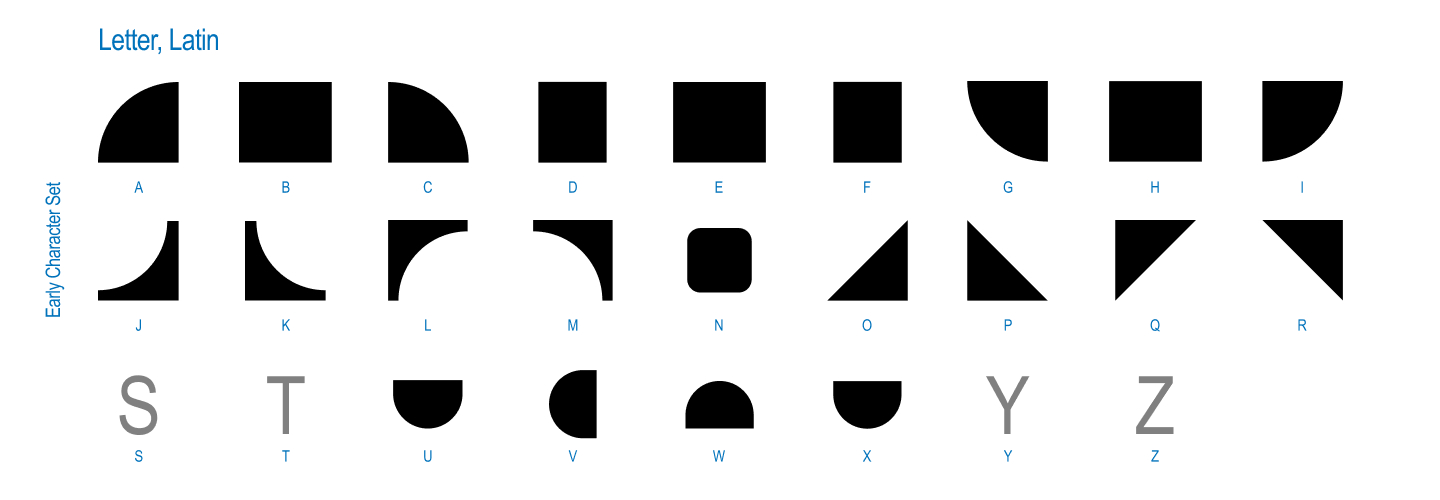
That weaving concept birthed the first official iteration of the project: a system defined by a single weight and a single axis. It functioned entirely as a modular, pattern-making font that always connected to itself through twists, loops, and turns. The core mechanic was beautifully simple—relying on round or square geometries, twisted or untwisted pathways—to mirror how oral storytelling and gossip transform, shift shape, and distort over time through dialogue. With this foundation established, the pair began collaborating directly on screen and paper, mapping out the initial grid of parts before letting creativity take the wheel.
Pit Stop 2: (Finding Our) Axes
Once the initial system proved viable, Kelsey Elder introduced a practical challenge: how was a user actually supposed to type with it? A modular, twisting, and connecting system functioned brilliantly as a conceptual art piece, but translating it into an intuitive tool for everyday users posed a significant hurdle. While Khodanovich and Mehta could navigate the system intuitively, outsiders struggled to make sense of the complex mechanics.
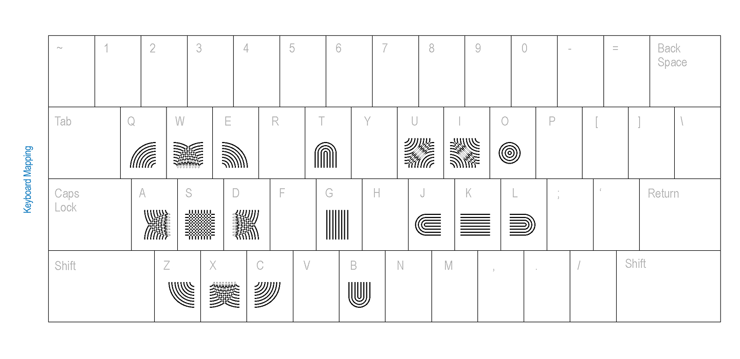
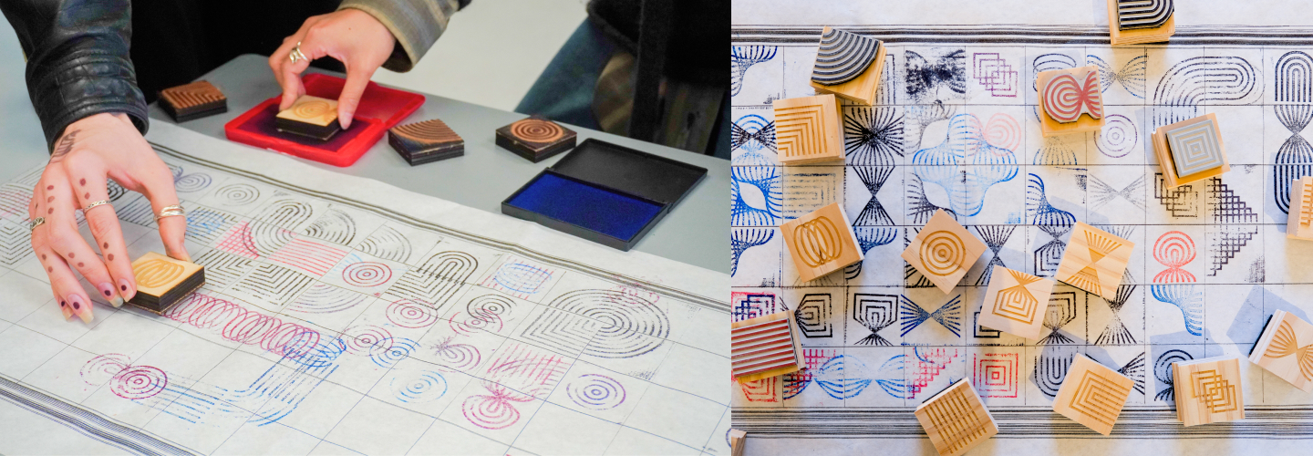
Elder suggested conducting keyboard mapping tests with their peers to determine the most intuitive methods for assigning the connecting parts to keyboard keys, drawing inspiration from digital gaming interfaces. In addition to digital testing, the duo embraced physical experimentation. They crafted rubber stamps and asked participants to stamp the glyphs onto extended physical grids, allowing people to experience the modularity with their hands rather than through a screen.
They also explored alternative input methods, including a Processing sketch that allowed users to draw their way into the system rather than relying on traditional keyboard input. Unsurprisingly, surrounded by fellow graphic designers, participants instinctively began assembling letters out of the modules without any prompting, immediately defaulting to Korean and English letterforms the moment the pieces were placed in their hands.
Pit Stop 3: (Going off on a) Tangent
That observational turning point shifted the trajectory of the project. If everyone interacting with the system naturally reached for letterforms, the creators decided to follow suit. Combined with the context of a variable type class, Khodanovich and Mehta expanded the grid dimensions and began constructing full alphabets equipped with contextual alternates. They tested color experiments and even attempted to build a sans-serif version. At this juncture, Tangent ceased to be merely a modular design experiment and officially became a typeface.
The evolution took another leap when Elder challenged them to leverage the generative nature of the system. He posed a forward-thinking question: if the entire framework was generative, why not instruct a computer to generate every possible permutation?
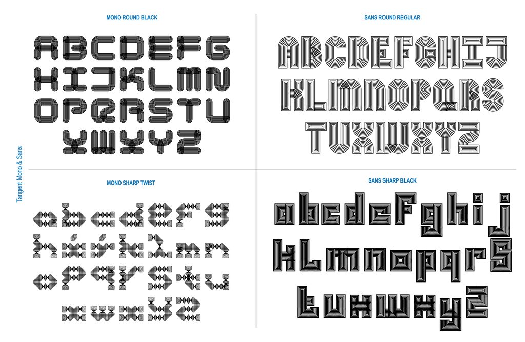
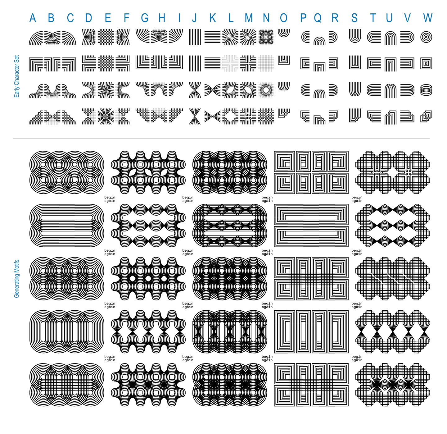
Establishing strict parameters, they set up a three-by-three grid where every spot had to be used, everything had to connect, empty slots were strictly capped, and rotating pieces to cheat the system was prohibited. Khodanovich spent considerable time working alongside Claude to refine the script until it successfully generated 971 distinct glyphs. True to their nature as type designers, they immediately began spotting letterforms within the computational noise, an exploration that ultimately led to the creation of the Mono version.
Pit Stop 4: (It takes a) Superfamily!
Just as the project seemed to settle, Elder introduced a final overarching question: what happens if it moves?
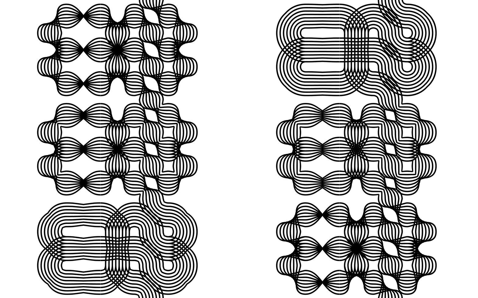
The prompt pulled them back into the realm of variable typography. Working across both sans-serif and monospaced variants, they built out a complete five-axis system encompassing twist, weight, amplitude, stretch, and radius.
Bringing this ambitious vision to life was no small feat. The designers frequently faced frustration when the Glyphs application resisted their complex workflow or refused to export the typeface properly. Having a collaborator proved essential during these roadblocks. Whenever one designer felt entirely defeated by software errors, they would pass the file to the other. Operating with a fresh pair of eyes, the receiving partner could almost always identify a solution to the technical impasse.
The inherently generative nature of the project means the work continues to expand. The creators maintain a running list of potential new axes and spinoff versions that the superfamily could grow into, finding new elements to incorporate whenever they believe the project has reached completion.
Reflecting on the journey, the creators view the project as an open invitation. They welcome designers and creatives to experiment with Tangent for posters, visual experiments, or other artistic endeavors, offering font files to those who reach out. Furthermore, they position the project as a showcase of their capability to craft unique, story-driven visual identities for brands seeking unconventional design solutions.