The ongoing global conversation surrounding typography, specialized script design, and the diverse applications of writing systems received a fresh contribution this week with the publication of a new piece on Alphabettes. Authored by typographic researcher and designer Sahar Afshar, the post—titled "Fit Arabic"—was published on May 15, 2026, adding to the platform’s continuous discourse on letterforms, type design, and the representation of women within the global typography community.
Alphabettes, widely recognized as an international platform highlighting the work and perspectives of women and non-binary individuals in lettering, type design, and typography, served as the host for Afshar’s latest contribution. The article, categorized under the site’s header discussions, invites readers and fellow typographers to engage with the intricacies of adapting and fitting Arabic scripts within contemporary and traditional typographic frameworks. Through a combination of visual presentation and thoughtful categorization, the piece bridges the gap between technical typographic execution and artistic appreciation.

The release of "Fit Arabic" highlights the enduring interest in non-Latin writing systems within the broader typography landscape. As digital communication continues to expand across diverse linguistic and cultural boundaries, the demand for sophisticated, high-performing typefaces that respect the structural integrity of the Arabic script has never been more critical. Afshar’s work on the platform draws attention to these nuances, offering insights that resonate with both seasoned type designers and typography enthusiasts who follow developments in multi-script typography.
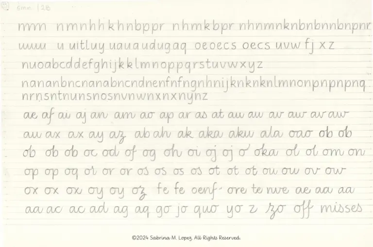
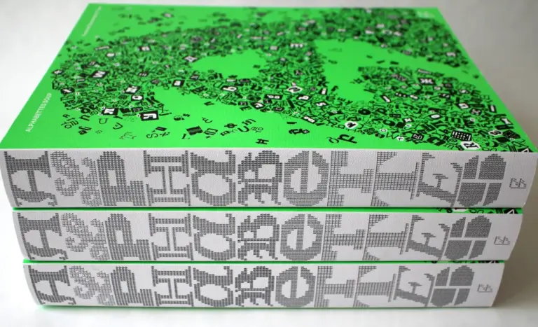
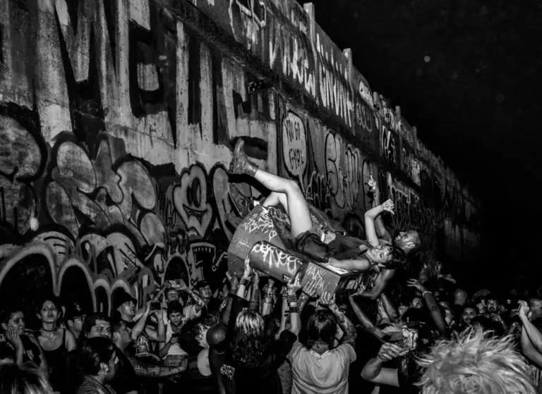
The post is accompanied by distinct visual assets designed to showcase the thematic focus of the piece, integrating seamlessly into the minimalist and typography-centric design aesthetic that Alphabettes maintains. By utilizing relevant categorization and tagging—including markers such as "arabic," "letterlove," "letters," "loveletters," "typeface," and "women in type"—the publication ensures that the content reaches an audience deeply invested in both the technical craft of letterforms and the community-driven aspects of the design industry.
Community engagement remains a central pillar of the Alphabettes platform, and Afshar’s contribution is framed within an active environment of ongoing typographic explorations. Positioned alongside recent work-in-progress features examining historical and experimental scripts—such as Xicheng Yang’s TangutBux project and forthcoming revivals of historical penmanship like the Spencerian Revival—"Fit Arabic" contributes to a diverse mosaic of typographic studies currently being shared among international practitioners.

The publication of Afshar’s piece also underscores the importance of visibility and specialized research within the type design community. Platforms like Alphabettes continue to provide a vital space for professionals to share works-in-progress, critical essays, and deep dives into specific writing systems that might otherwise receive limited attention in mainstream design discourse. Through thoughtful contributions like "Fit Arabic," researchers and designers are able to foster a deeper understanding of the complexities inherent in designing across different writing cultures, ensuring that type design continues to evolve in an inclusive and globally conscious direction. Readers interested in exploring the visual examples and detailed commentary provided in the post can access the full feature directly through the Alphabettes archive, where community discussions and related posts remain open for engagement.