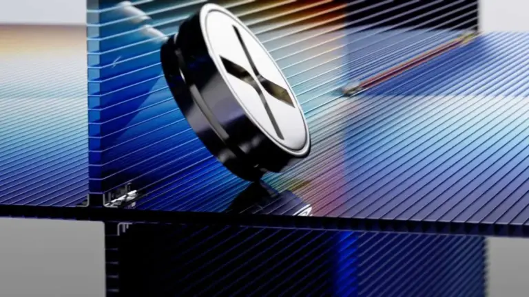
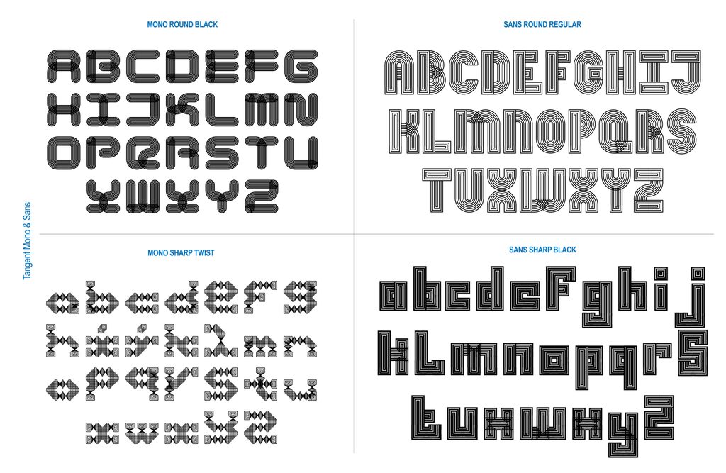
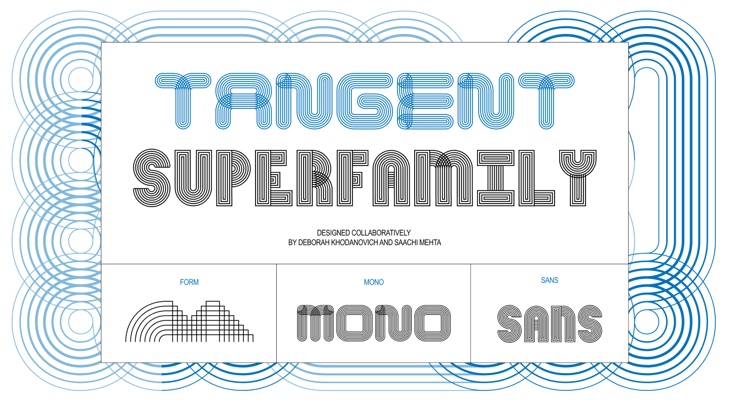
What happens when two designers take inspiration from the fluid, ever-changing nature of gossip, oral storytelling, and textiles, and translate those concepts into code and type design? For Deborah Khodanovich and Saachi Mehta, recent MFA graduates in Graphic Design from the Rhode Island School of Design (RISD), that exact question led to the creation of Tangent—a modular, generative type system that has since evolved into a sprawling superfamily spanning both Sans and Mono formats across five distinct variable axes.
Developed initially out of an assignment in Kelsey Elder’s Variable class at RISD, the project started with a simple brief inspired by Sister Corita Kent: “learn to see the world by looking at the world one piece at a time.” Students were instructed to observe patterns, toys, heirlooms, or optical illusions, break them down into fundamental components, and use those shapes to construct static glyphs. For Khodanovich and Mehta, who knew they wanted to collaborate from the outset, this modular constraint provided the ideal foundation. They could pass design files back and forth, building a system that was inherently connective and interactive.
Pit Stop 1: (Crossed) Pathways
Even in the earliest stages of ideation, Khodanovich and Mehta found themselves circling similar thematic territories from different creative directions. Mehta was deeply engaged with the visual qualities of ribbons—their continuous, over-under twisted continuous flow. Khodanovich, meanwhile, was exploring custom path-drawing mechanics within digital environments like Animal Crossing. Despite exploring seemingly different digital and physical rabbit holes, both designers converged on textiles, knitting, weaving, and embroidery.
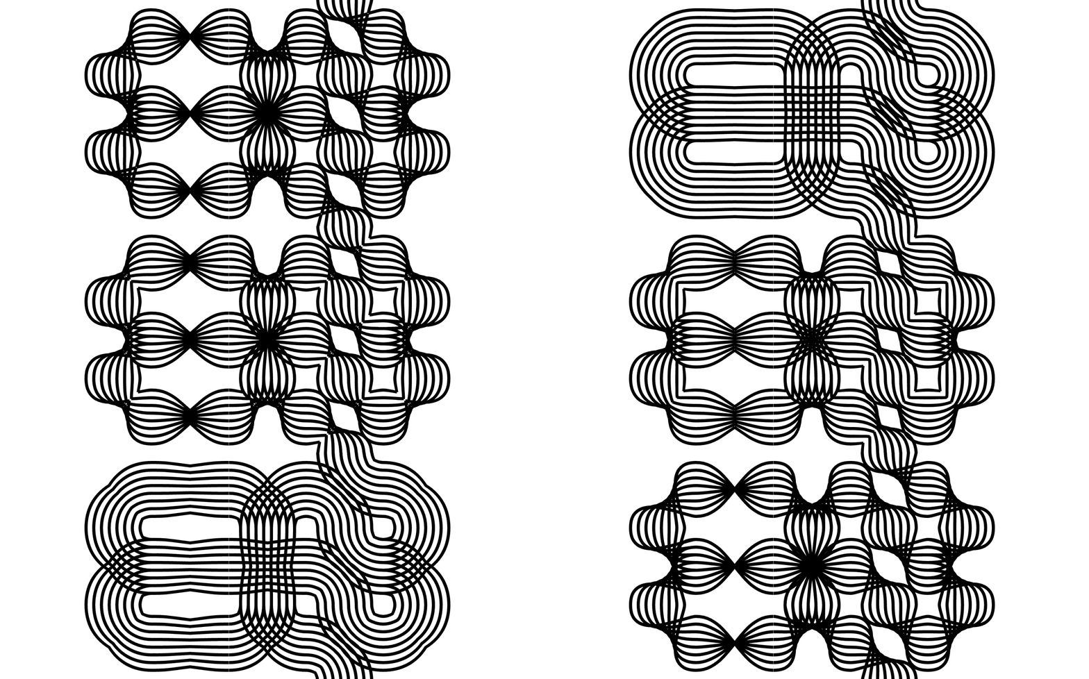
This shared fascination quickly transitioned from solid, connected forms into layered strings of parallel lines capable of weaving in and out of one another like thread. This mechanical breakthrough yielded the first true iteration of the project: a single weight, single-axis, pattern-making font built on a modular system where every glyph inherently connects to its neighbors, offering choices of round or square, twisted or untwisted forms.
Underpinning these aesthetic choices was a conceptual framework rooted in linguistics and human communication: how does gossip and oral storytelling transform and shift shape over time? How do narratives become twisted as they are passed from person to person through casual dialogue? By sharing screens and sketching out initial grids together, the duo established the core mechanics that would fuel every subsequent version of the typeface.
Pit Stop 2: (Finding Our) Axes
Once a functional modular system was established, instructor Kelsey Elder posed a practical design challenge: how does a user actually type with a system built on twisting, connecting components? While Khodanovich and Mehta could navigate the system intuitively, translating that fluency to external users required extensive testing.
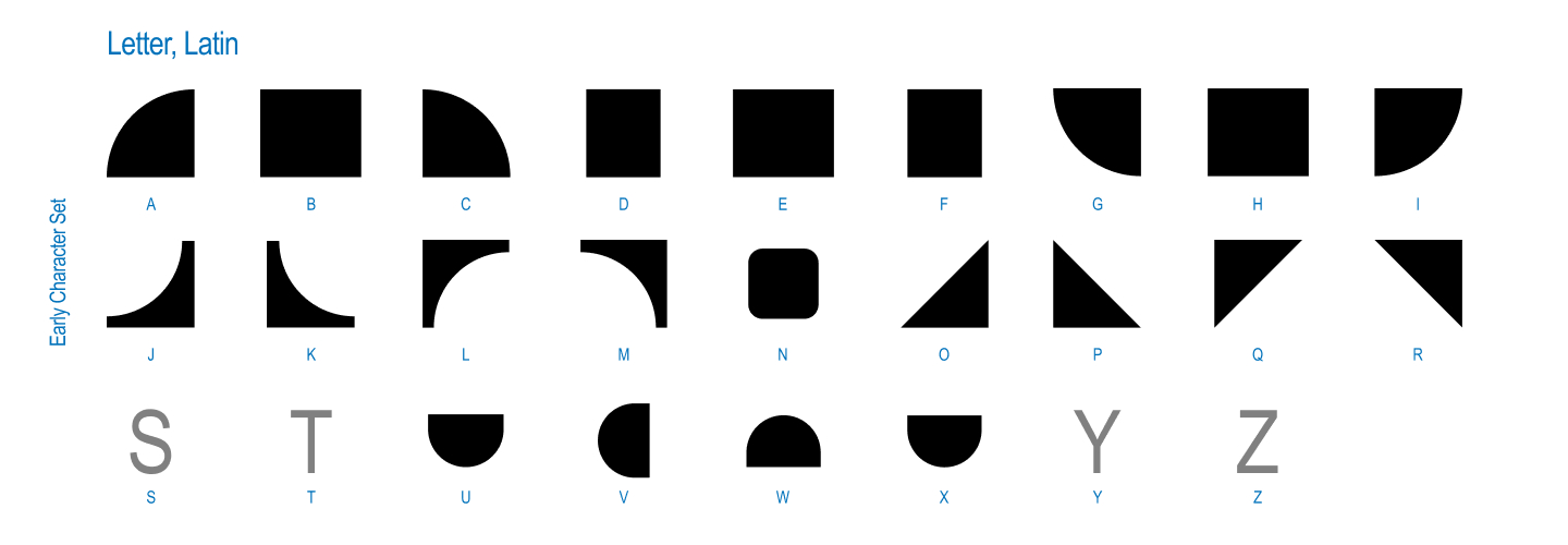
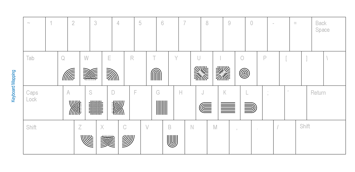
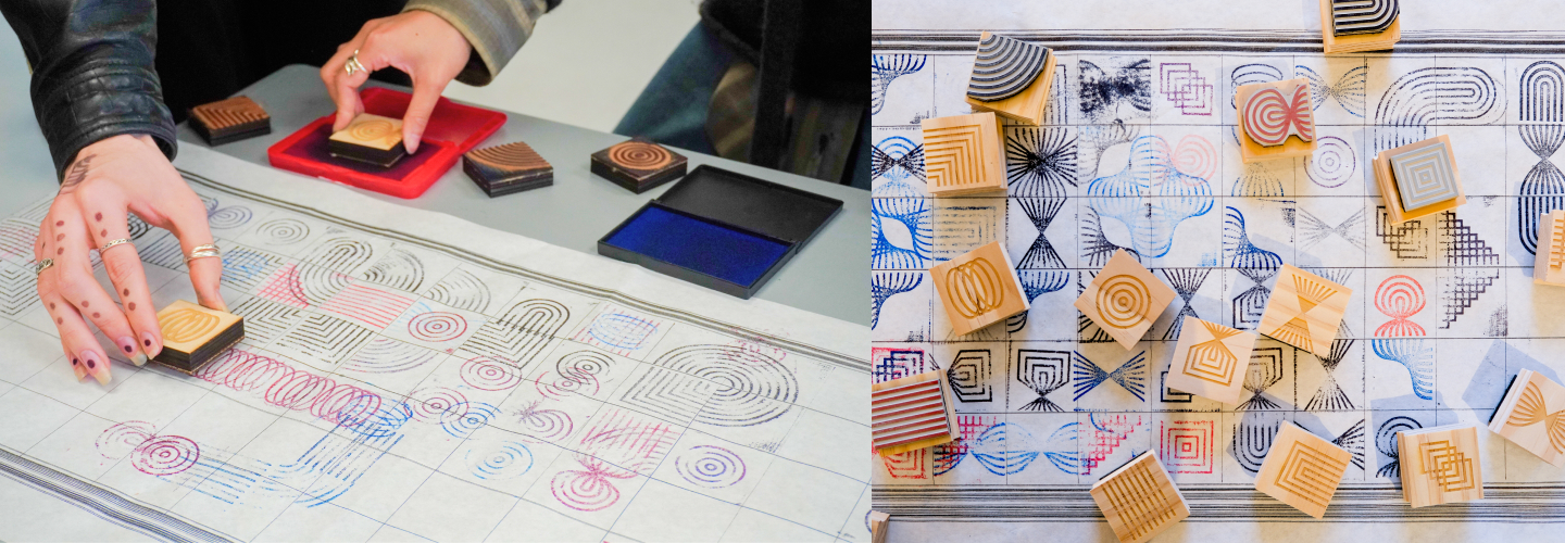
To solve this usability hurdle, the creators ran keyboard mapping tests with their peers, looking to digital games and alternative input systems to determine the most intuitive way to assign connecting components to specific keys. Alongside digital tests, they embraced physical prototyping by manufacturing custom rubber stamps. They invited participants to stamp the glyphs across long physical grids, allowing users to experience the modular logic tactilely rather than purely on a screen.
The experimentation didn’t stop at stamps or keyboards. The designers also developed a Processing sketch that allowed users to draw their way into the system rather than relying strictly on traditional typing methods. Interestingly, when handed the modular components, graphic design peers instinctively began forming recognizable letters in both English and Korean. This organic human tendency to find typography within abstract modular noise served as a major turning point for the project’s trajectory.
Pit Stop 3: (Going off on a) Tangent
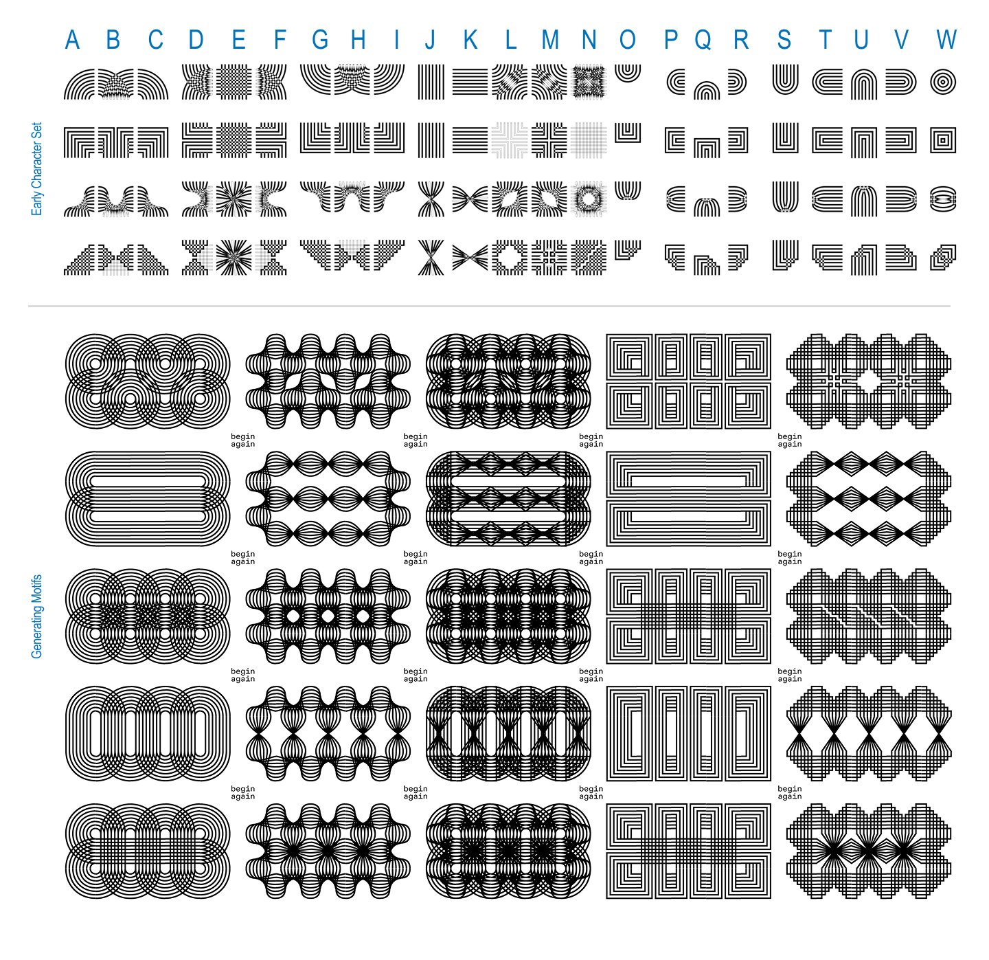
Motivated by how naturally users gravitated toward letterforms, and fueled by their coursework in a variable type class, Khodanovich and Mehta expanded their grid dimensions. They began constructing full alphabets equipped with contextual alternates, experimenting with color variations, and developing a companion Sans version. At this juncture, Tangent ceased being merely an experimental modular system and formally crossed the threshold into becoming a true typeface.
The evolution took another leap forward when Elder challenged them to leverage the generative nature of the system by programming a computer to generate every possible permutation. Working with strict rules—a 3-by-3 grid where every spot must be utilized, all parts must connect, empty slots were capped, and pieces could not be rotated to cheat the rules—Khodanovich collaborated with Claude to write a script that successfully generated 971 unique glyphs. True to their background as type designers, they immediately began discerning letters within the generated noise, an exploration that directly inspired the development of Tangent Mono.
Pit Stop 4: (It takes a) Superfamily!
The project expanded further when Elder introduced a final question: what happens if the type moves? This prompt pushed the designers back into variable font territory. They engineered a complete five-axis system incorporating twist, weight, amplitude, stretch, and radius across both the Sans and Mono editions.
Building a multi-axis variable font presented technical hurdles. The designers frequently encountered frustrations when the font-development application Glyphs resisted their complex workflows or refused to export the variable files. However, the collaborative nature of the project provided a built-in safety net. Whenever one designer hit a technical wall, they would pass the file to the other. With a fresh set of eyes, the impasse could usually be resolved through teamwork.
Today, Tangent exists as an expansive, ongoing generative superfamily with a running list of potential new axes and spinoff versions waiting in the wings. Whenever the creators feel the project is finished, new ideas naturally emerge.
For those interested in exploring the work, Khodanovich and Mehta have issued an open invitation for fellow creatives to experiment with Tangent for posters, design experiments, or projects by reaching out directly for font files. For organizations seeking a story-driven, connective typographic identity, the designers remain open to commissions.
Deborah Khodanovich is a Toronto-born designer and educator based in Providence, Rhode Island, having recently completed her MFA in Graphic Design at RISD. Her practice investigates gossip as a method of knowledge production, examining information networks and intimacy through typography, textiles, and books.
Saachi Mehta works at the intersection of visual design, motion graphics, and systems, translating concepts into experiences across identity, environmental, and editorial contexts. A former motion design instructor at RISD, where she also earned her MFA in Graphic Design, her professional background includes design work for the RISD Museum, Netflix, and HP.