Once upon a time, YouTube was simply the digital destination you went to watch a cat play the keyboard, or perhaps to upload a home video of your child, still recovering and somewhat disoriented from a trip to the dentist, having a profound existential crisis in the backseat of your family car. Back in those early days, the platform was a novelty, a quirky corner of the internet where anything went, provided it could be recorded and uploaded onto the web. In the dozen years since YouTube was first created and introduced to the world, it has evolved into something vastly different and infinitely more expansive. It has transformed into a universal hub for everything imaginable: a vibrant community for gamers, a broadcast network for livestreamers, a primary home for high-production music videos, a digital showcase for vloggers, a platform for Hollywood star power like Dwayne "The Rock" Johnson, a real-time source for breaking global news, home to record-shattering viral phenomena like "Despacito," a distributor for feature films, and whatever eccentric, internet-breaking spectacle creators like Logan Paul manage to dream up.
Yet, while the service has grown up significantly, maturing alongside its audience and expanding its technological capabilities, the application and website itself had largely remained stuck in the past. Both the desktop site and the mobile app could frequently feel cluttered, heavy, and unhelpful, presenting users with an overabundance of confusing navigation menus while failing to put enough emphasis on the actual content—the videos themselves. YouTube management was well aware of these persistent user interface shortcomings, and the company has rolled out a totally redesigned platform meant to rectify these historical complaints. Now, whether you choose to consume your video content via the traditional website or through the mobile application on your smartphone, you will encounter a YouTube that looks visibly cleaner, significantly simpler, and vastly more focused. In both environments, the platform appears to have taken a long, hard look at how video is produced, consumed, and shared in the modern digital era, subsequently building a completely new service around those contemporary realities.
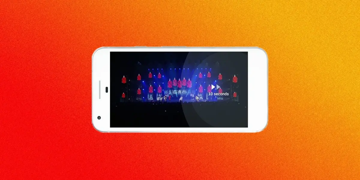
Consider the evolution of the mobile application, which has undergone some of the most noticeable aesthetic and functional transformations. The brand-new version of the app aggressively trades away all those heavy, distracting red borders for clean, minimalist white lines. This deliberate design choice ensures that video thumbnails and the moving images themselves remain the absolute focal point of the user experience, eliminating visual noise and letting users immediately spot what they want to watch. Furthermore, the mobile update introduces functionality that long remained exclusive to the desktop version of the platform: users can now seamlessly speed up or slow down playback speed directly from their mobile devices. Additionally, the app now supports intuitive touch controls, allowing viewers to simply double-tap on the left or right side of the screen to quickly rewind or fast-forward through video content.
Perhaps one of the most long-overdue and user-friendly changes arriving on the mobile app involves the handling of vertical video formats. Historically, watching a video filmed in a vertical orientation on YouTube was an exercise in frustration, subjecting viewers to massive black bars, known as letterboxing, on either side of the frame. The new design corrects this archaic limitation, finally recognizing that vertical video is a legitimate and widely accepted format that should not be penalized by rigid, outdated video players. Going forward, vertical videos will display properly, filling the phone screen naturally without unnecessary borders or empty space. Even when viewers are not watching content in full-screen mode, the dynamic player adjusts fluidly to fit whatever arbitrary size or aspect ratio the video happens to be, completely breaking away from the rigid 16:9 widescreen box that once dictated every viewing experience. This new design fundamentally acknowledges that modern creators make, and modern audiences watch, an incredible variety of videos in a multitude of different ways, empowering users by giving them as much visual control as humanly possible over their viewing sessions.

Along with this sweeping functional and aesthetic update, the mobile app also brings with it a brand-new, modernized icon. Since the earliest days of the platform, YouTube had always relied upon its classic text-based logo, featuring the black word "You" followed immediately by the white word "Tube" enclosed inside a rounded, rectangular red background. The freshly updated logo abandons the old text arrangement in favor of a cleaner, more universally recognizable symbol: a bold red play button—the company’s most iconic and enduring visual signifier—placed directly next to the familiar typography of the word YouTube.
On the desktop front, the new design updates the visual aesthetic quite substantially, though it focuses more on refining the overall look and feel rather than completely restructuring the core viewing experience. Instead of the traditional layout characterized by stark white content boxes resting upon dull gray backgrounds, users are now given the choice between a clean, bright white display or a brand-new dark, cinematic theme. Both display options are complemented by fresh, simplified typography that makes reading titles, descriptions, and comments easier on the eyes. The entire web page breathes a little better than it did previously, utilizing generous whitespace and adhering closely to Google’s established Material Design guidelines to create a cohesive, modern visual language across platforms.
Ultimately, the overarching philosophy and the entire stated point of this massive redesign is to effectively take YouTube out of your experience while you are using YouTube. The core thesis is that a viewer should be completely absorbed in the content they have chosen to watch, rather than distracted by the surrounding user interface, the navigation bars, or even the underlying recommendation engine that constantly feeds them new suggestions. Of course, this design philosophy deliberately tries to make you forget about the massive server load you might be causing by streaming your fortieth consecutive view of Taylor Swift’s "Look What You Made Me Do."
These sweeping interface changes certainly feel like a genuine, substantive step in the right direction for the platform. By systematically clearing the digital cruft out of the way, the redesign allows vastly different kinds of video formats—from traditional cinematic horizontal uploads to modern vertical smartphone creations—to feel entirely native to the ecosystem. It even subtly assists users in discovering new content to watch without resorting to aggressive or overwhelming menu systems. Furthermore, for those who prefer a more subdued nighttime viewing environment, throwing on the newly introduced Dark Theme makes watching the undead iterations of pop stars feel even more dramatic and immersive than before.
Underpinning all of these visible aesthetic and functional upgrades is a fundamental technological shift. YouTube engineers note that these new products have been constructed upon an entirely new underlying technical framework, one that will fundamentally enable the development and deployment of new features and tools even faster than before. Given the rapid, relentless pace at which the online video landscape changes, such foundational agility is an absolute necessity for the company. Everyday users are constantly finding innovative new ways to record, livestream, watch, comment upon, and search for video content across the globe. In an environment defined by perpetual disruption, YouTube recognizes that it can only maintain its status as the undisputed heavyweight champion of online video as long as its underlying infrastructure and interface can successfully keep pace with the evolving habits of its massive global audience.