The web development ecosystem is experiencing a rapid wave of innovation, driven by new browser features, refined CSS specifications, and evolving interface design standards. The latest edition of "What’s !important" (#18) highlights a collection of recent breakthroughs, technical tutorials, and open discussions from prominent developers across the front-end community. From declarative interest invokers and native HTML location elements to advanced CSS Grid variable mapping and feature queries, front-end engineers are gaining unprecedented control over user experience, layout logic, and application performance.
These updates reflect a broad, industry-wide shift toward relying on native platform capabilities rather than heavy JavaScript polyfills or complex DOM manipulations. As browser engines adopt these new features—particularly Google Chrome leading several key implementations—developers are actively testing progressive enhancement strategies to bring modern standards into production environments without sacrificing backward compatibility.
Rethinking Tooltip Mechanics with Interest Invokers
User experience design frequently grapples with the delicate balance of contextual overlays, particularly tooltips. Developer Abhishek Jakhar recently examined the behavioral nuances of tooltip timing, arguing that interactive tooltips require an intentional delay before appearing, followed by an immediate dismissal once the user moves away. The primary rationale behind this design pattern is to prevent unwanted visual clutter; users moving their cursor across a busy screen should not inadvertently trigger a cascade of popups. However, once a user explicitly decides to dismiss a tooltip, the interface should respond instantly without lingering animations.
Jakhar demonstrated how to programmatically implement this timing strategy, while also noting a critical edge case: if an element’s hoverable interactive target is too small, subtle mouse movements can cause unintentional de-triggering. In such instances, maintaining a slight delay during dismissal helps preserve usability and prevents jarring flicker.
Responding to Jakhar’s exploration, CSS practitioner Chris Coyier presented a modern declarative approach utilizing interest invokers. Built on emerging web platform capabilities, interest invokers introduce two dedicated CSS properties: interest-delay-start and interest-delay-end. These properties allow developers to manage display timing natively within stylesheets rather than relying on complex JavaScript event listeners or CSS keyframe workarounds. While full support for interest invokers is currently limited to Chrome, the technique serves as an ideal application for progressive enhancement, allowing modern browsers to deliver optimized overlay behavior natively while gracefully falling back in unsupported user agents.
<geolocation> and How to Use It Today
Managing location data on the web has historically presented significant developer friction. The traditional JavaScript Geolocation API involves complex asynchronous flows and overhead stemming from underlying hardware interactions, including GPS satellites, local Wi-Fi networks, and cellular towers. Furthermore, once a user grants or denies location permissions, modifying that state later within the browser interface can be confusing and frustrating for non-technical users.
The proposed <geolocation> HTML element addresses many of these UX and developer pain points by encapsulating location access directly into a native, declarative form element. However, integrating a native browser control introduces unique constraints, particularly regarding CSS styling restrictions designed to prevent UI spoofing and maintain platform security guarantees.
Because native support for <geolocation> is presently confined to Chrome, implementation strategies require a dual approach. Developers can integrate the new <geolocation> element alongside the established JavaScript Geolocation API. By leveraging this fallback methodology, engineering teams can adopt the native element immediately in supporting browsers while maintaining full functional coverage for users on other browser engines, ensuring a seamless transition as broad cross-browser adoption progresses.
MicroLighter: A ::highlight()-Based Syntax Highlighter
Code syntax highlighting on the web has traditionally relied on heavy JavaScript libraries that parse code blocks and wrap individual tokens in thousands of custom <span> elements. This approach bloats the Document Object Model (DOM), consumes significant memory, and frequently degrades rendering performance on modern developer portals and documentation sites.

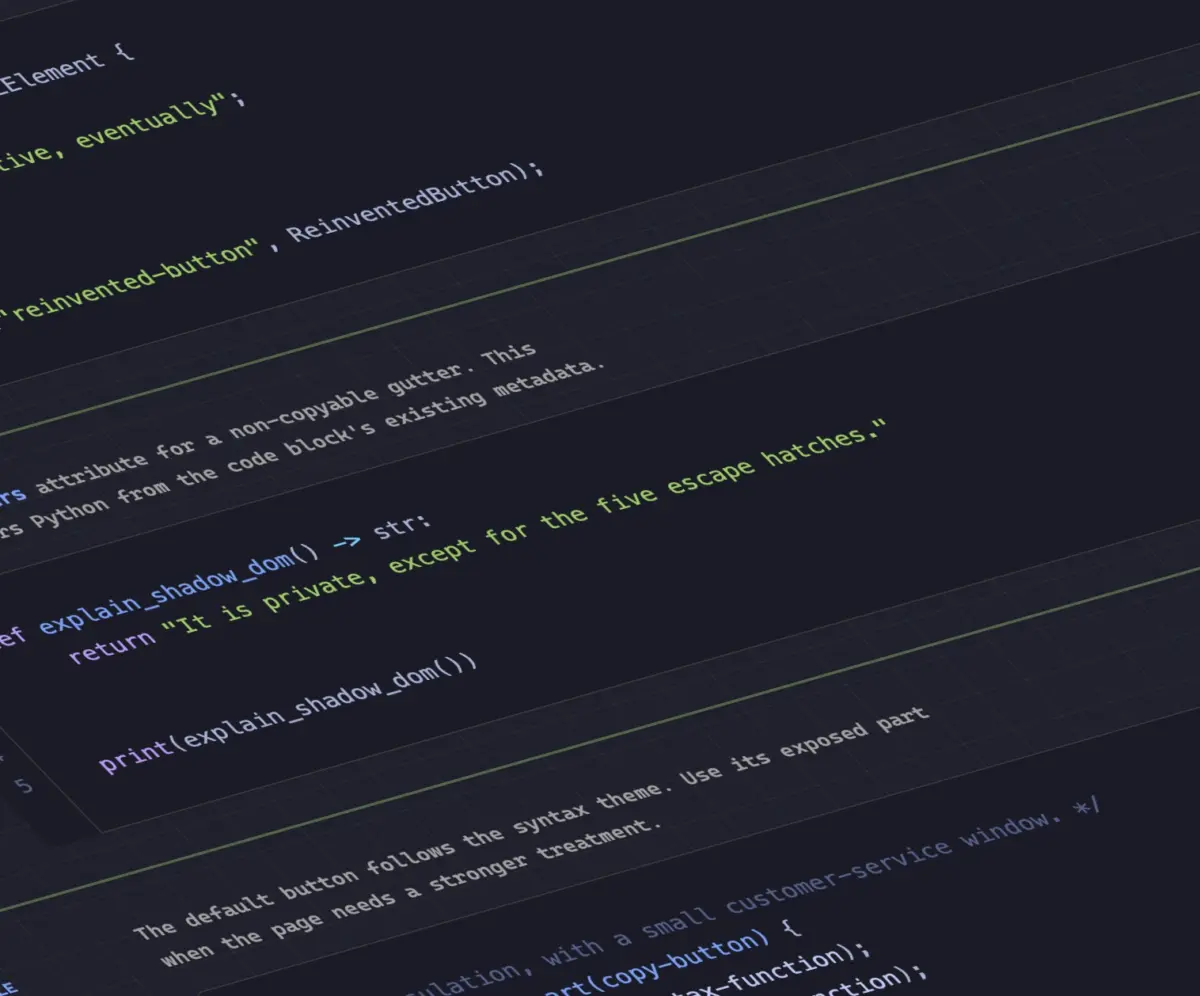
To address these performance bottlenecks, developer Dave Rupert created MicroLighter, a lightweight syntax highlighting utility built on top of the browser’s native Custom Highlight API and the ::highlight() CSS pseudo-element. By leveraging the Custom Highlight API, MicroLighter allows developers to programmatically define text ranges and apply styling rules directly through the rendering engine without modifying the underlying DOM tree structure.
Rupert published technical instructions detailing how to implement MicroLighter within modern web applications, while web developer Geoff Graham provided additional coverage analyzing its architecture. The utility demonstrates how modern browser APIs can effectively obsolete legacy, DOM-heavy client-side scripts in favor of native, high-performance styling mechanisms.
How to Get CSS Grid Information into CSS Variables
Front-end developer Temani Afif introduced an innovative technique that bridges layout engines and custom property logic by exposing dynamic CSS Grid metadata directly into CSS variables. Specifically, Afif demonstrated how developers can capture structural parameters—such as the total count of rows and columns—as well as the exact coordinate indices (X and Y positions) of individual grid cells.
Currently, this methodology carries one core constraint: the targeted grid layout must utilize equal-width column tracks. However, as CSS specification standards continue to evolve rapidly, layout engines may eventually lift this restriction for more dynamic layout configurations.
Afif further extended this concept to showcase practical user interaction models, demonstrating how cell coordinate tracking can be repurposed to calculate hover proximity within pure CSS. By exposing cell locations through custom properties, stylesheets can dynamically adjust visual elements based on the cursor’s relative distance to target components, opening up sophisticated micro-interactions without necessitating continuous JavaScript event tracking.
Dark Mode: Two-State or Tri-State?
The architectural design of dark mode toggles remains a subject of active debate within the web development community, centered on how user preferences should interact with operating system defaults.
W3C member Lea Verou advocates for a binary, two-state toggle architecture, emphasizing simplicity and predictable interface behavior. Conversely, browser engine contributor Bramus argues in favor of a tri-state approach—allowing users to explicitly select between "Light," "Dark," and "System Default." Proponents of the tri-state model emphasize that it respects explicit user choices while remaining synchronized with operating system schedule changes when desired.
Synthesizing both perspectives, developer Vale.Rocks outlined an "auto-until-overridden" two-state model. Under this design pattern, an application defaults automatically to the user’s system-level color scheme setting. However, as soon as the user manually interacts with the theme toggle, the application registers an explicit preference override. This hybrid approach seeks to retain the operational simplicity of a two-state interface while preserving user autonomy over personal display preferences.
An Introduction to the Class Prefix Selector
Bramus also introduced a proposed addition to CSS selector capabilities: the class prefix selector. Designed as a specialized wildcard syntax, the proposed .something-* selector allows developers to match all class names sharing a common prefix.

.something-*
  /* Style rules applied to any matching class prefix */
While the specification is not yet implemented across browser engines, the proposal offers significant ergonomic and performance improvements over existing attribute selectors. Historically, targeting dynamic class names required complex attribute matching syntax:
[class^="something-"]
  /* Matches class="something-xxx" */


[class*=" something-"]
  /* Matches class="xxx something-xxx" */


[class*="something-"]
  /* Matches class="my-something-xxx" */
Legacy substring and prefix attribute selectors carry noticeable performance overhead because browser layout engines must parse raw string values across element attribute lists. The dedicated class prefix selector simplifies stylesheet syntax while providing browser engines with optimized, native class-index lookup pathways. Web designer Geoff Graham provided additional commentary on the proposal, noting that its utility and operational simplicity make it a strong candidate for swift adoption across browser vendors.
Advanced Feature Queries with named-feature()
Complementing his selector proposals, Bramus detailed the rollout of the @supports named-feature() conditional function, which is now supported in Google Chrome.
Standard feature queries through @supports (property: value) allow stylesheets to test whether a browser recognizes specific CSS syntax. However, standard queries cannot determine whether an engine correctly supports subtle behavioral interactions or complex layout sub-features. The @supports named-feature() function addresses this limitation by allowing developers to query explicit browser engine capabilities—such as whether the layout engine properly respects matrix transforms when calculating CSS anchor positioning.
By enabling targeted capability detection at the engine level, named-feature() significantly enhances the overall utility of @supports directives, giving engineers granular control when executing progressive enhancement strategies.
Balancing Wrapped Flex Items Across Rows and Columns
Layout balancing capabilities have expanded beyond typography with Chrome’s introduction of flex-wrap: balance. Expanding upon the design principles established by text-wrap: balance—which automatically calculates line lengths to eliminate typographic rags and widows—flex-wrap: balance applies similar layout logic to flexbox containers.
Web layout specialist Ahmad Shadeed published a detailed analysis examining the mechanics of flex-wrap: balance and its practical design applications. When flex items span multiple lines or columns, standard wrapping often creates uneven visual distributions, leaving isolated items on final rows. The flex-wrap: balance directive instructs the layout engine to calculate total available space across wrapping boundaries, evenly distributing flex items to create visually harmonious grids without requiring manual media query adjustments or structural DOM modifications.