If you had asked branding experts or political analysts a month ago to identify the most politically explosive graphic design initiative in Australia, very few would have pointed toward a local municipal email signature. Yet, an administrative decision regarding digital communication assets in Sydney’s southern suburbs has unexpectedly escalated into a passionate national debate, drawing attention across Australia and echoing across media outlets over 10,000 miles away in the United Kingdom.
The controversy centers on Sutherland Shire Council, a local government area located in Sydney’s south that represents a population of roughly 240,000 residents. The region rarely dominates national news headlines, let alone international reporting. However, the local authority recently found its brand identity at the absolute epicenter of a fierce public dispute over history, public representation, and modern design standards.
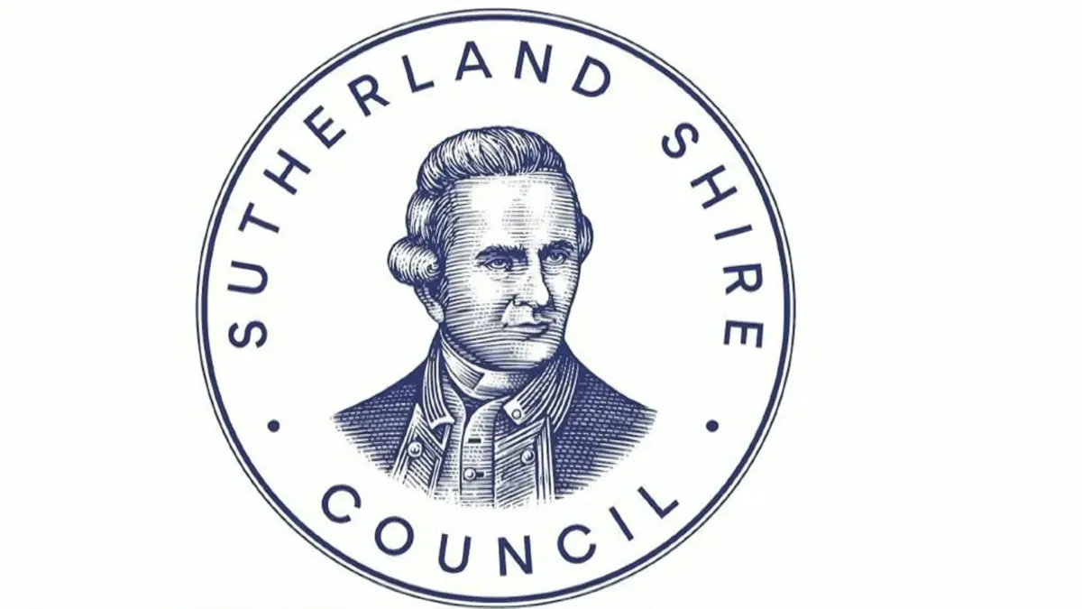
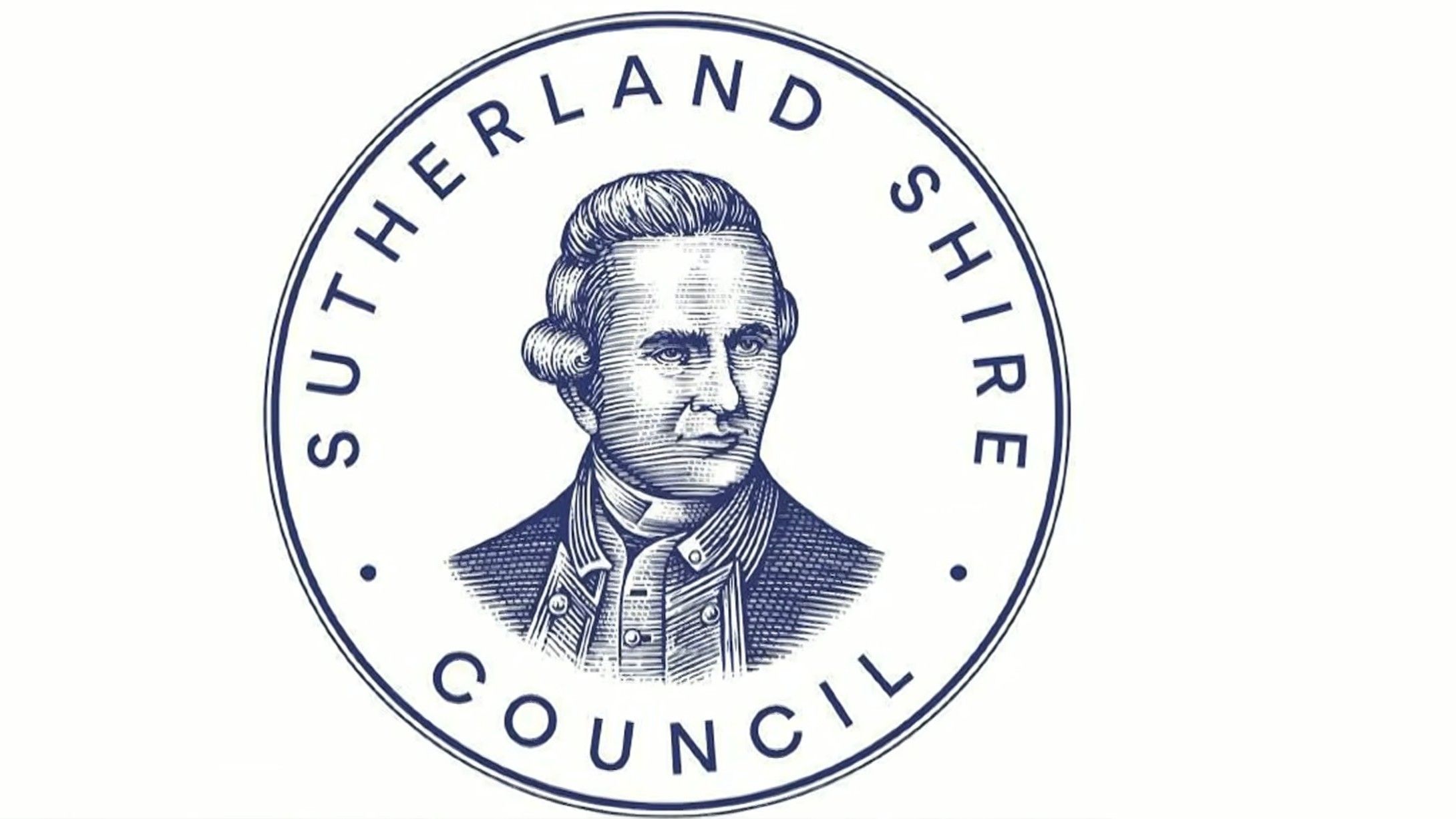
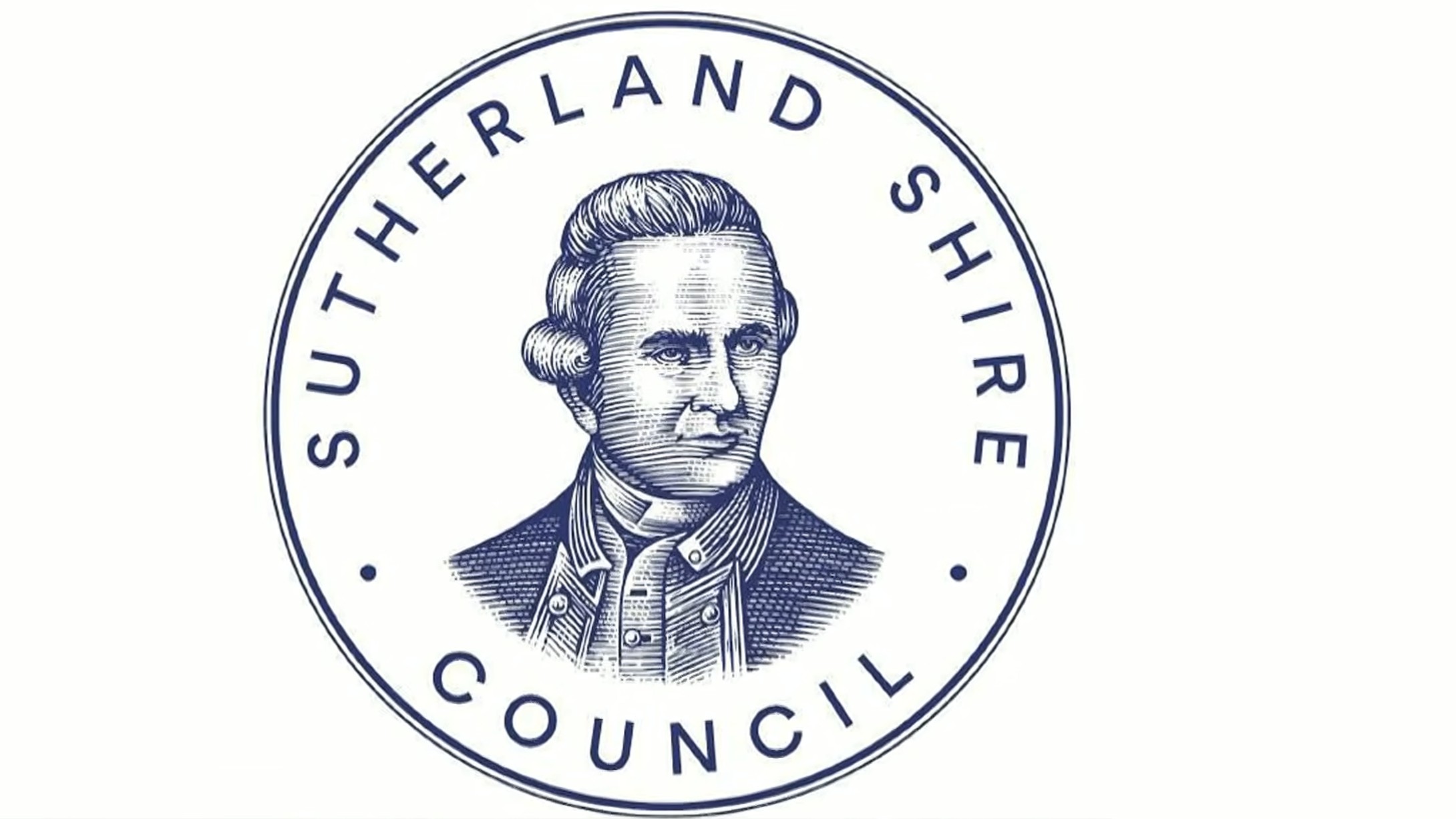
At the heart of the disagreement is the council’s long-standing crest: an intricate circular emblem featuring an engraved portrait of Captain James Cook. The British explorer famously came ashore on the east coast of Australia at Kurnell—located within the borders of the modern-day Sutherland Shire—in April 1770. For decades, Cook’s likeness has served as a central visual marker for the municipal authority. But when council staff began adjusting how and where that detailed emblem is used across digital channels, what was intended as a routine graphic cleanup quickly turned into a high-profile cultural flashpoint.
The Captain Cook crest row explained
The controversy began to simmer back in July, when municipal staff started favoring a newer, streamlined logo for everyday digital communications, including staff email signatures and standard administrative notices. This alternative logo features a clean, light blue wave graphic positioned above bold, modern lettering. It is a straightforward design meant to evoke the coastal geography of Sydney’s southern beaches and present a clear visual identity that scales effectively on modern digital displays.
Crucially, the practical implementation of this lighter design did not mean Captain Cook had been removed, erased, or "cancelled" by municipal administrators. The council had not voted to abolish the historic crest or strip Cook from local history. Instead, internal guidelines had designated the detailed circular portrait for high-level, formal contexts—specifically what the council categorized as "civic, ceremonial and high-value corporate applications." For low-resolution or small-scale applications, such as small screens and email footers where complex line engravings inevitably turn into unreadable dark smudges, staff began employing the simplified wave icon.
Despite the functional rationale, the operational shift occurred without a formal council-wide vote, triggering friction among elected representatives. Councillor Haris Strangas expressed strong dissatisfaction with the fact that elected officials had not been consulted prior to the rollout of the digital design policy. Seeking to address the lack of broad council input, Strangas tabled a motion demanding a formal review of the municipal identity and branding guidelines.
To explain his motion, Strangas appeared on Nine’s Today show, a major national breakfast television program in Australia. During the broadcast, Strangas presented himself as a pragmatic local representative who was not seeking to inflame cultural tensions. He explicitly acknowledged that most working-class residents in the Shire had far more pressing daily concerns than municipal graphic design. Nevertheless, he maintained his stance that historical symbols should not be quietly sidelined in administrative correspondence without public discussion and democratic oversight.
Once the story reached national television, the subtle distinction between dual-use brand guidelines and complete visual erasure was quickly lost in public commentary. Sutherland Shire unexpectedly found itself on the front lines of Australia’s broader cultural and political debates. External commentators, media figures, and political pundits rapidly seized upon the narrative, projecting their own ideological agendas onto the council’s internal operational decision. What began as a standard debate over internal administrative consultation swiftly spiraled into a heated public controversy over historic memory and visual symbolism.
While many local residents likely viewed the mounting media storm with detachment or amusement, the episode highlights a growing challenge for contemporary graphic designers and brand managers: modern political polarization makes it increasingly difficult for public and private organizations to perform routine visual maintenance.
Why logos need to change
From a professional design perspective, logos and brand marks are functional tools designed to communicate clearly across media formats, rather than static monuments carved permanently in stone. As communication platforms evolve—shifting from print media and heavy letterheads to smartphones, smartwatches, and high-density digital displays—visual identities require continuous adjustment. Logos must be refined, updated, redesigned, or supplemented when they become visually dated or fail to function practically on small screens. Such updates represent standard brand maintenance rather than historical revisionism or visual vandalism.
Under normal circumstances, routine brand evolutions take place without generating public outrage. The vast majority of visual rebrands occur smoothly, with general audiences barely registering the technical adjustments involved:
- In 2019, financial services giant Mastercard removed its name from its iconic overlapping red and yellow circles emblem, trusting the simplified geometry to stand on its own in digital environments.
- That same year, Volkswagen flattened its classic chrome badge into a minimalist, two-dimensional line design optimized for digital interfaces and electric vehicle displays.
- In 2021, Burger King abandoned its glossy 1990s emblem to return to a simplified, retro-inspired bun icon that scales effortlessly across modern digital apps and physical signage.
- In 2023, Pepsi introduced a modernized, bolder globe logo utilizing sharp typography and high-contrast black tones to improve visual pop across digital packaging.
Historically, changes to Sutherland Shire Council’s own visual branding followed this exact pattern of practical adaptation without drawing national attention. In 2008, the council adjusted its official mark by reducing the scale of the Captain Cook portrait to prominent display alongside updated council typography and a revised color palette. Later, ahead of the 2020 250th anniversary of Cook’s landing at Kurnell, the detailed engraving was carefully restyled and optimized to ensure better reproduction on computer monitors. Furthermore, the light blue wave motif itself is far from new; it was originally introduced into the council’s broader visual identity kit back in 2017. None of those prior adjustments sparked national political debate or international headlines.
The practical necessity of the latest change stems directly from the technical limitations of digital screens. Intricate 18th-century style portrait engravings—replete with fine cross-hatching and complex line work—were designed for copperplate printing press technology and large-format paper documents. When shrunken down to fit inside a standard 16-pixel email footer or a mobile web header, those complex details collapse into visual noise. The wave mark, by contrast, maintains crisp readability across any digital format, fulfilling the primary job of a modern utility mark.
What this means for designers
The fierce pushback surrounding Sutherland Shire’s digital email signature reflects a challenging environment for design professionals. Graphic identity projects are no longer evaluated purely on technical merit, legibility, color harmony, or typographic hierarchy. Instead, public marks are increasingly swept up into broader debates around history, heritage, and socio-political identity.
This reality does not suggest that historical context is irrelevant, nor does it imply that local communities should be denied a voice in how their public institutions are presented. Captain Cook’s historical connection to Kurnell remains a central chapter in the local heritage of the region, a fact reflected in the council’s decision to preserve the historic crest for formal civic ceremonies and legal documents. The operational policy merely introduced a complementary, versatile graphic for high-frequency digital channels.

However, the disproportionate public reaction to minor design tweaks creates severe operational problems for creative professionals. When routine branding updates trigger intense media blowback and public controversy, corporate and municipal clients often absorb a damaging lesson. Observing the intense reactions faced by organizations ranging from local councils to major corporate rebrands such as Cracker Barrel or Jaguar, decision-makers may conclude that avoiding visual updates altogether is the safest course of action.
This growing risk aversion presents a serious challenge for the design industry. When organizations become too fearful of public controversy to update their visual systems, they remain trapped with outdated, non-functional visual identities that fail to meet modern technical standards. For institutions like Sutherland Shire Council, balancing historical preservation with practical, modern design remains a delicate task—one where standard administrative maintenance can instantly transform into a national political debate.