For decades, digital typography on the web was constrained by browser rendering inconsistencies and rigid layout mechanics. Early front-end reset stylesheets, such as Eric Meyer’s reset or Normalize.css, focused primarily on eliminating browser-default margins, harmonizing padding, and standardizing box models across competing layout engines. However, fine-grained typographic controls—such as managing text orphans, trimming line-box leading, or scaling headings relative to their immediate parent containers—remained largely out of reach for native CSS. Developers were frequently forced to rely on heavy JavaScript utilities, brittle negative margins, or verbose media queries to achieve editorial-grade typography.
Recent advancements within the World Wide Web Consortium (W3C) CSS specifications have fundamentally transformed this landscape. Modern CSS now offers native properties capable of managing subtle typographical nuances that once sat entirely outside the scope of a standard reset. Features like text-wrap: pretty prevent isolated single-word orphans, container query length units allow typographic scaling tied directly to component dimensions, and properties like text-box-trim strip built-in half-leading from line boxes.
To bring these modern features together into a robust, standard-compliant baseline, developer tooling has introduced tidy-typography.css. This open modern stylesheet gathers progressive web rendering rules, fluid sizing models, vertical rhythm controls, intelligent line wrapping, fine-tuned hyphenation, and OpenType font capabilities into a unified default layer. Designed with progressive enhancement in mind, tidy-typography.css provides guardrails for experimental declarations, ensuring that unsupported properties degrade gracefully while elevating rendering precision in modern browsers.
Rendering and fallback sanity
Establishing a predictable typographic baseline begins with baseline rendering hints and fallback management. Operating systems and rendering engines—particularly WebKit, Gecko, and Blink—process web fonts differently across platforms, which can lead to unwanted visual artifacts, auto-inflated text on mobile screens, or synthesized pseudo-bold fonts.
html
  -webkit-font-smoothing: antialiased;
  text-rendering: optimizeLegibility;
  font-synthesis: none;

  -moz-text-size-adjust: none;
  -webkit-text-size-adjust: none;
  text-size-adjust: none;


body
  font-size-adjust: from-font;
The declaration font-synthesis: none prevents browser engines from algorithmically generating fake bold or italic styles when a font family lacks dedicated bold or oblique font files. Synthetic font rendering often distorts glyph geometry and stroke contrast; explicitly disabling synthesis forces clean fallbacks. Properties such as -webkit-font-smoothing: antialiased and text-rendering: optimizeLegibility serve as hardware rendering hints—primarily targeting WebKit and Blink environments—to sharpen vector stem rendering and enable kerning pairs, though final results vary based on display hardware and operating system settings.
Mobile rendering behavior presents additional challenges. Mobile browsers frequently employ automated font inflation algorithms designed to artificially enlarge body copy when switching device orientations. Disabling this behavior via text-size-adjust: none prevents unexpected layout shifts during device rotation. Meanwhile, font-size-adjust: from-font reads aspect ratio metrics from the primary font file to preserve consistent optical sizing while custom web fonts load asynchronously over local fallback faces.
Fluid typography
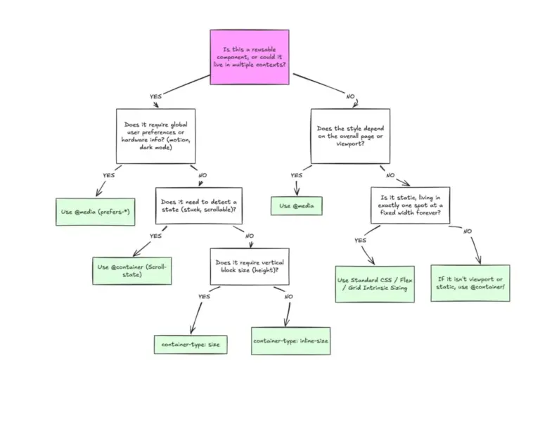
Traditional fluid typography relies on viewport-based length units, such as vw, paired with clamp() functions to dynamically scale text sizes between minimum and maximum viewport bounds. However, viewport-based fluid typography operates blindly with respect to structural layout context: a heading situated inside a narrow 300-pixel sidebar scales according to the total screen width rather than the space available within its containing column.
.article-container
  container-type: inline-size;


:root
  --step-0: clamp(1rem, 0.9rem + 1cqi, 1.125rem);
  --step-3: clamp(2rem, 1.6rem + 3cqi, 2.75rem);
By assigning container-type: inline-size to an outer wrapper element, developers create an explicit container query context. Child elements can subsequently utilize container query inline units (cqi), where 1cqi represents one percent of the container’s inline width rather than the total browser viewport.
Substituting vw with cqi within a standard clamp() mathematical expression allows typographic scales to adjust contextually. A heading component using container query units dynamically scales whether it occupies a full-width article column or a narrow secondary widget, eliminating the need for component-specific breakpoint overrides across layout media queries.
Vertical rhythm: trim the half-leading
In standard CSS inline layout models, the line-height property adds spacing above the font’s cap-height and below its baseline, a concept known as half-leading. While half-leading ensures comfortable reading distances within running body paragraphs, it creates significant alignment issues when headings or text blocks need to align flush alongside adjacent UI elements, image edges, or structural grid lines.
:heading, p, blockquote, figcaption, li
  text-box-trim: trim-both;
  text-box-edge: cap alphabetic;
  /* shorthand: text-box: trim-both cap alphabetic; */
The modern text-box-trim property addresses this long-standing layout issue by stripping excess half-leading from the top and bottom of line boxes. When paired with text-box-edge: cap alphabetic, the browser calculates layout boundaries directly from the font metrics—measuring explicitly from capital letter caps to the alphabetic baseline. This eliminates the need for arbitrary negative margins or manual transform nudges previously used to compensate for font line metrics.
@supports selector(:heading)
  :heading
    text-box: trim-both cap alphabetic;
Because specifications evolve alongside browser engines, CSS Selectors Level 5 introduces the proposed :heading pseudo-class, designed to match all standard heading elements from h1 through h6 as well as elements assigned role="heading". Because browser adoption of :heading remains emerging, wrapping modern selector extensions inside @supports selector() blocks ensures legacy CSS parsers safely ignore unsupported syntax without discarding adjacent stylesheet declarations.
Balanced headlines, orphan-free paragraphs
Line-wrapping behavior dramatically influences both the aesthetics and readability of text blocks. Default browser wrapping algorithms evaluate line breaks on a word-by-word basis, which frequently leaves single hanging words—commonly referred to as orphans—on the final line of headings or paragraphs.
:heading, blockquote, figcaption
  text-wrap: balance;


p, li, dd
  text-wrap: pretty;
  max-width: 65ch;


[contenteditable="true"]
  text-wrap: stable;
The text-wrap: balance declaration instructs the layout engine to calculate and distribute text across available lines evenly. This property is optimized for short display blocks, such as headlines and pull quotes up to approximately six lines. For longer body copy, text-wrap: pretty alters the breaking algorithm specifically to evaluate the final lines of a paragraph, preventing isolated single-word orphans without recalculating the line geometry of the entire text block.
Both declarations replace client-side JavaScript orphan-control scripts. For interactive forms or web applications containing editable text interfaces, [contenteditable="true"] elements utilize text-wrap: stable. This prevents paragraph structures from constantly reflowing and shifting layout boundaries as users type or edit text content.
Hyphenation, properly tuned
Enabling automatic hyphenation improves justified or narrow-column body text by reducing harsh rag edges along paragraph boundaries. However, implementing hyphens: auto requires semantic document language configurations to function correctly.
<html lang="en-GB">p
hyphens: auto;
Browsers depend entirely on language dictionaries to calculate hyphenation break points. If a document lacks a valid lang attribute (such as <html lang="en-GB">), the browser engine cannot bind a dictionary and fails to hyphenate. Even with a valid language declared, default hyphenation algorithms can create visual issues, such as consecutive hyphenated line ends—known as hyphen ladders—or broken two-letter word fragments.
p
  hyphens: auto;
hyphenate-limit-chars: 6 3 3; /* word length, min before break, min after break */
hyphenate-character: "‐"; /* use proper hyphen glyph instead of dash */
hyphenate-limit-lines: 2; /* no more than 2 consecutive hyphenated lines */
hyphenate-limit-zone: 8%; /* reduce overall hyphenation frequency */
hyphenate-limit-last: always; /* never hyphenate the last word of a paragraph */
/* Safari legacy equivalents */
-webkit-hyphens: auto;
-webkit-hyphenate-limit-before: 4;
-webkit-hyphenate-limit-after: 3;
-webkit-hyphenate-limit-lines: 2;
pre, code, var, samp, kbd, :heading
hyphens: manual;
-webkit-hyphens: manual;
CSS Text Module Level 4 introduces controls for fine-tuning break limits. The hyphenate-limit-chars property defines the minimum total word length alongside the minimum character count required before and after a break hyphen. hyphenate-limit-lines restricts sequential hyphenated line ends to prevent visual clutter, while hyphenate-limit-zone controls margin boundaries, and hyphenate-limit-last: always protects final paragraph words from splitting.
Because WebKit engines require prefixed syntax for legacy support, declaration blocks should include both standard properties and -webkit- vendor prefixes. Code snippets, technical variables, and headings explicitly set hyphens: manual, ensuring programmatic syntax and display headers are never broken by automatic dictionary rules.
Hanging punctuation and ink-aware underlines
Punctuation marks carry different optical weights than solid alphanumeric glyphs. When quotation marks or brackets appear at the beginning or end of aligned body text, their surrounding whitespace can create the visual illusion of an indented left or right margin.
blockquote, p
  hanging-punctuation: first allow-end last;


a
  text-decoration-thickness: from-font;
  text-underline-offset: 0.15em;
  text-decoration-skip-ink: auto;
The hanging-punctuation property shifts punctuation marks slightly outside the boundaries of the text box. Specifying first allows opening quotes to hang beyond the start edge, last handles closing marks, and allow-end permits trailing punctuation to hang beyond the inline end margin instead of forcing an unwanted line wrap. This produces clean alignment along paragraph margins.
Hyperlink underlines benefit from similar optical enhancements. Historically, browsers applied fixed single-pixel line weights and arbitrary vertical offsets regardless of font weight or stroke characteristics.
Setting text-decoration-thickness: from-font aligns underline stroke thickness with metrics embedded directly within the font file. Adding text-underline-offset: 0.15em lowers the line to give character descenders space, while text-decoration-skip-ink: auto breaks the underline stroke wherever descenders cross it, keeping text legible.
Variable font fine-tuning
Variable fonts allow a single font file to house multiple stylistic axes—such as weight, width, optical size, and grade—delivering design flexibility with minimal network overhead.
body
  font-optical-sizing: auto;
  font-variant-ligatures: common-ligatures contextual;
  font-kerning: normal;


/* Dark mode grade compensation */
:root
  --vf-grad: 0;


@media (prefers-color-scheme: dark)
  :root  --vf-grad: -50;


*
  font-variation-settings: "GRAD" var(--vf-grad, 0);
When custom fonts include an optical size axis (opsz), declaring font-optical-sizing: auto adjusts stroke contrast automatically based on rendered font size, optimizing stroke width for small body copy while preserving fine detail in large headlines. Declarations for font-variant-ligatures and font-kerning activate standard OpenType features, enabling contextual glyph replacements and kerning tables.
Typography rendered in dark mode introduces a distinct visual challenge: bright text displayed against dark backgrounds optically bleeds, making glyph weights appear perceptually heavier than identical text rendered in light mode. Where variable fonts ship with a Grade axis (GRAD), dark mode media queries can adjust --vf-grad (e.g., to -50). This reduces perceived font weight in dark environments without changing glyph widths or causing layout shifts.
@font-face
  font-family: "Mono";
  src: url("/fonts/mono-var.woff2") format("woff2");
  size-adjust: 105%; /* tune per-font */
When combining monospaced fonts alongside body typefaces, mismatched x-heights frequently disrupt line alignment. Applying size-adjust directly within the @font-face block rescales the target font’s metrics relative to standard body type without modifying author-declared font-size values across stylesheets.
Numeric, emoji, and script-aware text
Typographic numbers serve distinct layout requirements depending on context. Numerical data presented within tabular rows requires uniform widths to align cleanly down data columns, whereas numbers placed within flowing body prose should adjust proportionally to match adjacent text.
table, .tabular
  font-variant-numeric: tabular-nums lining-nums;


.prose
  font-variant-numeric: oldstyle-nums proportional-nums;


.emoji-color
  font-variant-emoji: emoji;


.emoji-mono
  font-variant-emoji: text;
Applying font-variant-numeric: tabular-nums lining-nums enforces equal glyph widths and uniform cap heights for numeric structures within tables and data grids. Conversely, oldstyle-nums proportional-nums lowers digit heights and assigns proportional inline widths, integrating numbers smoothly into running text without disrupting line texture.
The font-variant-emoji property provides explicit control over emoji presentation formats. Rather than leaving color versus monochrome rendering to platform defaults, applying .emoji-color or .emoji-mono guarantees consistent emoji styling across diverse client environments.
Locale-aware quotes and native subscripts and superscripts
Quotation marks, spacing conventions, and glyph ordering vary significantly by language and geographic region. For instance, standard English wraps secondary quotes within primary double quotes, British English flips this convention, and French typography uses guillemets separated by non-breaking spaces.
:where(:lang(en)) > *  quotes: '"' '"' "'" "'";
:where(:lang(en-GB)) > *  quotes: "'" "'" '"' '"';
:where(:lang(fr)) > *  quotes: "«0202F" "0202F»" '"' '"';

q::before  content: open-quote;
q::after  content: close-quote;
Using CSS :lang() pseudo-classes paired with the quotes property enables dynamic localized punctuation structures based on document markup. Standard inline quote elements (<q>) leverage open-quote and close-quote keywords to generate regional punctuation automatically, separating presentation layer rules from raw content.
@supports (font-variant-position: sub)
  :is(sub, .sub)
    vertical-align: baseline;
    font-size: 100%;
    line-height: inherit;
    font-variant-position: sub;


@supports (font-variant-position: super)
  :is(sup, .sup)
    vertical-align: baseline;
    font-size: 100%;
    line-height: inherit;
    font-variant-position: super;
Default browser rendering for subscript (<sub>) and superscript (<sup>) elements relies on synthesized CSS scaling, shrinking normal glyph sizes and altering vertical baselines. The modern font-variant-position property accesses dedicated OpenType subscript and superscript glyphs directly from supporting font files, resetting traditional vertical-align, font-size, and line-height overrides so custom glyphs render cleanly.
A note on specificity: :is() and :where()
Managing stylesheet architecture across large web projects requires careful specificity management. The CSS functional pseudo-classes :where() and :is() provide powerful mechanisms for scoping selectors and controlling the cascade.
:where(h1, h2, h3, h4, h5, h6)
  margin-block: 0.5em;
The :where() pseudo-class forces its entire selector list to resolve with zero specificity (0,0,0). Placing baseline reset configurations inside :where() allows author utility classes or component-level stylesheets to override reset defaults without requiring complex selector chains or !important flags.
:is(h1, h2, h3, h4, h5, h6), p, blockquote, figcaption, li
  text-box: trim-both cap alphabetic;
Conversely, the :is() pseudo-class adopts the specificity score of its most specific argument. :is() serves primarily to condense long, repetitive selector groups—such as complex heading sequences—simplifying stylesheet maintenance while maintaining expected cascade weights.
The final tidy-typography.css
The complete tidy-typography.css stylesheet aggregates these modern typography features into a unified baseline. Unsupported properties degrade gracefully in older browsers, allowing development teams to adopt progressive typographic features immediately:
/* ==========================================================================
tidy-typography.css — a modern typography reset
Every rule degrades gracefully in unsupported browsers.
========================================================================== */

html
  -webkit-font-smoothing: antialiased;
  text-rendering: optimizeLegibility;
  font-synthesis: none;
  -moz-text-size-adjust: none;
  -webkit-text-size-adjust: none;
  text-size-adjust: none;


body
  max-width: 800px;
  margin: 0 auto;
  padding: 1rem;


/* ---- Fluid typography ---- */

.article-container
  container-type: inline-size;


:root
  --step-0: clamp(1rem, 0.9rem + 1cqi, 1.125rem);
  --step-1: clamp(1.25rem, 1.1rem + 1.5cqi, 1.5rem);
  --step-2: clamp(1.6rem, 1.35rem + 2cqi, 2rem);
  --step-3: clamp(2rem, 1.6rem + 3cqi, 2.75rem);
  --step-4: clamp(2.5rem, 1.9rem + 4.5cqi, 4rem);
  --vf-grad: 0;


@media (prefers-color-scheme: dark)
  :root
    --vf-grad: -50;


/* ---- Variable font fine-tuning ---- */

*
  font-variation-settings: "GRAD" var(--vf-grad, 0);


body
  font-size: var(--step-0);
  font-size-adjust: from-font;
  line-height: 1.6;
  font-optical-sizing: auto;
  font-variant-ligatures: common-ligatures contextual;
  font-kerning: normal;


/* ---- Text box trim ---- */

:is(h1, h2, h3, h4, h5, h6), p, blockquote, figcaption, li
  text-box: trim-both cap alphabetic;


/* ---- Text wrap ---- */

:is(h1, h2, h3, h4, h5, h6), blockquote, figcaption
  text-wrap: balance;
  font-size: var(--step-3);
  line-height: 1.15;
  letter-spacing: -0.01em;


h1
  font-size: var(--step-4);


p, li, dd
  text-wrap: pretty;
  max-width: 65ch;
  hyphens: auto;
  hyphenate-limit-chars: 6 3 3;
  hyphenate-limit-lines: 2;
  hyphenate-limit-zone: 8%;
  hyphenate-limit-last: always;


pre, code, var, samp, kbd, :is(h1, h2, h3, h4, h5, h6)
  hyphens: manual;


blockquote, p
  hanging-punctuation: first allow-end last;


[contenteditable="true"]
  text-wrap: stable;


/* ---- Numeric, emoji, and script-aware text ---- */

table, .tabular {
  font-variant-numeric: tabular-nums lining-nums;