The typographic community is celebrating a fresh visual addition to its digital landscape as designer and typographer Andrea Leksen debuts her latest header artwork for the prominent platform Alphabettes. Published on October 15, 2026, the newly introduced header showcases a refined fusion of classical letterforms and modern digital craftsmanship, reinforcing the platform’s commitment to highlighting excellence in type design, lettering, and typography.
Alphabettes, a widely recognized international network and platform celebrating the work of women and non-binary individuals in lettering, type design, and typography, frequently collaborates with leading creative professionals to update its visual identity. The latest update, masterfully crafted by Leksen—a respected voice within the community known for her meticulous attention to detail and expressive letterforms—brings a renewed sense of aesthetic elegance to the site’s digital pages.
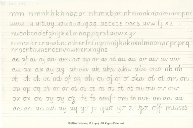
The newly unveiled header, prominently displayed across the platform, features intricate script elements that balance technical precision with organic fluidity. According to details associated with the release, the piece ties closely into ongoing conversations surrounding "letterlove" and the deep-rooted passion that designers hold for the craft of shaping alphabets. By integrating this custom lettering into the site’s primary header space, Alphabettes continues to provide a living gallery for contemporary typographic exploration.

Type design has experienced a profound renaissance in the digital age, driven by the accessibility of modern design tools and a growing appreciation for bespoke branding. Platforms like Alphabettes serve as vital hubs for practitioners to share insights, showcase portfolios, and engage in meaningful discussions about the evolution of the field. Leksen’s contribution encapsulates this spirit, offering visitors an immediate visual encounter with high-level lettering art the moment they arrive on the site.
The announcement has quickly drawn attention from members of the broader typography community, sparking discussions across digital channels about the nuances of script design, legibility, and the delicate balance required to make digital letterforms feel warm and human. Observers note that Leksen’s work on the header exemplifies the meticulous skill required to design custom alphabets that must scale gracefully across various screen sizes and resolutions without losing their distinctive character.
As part of the platform’s continuous evolution, the header update follows a rich lineage of previous visual contributions, such as the widely discussed "Type + Lettering" features that explore the intersection of traditional hand-drawn letterforms and digital type production. By featuring work from established practitioners like Leksen, Alphabettes not only honors the rich history of typography but also pushes the boundaries of contemporary digital publishing design.
Community members, typography enthusiasts, and fellow designers have already begun engaging with the new release, leaving comments and sharing appreciation for the intricate details embedded within the script. The platform’s interactive spaces remain open for feedback, allowing the global design community to connect directly with the creators shaping the visual vocabulary of modern typography. With this latest launch, Alphabettes reaffirms its position as a central pillar for type design discourse, driven by the passion and expertise of contributors dedicated to the art and science of letters.